
Empfohlen
Weitere ähnliche Inhalte
Was ist angesagt?
Was ist angesagt? (19)
Andere mochten auch
Andere mochten auch (16)
Ähnlich wie Technology
Ähnlich wie Technology (20)
Kürzlich hochgeladen
Kürzlich hochgeladen (20)
Technology
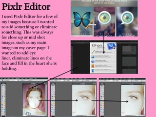
- 1. I used Pixlr Editor for a few of my images because I wanted to add something or eliminate something. This was always for close up or mid shot images, such as my main image on my cover page. I wanted to add eye liner, eliminate lines on the face and fill in the heart she is holding.
- 2. I used Pixlr-o-matic for all of my images across my cover page, contents page and double page spread. Pixlr-o-matic allowed me to browse through effects (see bottom middle) and decide on which complemented my image the most and which gave the perfect effect that I wanted. For example, the effect used here, has given the image a pink finish which would be conventional for my magazine because of the house style I have used. For example; If I used this image, it is placed in this bowl and below it, you can scroll through a number of effects, which the image changes to when you click on them. Here, the finished product is ready to be saved.
- 3. I used Adobe Fireworks to photo shop images such as this image of the girl group. I only used Fireworks if I needed to do intricate work such as eliminating the background which meant using the lasso tool on fireworks to cut around the image which left me with the image bottom right. Fireworks is extremely useful when wanting to colour in a background or eliminating the background. It can also be used to fill colour into a chosen area of your image. If needed, it can also be used to change the colour of your models eyes etc. After choosing your image, you can eliminate the background using the lasso tool. Here, I have taken away the entire background. Here is the finished product which I used against white so there is no outline of the image which looks effective.
- 4. Font space is an online website which enables you to search a font under categories to make it easier. Once you have found your font you are able to change the size and colour and then save it under images. This proved very useful and I used it for my masthead. I used a sans serif, pink, feminine font which looked effective and worked well with my house style. I was able to browse easily and it was very easy to use the image as I just eliminated the background using a tool on Microsoft Word. A list of all sans serif fonts For example; if I picked this font, I am able to change the colour to pink, and alter the size of the text using the tools, here you can see the colour wheel.
- 5. I used Microsoft Word to create my entire magazine on. This proved easy to use and was useful when I needed to bring items forward and send items backwards. It enabled me to insert images easily and produce text which was simple to change if needed. The cover page was the most intricate design out of the three pages. This was because it had a lot of features on it, such as borders, text, images, backgrounds, bar code, captions, masthead etc. These needed to be inserted and positioned perfectly in order for the cover page to be composed effectively. This proved difficult but by using the tools under ‘format’ such as ‘bring to front’ and ‘send backward’ this was easier and enabled me to control everything because at times it got confusing as to which background needed to be placed where.