
Empfohlen
Weitere ähnliche Inhalte
Andere mochten auch
Andere mochten auch (12)
Mehr von Plang_Thailand1
Kürzlich hochgeladen
Kürzlich hochgeladen (20)
Essay on cover vibe
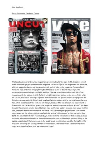
- 1. Jake Sandham Essay: Comparing Two Front Covers The target audience for the uncut magazine is predominately for the ages 25-55, it reaches a much wider and older age group than the vibe magazine. The house style of the magazine is red and black, which is suggesting danger and shows us the rock and roll edge to the magazine. The use of serif fonts and black and white imagery throughout the cover is also to do with house style. The masthead stands out in bright red, bold, serif font. The text is well balanced on each side of the magazine, with the picture of Keith Richards being the dominant picture on the cover. From what we can see, Richards is smoking a cigarette with cool aviator sun glasses which is bringing forth the Rock theme once again. He doesn’t look very healthy in the picture, and he has long brushed across hair, which also shows off the rock and roll lifestyle, because if he was all clean and washed with a flower in his hair, he would not go with the magazine, and the magazine probably wouldn’t sell. Even thought the picture is a male, it would attract male and female readers because, men would find him cool, and some women would find him attractive. The Guttenberg design principle is used on this cover, as we see the primary optical area has in big writing ‘rolling stones’ as they are such a liked band, this would attract more readers to buy it. In the terminal optical area is the bar code, as this is not really relevant to the reader or buyer of the magazine, and in affect helps get more things in the optical areas to catch the buyer’s eye. In the ‘dead’ areas, is writing that won’t be the big hit in the magazine and things are usually put there to fill the space. The lead article is clearly on the stone roses, as it states in a large font, ‘exclusive stone roses’.
- 2. Jake Sandham For the other magazine, it is very different to the uncut magazine, apart from the house style which is very similar with the red, black and grey. The masthead in vibe magazine is in san serif font, bold and white which gives it a much more exclusive, RnB look to the magazine, also the word ‘Vibe’ is to do with the vibrations of the speakers which are relevant to the genre of magazine being music. The main image is of American rapper Lil Wayne, the picture is centred on the magazine cover, with his chest out and his jewellery displayed showing off his lifestyle and making him look free. In comparison to uncut magazine there is much less font making it less busy, showing more space on the magazine makes you notice the image more. Although there is less text than the uncut, the text is well balanced on each side which is similar to uncut cover. From what we can see his skin in the image looks very healthy although it is covered in tattoos; this shows he has time to look after herself and the money to spend on tattoos; this could attract a female audience as they may be attracted to this, or male as they may think it is cool. The fact that he is naked shows he is very confident about his body, and isn’t afraid to show it off. He has a serious, seductive face, which would attract a female audience. He is wearing sunglasses which could represent wealth in him and the industry he is in, it could also suggest he has pain in his eyes and he doesn’t want people to see it. The target audience for this specific magazine, I think would be 16-26 year olds as the image on the front cover is a young male rapper. Even though the photograph is of a man, this would attract both male and female. The masthead is very large, but we can’t see all of it is behind the image on the front. As we can see ‘Weezy’ which is Lil Wayne nickname is in a different size and colour to the other text on the page, this makes it stand out far more, as your eyes are drawn to this area because it is the primary area. This makes you want to read about him, as this is the main story in the magazine. The terminal area being the bottom right, which is the second place the viewers tend to look although this time on the magazine it is empty. In the ‘dead areas’, the bottom left and the top right, are irrelevant icons, such as the barcode and plain areas.