How to Create Online Experiences that People Love - August 2011

So what are the latest and greatest in online trends in New Zealand and overseas? Recently Trent Mankelow and his Optimal Usability team were asked to distil learning from research and design projects with 190 clients across 19 industries and present the most important online trends that are emerging here and overseas - a somewhat daunting challenge. In this entertaining presentation Trent digs into this research to outline: The three key attributes of world-class organisations, using local and overseas examples from a number of industries. How new devices are going to affect future experiences. Why the chief economist at Google thinks statisticians are sexy. What swearing, fairies, and dinosaurs have to do with a good customer experience. Why design is not the same as aesthetics. What you can do to join to fight for great online experiences in New Zealand.

Empfohlen
Empfohlen
Weitere ähnliche Inhalte
Was ist angesagt?
Was ist angesagt? (20)
Ähnlich wie How to Create Online Experiences that People Love - August 2011
Ähnlich wie How to Create Online Experiences that People Love - August 2011 (20)
Mehr von Optimal Usability
Mehr von Optimal Usability (20)
Kürzlich hochgeladen
Kürzlich hochgeladen (20)
How to Create Online Experiences that People Love - August 2011
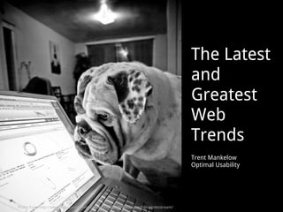
- 1. The Latest and Greatest Web Trends Trent Mankelow Optimal Usability Photo from http://www.flickr.com/photos/jesse757/3094868007/sizes/l/in/photostream/
- 2. How to Create Online Experiences That People LOVE Trent Mankelow Optimal Usability Photo from http://www.flickr.com/photos/saraalfred/3199313309/in/photostream/
- 11. How can you create an online experience that people love?
- 12. By focussing on three things: Data Design Service
- 13. Case Study 1. Service
- 14. “ That was the best customer service I have ever had.”
- 15. Photo from http://scott-allison.net/2009/12/08/culture-at-zappos-and-how-everyone-benefits/
- 16. New employees are offered $2,000 to quit
- 20. X 1,000,000,000
- 21. Zappos is a service company that happens to sell shoes
- 23. World-class companies focus on Service
- 24. My TV Buying Experience
- 28. Your TV is ready to pick up!
- 29. Photo from http://www.dnzproperty.com/images/objectImages/highres_images/PMC-Noel-Leeming.jpg
- 30. A new TV!!
- 31. Customer-facing staff Websites Communications Physical environments Payment systems Packaging
- 32. Customer-facing staff Websites Communications Physical environments Payment systems Packaging
- 33. Great online experiences start with explicitly designing the ENTIRE experience: across interactions and across channels
- 36. Case Study 2. Design
- 37. “ As a discussion about design grows longer, the probability of using Apple as an exemplar approaches one” (With apologies to Adaptive Path and Mike Godwin)
- 38. Apple have a fanatical focus on elegant, emotional design
- 39. They throw away 90% of the work they do
- 40. Design is infused throughout the customer journey
- 44. World-class companies focus on Design
- 45. Design ≠ Aesthetics
- 46. “ Design’s power runs far deeper than aesthetics .... If you are mapping out a sales strategy, or streamlining a manufacturing operation, or crafting a new system for innovating you are engaged in the practice of design” - Bill Breen, Masters of Design, 2004
- 47. Good design = Simple Good design = Personable Good design = Attractive
- 48. World-class companies simplify simplify simplify
- 53. The most popular spot on the Xero home page? ‘ Try for free’
- 58. “ My buddy Russ and I were talking one day. ‘What the fuck should I make for dinner?’ I queried. That's the genesis for this website.”
- 64. World-class companies have personality
- 74. If someone is physically attractive, people tend to assume they also have a host of admirable qualities, such as intelligence and honesty. - B.J. Fogg
- 75. Teachers presume that good-looking children are more intelligent than their less attractive classmates
- 76. A visually appealing website is seen as more credible
- 77. Bonus tip: if you want to capture and hold attention, use photos
- 78. Bonus tip: use attractive people
- 82. Case Study 3. Data
- 83. "Quicken is not quick, there's got to be a better way to do this.” – Aaron Patzer, CEO and founder
- 85. Mint focuses on helping individual users make sense of their own data
- 86. Their next level of insight is in comparing ourselves with others like us
- 87. 2 ,000,000 users 2 years $ 2 ,000,000 marketing
- 88. World-class companies focus on Data
- 89. Food Sex Information?? Dopamine makes us seek
- 91. World-class companies provide tools to help customers understand their own data
- 99. World-class companies focus on three things: Data Design Service
- 100. One final point – Devices are becoming smarter Mobile Location-aware Touch-enabled Context-aware
- 101. Mobile
- 102. Location-aware
- 103. Touch-enabled
- 104. Context-aware
- 105. In conclusion
- 106. What? So what? Now what?
- 108. Read
- 109. Play
- 110. Show
- 112. Questions? [email_address] (021) 389-494 @trentmankelow @OptimalNZ Sign up to our newsletter at www.optimalusability.com !
Hinweis der Redaktion
- OK, so you thought you were here today to hear about the latest and greatest web trends…
- Well, instead I have decided to try to woo you a bit, and have renamed what I’m talking about to How to Create Online Experiences that People Love. TODO: bring Zappos book, Lonely Planet ========== New Zealand's internet user base grew more than 320% between 2000 and 2009. [Source: Internet World Stats, August 2010] New Zealand currently has 3.5 million internet users, representing a penetration rate of 83%. [Source: Internet World Stats, February 2010] TODO: get new cover image each time I present this?
- And I want to start with me on my holiday. A couple of years ago I was lucky enough to go to Argentina. Here I am with my wife. ============ TODO: swap photos every time I present
- I have a bit of a love affair with Argentina. That trip was actually the sixth time I’ve visited. But this trip was different from all the others.
- It’s the first trip where I truly weaned myself from the Lonely Planet. CLICK ================= http://jp.niagaracollege.ca/ABlack/LonelyPlanetWebsite/pictures/lp.jpg
- You see, this time we travelled with a little notebook computer, and used the free WiFi everywhere we went.
- So instead of the Lonely Planet, we used Hostel World to make our bookings. It was way better than the Lonely Planet. It has a lot more places to stay. It had a lot more detail on those places. It had ratings from lots and lots of people – it wasn’t based one the opinion of one author.
- We also used trip advisor a lot – we would try and visit the top couple of restaurants in a town.
- Here we are trying the top rated restaurant in Bariloche.
- Sometimes we’d write restaurant reviews to help out the next lot of travellers.
- Now, neither of these sites would win awards for their design, but we loved them. We relied on them. They were certainly better than a big, heavy, out-of-date book. Today I’d like to share with you some thoughts about how you can create online experiences that people love.
- I think that you can create world-class online experiences by focussing on doing three things right: Service, Design and Data. This is the very loose framework for my talk – I’m just gonna try and spend the next hour filling your brains with case studies, examples, statistics, and psychology. I want to spend most of the time on design and data.
- OK, so to kick us off, I want to introduce you to a company called Zappos. They are an example of world-class customer service. They started out as an online shoe store.
- They’ve really embedded customer service into everything they do. Zappos’ goal is to make sure every interaction results in the customer saying, “That was the best customer service I have ever had”. That’s why they view any expense that enhances the customer experience as a marketing cost - which includes it’s call centre.
- As a result of this goal, they think really carefully about who to hire in customer service roles. After jumping through all the hoops to get hired, and completing a 4-week paid training programme, new employees have one final test.
- They are offered $2,000 to quit. To have to really want this job. How much were you offered to quit?
- 97% turn it down
- The reason that they offer the bribe is that they figure that it’s best to know early if an employee doesn’t buy into the customer service vision.
- The result is that Zappos have become famous for their customer service. Tony Shay has even written a book on it.
- The results of this focus on customer service have been pretty spectacular. They grew to a US$1B-a-year retailer in less than 10 years. They were bought in July 2009 by Amazon for $1.2B (http://www.tampabay.com/news/business/retail/zappos-ceo-thinks-online-customer-service-is-essential-to-survival/1128880).
- I believe that the reason that Zappos is so successful is that they are a service company that happens to sell shoes. Their tag line is “powered by service”.
- In fact, Zappos is moving from footwear-only to becoming what they describe as a “top-tier customer service platform that can sell almost anything.” ============= From http://www.tampabay.com/news/business/retail/zappos-ceo-thinks-online-customer-service-is-essential-to-survival/1128880.
- Great websites are built on a foundation of great service.
- Let me explain this in the context of buying a TV. When I last bought a TV it involved me....
- looking at the Consumer website,
- researching the cheapest prices online, which at the time, was Noel Lemming
- making the purchase online,
- receiving a phone call to say it was ready to pick up
- going into Noel Lemmings to pick it up.
- And I took it home – happy me!
- Buying a TV involved multiple interactions with multiple organisations across multiple touchpoints over time.
- Your website can be awesome, but if you haven’t through about the end-to-end customer journey, then people can still have a bad experience. You have to understand how your website fits into this.
- And great service comes from understanding and explicitly designing the entire customer experience: across interactions and across different channels.
- That’s why Tony thinks that “ the telephone remains one of the greatest brand inventions ever. Where else can you get customers' undivided attention today?” He’s thinking bigger than online. It’s interesting that n ot many websites even want to talk to customers.
- Anyway, this sums it up. Can anyone read Dutch? This billboard says 'Service is not a department but a mentality.‘ Great service underpins great online experiences.
- OK, onto design, the second attribute of world-class companies. Of course, I’m going to use Apple as an example.
- My apologies – this has been done to death. I just wanted to make a couple of quick points.
- One - Design is part of Apple's DNA, from the CEO on down. They care about the customer experience so much that apparently Steve Jobs got the marble for the floor at the New York Apple store shipped to California first so he could examine the veins! He helps to decide the kind of security cables holding devices down.
- Two - They spend a lot of money getting the design right. Apple designers design 10 different mock-ups of any new feature under consideration. And these are not just crappy mock-ups; they are all different, but all really good. They then narrow these 10 ideas down to three options, which the team spends a few more months further developing. ...until they finally narrow down to the one final concept that truly represents their best work. This is really expensive. They also pay their designers above market salary.
- Back to my earlier point – the other thing they do well is to infuse design throughout the different channels - from the emotional language on their website, to the hipness of their retail stores, to the joy of the out-of-the-box experience. They nail design at every step. Q: Have you heard of unboxing.com? ========== iPad2 unboxing photo from http://blog.macsales.com/9373-ipad-2-unboxing
- The results are pretty impressive, as you know. You might have seen earlier in the month that apparently they have more money than the US government, although as one of my workmates quipped, she has more money than the US government. ======= http://www.smh.com.au/technology/biz-tech/apple-has-more-cash-than-us-government-20110801-1i6x6.html
- CNN reported back in May 2011 that for Apple fans, thinking about Apple triggers a reaction in the brain similar to religious people. ========== http://edition.cnn.com/2011/TECH/gaming.gadgets/05/19/apple.religion/index.html?hpt=C2
- Scary stuff.
- If you want to create online experiences that people love you need to focus on design.
- By design, I’m not JUST talking about aesthetics.
- As Bill Breen says…[READ QUOTE] I don’t believe that design is a magical, specialist skill. I believe that you can all be designers if you choose to be. OK -
- I could talk about design all day, but I wanted to make 3 specific points. Go0d design is…
- Creating a really great experience, often leads to simple product sets and simple business models. Apple only have about 30 products. Contrast this with one New Zealand bank that has 93 different types of credit cards. One of the cards only has 8 customers!
- This is actually pretty important. A lot of choice hinders our decision making process. Who has heard of the famous jam study? This was an experiment that was done in 2000 in California. What they did is on one Saturday, they offered 24 flavours of jam, and on the next they offered 6. Now take a guess. Which display sold more jam? Given the “more is better” mindset, you’d think the larger display sold more. But as you probably know, that’s not what happened. [CLICK] When 24 jams were available, 60% of the customers stopped for a taste test and 3% of those bought some. When 6 jams were available, 40% of the customers stopped for a taste test, but 30% bought some. Huge results. While the larger display attracted more people, the smaller display sold more jam. Ten times more.
- This research is directly applicable to your website. If you want people to do something when they visit the site, then remove the clutter. Here is an 6-jam homepage from Dropbox, there are pretty much only 2 options on their homepage – watch a video about how Dropbox works or download the software.
- Here is an earlier version of their home page, which was a 24 jam home page – you can see that they don’t even bother talking about the benefits any more. And this is a pretty successful service (recent issues aside) - they were growing at 15 – 20% per month.
- The evolution of the Dropbox homepage demonstrates a real theme of successful web sites – many of them start with a single, clear call to action. This is Xero’s home page – what area do you think gets the most attention?
- The thing that gets the most attention is the button that says “Try Xero for free”. The clear call to action.
- 6-jam webpages can make a real impact to dollars and sense too. I was talking to the good people at Travelbug recently. They’ve just moved from this 24-jam homepage…
- To a 6 jam home page that is much simpler (this big image that rotates). Through A|B testing they know that this new version has a better bounce rate, conversion rate and total number of transactions (email from Daniel Bridges on 21/7). They’ve made the most important task – searching for somewhere to stay into a bigger priority on the page.
- Of course, you don’t always want too simple. This is why usability people don’t design games. (Sorry, I had to include at least one usability joke.)
- People love using elegant, beautiful, simple interfaces. As Norman says, we don’t want to spend out time deep in thought figuring out how to make something work. http://www.jnd.org/NNg-Photographs/DonNorman2003-3.jpg
- Apologies for the vulgarity, but I have to show you this. This is a very simple site. It offers a recipe idea each time you refresh, whilst chucking in a barrage of expletives for good measure.
- If you don’t like what it suggests that you can hit refresh.
- There are even vegetarian options.
- Once you finally get to something that looks good, you just click on it…
- … and they link through to the actual recipe. Try it tonight! Simple, simple, simple.
- Oh, and in case there anyone here responsible for social media strategy? TODO: take another screenshot to fix cropping
- On this point, we are definitely seeing a trend towards more personality online. The hotel industry has this term “delighters”. These are aspects of a product or service that delight the customer when present, but are not strictly required.
- Wufoo’s dinosaur is a good example of a delighter
- A local example is the Air Points Fairy from Air NZ
- Rob Fyfe talks about the Air New Zealand personality in this video
- It’s hard to like a faceless organisation. I really like this 404 page.
- The Sorted mouse is another example. Here’s how he’s evolved since he was launched in 2001. He’s gotten a bit trimmer over the years. From http://www.sorted.org.nz/blog/sorted-turns-8
- [GIVE PEOPLE TIME TO READ] TODO: Only use this slide in Wellington?
- One final example – Michelle got this yesterday when she logged in to the website that manages our email list. Just a thank you. Just because. As she puts it “It made me smile and happy and gave me warm and fuzzy feelings inside.”
- It’s important to have a visually appealing website, because it turns out that if we perceive someone as attractive, we also perceive them to be credible.
- This is called the halo affect, and its something we’ve known for a long time. “If someone is physically attractive, people tend to assume that they also have a host of admirable qualities such as intelligence and honesty.”
- For example, “teachers presume that good-looking children are more intelligent than their less attractive classmates” p 172, Influence. More attractive defendants are twice as likely to avoid jail time as ugly ones – p172, Influence. ================ Image from http://www.nzia.co.nz/projectImages/672132fd/Images/Art%20Maths%20Classroom%20Block%20_%20Classroom%20_%206%20of%206.jpg
- Thanks to the work that this guy has done on persuasion, trust and credibility over at Stanford University, we also know that first impressions count with websites too. A visually appealing site is seen as more credible. ==== Website from http://cdhb.govt.nz/
- Another couple of tips: If you want to capture and hold attention, use photos. Again, this stuff is pretty hard wired - babies as young as 4 months old will look at pictures of other people more than pictures of other objects or of animals. In an experiment in 2008, participants viewed pictures of 2,500 objects over the course of 5.5 hours. Afterward, they were shown pairs of images and indicated which of the two they had seen. Q: What percentage would people remember? [CLICK] ============ From Brain Rules TODO: redo collage so there aren’t so many photos the same?
- Another tip: our attention is riveted by faces. And if you are going to use faces, make sure that they are attractive. And by attractive, I mean symmetrical. This isn’t a real person – this is an 'average' face generated combining 15 female faces by the Face Research Lab . CLICK Apparently we see the symmetry as pleasing, because averageness may indicate genetic diversity that boosts immunity to disease. ============== http://www.valentinemoore.co.uk/trv/Attractive.pdf
- A final trick is that if you want people to look at something in particular on the page besides the photo, then have the person in the photo “looking” at that spot on the page. In this ad, the baby is looking staring straight ahead so we will simply look back at them and not really anywhere else. From http://usableworld.com.au/2009/03/16/you-look-where-they-look/
- In this version, the baby is looking at the headline. Notice how many more people are actually reading the text that the baby is looking at. Faces can be used to guide a person’s attention to key content and make sure they actually read it.
- This is a much, much better example. Where is Obama looking?
- OK, one final attribute - data. Q: Have you heard of Mint? How many people use some kind of online personal financial management tool? Mint is an easy-to-use personal-finance tracking tool that automatically categorises spending, reveals trends, and helps with long-term financial planning and goal setting
- Mint was started by a 25-year-old in 2007 who envisioned building a site that would help people manage their money. As he put it “Quicken is not quick, there’s got to be a better way to do this”.
- Here’s what it looks like. You set an amount you’d like to spend on a category – say, $140 on shopping per month. On a given day during the month, Mint shows you how much you’ve spent as compared to what day of the month it is. The bar in the chart is yellow if you’re under budget for the month but over for the day in the month, and red if you’re over completely. ======== TODO: update screenshot with something more up-to-date
- Because they track $50 billion in assets and $200 billion in transactions from 4 million users Mint are able to aggregate data to find interesting patterns. They help users compare themselves with others. For example, if you were in the top 20 percent spending for auto insurance, Mint might send you a little alert saying 'Hey, you spend more than 80 percent of the average Mint users.' And then they can connect you with better auto insurance deals. Of course. Instead of knowing how many dollar signs a guide gives a restaurant, you’ll see what the average amount spent at that restaurant is.
- This focus on data has led to some pretty amazing results. Mint went from zero to 2 million users, in 2 years (on a marketing budget of $2 million) Mint met its initial three-month goal for user acquisition in 36 hours. Mint was bought for US$170m in November 2009 by the makers of Quicken, who inspired the original idea! ======== Others who hit 2m users in 2 years = dropbox and xobni
- World-class companies help customers understand their own data.
- You’ve probably heard about dopamine. It’s the chemical that makes people seek food CLICK And sex But what you might not know if that it also makes us crave information. CLICK So while we’ve been complaining about information overload for 2,500 years we can’t help ourselves. The web feeds our addiction with all these new possibilities to collect data, share it, bring it from one place to another, to remix it, label it and find it. ============= For example, 23andMe offers an at-home DNA test to help figure out customers' ancestry and predisposition to 119 diseases. Sophisticated Home Weather stations can be purchased from Dick Smith for under $200. Who needs Metservice when you can collect the data yourself? Image: http://www.redstamp.com/products/1932-Paperwork-Sticky-Notes-Anne-Taintor TODO: redo this slide design
- The big problem is finding, filtering and understanding the data. That’s why is going to be hip to be a stats geek over the next decade.
- To create websites that people love, you should think about how to help users understand their own data. =========== "What the individual values today is a deeply personal, information experience. When I look ahead, this is the biggest change in computing I see coming.“ - Justin Rattner, Intel Senior Fellow, Chief Technology Officer and Director Intel Labs. From http://www.independent.co.uk/life-style/gadgets-and-tech/deeply-personal-information-experience-not-better-technology-at-the-heart-of-new-inventions-2019585.html
- And why people who can design compelling, insightful infographics will be in hot demand. This is an infographic that shows the effectiveness of health supplements on the Y-axis (higher is better), and uses the size of the bubbles to illustrate the popularity of that particular supplement among US adults. Anything below the “worth it line,” doesn’t have enough evidence of medicinal benefit and is probably not worth your time, according to the graphic’s creators, who looked at data from over 1500 studies.
- Here a really novel example of this. Changing Habits is a website from the UK. What happens is that you start out with a normal looking guy. ======= http://www.changinghabbits.co.uk/ And as you go through the process… Energy calculator from http://www.willyoujoinus.com/usingenergywisely/energygenerator/ Graph from http://www.opower.com/Approach/TargetedMessaging.aspx
- … Of filling out a form to describe your behaviour… Then body parts distort relative to the environmental impact of certain activities. Each body part relates to an area of activity. Feet is transport. Bum is waste.
- Here’s the worst case scenario.
- You don’t have to go to these lengths to give people insight into their own data. Simple graphs can be very useful, like these from O Power. O Power is a SAAS company that sells it’s software to power companies. Companies like Genesis sign up, and then all their customers get access to graphs like this one. These, simple graphs work because they introduce a bit of friendly competition. By subtly shaming or applauding individuals, the graph taps into wanting to keep up with the neighbours. Customers who received these statements reduced energy use by 2 – 3.5% percent more than those who got standard bills (http://www.nytimes.com/2009/01/31/science/earth/31compete.html?_r=4&scp=1&sq=utilities&st=cse). http://www.maxgladwell.com/2010/03/opower-smart-grid-superhero/ Same thing in Australia: When people were told their water consumption relative to the population, total water use was cut by 25% because people didn't want to be above the norm. (http://infomagination.typepad.com/blog/2009/06/an-introduction-to-behavioural-economics-rory-sutherland-at-the-ipa-44-club.html) ============= http://infomagination.typepad.com/blog/2009/06/smile-power-2-smiley-faces-save-the-planet.html From http://nudges.org/2009/02/02/promoting-friendly-competition-to-cut-back-on-energy/ Giving people information about their energy consumption and how it compares with their neighbors’ in order to cut back on energy use – and printing smiley faces and frowning faces on customer’s bills to emphasize the message
- In fact, the simple smiley face can be a very effective way of changing behaviour. We’ve all seen the speed signs. It turns out that its much more effective to flash a smiley face rather than show your speed. Thanks to these little faces, the number of people exceeding the speed limit where they were trialled fell by 53% . Apparently kids are desperate to see the smiley face. ==============
- So, what kind of data could you create and use? You can have fun with this stuff - you could do what OK Cupid did, and look at 526,000 online dating profiles to find out what white people really like?
- So, in summary, world-class companies are focussed on Customer service, Design-led and Data-driven. In my opinion, this is how you get to websites that people love.
- It would be remiss of me not to talk about another big trend - the rise of smart devices. I think there are four important trends relating to devices that we all need to be aware of.
- We don’t want to be tethered to our PCs. We want devices that are small, lightweight and portable. The mobile phone is the primary connection tool for most people in the world. Already there are more mobile phones than computers. Within five years the number of users accessing the Net from mobile devices will surpass the number who access it from PCs (from http://www.wired.com/magazine/2010/08/ff_webrip/all/1). Global shipments of smartphones and tablets surpassed shipments of desktop PCs and notebooks in Q42010 (Morgan Stanley - http://www.slideshare.net/kleinerperkins/kpcb-top-10-mobile-trends-feb-2011). ========== Photo of Bolivian women in the salt plains, checking for mobile photo reception
- Location-based services have been talked about since Y2K, but it has only been recently that we are starting to see devices that know where in the world they are. Groupon in the States are using GPS features of smart phones to give you offers that are tailored to exactly where you are. Will Treat Me or Grab One go the same way? You’re in NYC, you are bored or hungry and you hit one of the buttons. =========== http://www.businessweek.com/magazine/content/11_13/b4221070014682.htm
- Gesture-based interfaces are definitely becoming more mainstream, thanks in large part to Apple’s family of products. Microsoft Surface (which is what you see here) have shown us how large, multi-touch interfaces might actually be used too. Designing these touch-based interfaces isn’t like designing for the desktop. For a start, fingers are much fatter than mouse pointers and require larger buttons. One wonders if we are going to have to suffer though years of clumsy interactions, while designers catch up. How can you use touch screens to create compelling interfaces?
- Devices are becoming more and more aware of the context in which they operate. They have sensors to measure all sorts of different things: motion, pressure, light, noise and even air quality and posture. Accelerometers are one of the more popular sensors, and allow devices to detect movement and orientation. Using accelerometers some Nokia phones allow users to reject calls by turning them upside down , and some iPods offer a "shake to shuffle" capability. Nintendo are about to release another add-on to the Wii console called a Vitality Sensor . It’s a fancy name for a simple idea - a sensor that checks your pulse. But think about the creative ways game designers could use it, like gauging when a horror game is too horrific, or when you aren’t working out hard enough when playing WiiFit. It’s important to keep these trends in the back of your mind when you are thinking about your web presence.
- So, in conclusion
- What: My message is a simple one. If you want to create online experiences that people love, you should focus on three things: Ensuring that you offer a great service. Focus on designing simple, personable, attractive, interfaces. Help users unlock their own data. You should do this in the context of smart devices that we just talked about. So what: Do this and you’ll be world-class. I mean it in the best sense – not just to get more revenue or reduce costs, but because you’ll create experiences that delight. You’ll make the world a little less frustrating and a little more enjoyable. Now what: What are the next steps for you?
- There is no guidebook. If there were it would be out-of-date, inaccurate and very, heavy. Instead, I recommend 3 things. ================ http://jp.niagaracollege.ca/ABlack/LonelyPlanetWebsite/pictures/lp.jpg
- Read, read, read – everything you can. Blogs on psychology. Check out Tony Shay’s new book. Get these – they are called Mental Notes
- Buy an iPad 2, sign up for Twitter, join Foursquare, play Angry Birds. Anything that is a big trend that you just don’t get – jump in with two feet. There are 200 million people on Twitter – you should be too. Kids playing in water: http://2.bp.blogspot.com/_ldFi3ipcRsU/TBtA-E70JbI/AAAAAAAADco/eehkuQ6Hp5I/s1600/Kids+Playing.jpg
- Tell people what you’ve learnt. I’m not special because I’m up the front– you have your own stories to tell. Share them with workmates, at conferences, with your husband...anyone who’ll listen. It’ll sharpen you up. Pic from http://www.drshute.com/archives/Mary%20Kay%20Pictures%20004D%20(Small).jpg
- One final point. Q: Anyone seen this? This is the new Lonely Planet app for the iPad and iPhone. Had to happen, didn’t it?
- Just finally, a short “word from your sponsor”
- As a side point, I was telling my neighbour that I was going to buy this new TV. He went out that same day, and managed to buy the exact same TV for $100 bucks cheaper than I got it. AND he got it delivered before mine.
- If you need more evidence, have a read of this. [WAIT] Consumer behaviour is changing a lot in response to widespread broadband, smart phones and social media. Our attention is fracturing - when I last purchased a TV last year I used 3 different websites and a total of 6 different touchpoints.