
Empfohlen
Weitere ähnliche Inhalte
Was ist angesagt?
Was ist angesagt? (18)
Andere mochten auch
Ähnlich wie Front cover analysis
Ähnlich wie Front cover analysis (20)
Mehr von OliviaLyons
Mehr von OliviaLyons (20)
Kürzlich hochgeladen
Kürzlich hochgeladen (20)
Front cover analysis
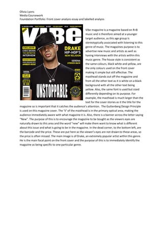
- 1. Olivia Lyons Media Coursework Foundation Portfolio: Front cover analysis essay and labelled analysis Vibe magazine is a magazine based on R+B music and is therefore aimed at a younger target audience, as this age group is stereotypically associated with listening to this genre of music. The magazines purpose is to advertise new music and artists as well as having interviews with the artists within this music genre. The house style is consistent as the same colours, black white and yellow, are the only colours used on the front cover making it simple but still effective. The masthead stands out off the magazine and from all the other text as it is white on a black background with all the other text being yellow. Also, the same font is used but sized differently depending on its purpose. For example, the masthead is much larger than the text for the cover stories as it the title for the magazine so is important that it catches the audience’s attention. The Guttenberg Design Principle is used on this magazine cover. The ‘V’ of the masthead is in the primary optical area, making the audience immediately aware with what magazine it is. Also, there is a banner across the letter saying “New”. The purpose of this is to encourage the magazine to be bought as the viewers eyes are naturally drawn to this area and the word “new” will make them want to know what is different about this issue and what is going to be in the magazine. In the dead corner, to the bottom left, are the barcode and the price. These are put here as the viewer’s eyes are not drawn to these areas, so the price is often missed. The main image is of Drake, an extremely popular artist within this genre. He is the main focal point on the front cover and the purpose of this is to immediately identify the magazine as being specific to one particular genre.
- 2. Olivia Lyons Media Coursework Foundation Portfolio: Front cover analysis essay and labelled analysis NME music magazine is based on rock and indie music and is therefore targeted at a niche audience, ranging from teenagers to middle aged people. The magazines purpose is to advertise new music within this genre, give music news, reviews and gossip as well as advertise upcoming concerts and festivals. The house style is consistent, using colours such as black and red. These colours have connotations of danger and death which resemble the genres the magazine covers as well as the target audience. Having the masthead in red on a black background is effective as it makes it stand out from all other text on the front cover. This is done so that the magazine can be immediately identified amongst others. The same font is used throughout the design, but the different sizes determine the more important information. For example The Killers are the main feature in the magazine, so their title is in a much larger font than other, less important cover stories, such as a 15 page guide to the world’s greatest rock festival. The main image is three separate images of the same person edited together to look like one, this is of Brandon Flowers, the lead singer from The killers. The simple image is still effective as each pose gives him a different personality, this reflects music within the ‘indie’ genre as it is varied, from being quite upbeat and happy to heavy and emotion filled. The Guttenberg Design Principle is used on this magazine cover to make the main image more quirky and interesting, other than just having a portrait picture of his face, NME have merged three pictures of Brandon together in order to make the front cover eye catching and to appeal to the audience. The masthead, the title of the magazine, is in the primary optical area, along with a cover line for a preview special. The purpose of this is that the viewer’s eyes are automatically drawn to this corner so by having a cover line for a preview special, they will be persuaded to buy it to find out more. As it was on Vibes front cover, the price is in the dead corner, an area of the page that the audience’s attention isn’t usually drawn to. The purpose of this is that the price is often missed.