
Empfohlen
Weitere ähnliche Inhalte
Andere mochten auch
Andere mochten auch (20)
Ähnlich wie Zack and cody
Ähnlich wie Zack and cody (20)
Kürzlich hochgeladen
Kürzlich hochgeladen (20)
Zack and cody
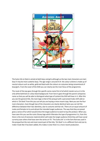
- 1. The Suite Life on Deck is aimed at both boys and girls although as the two main characters are twin boys it may be more suited to boys. The age range is around 8-14 .the colour scheme is made up of neutral colours such as white, gold and black with the colours on costumes being conventional of boys/girls. From the cover of the DVD you can clearly see the main focus of the programme. The route of the eye goes through the specific series name first of all which stands out as it is the only white bold text on a blue black background. From here it goes through the parent companies name so that you will be able to distinguish what type of content the DVD will have in it. After this you see the general title, the main logo is that of the prequel with a perceived make-shift add on which is ‘On Deck’ from this you can tell you are buying a more recent copy. Next you see the four main characters. Even though two of the characters are clearly identical twins you can tell the difference between their two identities, due to costume and hair etc. There are an equal amount of males and females to try and attract the intended target audiences. The way that they are posed gives a sense of fun which would entice the target audience to want to buy the product. When you have seen this you see the iconic Disney logo which illiterates the type of programme it is, from this there is the lure of exclusive material which will make the target audience think they will have social currency over others that have seen the series on TV. ‘The Suite Life’ is in the font that was used in the prequel but the rest and most recent part of the title, ‘On Deck’ is in a different font and size to make it look like it has been added, this makes it clear that it is a more recent production.
- 2. The fonts and sizes are used in such a way that makes the product look fun and eye- catching. The white on the blue makes it clear which series it is. The iconic Disney icon is universally known as producing quality products. ‘The Suite Life’ is in the font that was used in the prequel but the rest and most recent part of the title, ‘On Deck’ is in a different font and size to make it look like it has been added, this makes it clear that it is a more recent production.