Time Series Foundation Models - current state and future directions
Doctor who
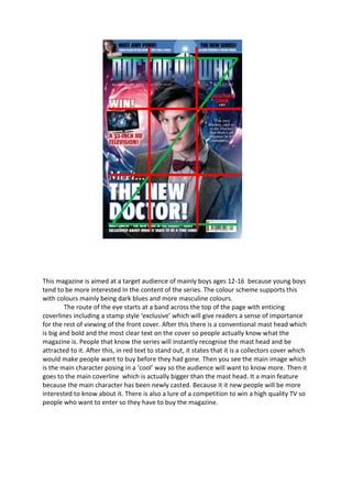
1. This magazine is aimed at a target audience of mainly boys ages 12-16 because young boys
tend to be more interested In the content of the series. The colour scheme supports this
with colours mainly being dark blues and more masculine colours.
The route of the eye starts at a band across the top of the page with enticing
coverlines including a stamp style ‘exclusive’ which will give readers a sense of importance
for the rest of viewing of the front cover. After this there is a conventional mast head which
is big and bold and the most clear text on the cover so people actually know what the
magazine is. People that know the series will instantly recognise the mast head and be
attracted to it. After this, in red text to stand out, it states that it is a collectors cover which
would make people want to buy before they had gone. Then you see the main image which
is the main character posing in a ‘cool’ way so the audience will want to know more. Then it
goes to the main coverline which is actually bigger than the mast head. It a main feature
because the main character has been newly casted. Because it it new people will be more
interested to know about it. There is also a lure of a competition to win a high quality TV so
people who want to enter so they have to buy the magazine.