Pantone color trends 2017- By Lee Eiseman
•Als PPTX, PDF herunterladen•
4 gefällt mir•2,975 views

Pantone director “Lee Eiseman” Unveiled the nine color palettes for 2017 from Pantone® View Home + Interiors . For ever-divergent tastes and styling influences, these nine distinctive groupings are following : • Day Dreaming • At Ease • Native Instincts • Florabundant • Acquired Taste • Forest Bathing • Reminiscence • Raw Materials • Graphic Imprints

Empfohlen
Weitere ähnliche Inhalte
Andere mochten auch
Andere mochten auch (20)
Ähnlich wie Pantone color trends 2017- By Lee Eiseman
Ähnlich wie Pantone color trends 2017- By Lee Eiseman (20)
Kürzlich hochgeladen
Kürzlich hochgeladen (8)
Pantone color trends 2017- By Lee Eiseman
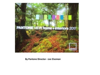
- 1. By Pantone Director - Lee Eiseman
- 2. Among the color and design trends : • The rising use as maps – both traditional and contemporary – as a design element • The resurgence of black and white imagery • The use of unexpected color combinations that seem to be discordant but yet they still work, pixilated and digitized patterns • The popularity of green, both as the color of nature and of health and wellness. • One of the important influencers of color, The film industry has always been a trendsetter in special effects. • The expectation level of the consumer goes up when these colors are seen on the big screen. • As recent examples--Star Wars: The Force Awakens” (with a sequel coming in 2017), the re-engineered and brighter colors in “The Peanuts Movie” and the creative use of beautiful color to depict each emotion in Disney’s “Inside Out.”
- 3. Florabundant – Just like its name implies, Florabundant is filled with the sumptuous beauty of rich floral hues. This palette offers a lot of drama from Pink Yarrow, Chrysanthemum, Red Dahlia and Baton Rouge and includes varying shades of green.
- 4. At Ease – A step from Day Dreaming, At Ease is grayed down for more of a sophisticated feel. A variety of ever popular neutrals, both cool and warm, are blended with muted tones in a way that seems effortless.
- 5. Native Instincts – Style-wise, current and future forecasts point to a homogenous mix of design and color where a piece of Native American pottery is compatible with a Turkish kilim carpet and/or a pre-Columbian artifact. Likewise, this palette offers bold colors like a smoky orchid and a Carmine red along with softer Earth tones.
- 6. Acquired Taste – In both food and surroundings, an acquired taste means an appreciation for the distinctively different. Such is the case with this palette which offers a mix of colors and/or textures not commonly seen together, yet they combine for a palette that is subtly luxurious. Colors include Orange Chiffon, Pale Gold, Mulberry, Brandied Melon, a dove gray and a muted pink.
- 7. Forest Bathing – This stress-reducing palette is inspired by the Japanese practice of “Shinrin-yoku” or forest bathing. Studies have shown that a contemplative walk in the woods reconnects the individual with nature and elevates their mood. Several shades of green and blue-green are enlisted, which are contrasted by Grape Kiss and a refreshing Acid Lime.
- 8. Reminiscence – A different kind of walk – a walk down memory lane – is the mood conveyed here. Traditional shades like Maritime Blue, Sepia Tint and Rattan convey a sense of nostalgia and stability, but the mix of new colors like murky Martini Olive and Bird’s Egg Green keep the palette feeling fresh.
- 9. Raw Materials – Both the re-use and re-purposing of materials from nature and the health and wellness movement are represented in this palette. Zephyr Pink offers an unexpected pop of color against the many, more natural tones.
- 10. Graphic Imprints – Described by Eiseman as “great fun,” this palette starts with a base of black and white but then pulls in a series of strong, vibrant colors with names that tell a story themselves: Blazing Yellow, Dazzling Blue, Prism Pink, Fandango Pink, Opaline Green and Orange Popsicle.
- 11. Day Dreaming – This palette is a continuation of the Color of the Year pastel theme, with colors that evoke thoughts that are light and weightless….in contrast to the heaviness of day-to-day stresses. A key here is that other colors, such as Yellow Iris and a Nile green, are used to expand on the blue and pink.
- 12. Day Dreaming – Reference Pictures
- 13. Day Dreaming – Reference Pictures