9953056974 Call Girls In Pratap Nagar, Escorts (Delhi) NCR
Evaluating websites barack-obama
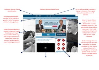
1. This website had links to social Evaluating Websites- Barack Obama On this website the logo is situated at
networking sites the top, in the centre. This is a good
idea as it makes it the centre of
attention
The tabs for different pages
are along the top. They are a
good font as they’re readable Along the tabs to different
and they’re also a good size. pages, it also has a link to
donation. This is a more
convenient way to put it, as it
will be easier for the reader to
Unlike all the other websites I go on it, as it’s just a click
analysed, this website actually away. Also, by giving it a red
has a background image. background, it stands out
However, I think that having a when you look a t the
plain background is better, as homepage
it doesn’t look messy, and
looks very well put together, On the homepage there is a
as well as looking professional sub-heading under which they
give updates, so they are
changed all the time, which is
really useful, and that’s
something which will be really
good to include in our own
site, but it would be difficult
for us to do.
2. This website has hardly any The homepage of this site also includes a video. This is a good There are also many things that are there which are under
text on the homepage. Even idea as it tells the reader exactly what the campaign is about. the sub-heading of ‘Take Action’. This is a really good idea
though a lot of text makes the Also, it tells you what’s going on as well as giving more to the for this particular campaign, as it is a political campaign,
homepage look boring, no text homepage. This is definitely something I would think about however for our campaign it might not be convenient as our
makes it look pretty empty, so putting on our own homepage too. campaign isn’t political
it should have some text, to
explain to you what the
website is about