2. Question 1
In what ways does your media product use, develop or challenge forms
and conventions of real media products?
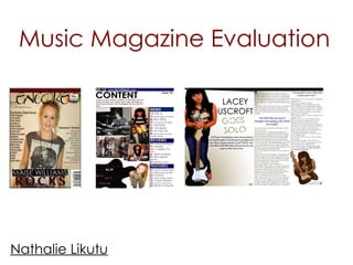
3. For my media coursework, I created a front cover, a contents page and a double page spread
of a new music magazine. All my images and text I used were original, produced by me.
I named my magazine ‘Encore’ because I was basing my music genre on new, fresh to the scene,
rock/indie music. A magazine like mine would be the NME magazine which I based a lot of my
ideas around, in the making of my magazine. While I was designing my front cover, and doing
research on existing covers, I noticed that there were many similarities and differences between
each and every magazine. The first similarity would be that the colour scheme of the majority of
magazine are carried on throughout the magazine. I have taken this idea, and adapted it within
my front cover. The same font is mainly used throughout the magazine and the magazine articles,
which is ‘Century Gothic’.
On current magazines, there is barely any space left on the front cover, which is normally either
taken up by the image, or by cover lines. For my magazine, I have tried to take up as much space
as possible, but at the same time, made it so it doesn't look too clustered. One thing I later added
onto my magazine was a banner, I felt it was a big thing missing from my magazine which now
makes it look much more professional, as it is bold and stands out against my nude background.
Another convention of a music magazine is the use of a large, dominant photograph , they are
used to take up the majority of the layout. I have decided to develop this convention into my own
piece of work, by using a very large image that takes up most of my front cover structural layout. I
feel that my image provides dominance, because it is fairly colourful due to the clothing worn also
because it is used for the background of the cover, making it a vital feature of the layout.
In terms of the common phrase and colour schemes that are conventionally used in music
magazines, I have developed these features into my piece of work by ensuring that the red blues
and whites are repeated through out my work to ensure a uniform and individual appearance. I
feel that this has helped my work conform to conventions because it has ensured that my
magazine has an identity and act as the representing of my magazines.
I have also used the basic conventions of a music magazine, including the date and price,
website by the masthead so people straight away know what they will be paying and whether
the issue has been recently distributed. I placed the barcode in the bottom right corner of my
magazine because this was the most common place to find a barcode on a music magazine, this
all allows my magazine to fit in with the rest.
4. For my Contents Page, I kept it simple and straight to the point because I
believe the contents page has to be easily readable for the audience to
identify what page they need to be on.
A lot of conventional magazines have a main image dominating the
contents page, I decided against it because I felt it would have more
impact with several smaller images on a dark background. Also, the smaller
images introduce the other features within the magazine without
dominating the page.
The font, size, and colour scheme are mostly carried on from the front cover
including the nude background, which creates a house-style theme for the
magazine. Starting with the title, many magazines only have "contents",
instead of "contents page". The purpose of this would be to cut space, so
that there is more space for the images, and the article titles and
description. Another reason is that simply, it doesn't need to be there.
When discussing my content page, I feel that I have adapted the
conventional normality of a real magazine by ensuring that features such as
a page title and issue number have been identified in a large and dominant
font that is clear for the audience to read. I have also ensure that I have
broken up my text so that it is obvious and straight forward for my audience
to read, so the page doesn't appear too text orientated. I have adopted
this idea by using a tile for the different sections. These being the 'reviews'
'features‘ and ‘News’ I have used bright bold colours to help break these up.
I feel by using these tiles, it helps identify the section and exciting to read
(due to the fonts and colours)
5. The magazine article which I previously analysed was flavour I noticed the
image on one side of the article was enlarged, to create more focus on the
star, I used this concept in my magazine as this is the effect I wanted to
create. I added the name of the star in bold and a subheading next to the
large image which shows that this is the exclusive story and gives detail of
what he article is about. One of the convention used in a magazine article
is the enlargement of certain quotes, the ones which are enlarged are
normally exaggerated with font styles and colours so the reader wants to
read the article to find out the whole story is about.
As for the colour of the text, I noticed that most interviews in magazines
have at least two different colours. One for the question being asked, and
one for the answer from the person. I have done this in my magazine,
having a kind of gold colour as the questions, black for the answer and my
main colour red for the quotes, the artist mentions. The reason I chose this
gold colour is because I spotted it on the artists clothing and thought it
connected with the artist. The use of space on the double-page spread is
also the same. Again, I tried to take up as much space as I could, without
the article looking too cramped, or too busy.
I have also used a smaller image on the text side, which gives more
information about the artist in a different way. Regular magazines usually
use this to add more to the article without having to read excessive
amounts of text. The black and gold text helps the reader to read the
interview without getting confused about who said what.
I have added a page number at the bottom and the website in tiny writing
which again is another conventions of music magazines.
If I had chance to improve it I would play around with the fonts and text a
little more so I could as I don’t think I have achieve what I wanted to with
the layout.
7. My product has represented age as a young, fairly mature audience. The target
audience that I chose for my magazine was 16-25. I have taken images of people
within that age group, which makes this target audience age group seem more
believable. I have chosen to make up my own rock artist for example ‘Lacey Uscroft’
for the magazine, which I believe to be within the age group that I have selected.
For the person in my images while I was taking the pictures, I wanted to have her
wearing stylish clothes, which she was. This represents this age group, as this age
group is more likely to want stylish clothes, and are more likely to copy from their
idols.
My magazine also represents both male and female, which is why I kept my colours
very neutral, e.g. using black, white blue and red. In order to appeal to both. My
magazine represents middle class people, this is reflected in price and content, it
also affects where would distribute my magazine. My title: ENOCRE is very modern,
quirky, young and clearly related to music. Therefore it relates to my audience.
My product represents ethnicity by not discriminating any type of ethnicity, this is
shown by making my magazine appeal to everyone in one go, by having white and
black rock stars names on my magazine front cover. However, my images only
contains one ethnic group, which is white, which I could have improved by putting
more than one ethnic group for the images on my front cover, contents page and
double-page spread.
8. Question 3
What kind of media institution might distribute your
media product and why?
9. ENCORE is a mainstream magazine, therefore the publisher would be
something like Bauer (the publisher for Q magazine) or EMAP, (the publisher
for MOJO) or IPC (the publisher of NME) would distribute my magazines as it
is similar to other magazines such as Vibe, NME and Q that they distribute
which are very successful magazines. My magazine has a wide range of
target audience resulting into a huge amount of profit if it was distributed
by well known companies.
My magazine is designed to appeal to middle class people, therefore it
would be sold in places where middle class people shop, e.g. WHSmiths
and Tesco’s etc. I decided to make my magazine £2.30, because in my
research, most good quality monthly music magazines were about that
price, if it was any more my target market (middle class teenagers)
wouldn’t buy it. In my questionnaire, more than half of the people said they
would pay between £2 and £3 for a music magazine.
Over IPC would be the most suitable publication company for my
magazine because it has the widest variety of magazines which indicates
that successful in their production of magazine and the results they get.
11. The main target audience for my magazine is 16-25 (teens / young adults). I had to use
several media conventions to make sure my magazine was suitable to the age group. I didn’t
find this hard, because I was part of that age range so I was able to ask my friends and also
think to myself about what would be interesting to see in a magazine. Although to capture
the full attention of this age range is a hard task. This is done mostly by including bright text,
and large images, and not too much text. This is because people of this age range don't
normally read texts, they just look at the images, so the images have to tell most of the story.
Font was a big factor in this, as I tried to stick with two fonts to not only grab the readers
attention, but keep it throughout the magazine and allow the pages to flow. In addition, as I
was creating the magazine to appeal to a specific audience, it was important that I chose
fonts to go with the particular age groups, and I think I did this successfully as the fonts I
picked were simple and clear to read. Also, as the magazine was based around rock/indie
music, I think the fonts I chose matched the genre quite well, and it was clear to identify the
genre when looking at the pages. The colours were important in representing the age group
because they had to flow, but have enough difference between them to contrast in the right
places for the right reasons. I picked the primary colours because of the significance they
have to young people. Besides these colours were able to go together well, as well as
standing out over each other in the right places. The colours I used will also appeal to both
genders and therefore opens up my target audience to both males and females . I also
made certain that the outfits and props matched the music genre, which I think they did. The
language I used in my magazine was quite colloquial, so it fit quite well with my target
audience. Also, as it was informal, the readers of the magazine would be able to understand
and relate to it . By doing this, it helped the reader gain a sense of trust towards the magazine
as they may feel like the speech is directed towards them. Overall, I feel that my magazine
represented my target audience well, by the use of font, colour, images and other factors,
and I feel that young people would be able to relate to the magazine through the language
used.
13. I found that throughout my magazine the images I used were predominantly of females. This
may have made the magazine for females only, however, in my short survey it showed that
the majority of boys were more inclined to read a music magazine, and they are more
interested in rock oriented music rather than pop. This is the reason I made my magazine
more for male and female and made sure I had at least two images of male. however the
use of female models in the magazine would attract male attention in a different way.
Costume was used in my magazine in a way that would attract the attention of the
audience. According to my previous survey, lots of teenagers don’t have the money to buy
expensive clothes, so it was important that I had a balance of affordable clothes on the
models. Converse and sweatshirts are very average and affordable, however, as my target
audience are influenced by their favourite artists, they will be attracted to the idea of simple
clothing.
The words “Exclusive” and “Latest” tell the reader that this is what to read if they want
something no one else has read, and they will be the first to know of something new in the
music world.
I also wanted to make my magazine seem friendly, so I used chatty and colloquial language
to attract the audience. I also used a lot of synthetic personalisation which is words like ‘you’
and ‘we’, to make it seem inclusive and personal to each and every reader; I believe this is a
great way to attract my target audience. All of the fonts I used were all bold and bright so
that they would stand out to my audience.
14. Question 6
What have you learnt about technologies from the
process of constructing this product?
15. Before beginning my practical project I had to create an account on
https://www.blogger.com/start which is an online blog which can be easily accessed in and
out of college. it allowed me to upload recent developments in my magazine, including
pictures, blog entrees and PowerPoint's.
During the process of constructing this product, I used many different types of technology. I
used cameras, computers and different programs I had never used before.
For taking the images, I had to use a camera. I only have a basic knowledge on cameras, so
I only know basic things, like how to turn the flash on and off, how to take the picture, and
how to view the picture on the camera, but that is about as far as it goes, so photography
isn't my strong point. There were different modes for the camera, and I didn't know which
mode it was in, so I just hoped for the best. I knew how to put the pictures on to the
computer, I knew that you needed a card reader, and needed to plug it in to the
computer, but I didn't have any idea on how to edit these images for my magazine.
I created my magazine on Photoshop which I only had little knowledge about. I began
learning how to use this program thanks to the Preliminary task, but I still only had a basic
knowledge on how to use the tolerance tool and the rubber tool to take the background
out of the picture. This then became a lot easier as I progressed with the project, creating
the front cover, contents and double-page spread.
16. Question 7
Looking back at your preliminary task, what do you
feel you have learnt in the progression from it to the
full product?
17. For my preliminary task I had to create a magazine cover and contents page for a college
magazine. Instantly you can see the difference in the two covers and shows how I have progressed
my the preliminary task. I think the biggest mistake I made when looking at my preliminary task is the
white writing against the polo shirt which making the cover line hard to read. Whereas my final
product I have bold black headings around the picture to draw the audience in. From my
preliminary task, my products have improved dramatically. The standard of my preliminary task
magazine cover is nowhere near the standard of my final front cover. This helped me to understand
the programs, which helped me to design my final front cover, contents page and double-page to
my full capability. By doing the preliminary task, I have realised just how important the analysis of
existing products is. Without analysing the existing products, I wouldn't have known what to include in
my magazine front cover, contents page or double-page spread. The reason to why my preliminary
task isn’t as good as my final product is simply because I had very little time to produce it and I was
new to the technology in which I was using to create and edit my photos. Overall I am very happy
with my final piece. I like the colours I have used, and I also like the images which I used, as they are
different from your average magazine. I think with a bit more time I could of improved my article. But
overall I am happy with my final piece and enjoyed every part of creating it.