2. Every room in every house has some sort of
Thesis Statement
design, but not all rooms are decorative and
welcoming. A house can truly become a home
when you apply basic rules of interior design
and your own personal touch. I have
dedicated my time to re-designing a room
while applying the tips I have learned, as well
as self-expression.
27. TEXTURE http://www.encausticpaints.com/Default.aspx?tabid=375
PATTERN
styl fabricsfromtheheart.com
http://www.cutoutandkeep.net/projects/woven_wall_art
e
pehaa.com
28. TEXTURE http://www.encausticpaints.com/Default.aspx?tabid=375
PATTERN
styl fabricsfromtheheart.com
http://www.cutoutandkeep.net/projects/woven_wall_art
e
pehaa.com
THEME
I chose interior design because I have always had an interest in it. Ever since I was little I would plan out what I wanted my house to look like when I grew up. When I decided to experiment by re-designing my own room I found it to be a big personal accomplishment. I am planing on studying art and business in college to possibly turn it into a career. \n
Every room in every house has some sort of design, but not all rooms are decorative and welcoming. A house can truly become a home when you apply basic rules of interior design and your own personal touch. I have dedicated my time to re-designing a room while applying the tips I have learned, as well as self-expression. \n
The easiest place to start is with color. Research has shown that using color can actually effect how you feel and behave. \nEXAMPLES: red raises blood pressure and creates excitement. \nGreen which is the opposite of red on the color wheel is associated with relaxation and rejuvenation. \n
The easiest place to start is with color. Research has shown that using color can actually effect how you feel and behave. \nEXAMPLES: red raises blood pressure and creates excitement. \nGreen which is the opposite of red on the color wheel is associated with relaxation and rejuvenation. \n
The color wheel is a circular arrangement of the color spectrum that illustrates the relationship between colors.\n
The primary colors are red yellow and blue. All colors come from combining these three colors together. The secondary colors are orange green and purple.\nTertiary come from combining primary with an adjacent secondary color so if you mix yellow and green you get yellow-green. \n
If you split the color wheel into half, you get warm colors and cool colors. Warm colors are from red to yellow and evoke a warming, cozy feel to a room. Cool colors are more calming and tranquil. \n
Warm colors are very welcoming, they are commonly associated with energy and vitality. \n
Cool colors are more tranquil because of their calm and quieting vibe. \n
These are some important, basic color terms \n\n
Accents adds interest and variety. They are often chosen by the opposite color on the color wheel from the dominant color in the room. In the paintings, the pear is a lot more obvious and interesting when a complementing color is with it. \n\n
Neutrals: arrange from black to white, including all grays. Also include off-whites to browns. These are basically the colors you don’t see on the color wheel but are still important \n
Shade is when you darken the initial color and tint is when you lighten it. This is done by adding black or white to a color. \n
These are 4 different ways of combining colors on the color wheel that designers use. \n
monochromatic: using a single color and only shades of this color and neutrals. This type of room needs texture and pattern to make it visually interesting. \n
This is an example of monochromatic. In order to make this room still look nice they added lots of pattern to the couch, pillows and rug as well as texture in the wicker chairs and various plants. \n
analogous: when you choose a color and also use the two colors on either side of it. This type of color selection works well with neutrals in order to still have that pop of color or focal point in a room where your eye is directed. \n\n
The neutral browns and tans also play a big part in helping spread around the color. For this room your eye is attracted to the couch which is a main focal point because of its color and center placement in the room. \n
complementary is when you use two colors directly across from each other. This works best to let one color be dominant and the other accent so they don’t compete with each other, especially if they are both very bold colors. \n\n
This room is using 2 very distinctive colors, orange and blue. Once again the use of neutrals is important and always appropriate. Because these are both very bold and opposite colors, if neutrals weren’t incorporated it would seem like too much was going on and confuse they eye, instead the neutrals help tone it down.\n
Triadic is the combination of any three colors that are equal in distance from each other and make a triangle shape.\n
This room uses an even amount of blue red and yellow, this way it makes the room look exciting. The colors are bold and fun, presenting a lot of energy in the room. \n
Texture, pattern, style and theme are all things that work with the colors to bring everything together. \n
Texture, pattern, style and theme are all things that work with the colors to bring everything together. \n
Texture, pattern, style and theme are all things that work with the colors to bring everything together. \n
Texture, pattern, style and theme are all things that work with the colors to bring everything together. \n
Texture brings a sense of depth and life to a room. Things with texture invite you to observe and take interest in the room. However, there are different kinds of texture. Something with a grainy surface like wood will bring texture as well as something smooth but colorful and full of pattern. A vase filled with flowers shows texture because it invites you to feel, look and smell.\n
The kind of texture that you feel is called tactile. This is mostly displayed in fabrics like on pillows, carpet, and seating.\n
The other type of texture is visual, what you see. This could be the texture of the walls or a painting. \n
Something that doesn’t have tactile texture, can have a pattern that provides visual texture. For example the fabric on a couch might be smooth but have a pattern to it, or accents around it with pattern. These pictures show the difference in a chair without visual texture and one without texture. \n
Incorporating pattern into a design scheme brings a greater level of interest and sophistication \n
There are four different kinds of pattern\nGeometric which is different shapes, usually stripes squares or circles. \nThen theres floral and motif which refers to a visually repetitive image. \nPictorial which can be used to provide theme \n
example\n
There are all different types of design styles, studying these can help you find your own style perspective. A few common style methods have been consistent enough to be classified as specific design styles. \n\n
I’m gonna show you a few different examples that are commonly used. The first ones contemporary, this look is very clean lined and chic. Here theres an example of a kitchen, living room and bathroom. Black white and other neutral colors tend to dominate this look, and if you want to add some color add accents and accessories to provide a dramatic punch of color. Texture also plays a big role because it makes up for the lack of color.\n
\n- This style emphasizes finely crafted details and elegant patterned fabrics \n- Traditional is one of the most popular styles in America today\n- Furniture is often constructed with curvy lines, its also usually dark wood with a lot of detail. \n- The colors used tend to be dark reds and greens with darker neutrals.\n
- this can range from cottage country to french country\n- The idea is that it has a live-in natural kind of comfort\n- The usual colors can vary\n- texture is key; wood, wicker, wrought iron and stone are very typical. \n\n\n
theme is similar to style because it helps bring everything together in the room, the difference is that style is an idea or a guide and theme is how you can personalize the room to make it fit the style. \n
Theme can be a pictorial illusion or a replication of a place or time period. Themes can be fictional or realistic. A good place to fully apply a theme is a child’s bedroom. \n
The most hands on part of an interior designers job is to accessorize, it is also what makes up the bulk of my application.\n
Even though a lot of what I talked about is informational and can definitely be helpful, there’s no one right way to design something, it all comes down to what you personally prefer. When taking on a design project yourself, the important thing is to apply your own personal touch. \n\n
It is important to have an inspiration to start your project. The best way to pick a color scheme is to either choose your favorite color, or the colors that you want to use. If you don’t have a color in mind, find something that inspires you. Examples of this can either be a colorful painting, a bed spread, or a rug. Choose something that has a few colors in it and then you will be able to pull colors from the object to choose your color scheme. You can also get your inspiration from a favorite place or memory. The picture of the color palate is from a show, Get Color on HGTV. She brings the color wheel to life and uses real objects to inspire color choices.\n
\n
\n
\n
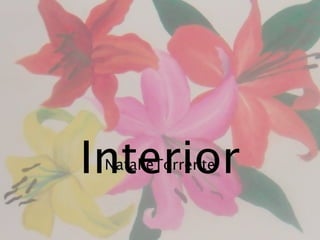
My room was my inspiration for my whole project and so I thought I would start by showing some pictures. This is the wall inside my closet, I painted lilies on it because they are my favorite flower and I wanted to really make the design project my own by painting it myself. \n
Here is my desk area, I wanted to show you the different ways i used decorations to make it look nice. I have different boxes and things for storage but they also show texture. The bulletin board is also how I really made it personal with pictures and things that are important to me. \n
This is really showing how the bold purple makes the room more interesting. If you can imagine the picture with just white curtains instead you can see that the picture would look a lot different. \n
I thought it was going to be a lot easier. An interior designer doesn’t usually do any of the construction they usually just plan things and get to go shopping but I’m really glad that I did help out a lot because I’m really proud of the outcome and I know that I put a lot of hard work into it. \n