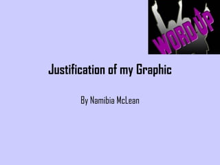
2. This is the graphic I used for my contents page. This was actually an accident as I was messing around on Photoshop CS3 and I decided to invert the colours to a gradient and this is the final result. I didn’t want to add grey to my magazine but in the end I did slightly because I needed something to soften the blacks and yellows that I was using. The image itself I was suppose to use for my contents page but because the image’s background had too many things in the background I decided to not use it. To be honest I wanted use an image from that photoshoot so bad because I didn’t want to feel like I did it for nothing so that’s when I decided to experiment and that’s what it ended up as. However I put a yellow outline as originally the outline was quite sharp and I wanted a smooth result so the yellow outline covered up the sharp edges well and it meant that I was sticking to my colour scheme. Additionally I’ve decided not to call this graphic a logo as such because that would mean it would have to be on every page and of course I didn’t put this image on my double page spread so I stuck to having this graphic exclusively for the contents page because it generally made my magazine seem more funky and interesting.