Barb vankerkhove 2012 presentation
•Download as PPSX, PDF•
0 likes•477 views

NCRC 2012 Annual Conference

Recommended
Recommended
More Related Content
What's hot
What's hot (14)
Similar to Barb vankerkhove 2012 presentation
Similar to Barb vankerkhove 2012 presentation (20)
More from Elyk Venture Management
More from Elyk Venture Management (20)
Recently uploaded
Recently uploaded (20)
Barb vankerkhove 2012 presentation
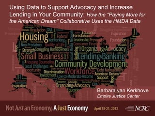
- 1. Using Data to Support Advocacy and Increase Lending in Your Community: How the “Paying More for the American Dream” Collaborative Uses the HMDA Data Barbara van Kerkhove Empire Justice Center
- 2. Effective use of data in advocacy To make a point with the numbers, hmm, let’s see You can’t let the numbers just be You gotta keep tweaking Statistically speaking Till they make sense to you and to me (with thanks to Warren Wightman)
- 3. Using the Raw HMDA LAR Data What is it? What you need Understanding of the dataset and its formatting A database program like MS Access Allows flexibility in what you want to examine By loan, borrower and geography Free download from FFIEC All of New York State in an afternoon
- 4. Flexibility to focus on “hot” issues Year(s) Hot Issues Report Number and Focus 2006-07 Subprime lending and #1: Disparities in high-cost loans across borrower reverse redlining race/ethnicity 2007-08 Collapse of subprime #2: High cost lending by now defunct subprime lenders in lending industry neighborhoods of color 2008-09 Did CRA cause the #3: Differences between CRA-covered banks and non- foreclosure crisis? CRA lenders in high cost lending in neighborhoods of color 2010-12 The foreclosure crisis #4: Changes by neighborhood in prime lending and and redlining redux refinance lending and by top 4 bank holding companies— TARP recipients #5: Continuing changes in prime refinance lending by neighborhood and denial disparities #6: Disparities in the concentration of government-backed lending by neighborhood and borrower
- 5. Telling your story with the data Determine overall message Key finding Recommendation(s) arising from it Balancing act between making your point and simplicity or understandability Get feedback from people not really familiar with the issue or data analysis
- 6. Presenting your findings A picture tells a thousand words, but try to make it simpler Charts, graphs Maps Avoid tables with lots of numbers Keep these for the appendix Present findings in more than one way Increases understanding by people with different learning styles Reinforces the message
- 7. Tell the story with charts 70.0% Chart II. Conventional Refinance Loan Denial Rates by City and Racial/Ethnic Compostion of Community, 2009 60.0% 50.0% 40.0% 30.0% 20.0% 10.0% 11.7% 12.5% 18.1% 21.9% 34.9% 50.5% 18.6% 22.3% 27.3% 42.7% 60.0% 15.6% 15.9% 26.7% 35.1% 57.8% 17.3% 20.2% 27.3% 38.2% 14.1% 15.0% 18.3% 24.4% 38.9% 16.8% 17.8% 16.7% 21.0% 28.9% 24.4% 22.2% 25.6% 30.9% 39.8% 0.0% Boston Charlotte Chicago Cleveland Los Angeles New York Rocheter < 10% of color 10% - 19% 20% - 49% 50% - 79% 80% - 100% of color
- 8. Retell the story with maps
- 9. Government-Backed Loans (GBLs) as a Percentage of Home Purchase Loans, Differences Between Predominantly White Neighborhoods (<10% residents of color) and Communities of Color (80-100% residents of color) 86.4% 90.0% 75.1% 72.0% 69.6% 80.0% 66.6% 62.7% 70.0% 51.5% 48.8% 60.0% 46.1% 46.1% 50.0% 37.0% 32.8% 31.0% 40.0% 27.7% 30.0% 15.1% 12.4% 20.0% 10.0% 0.0% Boston Charlotte Chicago Cleveland Los Angeles* New York Rochester 7-City City Average Disparity (how much more often borrowers in communities of color obtained GBLs than those in predominantly white communities) ratios 1.9 1.9 2.3 1.5 5.1 3.2 1.9 2.1 <10% of color 80%-100% of color * LA has too few tracts with <10% of color, so 10<20% of color is used as the baseline for LA rather than <10% of color.
- 10. “Paying More for the American Dream” Collaborators Kevin Stein Charles Bromley California Reinvestment Coalition Ohio Fair Lending Coalition Barb van Kerkhove Adam Rust Empire Justice Center Reinvestment Partners Jim Campen Spencer Cowan, Katie Massachusetts Affordable Housing Buitrago and Tom Alliance Feltner Alexis Iwanisziw and Woodstock Institute Sarah Ludwig NEDAP
- 11. For more information Barbara van Kerkhove, Ph.D. Empire Justice Center 585-454-4060 bvankerkhove@empirejustice.org www.empirejustice.org
Editor's Notes
- Since this workshop is about how we might use data to effectively support our advocacy work, I thought I’d share with you what I try to keep in mind…
- #1: Disparities in high-cost loans across borrower race/ethnicityBy all lenders Compared the top lenders and subsidiariesCase study of Long Beach Mtg #2: High cost lending by now defunct subprime lenders in neighborhoods of colorAble to pull the loans of these 35 lenders#3: High cost lending in neighborhoods of color Compared CRA-covered banks to lenders not covered by CRAConnected the HMDA LAR to a special lender data set from the Fed; able to code lenders differently for each city—CRA v. non-CRA#4: Changes by neighborhood in prime lending and refinance lending and by top 4 bank holding companies—TARP recipients#5: Continuing changes in prime refinance lending by neighborhood and denial disparities#6: Disparities in the concentration of government-backed lending by neighborhood and borrower The first report, based on data for mortgage lending during 2005, examined disparities in mortgage pricing by several of the country’s largest mortgage lenders that offered both prime and subprime loans; it demonstrated that borrowers of color were much more likely than white borrowers to receive higher-cost subprime loans.The second report, covering lending during 2006, showed how neighborhoods of color were saturated with high-risk mortgages made by lenders that later went out of business as a result of making abusive and unaffordable loans.The third report, which analyzed lending during 2007, compared the lending patterns of banks covered by the Community Reinvestment Act (CRA) with lenders that were not covered; it found that lenders not subject to the CRA were much more likely to make higher-cost loans to borrowers in neighborhoods of color than were lenders that were subject to the CRA.The fourth report, demonstrated that in neighborhoods of color, where the foreclosure crisis had taken an especially severe toll, conventional refinance loans declined precipitously between 2006 and 2008, even though such lending increased substantially in predominantly white neighborhoods. Last year’s report, based on data on lending during 2008 and 2009, again focused on reduced conventional refinance lending in communities of color and found a strong continuation of the same pattern. While conventional refinance loans declined from 2008 to 2009 by an average of seventeen percent in neighborhoods of color in our seven cities, such loans more than doubled in predominantly white neighborhoods. Denial rates for these loans were two and one-half times greater in neighborhoods of color than in predominantly white neighborhoods.
- Half of our reports have had both maps and charts in the body of the report (and maps of additional cities in the appendix): #5, #3, #2, #1—maps of 1 city in appendix#5, a total of 4 charts and one map in body of report#3, a total of 3 charts, 2 tables and 2 maps in body of report#2, a total of 6 charts and 1 map in body of report#1, a total of 3 tables and 2 charts in body of report, and 2 maps of NYC in appendixOther presentations: #4—changes in prime refinance lending—overall changes, changes by the top 4 BHCs. A total of 5 charts in this report.
- This is one of the four charts from last year’s Paying More… report (#5). As the percentage of people of color increases, the denial rate increases. This is true for every city from neighborhoods of 20-49% people of color and higher—the green, purple and light blue bars.We can say this using mapping as well… (next slide).
- This tells the story of high denial rates in communities of color in another way. All the neighborhoods with denial rates greater than 75% (the red areas) are communities of color (the black hash marks), and most of the neighborhoods with 50-75% denial rates are also communities of color. Almost all of the neighborhoods with the lowest denial rates (less than 22%, the white tracts) are majority white communities (no hash marks).
- (If there is time…) Finally, I wanted to share a chart that illustrates the fine line between getting lost in the data and telling your story with simplicity. This chart from our most recent report (#6) really was a balancing act for us—between too much information on a single chart and too many charts in our report. This chart originally had all five categories of neighborhoods for each of the cities, with the percentage of GBLs getting increasingly larger. And then we had a separate chart with the disparity ratios for each of the cities. With all the categories of lending we really wanted to analyze and show the findings for, that led to 8 separate charts in our report. We thought that was too many. So, over several iterations we came up with this chart—only comparing the predominantly white nhoods with the 80-100% minority nhoods and taking out the 3 middle categories. And then we added a text box with the disparity ratios at the bottom. This might make it a bit more complex than some people would like, but we talk about both the percentages and the disparities together in the text—so the reader can refer to a single chart and not flip back and forth. So, now our most recent report has only 4 charts that each tell a really compelling story on their own and then together. And for people who are really curious about the actual numbers, we have an appendix at the end of the report with tables for each city.