
Empfohlen
Weitere ähnliche Inhalte
Was ist angesagt?
Was ist angesagt? (20)
Ähnlich wie Film posters terminology and features
Ähnlich wie Film posters terminology and features (20)
Kürzlich hochgeladen
Kürzlich hochgeladen (20)
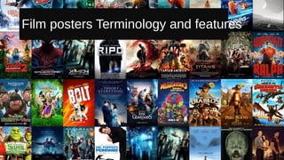
Film posters terminology and features
- 1. Film posters Terminology and features
- 2. Billing: By having two well-known actors playing the lead roles people are more likely to be attracted to the film, People are likely to have heard of them and may be more willing to watch the film because of their success in the film industry. Title: White stands out against dark background, the words ‘the’ and ‘of’ are smaller because they are less significant connecting words. Release Date: Informs the audience and generates anticipation and hype for the release. Its position is centered, clear and easy to read for the target audience. Secondary Images Main Image: The closeness of the protagonists in the foreground of the poster is a convention of a romance film. As the plot focuses around these two characters and their developing relationship. Credits Block/Company logo Crediting the Director, producers, screen writers and distributors. • James Marsh • Working Title • Eric Fellner • And that it was Based on ‘Travelling to Infinity: My Life with Stephen’ Positive Quote The expert quote describes the film as “heartbreaking” which could connote drama in the film. The quote describes the film as “heartbreaking” which is another convention of drama films, they are designed to move the audience emotionally. The Tagline: “The incredible story of Jane and Stephen Hawking” is also likely to attract an audience because the film focuses on one of the most well-known people in history. These secondary images give the poster depth and informs the audience as the image at the bottom allows the audience to get a glimpse of the setting: London/ Cambridge University. Where Stephen studied, this will appeal to an English audience as they are familiar with the location therefore it is possibly relatable.
- 3. AnalysisThe theory of everything is a 2014 biographical romantic Drama, based on the compelling true events of Stephen Hawking's life. Produced by Working Title Films the British production had plenty of financial backing, with a budget of $15,000. • The film tells the story of how Stephen (Eddie Redmayne) fell in love with his wife Jane Hawking (Felicity Jones) and his journey through his ALS diagnosis. • The film uses the actors as the USP (Unique Selling Point). As Eddie Redmayne is a well known actor and has won many film awards including an Oscar and ACCA award. As well as this the female lead (Flecitiy Jones) has also won many awards including an Empire Award. • Due to the more dramatic and romantic plotline, the intended audience for the film is likely to be adult women. However it could also appeal to couples due to the empowering love story of the struggle they both faced despite Stephens disability the young couple stayed together because of the true love they felt for one another.. Also this film may attract a family audience as despite Stephens disability he manages to have a normal family and cope with the usual and relatable family struggles of day to day life. Although the audience empathise with the main characters they do not pity them, but instead admire because of the empowering narrative. • One alternative reading of the poster could be that it romanticises disability, this could cause offense to disabled people which harms the marketing message because people are deterred from watching the film. • The main objects used on the poster are Stephen (Eddie Redmayne) and Jane (Felicity Jones) and they are represented photographically in full focus to portray their importance in the film. They are shown with Stephen holding Jane’s face, this intimacy between the characters connotes romance during the film. The represents disability well as disabled people are often represented in films as non-sexual so therefore the poster is suggesting that they are willing to challenge that stereotype. • The use of stars makes an audience more familiar with the characters because they are likely to have seen them in other films, this means that the poster appeals to many different people whilst still reaching it’s intended audience. The main colours used in the poster are blues. This perhaps connotes sadness however the dark blues could also connote seriousness and intelligence, darker colours usually portray a more dramatic plot. the theme of intelligence fits with the term ‘Super Crip’, created by Collin Barns; showing that despite Stephens disability he is admired for his excellent intelligence and theory's. Although as an audience his disability isn’t presented as pitiable the audiences admiration may become patronising. However the light blue’s symbolise hope and healing, the actress playing Jane Hawking costume is fully light blue so therefore as an audience we can already establish a link between her role in helping Stephen throughout the film. In the background image of the poster a light orange is used. Orange symbolises success and happiness which forebodes a happy ending to the film or a resolution. The font is White and therefore stands out against the background images sue to the dark colours, this creates contrast between the images and the font type this makes the writing easier to read because it stands out. The font style is simple but easy to read with the title being the biggest font sixe to allow it to stand out in comparison to the other information on the poster. This is similar to how it is shown on the DVD cover, the title is in the center and is placed in two lines horizontally, the words ‘Theory’ and ‘Everything’ are the most important words in the title and are therefore considerably larger in size. Overall this film is quite unique, hence it’s award success. However the poster does follow the codes and conventions of the romantic drama genre. With the embrace of the two characters in full focus. However the colour pallet does challenge with observation due to the use of blues instead of the stereotypical pinks and lighter colours. This highlights the sense of drama involved. Alternative Poster
- 4. Intertexual References: Gives the audience the link to the facebook page, it also gives a hashtag to get the audience talking online – generating hype, online and virally. Previous Credits: Targeting a potential audience who enjoyed the films credited. Positive Review: Gives an audience insurance that it is worthwhile watching the film because of the positive review. Billing: Chris Hemsworth is a popular actor and physically attractive male, men may aspire to be like his character, due to his happy go lucky attitude and luck with women and cars in the film. This film is predominantly skewed towards males. Secondary Image: Allows the audience to be informed the story is based around formula 1 racing. Main Image: The main image shows the two main protagonist with a serious expression and facing away from one another with their arms crossed this perhaps portrays a rivalry between the two characters which drives the film. Director: His films include: Cocoon, Apollo 13, How the Grinch Stole Christmas and A Beautiful Mind, which earned him the Academy Award for Best Director. Title: Large clear font matching style of racing stripe. Release Date Age certificate Tag Line Credit Block I have chosen to look at another Film based on True events to highlight any similarities, however this film contrasts the romance genre. Rush is a 2013 biographical sports drama film centered on the rivalry between Formula 1 drivers James Hunt and Niki Lauda during the 1976 Formula One motor-racing season.
- 5. I have chosen to look at this film poster for Vantage Point, this film is presented extremely differently from the previously analysed posters, as it is from a completely different genre, Action Thriller. The poster breaks a lot of conventions. For example the poster shows a photoshoped/ manipulated image where multiple images fill the outline of a human body, this may suggest the complexity of the plot as the tag line suggests it follows ‘8 Strangers’ this makes the audience question who they are and want to find out what the truth is, it also implies that the storyline will follow the actions of these 8 different characters and they will experience the action through their eyes. The images shown within the outline show the different characters involved, This is effective as it compels the audience to want to see the film to uncover the meaning behind the images shown and shows the importance of all the characters, however this contrasts most films as it does not quickly drawn an audiences attention to the protagonists due to the business of the jumbled images. The feature of a gun being held to the left of the poster, is a general code and convention of thrillers as it portrays to the target audience a sense of danger. This may appeal to a predominantly male audience seeking adrenaline through exciting fight scenes. The title is also shown inside the body outline in white and red, red is typically associated with action thrillers due to the connotation of danger this theme is strengthen by the gun in hand shown to the left, presenting a text-image cohesion pattern. This poster contains the general features, with the billing in the center of the images, this shows the famous actors are a USP for the film. The Title is placed under the actors names although the font size is considerably larger. Overall the use of photo manipulation to create an intriguing poster is very successful and different as it breaks many conventional features of a poster, I hope I can challenge the typical conventions when creating my own. However I want the audience to be able to clearly understand and read the information. This is what I must carefully consider when planning my poster. Tag line g Main Title Credit Block Release date
- 6. There are two posters linked with this film and I intend to analyse the differences between them. The Girl With The Dragon Tattoo Main Image Billing Title Release Date Manipulated Main Image Billing Title Credits Date Secondary Image Positive Tag Line/previous success Tag line Similarities: The title font and placement Is clear to the target audience as the white stands out on the dark background and grabs the attention of the viewer. The Inclusion of the credit block and billing is also the same. This allows the audience to see the vital information; such as who is involved with the film. The overall style they share is similar due to the tonal grey and black colour pallet which connotes mystery and drama to the poster. And are colours typically associated with dark films such as thrillers and suspense films. Tone is key in portraying the seriousness of the film and the expression of both actors in the posters is stern and serious. This engages the target audience which is perhaps aimed at an older audience of 25+. The presentation of the female role challenges the typical female character due to her short boyish hair and grey looking skin. Differences: The use of the main image is the obvious main difference, on the right is an image which has been heavily manipulated to create images layers of the two main characters and whilst this is intriguing and visually effective the audience are not quickly able to see the star actor, Daniel Craig. This is clear in the second poster (on the left) as the audience are quickly able to identify him as the protagonist due to his placement and coverage of the poster. This is key to selling the film as potential audiences may be persuaded because they like Daniel Craigs previous work/films. Another difference is the Tag line, the poster on the right uses an intriguing line which may give the audience an idea of the plot, uncovering some of the mystery which the poster conveys, however because the other poster has a much clearer image the tag line more simply a positive reference which states the movie idea came from ‘a bestselling trilogy’ this may incise some of the target audience but is not widely effective in my opinion.
- 7. There are two posters linked with this film and I intend to analyse the differences between them. The Girl With The Dragon Tattoo Main Image Billing Title Release Date Manipulated Main Image Billing Title Credits Date Secondary Image Positive Tag Line/previous success Tag line Similarities: The title font and placement Is clear to the target audience as the white stands out on the dark background and grabs the attention of the viewer. The Inclusion of the credit block and billing is also the same. This allows the audience to see the vital information; such as who is involved with the film. The overall style they share is similar due to the tonal grey and black colour pallet which connotes mystery and drama to the poster. And are colours typically associated with dark films such as thrillers and suspense films. Tone is key in portraying the seriousness of the film and the expression of both actors in the posters is stern and serious. This engages the target audience which is perhaps aimed at an older audience of 25+. The presentation of the female role challenges the typical female character due to her short boyish hair and grey looking skin. Differences: The use of the main image is the obvious main difference, on the right is an image which has been heavily manipulated to create images layers of the two main characters and whilst this is intriguing and visually effective the audience are not quickly able to see the star actor, Daniel Craig. This is clear in the second poster (on the left) as the audience are quickly able to identify him as the protagonist due to his placement and coverage of the poster. This is key to selling the film as potential audiences may be persuaded because they like Daniel Craigs previous work/films. Another difference is the Tag line, the poster on the right uses an intriguing line which may give the audience an idea of the plot, uncovering some of the mystery which the poster conveys, however because the other poster has a much clearer image the tag line more simply a positive reference which states the movie idea came from ‘a bestselling trilogy’ this may incise some of the target audience but is not widely effective in my opinion.