
Empfohlen
Weitere ähnliche Inhalte
Was ist angesagt?
Was ist angesagt? (20)
Andere mochten auch
Ähnlich wie The Evaluation of a Horror Promotional Package
Ähnlich wie The Evaluation of a Horror Promotional Package (20)
Mehr von Mirianay
Mehr von Mirianay (20)
Kürzlich hochgeladen
Kürzlich hochgeladen (20)
The Evaluation of a Horror Promotional Package
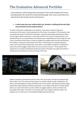
- 1. The Evaluation Advanced Portfolio In this evaluation I will be talking about the progress I have made throughout the course and talking about the overall horror promotional package. How I came up with ideas and what elements did I include and the overall process. In what ways does your media product use, develop or challenge forms and codes and conventions of real media products? To make my film trailer recognisable to my audience, I have used a number of codes and conventions of film trailers. As with existing horror film trailers, for example in ‘The Possession' they use setting and location to reflect the horror genre, I have also used setting and location to reflect my horror genre which is possession. In the trailer the film is set in quite an old house that is in an isolated setting, this is first presented to the audience by an establishing shot of the setting, this shot is also a convention of film trailers to allow the audience to establish where the film will take place. This setting is a convention of possession horror films. ‘The Possession’ for example presents a similar use of conventional setting, with a house that is in the middle of nowhere or isolated from anyone else and this suggest a place where no one can come to save you. ‘The Possession’ film inspired me in my choice of setting that would carry instant meaning for my audience that there is no help and no one will save you if you are living in this house. Another convention used within the horror trailer is the use of colour, the text are predominantly black, white or red. This is because these colours can represent death, murder and darkness. The colours work well together to create the effect of horror and evilness. Red represents blood, danger and the devil, black represents darkness and mystery, it also relates to the phrase ‘the black sheep’ which is an outcast from family or society. White can suggest coldness, which can relate to the personality of the villain. The colours are normally used on the straplines within the trailer. The straplines on our trailer are on a red and black background with white text.
- 2. The Evaluation Advanced Portfolio Another example of a convention used within the horror poster is the use of colour, in existing horror film posters they used red and dark colours to reflect that the poster is promoting a horror film. It also reflects the danger that lurks within the film itself warning the audience of the terror. These colours used are conventions of horror posters for example, it is similarly presented in ‘The Devil Inside’, with the background being black and the outline is in red this instantly conjures up thoughts of hell and the devil. This film poster inspired me in my choice of colours, so I was able to reflect the meaning behind the film poster to the audience. The ‘based on a true story’ text draws in the audience as they believe what happens in the movie/trailer has happened to someone before and they want to find out what they went through or what happened so they want to go watch the movie. The image on the poster fulfils expectations as on other possession posters e.g. ‘the possession’ and ‘the devil inside’ you expect to see dark colours to suggest that the sub genre and there is always an image of some sort of possessed person. As with existing film magazine, I have used the masthead and image to reflect the film being promoted on the magazine as horror. The image being used to promote the film is in the centre of
- 3. The Evaluation Advanced Portfolio the frame, to draw the audience attention in to the magazine, also by using the masthead to lure the audience in, I created a bold masthead to grab their attention and the font was distorted to suggest the film being presented is a horror. ‘Empire’, for example, presents a similar use of conventional image and masthead, with the masthead being bold and at the top of the magazine and also the image being in centre frame, this is always kept the same because the audience like familiarity so they are able to tell when they see the ‘Empire’ magazine from a far that it is in fact ‘Empire’. When creating the magazine I and my group struggled with the layout and the colours that would suit the magazine and horror genre for our film. We looked through some other film magazine and analysis how the colours are used and how it reflects the image or film, after we got a bit of an idea we started working on the front cover again. At the beginning our initial idea was the image on the magazine would be just the jack in the box as it is what possess the boy in our film and we wanted to reflect the evil in our film. But the image didn’t work on the front cover as it was either too small or looked wider than the jack in the box normally is. After that we decided to take new images for the front cover and change the image completely, we decided to keep the image as the boy from our film and keep it similar to the poster image to create the symbiotic link. After we chose our new image for the front cover we had to come up with colours that will suit the front cover and also represents the film itself. We found that many film magazines sell lines are different colours and colours that don’t necessarily match the image or film, it was challenging to follow this convention of the sell lines being different colours, size, shape and layout. So first we start experimenting with the colours we first tried orange, purple and green but it didn’t work and wasn’t effective, so we tried using the same colours used on the poster red and black, we also decided to add in blue to symbolise the jack in the box. For the sell lines we couldn’t get it quite right with it matching the colours of the masthead ‘Motion’ and the title of the film ‘Devil’s Toy, so we decided to keep it simple and plan and make the sell lines white as white matches everything and it stands out. Throughout trailer, poster and magazine there is always a symbiotic link, to link the three pieces together so that they support and complement each other. Once the audience see one of the three media pieces they will recognise it when the horror film is presented on the other two media pieces.
- 4. The Evaluation Advanced Portfolio How effective is the combination of the main product and ancillary texts? As promotion and advertisement is a large part of media in today’s society, the trailer, the poster and the film magazine are the three pieces that form a promotional package for our horror film. In order to create a successful promotional package there as to be a symbiotic link between the products to link them together. I followed the codes and conventions of horror trailers, posters and film magazines in order to make the film expand and attract and keep the audience engaged and interested in the film. This will increase the effectiveness of the whole package. I think me and my group have successfully appealed to the target audience, as we have appealed to their needs and desire within a horror poster, magazine and trailer. When conducted the target audience questionnaire, we asked the audience what do you think makes a good horror poster, 54% said imagery from this we decided to focus on a successful and terrifying image for the horror poster to promote our film and successful draw the audience attention to the poster. The image we used was of the child (Isaac) in our film that is possessed, the colours used on the image is dark colours and red, the dark colours portray death and fear and red portrays blood and killing. This instantly tells the audience that the film being promoted is horror and appeals to them as they enjoy horror films and the image gives them the chills and lures them in to watch it. For the trailer the audience said that tension is the most important aspect in a horror trailer, in order to appeal to the audience we tried to include as many tension filled scenes in the trailer as possible, to appeal to our audience and grab their attention and then be able to scary them to create an impact. 34% of the target audience said to create a successful film magazine is to have an effective image and 28% said colour, from this we chose to keep the image similar to the poster because it creates a symbolic link and they support each other but it also was effective. The colours we used was similar to the poster black and red to create the same meaning as the poster and lure the audience in to the magazine and find out more about our film being promoted. The symbiotic link between the magazine and the poster is the Jack in the box, the Jack in the box is what possesses the boy in the film, and an evil spirit is unleashed and attacks the boy's body and takes over his mind and soul. This is effective because when the audience have seen only one of the products e.g. only seen the poster, when they see the magazine they will instantly notice the Jack in the box as it is has bright colours and it will remind them of the poster or magazine whichever one they saw. It also makes the promotional package more professional as it keeps the repeated elements; it allows meaning to be delivered and understood more powerfully. Every time they see the Jack in the box it will remind them to go watch the trailer or watch the film. The images that are used on the poster and magazine front cover are similar as they have a similar pose, the character has his back to the wall and in both images he is making direct address with the audience. Making direct address with the audience can scary them and also could mean that they are next to be possessed by this evil spirit that is possessing the child in the image. The boy in the image is holding the Jack in the box in both the poster and the magazine; this keeps the image familiar look when
- 5. The Evaluation Advanced Portfolio coming across either one of the pieces. Symbiotic link is being effectively drummed into the audience memory due to repeated exposure. Symbiotic Link What have you learned from your audience feedback? Our target audience is both female and male and they are aged between 18 and 30; they are fun, clever and sophisticated. They enjoy possession films, as this sub genre appeals to their interest in all things spiritual. When presenting my audience with the three promotional pieces, we first presented them with our first draft of the three pieces. With the poster they said ‘it was really good and really attract them to the poster with the colours we used which stand out to them’. When presenting them with the first draft of the trailer they didn’t respond the same as they did with the poster; they said it had a good narrative which we successful delivered, they understand the narrative but what they did say was that the trailer was not scary enough. They believe it was the music it didn’t work with the trailer and the on the straps the red background was too bright they said it needed to be darker. Following receiving this feedback we decided to take the feedback on board and edit the trailer further; when we edited the trailer with the feedback we got from our audience, we went back and showed them the trailer again. This time we got more positive feedback, they said “Last time I saw the video it was not quite there and now it is much better it keeps me engaged and wanting to find out more about the movie”. Also one of our audience said the trailer gave her Goosebumps. The audience also said they liked the magazine and it has
- 6. The Evaluation Advanced Portfolio similar features to the poster which is a good thing as it is more recognisable, as if they saw the magazine in the shops they would straight away know that the magazine features the ‘Devil’s Toy’ character, as we keep the image similar to the poster and it makes it easier to acknowledge the magazine or poster. There was only one negative point made about the poster which was “the date should be 2014 instead of 14”. I am glad to say that our promotional package was successful in grabbing our audience attention and we successfully delivered the narrative and gave them the terrifying feeling we was going for.