
Empfohlen
Weitere ähnliche Inhalte
Was ist angesagt?
Was ist angesagt? (20)
Andere mochten auch
Andere mochten auch (20)
Ähnlich wie Web usability MKS
Ähnlich wie Web usability MKS (20)
Kürzlich hochgeladen
Kürzlich hochgeladen (20)
Web usability MKS
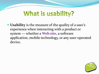
- 1. Usability is the measure of the quality of a user's experience when interacting with a product or system — whether a Web site, a software application, mobile technology, or any user-operated device.
- 2. Web usability is about making your website in such a way that your site users can find what they're looking for quickly and efficiently. A usable website can reap huge benefits on to your website and your business. Good usability means: Easy to Learn, Efficient to use, Easy to remember Error tolerant, Subjectively pleasing
- 3. Every `10 invested in improving your website's usability returns ` 10 to `100 (source: IBM) A web usability redesign can increase the sales/conversion rate . Low Usability Result in: Frustrated Users, Visitor Living, Reduction in Repeat Visiting, Higher Support Cost, Decreased Productivity.
- 4. Who will use the product? What are they trying to do? How long should it take? Will they be happy about it? Under what circumstances?
- 5. Users have gradually become accustomed to particular layouts and phrases on the Internet, for example: Organization logo is in the top-left corner and links back to the homepage The term ‘About us’ is used for organization information Navigation is in the same place on each page and adjacent to the content Anything flashing or placed above the top logo is often an advertisement
- 6. The term ‘Shopping cart’ is used for items you might wish to purchase There are numerous other conventions like these that enhance your website's usability - can you think of some more? Don't underestimate the importance of these conventions - as the Internet matures we're getting more and more used to things being a certain way. Break these conventions and you may be left with nothing but a website with poor usability and a handful of dissatisfied site visitors. Don’t forget to use a site or “sight” map
- 7. Most users have screen area set to 800 X 600 (3/2003) Short attention span Task in mind or an information need Previous experience with websites and other media Limited connection speed Users do not read - they scan Used to printing and page idea
- 8. Images & animations. Use the alt attribute to describe the function of each visual. Image maps. Use the client-side map and text for hotspots. Multimedia. Provide captioning and transcripts of audio, and descriptions of video. Hypertext links. Use text that makes sense when read out of context. For example, avoid "click here.” Page organization. Use headings, lists, and consistent structure. Use CSS for layout and style where possible.
- 9. Graphs & charts. Summarize or use the long desk attribute. Scripts, applets, & plug-ins. Provide alternative content in case active features are inaccessible or unsupported. Frames. Use the no frames element and meaningful titles. Tables. Make line-by-line reading sensible. Summarize.
- 10. Product doesn’t match job or task Poor organization/layout Product not self-evident Requires recall rather than recognition Inconsistent screens, messages, terminology Design is inefficient No exit or undo Help or documentation is not helpful
- 12. Restrictions must not be on user Don't prevent your users from navigating through the Internet in the way that they want to. For example: 1. Every time a link is opened in a new window the back button is disabled. Approximately 60% of Web users employ the back button as their primary means of navigation (source: Usability Interface). If you do this then you're preventing 60% of your users from using their primary navigation - now that can't be good for usability.
- 13. 1. Don't use frames to lay out your website. Frames can cause a number of usability problems, namely: Disabling the back button Bookmarking not possible Impossible to e-mail the link to someone else Problems with printing Users feel trapped if external links open in the same window There are lots of other ways that websites can place restrictions on its users, ultimately damaging their usability - can you think of any more? Just think back to the last time a website really infuriated you - what annoying thing did it do to make you feel that way?
- 14. Do not use popup windows Do not require users to remember information from page to page Support printing Tables Make line-by-line reading sensible Summarize Write meaningful labels
- 15. Conclusion: Usability is all about making the process easier to use. The website should provide all the essentials and rest users only looked into the website for what they want. Most professional web design firms take care of these usability factors so that a less frustration is produced and users feel relaxed.
- 16. By - Mukesh singh
Hinweis der Redaktion
- Ease of learning - How fast can a user who has never seen the user interface before learn it sufficiently well to accomplish basic tasks?Efficiency of use- Once an experienced user has learned to use the system, how fast can he or she accomplish tasks?Error tolerant- How often do users make errors while using the system, how serious are these errors, and how do users recover from these errors?Subjective pleasing-How much does the user like using the system?