SlideShare ist ein Scribd-Unternehmen logo
1 von 3
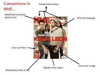
Conventions in
NME…

Simple bold colours

Masthead in primary
optical area

Informal language

Sans serif font

Dominantly male artists

Modern font styles

One main image
Conventions in my
magazine…

I have used modern font styles for my
magazine to fit in with the indie genre

I have placed the
masthead in the
primary optical area

I have also used bold
simple colours, such as
red, black and white

I made sure that
I used sans serif
font too, to
make my
magazine look
conventional

One main image
Conventions on my magazine cover…
My magazine has the masthead in the primary optical area, this is
conventional for an indie magazine, it is the first thing that the reader will see
and it also makes it stand out more.
I have used one main image on my magazine cover as this is something that I
found was generally typical of an indie magazine. The image takes up all of
the space on the front cover and the cover line is underneath it, this is
conventional and shows that it is the most important part of not only the
magazine cover but also the whole magazine.
I have a consistent house style throughout my whole magazine and the main
three colours used are, red, white and black. These are featured on my front
cover and are three bold yet simple colours that are conventional for all indie
magazines.
Sans serif is a more modern font style compared to serif, therefore
conventional for an indie magazine, I have made sure that I had used this font
style on my magazine cover to make it fit in with the indie genre.

Weitere ähnliche Inhalte

Mehr von MichaelaHead

Mehr von MichaelaHead (17)

Font ideas
Font ideasFont ideas
Font ideas
 
Storyboard
StoryboardStoryboard
Storyboard
 
Ancillary production planning (magazine)
Ancillary production planning (magazine)Ancillary production planning (magazine)
Ancillary production planning (magazine)
 
Ancillary production planning (poster)
Ancillary production planning (poster)Ancillary production planning (poster)
Ancillary production planning (poster)
 
Production plan
Production planProduction plan
Production plan
 
Shot list
Shot listShot list
Shot list
 
Script
ScriptScript
Script
 
New script new
New script newNew script new
New script new
 
Trailer outline
Trailer outlineTrailer outline
Trailer outline
 
Production pitch
Production pitchProduction pitch
Production pitch
 
Final Magazine Feedback
Final Magazine FeedbackFinal Magazine Feedback
Final Magazine Feedback
 
Target audience
Target audienceTarget audience
Target audience
 
Representation
RepresentationRepresentation
Representation
 
Survey feedback analysis
Survey feedback analysisSurvey feedback analysis
Survey feedback analysis
 
Progression within media
Progression within mediaProgression within media
Progression within media
 
Technology
Technology Technology
Technology
 
Representation
Representation Representation
Representation
 

Conventions within my magazine and NME

  • 1. Conventions in NME… Simple bold colours Masthead in primary optical area Informal language Sans serif font Dominantly male artists Modern font styles One main image
  • 2. Conventions in my magazine… I have used modern font styles for my magazine to fit in with the indie genre I have placed the masthead in the primary optical area I have also used bold simple colours, such as red, black and white I made sure that I used sans serif font too, to make my magazine look conventional One main image
  • 3. Conventions on my magazine cover… My magazine has the masthead in the primary optical area, this is conventional for an indie magazine, it is the first thing that the reader will see and it also makes it stand out more. I have used one main image on my magazine cover as this is something that I found was generally typical of an indie magazine. The image takes up all of the space on the front cover and the cover line is underneath it, this is conventional and shows that it is the most important part of not only the magazine cover but also the whole magazine. I have a consistent house style throughout my whole magazine and the main three colours used are, red, white and black. These are featured on my front cover and are three bold yet simple colours that are conventional for all indie magazines. Sans serif is a more modern font style compared to serif, therefore conventional for an indie magazine, I have made sure that I had used this font style on my magazine cover to make it fit in with the indie genre.