SlideShare a Scribd company logo
1 of 13
Frankie Jamie Michael
Masthead –   The one lettered title makes it look more prominent and is a contrast to the background, symbolising that it is important for their title to stand out from the front cover art. The magazine was called Q to  connote   the fact they used cue a song ready to play and get recognised.   Layout -  The fact the band takes up the whole background makes it look busy and eye-catching, attracting the attention of potential buyers. By using the art work by Hokusai: The Great Wave off Kanagawa with the Gorillaz it  represents   the theme of Japanese manga. Using words like ‘sail’  anchors  back to art on the front cover. Target Audience -  The  audience  is identified by the lack of writing on the cover, concentrating more on the imagery and boyish colours  encodes   that the magazine is for a male audience who like rock and indie style music and football and are around 16 – 25. The   layout  of this magazine  represents   the idea that as the Gorillaz are on top of the wave; they are on top of music industry again, like all the previous artists shown in the wave below them. Content analysis -  The fact that the Gorillaz are the main   feature   and are sailing   high up on the page and are firing a hook into the Q logo  suggests   they are planning on sticking around in the music industry. Gorillaz are   represented   as fun and dangerous in this cover as they are smiling but also firing weapons. This illustrates their carefree ways, like many alternate rock bands are portrayed. Copy –  The text also gives an idea of who the  target audience   is, by talking about sex and drugs implies the ‘rock’n’roll’ life style that many young men in their late teens and 20’s  want to know about. The banner at the top is used to show that it is a well known magazine.
Layout  – The image of the   cover model  has been placed over part of the masthead as this shows that it is a well known magazine. Also the copy and headlines have been placed around the free promotional CD and the cover model to also make them stand out more. Colour  – The dull background image makes the bright red title and the subtitles stand out more as it makes it look brighter and bolder. The grey background makes it stand out. The black and reds are commonly used in this  genre   of magazine, which is rock music. Target Audience  – The  target audience  of this magazine is elder males ages 25-50+ as most of this magazines  features  bands from the 70s. But the youth of today may still be interested in these bands. This is  encoded  by most of the reviews being of older bands. Masthead  – The title of this magazine is made to look very strong, it shows this by using sharp edges, sharp  colours  and a 3-D effect. The word  ‘Uncut’  connotes  non edited, truthful information. When you think of the word ‘Uncut’ it makes you think of live music, films and uncut stories. Medium shot  – the  connotations   of this shot is that the cover model is dominant as the camera angle is slightly low which makes it look like we are looking up to him. Misé-en-scene  – The background is the sun trying to breakthrough the clouds which implies that the artist on the front is also making a breakthrough in the music industry. His facial expression and clothes are very casual which shows he is just a normal person but is moving up in the music industry. Copy  – ‘The last testament’ this is religious which  represents  the cover model being dominant and important. Also it says ‘201 reviews’ this means you get a lot for your money you spent on the magazine.
Image  – Name of the band  anchors  the title with the image. Copy  – The text  represents  who the target audience is. The ‘Dangerous’ stands out to show the violence feel of the band. The  preferred meaning  of the front cover is safe danger and rebellion. This is  anchored  by the phrase “be afraid Britain”. Layout  – The image is placed over the masthead, this  represents  the magazine itself is popular and self confident. The font of the title gives a smashed effect. This  connotes  that the music this band plays is so loud that it breaks windows. There are articles all over the front cover wasting no space. This enables the publisher to receive as much attention from the audience as possible Medium long shot  –  The shot used  represents  the band as being dominant. The hand itself appears to be coming out of the page, therefore giving a sense of interacting with the audience. Misé-en-scene  – The costumes used are dark, and constricted. This  represents  the  genre  of music that the band plays. Their facial expressions look determined as they look directly at the reader. Target Audience  – The  target audience  of this magazine seems to be 16 – 25 males who are into the rock/ metal  genre  of music. This is  encoded  by the frequent use of exclamation marks and promoting the download. Preferred Meaning  – The  preferred meaning  of this magazine is danger and violence. The theme itself is black and red, relating to the  genre  of music. The text “Kicks Off” also  represents  violence.
[object Object],[object Object],[object Object],[object Object],[object Object],[object Object],[object Object],[object Object],[object Object]
Layout -  The   layout   of the contents page is kept basic over a double page with simple colours. As the magazine is for a male  audience   this can appeal to them more as they just want to know where to find the information they want. A member from the band Gorillaz takes up a lot of room on the contents page showing that they are a  main feature   and are more dominant over any other feature of the month. Colour -  The style of writing and colour scheme for the contents page matches the title on the front cover illustrating the continuity within the magazine. The use of red on the Q title and throughout the magazine symbolises its association with love,  signifying   the magazines love for music, and its passion towards it. The white used also provides a positive outlook as it  connotes  youth and peace;  encoding   the idea that music is good. Language -  The language used on the contents page is used to make the reader feel like they are friends with the people at Q magazine. It uses an informal tone to make it sound more casual and by having sub headings  called: ‘Features’ ‘Review’ and ‘Regulars’ it splits the book up even more for the reader. Using the word ‘ Regulars’  encodes   the casual relationship they want to achieve with their more loyal readers, by having the regular and standard information that comes in every issue. Target audience –  The   topics   discussed in the contents page give us an insight to the  target audience ,  they talk about ‘ A round with...’ implying going to the pub and drinking beer which is what younger men are stereotypically known for doing. The fact there is no pictures of celebrities, girls or clothing indicates that this is highly unlikely to be a girls magazine.
Layout  – The layout of the contents is  constructed  with a large image taken up most of the right hand side of the page which  represents  his importance. The features is set in a list down the left hand side to make it easy to read and go down the list. This keeps it looking organised. Image  – The image on the contents takes up most of the page. The image is a mid shot with a low angle looking up at the artist which  represents  him as being important, and very popular in this  genre  of music. Statistics  – The cover story takes up 12 pages including advertisements. Uncut reviews take up 55 pages, consisting of 35 album reviews and 20 film reviews. The album reviews will relate to the  target audience  and the  genre  of music. Copy  – At the top it says ‘Take 154’, this links to the  representation  of the title ‘Uncut’ as it relates to the film reviews and the word ‘cut’ is often used in film directing. The headings of the features are shown in red to highlight the main points of the features so you can read the bold, red heading to find out what is in that certain feature. Misé-en-scene  – By looking at the photo on the right you can tell that it is an old picture by the clothes he is wearing. This also links to the  genre  of the magazine as a lot of older bands are featured in this months magazine. The facial expression  represents  the artist is a serious look, which shows he was serious about his work.
Layout  – At the top of page are what bands are included in the issue, along with the image at the top right of the page which is a medium long shot to show the bands body language and facial expressions. Halfway down the page the reader is able to see what is included in the magazine altogether. The  colour  scheme of yellow and black  connotes  warning and danger, this is the  preferred   meaning , similar to the front cover. The white background makes the text easier to read and the page easier to navigate. To the left of the page references is an editors photo and what he thinks about the magazine. The photo itself is looking directly at the viewer, engaging them to read the article. Copy  – The title of the magazine hasn’t changed font or  colour  to keep the continuity. The yellow subheadings’ look corroded and distort. Thus  connoting  discomfort.  Beside some of the page references are little bullet points with the text ‘Cover Page’ inside. This keeps continuity from the front page enabling the reader to navigate the contents even easier. Misé-en-scene  – The facial expressions and body language of band top right of the page all  signifies  that the band are provocative. Their choice of costumes are mainly black. This  represents  the band as being  rock/ metal  genre  of music.  Statistics  – The ‘Features’ section of the magazine holds 46 pages. In these pages there are articles from other bands such as Linkin Park and My Chemical Romance. This relates to the  genre  of music which encodes who the  target audience  is.
[object Object],[object Object],[object Object],[object Object],[object Object],[object Object],[object Object],[object Object]
Representation-  Kid Cudi is shown as a cool, rebellious artist. The fact he is wearing a t-shirt he designed himself and had lots of gold jewellery on displays that he is successful and wealthy. The rhyme used as a sub heading  anchors   the  genre  back to the hip hop rapper Kid Cudi. Layout -  The   layout   is kept quite simple and has lots of extra space, which makes it look more stylish. The dark background which is contrasted with neon smoke makes it look attractive and by making Kid Cudi stand out against this background it achieves getting its target audience interested as he is made the main focus. Language -  The text allows the reader to have an insight into the life of  Kid Cudi and see what he has accomplished. The informal style of writing  encodes   the relationship that Q wishes to have between its readers and their music idols. Using a whole page just to display the artist  represents   his importance and the fact he is well known. His pose in which he is looking straight at the camera illustrates his confidence and by making rude hand gestures encapsulates how he doesn’t care about what people think of him. Using extra light on his top makes it look brighter and more eye catching, which also promotes his own range of clothing. Copy –  The target audience is defined as males. This is  encoded  through the use of a simple font text and his boisterous pose which appeals to a young male audience.
Image  – This double-page spread is made up of once big image. It is a low angle, medium close up which  connotes  he is the dominant figure. It also shows this as the image of him takes up the whole of one of the pages, this makes the audience concentrate on him. Layout  – The  construction  of the  copy  is mainly on the left hand side on this spread. The layout is very unstable as all the copy is in different sizes and it put all on one page, this could  signify  the emotion of the band. Colour  – All of this spread is made up of the  colours  black, greys and white. These colours  connote  danger, death and negativity which  anchors  the story the band ‘falling to pieces’. Copy  – The copy on the left hand side is mainly a quote from the cover story. The less important and less dominate words are in dark grey, but the powerful impacting words are in bolder, italic bright colours, this  represents  the dominant male in the picture. Also for important people or words, capital letters are used to add emphasise to them. Preferred Meaning  – The  preferred meaning  of this magazine wants to make you frightened when looking at this double page spread. The  colours  black and grey  anchor  this meaning as they  signify  danger.
Layout  – The layout is  constructed   through the use of having the image spread across both pages to capture full attention of the reader. Across the middle of both pages is a ripped strip. This strip  connotes   manliness and messiness which encodes the  target audience  of 16 – 25 males. Copy  – The text embedded within the ripped strip  represents  the genre of music that the band plays. ‘Rock your faces off’  represents  a violent feel  to the band. The text at the bottom right of the double spread is within a notepad page style of text box. This relates back to the strip across the page showing that it is ripped out of a book. The corroded edges also links into the title of the magazine. Misé-en-scene  -  The costumes used are casual and the  colours  of the costumes are mainly positive, the white  connotes  purity which is in contrast with the black vest. However, their facial expressions are also positive, smiling at the camera. This  represents  the band in high spirits. However, the cracked background keeps the continuity of the fearful meaning of the magazine. Preferred meaning  – The  preferred meaning  of this double page spread is happiness, the opposite to the front cover and contents page. This is  represented  through the use of blue which  connotes  calm, coolness and friendship. Image  -  Another Medium-long shot/ wide shot is used to  represent  the band as being calm and happy.
[object Object],[object Object],[object Object],[object Object],[object Object],[object Object],[object Object],[object Object],[object Object],[object Object],[object Object]

More Related Content

What's hot

Task 5 – deciding which genre and style
Task 5 – deciding which genre and styleTask 5 – deciding which genre and style
Task 5 – deciding which genre and styleAS Media Column D
 
Final media music magazine annabel lucey
Final media music magazine annabel luceyFinal media music magazine annabel lucey
Final media music magazine annabel luceybell101
 
Media cw music magazine reaserch and ideas annabel lucey
Media cw music magazine reaserch and ideas annabel luceyMedia cw music magazine reaserch and ideas annabel lucey
Media cw music magazine reaserch and ideas annabel luceybell101
 
Music magazine annabel lucey
Music magazine annabel luceyMusic magazine annabel lucey
Music magazine annabel luceybell101
 
Music magazine reaserch and ideas annabel lucey
Music magazine reaserch and ideas annabel luceyMusic magazine reaserch and ideas annabel lucey
Music magazine reaserch and ideas annabel luceybell101
 
Music magazine reaserch and ideas annabel lucey
Music magazine reaserch and ideas annabel luceyMusic magazine reaserch and ideas annabel lucey
Music magazine reaserch and ideas annabel luceybell101
 
Mojo’ magazine analysis
Mojo’ magazine analysisMojo’ magazine analysis
Mojo’ magazine analysisasmediac14
 
Magazine analysis production
Magazine analysis productionMagazine analysis production
Magazine analysis productiongraceemilyyy
 
Music Magazine Analysis
Music Magazine AnalysisMusic Magazine Analysis
Music Magazine AnalysisLauren_Clarke
 
Final powerpiont
Final powerpiontFinal powerpiont
Final powerpiontbell101
 
My analysis of 4 Contents Pages
My analysis of 4 Contents PagesMy analysis of 4 Contents Pages
My analysis of 4 Contents PagesKieran Hadfield
 
analysis of my own magazine - Leeroy
analysis of my own magazine - Leeroyanalysis of my own magazine - Leeroy
analysis of my own magazine - LeeroyLeeroy Magaramiri
 
Double Page Spread Analyses
Double Page Spread AnalysesDouble Page Spread Analyses
Double Page Spread AnalysesKieran Hadfield
 
Front Cover Evaluation
Front Cover EvaluationFront Cover Evaluation
Front Cover EvaluationHarHazel
 

What's hot (19)

Task 5 – deciding which genre and style
Task 5 – deciding which genre and styleTask 5 – deciding which genre and style
Task 5 – deciding which genre and style
 
Formal magazine proposal
Formal magazine proposalFormal magazine proposal
Formal magazine proposal
 
Final media music magazine annabel lucey
Final media music magazine annabel luceyFinal media music magazine annabel lucey
Final media music magazine annabel lucey
 
Media cw music magazine reaserch and ideas annabel lucey
Media cw music magazine reaserch and ideas annabel luceyMedia cw music magazine reaserch and ideas annabel lucey
Media cw music magazine reaserch and ideas annabel lucey
 
Music magazine annabel lucey
Music magazine annabel luceyMusic magazine annabel lucey
Music magazine annabel lucey
 
Music magazine reaserch and ideas annabel lucey
Music magazine reaserch and ideas annabel luceyMusic magazine reaserch and ideas annabel lucey
Music magazine reaserch and ideas annabel lucey
 
Music magazine reaserch and ideas annabel lucey
Music magazine reaserch and ideas annabel luceyMusic magazine reaserch and ideas annabel lucey
Music magazine reaserch and ideas annabel lucey
 
Rate cards
Rate cardsRate cards
Rate cards
 
Mojo’ magazine analysis
Mojo’ magazine analysisMojo’ magazine analysis
Mojo’ magazine analysis
 
Magazine analysis production
Magazine analysis productionMagazine analysis production
Magazine analysis production
 
Music Magazine Analysis
Music Magazine AnalysisMusic Magazine Analysis
Music Magazine Analysis
 
Rock sound
Rock soundRock sound
Rock sound
 
Music Magazine Analysis
Music Magazine AnalysisMusic Magazine Analysis
Music Magazine Analysis
 
Final powerpiont
Final powerpiontFinal powerpiont
Final powerpiont
 
My analysis of 4 Contents Pages
My analysis of 4 Contents PagesMy analysis of 4 Contents Pages
My analysis of 4 Contents Pages
 
analysis of my own magazine - Leeroy
analysis of my own magazine - Leeroyanalysis of my own magazine - Leeroy
analysis of my own magazine - Leeroy
 
Double Page Spread Analyses
Double Page Spread AnalysesDouble Page Spread Analyses
Double Page Spread Analyses
 
The source magazine
The source magazineThe source magazine
The source magazine
 
Front Cover Evaluation
Front Cover EvaluationFront Cover Evaluation
Front Cover Evaluation
 

Similar to Radial Analysis

Lewis Merle magazine analysis
Lewis Merle  magazine analysisLewis Merle  magazine analysis
Lewis Merle magazine analysisAnne Horne
 
Magazine Double Page Spread Research
Magazine Double Page Spread ResearchMagazine Double Page Spread Research
Magazine Double Page Spread ResearchLynley Sykes
 
Detailed Analysis
Detailed Analysis Detailed Analysis
Detailed Analysis LukeHarris01
 
Rsearch - Detailed Analysis
Rsearch - Detailed Analysis Rsearch - Detailed Analysis
Rsearch - Detailed Analysis LukeHarris01
 
Analysing nme dizzee cover prep for blog ppt
Analysing  nme dizzee cover prep for blog pptAnalysing  nme dizzee cover prep for blog ppt
Analysing nme dizzee cover prep for blog pptelliefarr
 
Presentgggation1
Presentgggation1Presentgggation1
Presentgggation1tjjones2
 
Magazine front cover research
Magazine front cover researchMagazine front cover research
Magazine front cover researchtashaa_smith
 
Magazine anaylisis
Magazine anaylisisMagazine anaylisis
Magazine anaylisissineadjen
 
Magazine anaylisis
Magazine anaylisisMagazine anaylisis
Magazine anaylisissineadjen
 
Magazine research final
Magazine research finalMagazine research final
Magazine research finaltashaa_smith
 
Front cover analysis (main task)
Front cover analysis (main task)Front cover analysis (main task)
Front cover analysis (main task)EDPRICE93
 
Analysing existing magazines
Analysing existing magazinesAnalysing existing magazines
Analysing existing magazinesamber_foster
 
Analysing existing magazines
Analysing existing magazinesAnalysing existing magazines
Analysing existing magazinesamber_foster
 
Cover, Contents and DPS Analysis
Cover, Contents and DPS AnalysisCover, Contents and DPS Analysis
Cover, Contents and DPS Analysisabbfarmery
 

Similar to Radial Analysis (20)

Micro analysis
Micro analysisMicro analysis
Micro analysis
 
Magazine analysis
Magazine analysisMagazine analysis
Magazine analysis
 
Lewis Merle magazine analysis
Lewis Merle  magazine analysisLewis Merle  magazine analysis
Lewis Merle magazine analysis
 
Magazine Double Page Spread Research
Magazine Double Page Spread ResearchMagazine Double Page Spread Research
Magazine Double Page Spread Research
 
Research
ResearchResearch
Research
 
Detailed Analysis
Detailed Analysis Detailed Analysis
Detailed Analysis
 
Research
ResearchResearch
Research
 
Research
ResearchResearch
Research
 
Rsearch - Detailed Analysis
Rsearch - Detailed Analysis Rsearch - Detailed Analysis
Rsearch - Detailed Analysis
 
Analysing nme dizzee cover prep for blog ppt
Analysing  nme dizzee cover prep for blog pptAnalysing  nme dizzee cover prep for blog ppt
Analysing nme dizzee cover prep for blog ppt
 
Presentgggation1
Presentgggation1Presentgggation1
Presentgggation1
 
Magazine front cover research
Magazine front cover researchMagazine front cover research
Magazine front cover research
 
Magazine anaylisis
Magazine anaylisisMagazine anaylisis
Magazine anaylisis
 
Magazine anaylisis
Magazine anaylisisMagazine anaylisis
Magazine anaylisis
 
Magazine research final
Magazine research finalMagazine research final
Magazine research final
 
Front cover analysis (main task)
Front cover analysis (main task)Front cover analysis (main task)
Front cover analysis (main task)
 
5sos work
5sos work5sos work
5sos work
 
Analysing existing magazines
Analysing existing magazinesAnalysing existing magazines
Analysing existing magazines
 
Analysing existing magazines
Analysing existing magazinesAnalysing existing magazines
Analysing existing magazines
 
Cover, Contents and DPS Analysis
Cover, Contents and DPS AnalysisCover, Contents and DPS Analysis
Cover, Contents and DPS Analysis
 

More from MFJ

Audience Identification A2
Audience Identification A2Audience Identification A2
Audience Identification A2MFJ
 
Our production final
Our production finalOur production final
Our production finalMFJ
 
Use of technology.
Use of technology.Use of technology.
Use of technology.MFJ
 
Journalism analysis
Journalism analysisJournalism analysis
Journalism analysisMFJ
 
Front cover analysiss
Front cover analysissFront cover analysiss
Front cover analysissMFJ
 
Double page analysiss
Double page analysissDouble page analysiss
Double page analysissMFJ
 
Contents analysis
Contents analysisContents analysis
Contents analysisMFJ
 
Journalism
JournalismJournalism
JournalismMFJ
 
Use of Technology
Use of TechnologyUse of Technology
Use of TechnologyMFJ
 
Front cover analysis
Front cover analysisFront cover analysis
Front cover analysisMFJ
 
Double page analysis
Double page analysisDouble page analysis
Double page analysisMFJ
 
Contents analysis
Contents analysisContents analysis
Contents analysisMFJ
 
Evalation of jouralism
Evalation of jouralismEvalation of jouralism
Evalation of jouralismMFJ
 
Evalation of front cover
Evalation of front coverEvalation of front cover
Evalation of front coverMFJ
 
Evalation of double spread page
Evalation of double spread pageEvalation of double spread page
Evalation of double spread pageMFJ
 
Production Phase[1]
Production Phase[1]Production Phase[1]
Production Phase[1]MFJ
 
Primary Data
Primary DataPrimary Data
Primary DataMFJ
 
Slideshow Of Sketches
Slideshow Of SketchesSlideshow Of Sketches
Slideshow Of SketchesMFJ
 
Magazines
MagazinesMagazines
MagazinesMFJ
 

More from MFJ (19)

Audience Identification A2
Audience Identification A2Audience Identification A2
Audience Identification A2
 
Our production final
Our production finalOur production final
Our production final
 
Use of technology.
Use of technology.Use of technology.
Use of technology.
 
Journalism analysis
Journalism analysisJournalism analysis
Journalism analysis
 
Front cover analysiss
Front cover analysissFront cover analysiss
Front cover analysiss
 
Double page analysiss
Double page analysissDouble page analysiss
Double page analysiss
 
Contents analysis
Contents analysisContents analysis
Contents analysis
 
Journalism
JournalismJournalism
Journalism
 
Use of Technology
Use of TechnologyUse of Technology
Use of Technology
 
Front cover analysis
Front cover analysisFront cover analysis
Front cover analysis
 
Double page analysis
Double page analysisDouble page analysis
Double page analysis
 
Contents analysis
Contents analysisContents analysis
Contents analysis
 
Evalation of jouralism
Evalation of jouralismEvalation of jouralism
Evalation of jouralism
 
Evalation of front cover
Evalation of front coverEvalation of front cover
Evalation of front cover
 
Evalation of double spread page
Evalation of double spread pageEvalation of double spread page
Evalation of double spread page
 
Production Phase[1]
Production Phase[1]Production Phase[1]
Production Phase[1]
 
Primary Data
Primary DataPrimary Data
Primary Data
 
Slideshow Of Sketches
Slideshow Of SketchesSlideshow Of Sketches
Slideshow Of Sketches
 
Magazines
MagazinesMagazines
Magazines
 

Radial Analysis

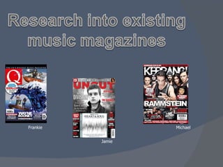
  • 2. Masthead – The one lettered title makes it look more prominent and is a contrast to the background, symbolising that it is important for their title to stand out from the front cover art. The magazine was called Q to connote the fact they used cue a song ready to play and get recognised. Layout - The fact the band takes up the whole background makes it look busy and eye-catching, attracting the attention of potential buyers. By using the art work by Hokusai: The Great Wave off Kanagawa with the Gorillaz it represents the theme of Japanese manga. Using words like ‘sail’ anchors back to art on the front cover. Target Audience - The audience is identified by the lack of writing on the cover, concentrating more on the imagery and boyish colours encodes that the magazine is for a male audience who like rock and indie style music and football and are around 16 – 25. The layout of this magazine represents the idea that as the Gorillaz are on top of the wave; they are on top of music industry again, like all the previous artists shown in the wave below them. Content analysis - The fact that the Gorillaz are the main feature and are sailing high up on the page and are firing a hook into the Q logo suggests they are planning on sticking around in the music industry. Gorillaz are represented as fun and dangerous in this cover as they are smiling but also firing weapons. This illustrates their carefree ways, like many alternate rock bands are portrayed. Copy – The text also gives an idea of who the target audience is, by talking about sex and drugs implies the ‘rock’n’roll’ life style that many young men in their late teens and 20’s want to know about. The banner at the top is used to show that it is a well known magazine.
  • 3. Layout – The image of the cover model has been placed over part of the masthead as this shows that it is a well known magazine. Also the copy and headlines have been placed around the free promotional CD and the cover model to also make them stand out more. Colour – The dull background image makes the bright red title and the subtitles stand out more as it makes it look brighter and bolder. The grey background makes it stand out. The black and reds are commonly used in this genre of magazine, which is rock music. Target Audience – The target audience of this magazine is elder males ages 25-50+ as most of this magazines features bands from the 70s. But the youth of today may still be interested in these bands. This is encoded by most of the reviews being of older bands. Masthead – The title of this magazine is made to look very strong, it shows this by using sharp edges, sharp colours and a 3-D effect. The word ‘Uncut’ connotes non edited, truthful information. When you think of the word ‘Uncut’ it makes you think of live music, films and uncut stories. Medium shot – the connotations of this shot is that the cover model is dominant as the camera angle is slightly low which makes it look like we are looking up to him. Misé-en-scene – The background is the sun trying to breakthrough the clouds which implies that the artist on the front is also making a breakthrough in the music industry. His facial expression and clothes are very casual which shows he is just a normal person but is moving up in the music industry. Copy – ‘The last testament’ this is religious which represents the cover model being dominant and important. Also it says ‘201 reviews’ this means you get a lot for your money you spent on the magazine.
  • 4. Image – Name of the band anchors the title with the image. Copy – The text represents who the target audience is. The ‘Dangerous’ stands out to show the violence feel of the band. The preferred meaning of the front cover is safe danger and rebellion. This is anchored by the phrase “be afraid Britain”. Layout – The image is placed over the masthead, this represents the magazine itself is popular and self confident. The font of the title gives a smashed effect. This connotes that the music this band plays is so loud that it breaks windows. There are articles all over the front cover wasting no space. This enables the publisher to receive as much attention from the audience as possible Medium long shot – The shot used represents the band as being dominant. The hand itself appears to be coming out of the page, therefore giving a sense of interacting with the audience. Misé-en-scene – The costumes used are dark, and constricted. This represents the genre of music that the band plays. Their facial expressions look determined as they look directly at the reader. Target Audience – The target audience of this magazine seems to be 16 – 25 males who are into the rock/ metal genre of music. This is encoded by the frequent use of exclamation marks and promoting the download. Preferred Meaning – The preferred meaning of this magazine is danger and violence. The theme itself is black and red, relating to the genre of music. The text “Kicks Off” also represents violence.
  • 5.
  • 6. Layout - The layout of the contents page is kept basic over a double page with simple colours. As the magazine is for a male audience this can appeal to them more as they just want to know where to find the information they want. A member from the band Gorillaz takes up a lot of room on the contents page showing that they are a main feature and are more dominant over any other feature of the month. Colour - The style of writing and colour scheme for the contents page matches the title on the front cover illustrating the continuity within the magazine. The use of red on the Q title and throughout the magazine symbolises its association with love, signifying the magazines love for music, and its passion towards it. The white used also provides a positive outlook as it connotes youth and peace; encoding the idea that music is good. Language - The language used on the contents page is used to make the reader feel like they are friends with the people at Q magazine. It uses an informal tone to make it sound more casual and by having sub headings called: ‘Features’ ‘Review’ and ‘Regulars’ it splits the book up even more for the reader. Using the word ‘ Regulars’ encodes the casual relationship they want to achieve with their more loyal readers, by having the regular and standard information that comes in every issue. Target audience – The topics discussed in the contents page give us an insight to the target audience , they talk about ‘ A round with...’ implying going to the pub and drinking beer which is what younger men are stereotypically known for doing. The fact there is no pictures of celebrities, girls or clothing indicates that this is highly unlikely to be a girls magazine.
  • 7. Layout – The layout of the contents is constructed with a large image taken up most of the right hand side of the page which represents his importance. The features is set in a list down the left hand side to make it easy to read and go down the list. This keeps it looking organised. Image – The image on the contents takes up most of the page. The image is a mid shot with a low angle looking up at the artist which represents him as being important, and very popular in this genre of music. Statistics – The cover story takes up 12 pages including advertisements. Uncut reviews take up 55 pages, consisting of 35 album reviews and 20 film reviews. The album reviews will relate to the target audience and the genre of music. Copy – At the top it says ‘Take 154’, this links to the representation of the title ‘Uncut’ as it relates to the film reviews and the word ‘cut’ is often used in film directing. The headings of the features are shown in red to highlight the main points of the features so you can read the bold, red heading to find out what is in that certain feature. Misé-en-scene – By looking at the photo on the right you can tell that it is an old picture by the clothes he is wearing. This also links to the genre of the magazine as a lot of older bands are featured in this months magazine. The facial expression represents the artist is a serious look, which shows he was serious about his work.
  • 8. Layout – At the top of page are what bands are included in the issue, along with the image at the top right of the page which is a medium long shot to show the bands body language and facial expressions. Halfway down the page the reader is able to see what is included in the magazine altogether. The colour scheme of yellow and black connotes warning and danger, this is the preferred meaning , similar to the front cover. The white background makes the text easier to read and the page easier to navigate. To the left of the page references is an editors photo and what he thinks about the magazine. The photo itself is looking directly at the viewer, engaging them to read the article. Copy – The title of the magazine hasn’t changed font or colour to keep the continuity. The yellow subheadings’ look corroded and distort. Thus connoting discomfort. Beside some of the page references are little bullet points with the text ‘Cover Page’ inside. This keeps continuity from the front page enabling the reader to navigate the contents even easier. Misé-en-scene – The facial expressions and body language of band top right of the page all signifies that the band are provocative. Their choice of costumes are mainly black. This represents the band as being rock/ metal genre of music. Statistics – The ‘Features’ section of the magazine holds 46 pages. In these pages there are articles from other bands such as Linkin Park and My Chemical Romance. This relates to the genre of music which encodes who the target audience is.
  • 9.
  • 10. Representation- Kid Cudi is shown as a cool, rebellious artist. The fact he is wearing a t-shirt he designed himself and had lots of gold jewellery on displays that he is successful and wealthy. The rhyme used as a sub heading anchors the genre back to the hip hop rapper Kid Cudi. Layout - The layout is kept quite simple and has lots of extra space, which makes it look more stylish. The dark background which is contrasted with neon smoke makes it look attractive and by making Kid Cudi stand out against this background it achieves getting its target audience interested as he is made the main focus. Language - The text allows the reader to have an insight into the life of Kid Cudi and see what he has accomplished. The informal style of writing encodes the relationship that Q wishes to have between its readers and their music idols. Using a whole page just to display the artist represents his importance and the fact he is well known. His pose in which he is looking straight at the camera illustrates his confidence and by making rude hand gestures encapsulates how he doesn’t care about what people think of him. Using extra light on his top makes it look brighter and more eye catching, which also promotes his own range of clothing. Copy – The target audience is defined as males. This is encoded through the use of a simple font text and his boisterous pose which appeals to a young male audience.
  • 11. Image – This double-page spread is made up of once big image. It is a low angle, medium close up which connotes he is the dominant figure. It also shows this as the image of him takes up the whole of one of the pages, this makes the audience concentrate on him. Layout – The construction of the copy is mainly on the left hand side on this spread. The layout is very unstable as all the copy is in different sizes and it put all on one page, this could signify the emotion of the band. Colour – All of this spread is made up of the colours black, greys and white. These colours connote danger, death and negativity which anchors the story the band ‘falling to pieces’. Copy – The copy on the left hand side is mainly a quote from the cover story. The less important and less dominate words are in dark grey, but the powerful impacting words are in bolder, italic bright colours, this represents the dominant male in the picture. Also for important people or words, capital letters are used to add emphasise to them. Preferred Meaning – The preferred meaning of this magazine wants to make you frightened when looking at this double page spread. The colours black and grey anchor this meaning as they signify danger.
  • 12. Layout – The layout is constructed through the use of having the image spread across both pages to capture full attention of the reader. Across the middle of both pages is a ripped strip. This strip connotes manliness and messiness which encodes the target audience of 16 – 25 males. Copy – The text embedded within the ripped strip represents the genre of music that the band plays. ‘Rock your faces off’ represents a violent feel to the band. The text at the bottom right of the double spread is within a notepad page style of text box. This relates back to the strip across the page showing that it is ripped out of a book. The corroded edges also links into the title of the magazine. Misé-en-scene - The costumes used are casual and the colours of the costumes are mainly positive, the white connotes purity which is in contrast with the black vest. However, their facial expressions are also positive, smiling at the camera. This represents the band in high spirits. However, the cracked background keeps the continuity of the fearful meaning of the magazine. Preferred meaning – The preferred meaning of this double page spread is happiness, the opposite to the front cover and contents page. This is represented through the use of blue which connotes calm, coolness and friendship. Image - Another Medium-long shot/ wide shot is used to represent the band as being calm and happy.
  • 13.