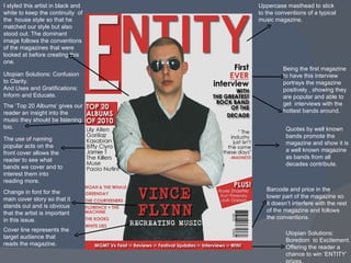
1. I styled this artist in black and white to keep the continuity of the house style so that he matched our style but also stood out. The dominant image follows the conventions of the magazines that were looked at before creating this one. Uppercase masthead to stick to the conventions of a typical music magazine. Change in font for the main cover story so that it stands out and is obvious that the artist is important in this issue. Barcode and price in the lower part of the magazine so it doesn’t interfere with the rest of the magazine and follows the conventions. Utopian Solutions: Confusion to Clarity. And Uses and Gratifications: Inform and Educate. The ‘Top 20 Albums’ gives our reader an insight into the music they should be listening too. Being the first magazine to have this interview portrays the magazine positively , showing they are popular and able to get interviews with the hottest bands around. Cover line represents the target audience that reads the magazine. Utopian Solutions: Boredom to Excitement. Offering the reader a chance to win ‘ENTITY’ prizes. Quotes by well known bands promote the magazine and show it is a well known magazine as bands from all decades contribute. The use of naming popular acts on the front cover allows the reader to see what bands we cover and to interest them into reading more.