

Empfohlen
Empfohlen
Weitere ähnliche Inhalte
Was ist angesagt?
Was ist angesagt? (20)
Ähnlich wie Avoid Error Not Design
Ähnlich wie Avoid Error Not Design (20)
Mehr von MaximumHit Ltd
Mehr von MaximumHit Ltd (20)
Kürzlich hochgeladen
Kürzlich hochgeladen (20)
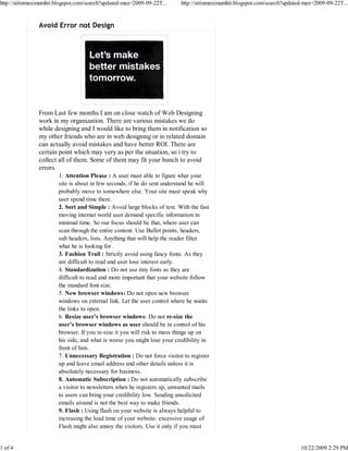
Avoid Error Not Design
- 1. http://nitinmaximumhit.blogspot.com/search?updated-max=2009-09-22T... http://nitinmaximumhit.blogspot.com/search?updated-max=2009-09-22T... Avoid Error not Design From Last few months I am on close watch of Web Designing work in my organization. There are various mistakes we do while designing and I would like to bring them in notification so my other friends who are in web designing or in related domain can actually avoid mistakes and have better ROI. There are certain point which may very as per the situation, so i try to collect all of them. Some of them may fit your bunch to avoid errors. 1. Attention Please : A user must able to figure what your site is about in few seconds, if he do sent understand he will probably move to somewhere else. Your site must speak why user spend time there. 2. Sort and Simple : Avoid large blocks of text. With the fast moving internet world user demand specific information in minimal time. So our focus should be that, where user can scan through the entire content. Use Bullet points, headers, sub headers, lists. Anything that will help the reader filter what he is looking for. 3. Fashion Trail : Strictly avoid using fancy fonts. As they are difficult to read and user lose interest early. 4. Standardization : Do not use tiny fonts as they are difficult to read and more important that your website follow the standard font size. 5. New browser windows: Do not open new browser windows on external link. Let the user control where he wants the links to open. 6. Resize user’s browser windows: Do not re-size the user’s browser windows as user should be in control of his browser. If you re-size it you will risk to mess things up on his side, and what is worse you might lose your credibility in front of him. 7. Unnecessary Registration : Do not force visitor to register up and leave email address and other details unless it is absolutely necessary for business. 8. Automatic Subscription : Do not automatically subscribe a visitor to newsletters when he registers up, unwanted mails to users can bring your credibility low. Sending unsolicited emails around is not the best way to make friends. 9. Flash : Using flash on your website is always helpful to increasing the load time of your website. excessive usage of Flash might also annoy the visitors. Use it only if you must 1 of 4 10/22/2009 2:29 PM
- 2. http://nitinmaximumhit.blogspot.com/search?updated-max=2009-09-22T... http://nitinmaximumhit.blogspot.com/search?updated-max=2009-09-22T... offer features that are not supported by static pages. 10. Music On Visitor Gone : Please do not play background Music on your website. 11. Music on Demand : If you like to play Music than let the visitor choose and play as per the convenience. 12. Website with badges: Badges of networks and communities make a site look very unprofessional. Even if we are talking about awards and recognition badges you should place them on the “About Us” page. 13. Not Everything On Homepage : Let the user surf your website, do not try to put everything on homepage only. 14. Contact Detail : Using “forms” to contact is a good medium but please mention direct contact details like Phone No., Address etc as every visitor might not be comfortable with filling forms. He might like to call directly and proceed business. 15. Blink : Avoid using blinking text on website. 16. Avoid complex URL structures: a simple, keyword-based URL structure will not only improve your search engine rankings, but it will also make it easier for the reader to identify the content of your pages before visiting them. 17. Site Map : Must be provided to ease visitor surfing your website. 18. “Back” button: Do not break the “Back” button under any circumstance. Opening new browser windows will break it, for instance, and some Javascript links might also break them. 19. Use CSS over HTML tables: HTML tables were used to create page layouts. With the advent of CSS, however, there is no reason to stick to them. CSS is faster, more reliable and it offers many more features. 20. Minimize “drop down” – Untill its required avoid using drop down menus, try to simplify the surfing by using navigation options straight way. 21. Use text navigation: text navigation is not only faster but it is also more reliable. 22. PDF linking - Make sure to explicit links pointing to PDF files so that users can handle them properly. As many times when user clicked on a link only to see your browser freezing while Acrobat Reader launches to open that (unrequested) 23. Visitor Confusion : Do not confuse the visitor with many versions, avoid confusing the visitor with too many versions of your website. For example:-what bandwidth do I prefer? 56Kbps? 128Kbps? Flash or HTML? Hold ON J, just give me the content! 24. Advertisement Ethics ; Do not blend advertising inside the content as some of the NEW portal do so and till the time they realized Visitor gone away. Blending advertising like Adsense units inside your content might increase your click- through rate on the short term. Over the long run, however, this will reduce your readership base. 25 Simplicity the Best : Using simple navigation will deliver 2 of 4 10/22/2009 2:29 PM
- 3. http://nitinmaximumhit.blogspot.com/search?updated-max=2009-09-22T... http://nitinmaximumhit.blogspot.com/search?updated-max=2009-09-22T... 25. Simplicity the Best : Using simple navigation will deliver more. 26. Forceful Introduction : do not force the user to watch or read something before he can access to the real content. This is plain annoying, and he will stay only if what you have to offer is really unique. 27. FrontPage the Old Page : Appear to make web design easier, the output will be a poorly crafted code, incompatible with different browsers and with several bugs. 28. Cross-browser compatible: Make your website compatible with the most used browsers on the market, else you will lose readers over the long term. 29. Anchor Text : Make sure to include a relevant anchor text on your links. It will ensure that the reader knows where he is going to if he clicks the link, and it will also create SEO benefits for the external site where the link is pointing. 30. Avoid cloak links : If you cloak your links (either because they are affiliate ones or due to other reasons) your site will lose credibility. 31. Visible Linking : Make sure all links are properly visible to avoid any mis understanding. 32. Underline or Color normal text: Please do not underline normal text unless absolutely necessary. Just as users need to recognize links easily, they should not get the idea that something is clickable when in reality it is not. 33. Change Color : Clickable link must change color so visitor will not in confusion whether he click the link earlier or not. 34. Animated GIF’s : Strictly avoid using animated GIF files unless you have advertising banners that require. They make a site look unprofessional and detract the attention from the content. 35. Make sure to use the ALT and TITLE attributes for images: apart from having SEO benefits the ALT and TITLE attributes for images will play an important role for blind users. 36. No Harsh Color : Using harsh color will kill the user interest. Always use good color scheme to keep the user interest. 37. Pop Ups the Block Ups: If pop is so useful most of the browser does not provide “BLOCK POP UP”. 38. Avoid Javascript links: those links execute a small Javascript when the user clicks on them. Stay away from them since they often create problems for the user. 39. Footer : Always use functional links in footer. A more professional approach. 40. Long Page : Avoid using long page and Improve navigation. 41. Horizontal Scrolling : There should be no Horizontal scrolling. The most used screen resolution nowadays is 1024 x 768 pixels, so make sure that your website fits inside it. 42. Spell Check : No spelling mistake in your website to keep the credibility and quality of your work high. 3 of 4 10/22/2009 2:29 PM
- 4. http://nitinmaximumhit.blogspot.com/search?updated-max=2009-09-22T... http://nitinmaximumhit.blogspot.com/search?updated-max=2009-09-22T... p y q y y g 43. CAPTCHA: If you are using CAPTCHA than make sure letters are readable. 44. Contact Form : Please ask minimum required information from Visitor. Do not try to get the complete Bio data of the visitor. 45. Hidden Things : Do not use Hidden Links or hidden Text, even from SEO point this is not a good practice. 46. Linking : Do not link the content or picture from any banned site or irrelevant site which has no relevancy with your website. 47. Website Theme : Always carry a proper theme for your website and do not alter the theme in MIDWAY. 48. Blog : Adding blog to your website is good if you can put fresh content on regular basis. 49. Plugging : Do not use unnecessary plugings as it increase the load time of your website. 50. Font Adjustment : When possible use ‘em’ instead of ‘px’ or % as a measure in your CSS. It grows (or shrinks) proportionally if your user increases (or decreases) his browser’s font sizes. That’s because em’s size is relative to the font size of parent elements while pixels and percentages are relative to screen’s size. 51. Mobile Compatible : As now a day’s use of smart phones are very high. Website must have mobile version to reach more visitors. 52. Visitor Counters : Don’t use visitor counters. Instead, use an invisible tracking system like Google Analytics. Why should I care that I am visitor number xxxxxxxxx. 53. Tables or CSS : Don’t use tables to layout your web pages. Use CSS instead. Table layouts bloat your code and in some cases will change your code to content ratio to the point that Google will penalize your site for it. 54. Don’t use frames : Search engines and screen readers have a big problem trying to read the contents of frames and it will also affect your code to content ratio. Happy Designing ! Nitin Chauhan | nitin@maximumhit.com | www.maximumhit.com 4 of 4 10/22/2009 2:29 PM