Beginners Guide to TikTok for Search - Rachel Pearson - We are Tilt __ Bright...
Ideas Mood Board
1. Central Image
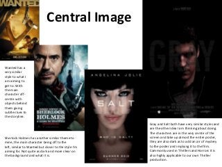
Wanted has a
very similar
style to what I
am aiming to
get to. With
the main
character offcentre with
objects behind
them giving
subtle clues to
the storyline.
Sherlock Holmes has another similar theme to
mine, the main character being off to the
left, similar to Wanted but closer to the style I’m
aiming for. Not quite as dark and more clear on
the background and what it is.
Gray and Salt both have very similar styles and
are the other idea I am thinking about doing.
The characters are in the very centre of the
screen and take up almost the entire poster,
they are also dark as to add an air of mystery
to the poster and implying it to the film.
Commonly used in Thrillers and Horrors it is
also highly applicable to our own Thriller
production.
2. This composition is also
appealing, its very compact
like Sherlock Holmes and
allows lots of space for the
main image, as well as the
actors name at the top and
the all other writing at the
bottom including affiliates
and companies. The colour
scheme here is another I’d
use, the very dull colours
suiting the mystery and
Thriller style I am aiming for.
Composition, Text, Colour Scheme
Sherlock Holmes has a similar
composition to what I would aim to
create, the titles being in the bottom of
the screen along with date and actor
credits. This is very compact and thus
allows plenty of space for the main
image. The colour scheme here is not
quite what I’d aim for, its too bright and
clear, but the faded colour of the
background he is composed on is good.
Solo has another type of
composition I would be
interested in making,
where the main actors
face and text dominates
the main screen and the
image is at the bottom,
usually a location to
represent what the film
might be about. The
colour scheme here is
similar to what I would
aim for, dark contrasts
between colours and a
overall dark look.
Endgame has a similar effect to
Solo, the main characters at the
top and a image at the bottom.
It also has the nice feature of
the actors and actresses names
along the top. Also the text
being just beneath the title is
compact and also visually
appealing encouraging people
looking for the title to also see
the catchphrase and tag line.
The colour scheme of Endgame
is also good, the dark and dull
colours working well with the
bright fire on the car. I would
use a similar style.