![[object Object],[object Object],[object Object],[object Object],[object Object],[object Object]](data:image/gif;base64,R0lGODlhAQABAIAAAAAAAP///yH5BAEAAAAALAAAAAABAAEAAAIBRAA7)
Empfohlen
Weitere ähnliche Inhalte
Was ist angesagt?
Was ist angesagt? (17)
Andere mochten auch
Ähnlich wie Print Screens
Ähnlich wie Print Screens (20)
Kürzlich hochgeladen
Kürzlich hochgeladen (20)
Print Screens
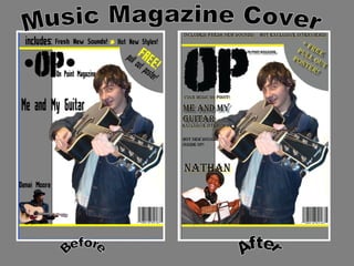
- 1. Music Magazine Cover Before After
- 5. Cover line image For me to be able to have this image as my cover line image I had to open it into Adobe Photoshop CS3 so that I could edit it and place it into my left third in Adobe InDesign CS3. I had to cut around the image, again using the Polygonal Lasso tool for me to have a white background with my image, I then had to unlock the layer so I could use the Magic Wand tool to delete the background, which would then just leave me with the image. I saved the image as a PNG file, which then allowed me to open the file on Adobe InDesign CS3. For it to then be placed over my left third without there been a white background with it.
- 6. The Strap line, Pug and top strip text Strap line Once I had placed in my images for my cover it was then time for me to add the strap line, which is the text underneath the Masthead. For my magazine I had chosen the strap line ‘Your Music On Point’ Which refers back to the use of the ‘OP’ as my masthead which stands for On Point. I wanted my strap line to link into my name and to the whole magazine which is music. Pug I had chosen to place a freebie in my pug. When pugs contain freebies or competitions it grabs the readers eye and gives them that feeling that they need to purchase it because of the freebies. Top Strip For my top strip I had chosen to write what the magazine includes. I had wrote fresh new sounds, hot exclusive interviews. I used these because I had hoped it would give the magazine a more interesting look so that it would seem interesting to purchase and read.
- 7. Cover line Text and Main Article Text The title for my main articles text is ‘ Me And My Guitar’. I had made it bold and black with a yellow glow so that it would stand out from the title and the top strip text. Underneath that exclusive interviews is written so that everyone knows that that is part of the main article and image. For the cover line text I had chosen to just go for the artist name, keeping it plain and simple yet original. I also chose to put the title in big, black and bold writing with again some yellow glow around it to make it stand out from the image.
- 8. Music Magazine Contents Page Before After
- 9. Contents Page To start off my contents page I had simply used the same background as I did on the cover, because I wanted to keep the colour scheme continuous through the magazine so I used the same colours again for the contents page. Contents Page Font For the title for my contents page I again used www.dafont.com where I chose again another font which I felt was on the rock genre side. The black, big and bold font was used again to keep it looking plain and simple. Effect Behind The Contents Page Font On Adobe Photoshop CS3 I used the shapes that were already on the programme and found a shape that looked like paint splats. I added then to a blank page and changed the colour to yellow so that it would be visible from behind the text. I saved it as a JPEG and placed it into Adobe InDesign CS3 where I then arranged it so send back where the image of the pain splats had then gone behind the text,
- 10. Image Boxes I had decided to add boxes to the contents page where my images would be. I again stuck to the colour scheme. The box closest to the title is the box that I was planning on adding my main article image and the second box was for the cover line image. In the image below that it shows how the images of the boxes have changed. The top box has got the same image from the cover in it, this should help everyone to notice it from the front cover. Two more boxes had been added but have been rotated sideways a little and have been moved down from how the one was in the above image. These boxes are there for the cover line images. The images in the boxes are of the cover line artist. There are three images of this artist so that we can get a glimpse of who the artist is.
- 11. Contents page images The images for the cover line artist on my contents page were edited on Adobe Photoshop CS3 where I cut out the white backgrounds so that when they were inserted into the boxes on the contents page that you wouldn’t be able to see the backgrounds so they would be able to be dragged and dropped on any part of the contents page. I chose images that would have reflected the artists personality and that included his instrument to.
- 12. Contents Page Text The text I used for my contents page was found on Adobe InDesign CS3 called Algerian which I thought was more of a rock font. I kept it in a black colour but I then added a yellow glow around it so that it could be seen on the page over everything else. I then added a shadow to my images so that they would stand out and look professional and give it an effect. Following that I then added little stars next to the text. I found these from Adobe Photoshop where I then added it to a blank page and changed the colour from black to yellow so that it would stand out from the text.
- 13. Music Magazine Double Page One Before After
- 14. Double Page Article 1 To start my double page off I used the same backgrounds as I did with the cover and contents page. I then used the image of the artist with his instrument. I felt that it was a good image to use because it shows a side of his personality also it relates to the title of the article, ‘Me and My Guitar’. It shows the relationship that the artist has with his guitar.
- 15. Double Page Article Images The image I had found for my double page article was opened onto Adobe Photoshop CS3 where I cut around the image using the Polygonal Lasso tool and deleted the background so I was left with just a white background, where I then used the Magic Wand tool to delete the white background so I was left with just the image of the artist. I then saved it as a PNG file and placed it into Adobe InDesign CS3 where I then had to decide on the positioning of the image.
- 16. Double Page Article Image And Title Once I had chosen and edited the image I then had the decision on where I was going to place it. My overall decision was to flip the image and place it on the edge of the page. I decided on the image been large because i spent time browsing through magazines and their articles and more magazines had large images instead of small images. I had still manage to save space for the articles text for when it needed to be placed in. I then added a shadow around the image to give it an effect so it would stand out. Moving onto the title where I used the same font as the text on the contents page and made it to a large size so that it was noticeable where I then made the font black and added a yellow glow around it to make it stand out from the rest of the page. I then added my double page article. With this I made it go around the image, but making sure it was still easy to read. The font I used was Arial and I kept it at size 11. I done this because after looking at other magazines all of their articles are in small fonts.
- 17. Double Page Article Once my article was in place I then decided on adding a little box by my image where it had a quote from the artist which was extracted out of the article. i felt this was useful because people could refer to that before reading it if they felt like it. I had also seen this in previous magazines I have looked at. Following that I then added a page number. I found the design for the page number off www.dafont.com where I saved the image and placed it into Adobe InDesign CS3. I used that certain one because it had the rock feel to it. I placed it at the bottom right hand corner of the double paged article page.
- 18. Music Magazine Double Page Two Before After
- 19. Double Page Article 2 I used the same background as previous except this time I had flipped it so that it was on the other side of the page. Then I found my image that I wanted to use and added it for the page. I decided on placing the image along the yellow line of the background and again like the other image I made it large but still kept space for the rest of the article to be placed in.
- 20. Double Page Article 2 Images The image that I had used was firstly opened on Adobe Photoshop where I then used the Polygonal Lasso tool to cut around the original image to get it into a white background. Following that I then used the Magic Wand tool to delete the background so I was left with the image on its own.
- 21. Double Page Article 2 Text As the image was in place it was then easy for me to place in the article. I found the font off Adobe InDesign for the title and made it large and black with a yellow glow around it so it would stand out from the whole article. The image at the bottom shows how I’ve added another box with a quote from the article and added a drop shadow around it to give it some effect so it doesn’t look boring.
- 22. Double Page Article 2 To complete my double page article off I added a page number to the bottom right hand corner. I found the font for this on www.dafont.com where I placed it onto Adobe InDesign CS3 for an extra effect.