What does it take to create the world's best corporate website?
•Als PPTX, PDF herunterladen•
0 gefällt mir•274 views


Empfohlen
Empfohlen
Weitere ähnliche Inhalte
Ähnlich wie What does it take to create the world's best corporate website?
Ähnlich wie What does it take to create the world's best corporate website? (20)
What does it take to create the world's best corporate website?
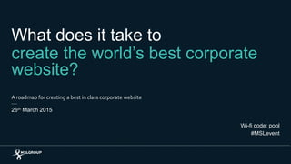
- 1. What does it take to create the world’s best corporate website? A roadmap for creating a best in class corporate website 26th March 2015 Wi-fi code: pool #MSLevent
- 2. Agenda 8:50 – 9:00am – Introduction from the Chair James Warren, Head of Digital, MSLGROUP UK and EMEA 9:00 – 9:40am – What does a best in class website look like? Dean Parker, Senior Digital Consultant, MSLGROUP 9:40 – 10:20am – Panel discussion and Q&A Simon Thresh, Digital Strategy Lead, SABMiller James Russell, Corporate Communications Director, Experian Lucy Cording and Dean Parker from MSLGROUP 2
- 6. 6 Mega-trends: Useful tools to improve the user experience
- 7. Mega-trends: Site content optimised for search and sharing
- 8. Agenda 8:50 – 9:00am – Introduction from the Chair James Warren, Head of Digital, MSLGROUP UK and EMEA 9:00 – 9:40am – What does a best in class website look like? Dean Parker, Senior Digital Consultant, MSLGROUP 9:40 – 10:20am – Panel discussion and Q&A Simon Thresh, Digital Strategy Lead, SABMiller James Russell, Corporate Communications Director, Experian Lucy Cording and Dean Parker from MSLGROUP 8
- 10. Methodology The ‘Design’ parameter in detail Form [30] Single-minded: How well the site deploys a consistent and distinctive design theme throughout the site. [10pts] Aesthetics: How well the design is executed to reflect the business it is representing. [10pts] Impact: How well the design makes the site stand out from the crowd. [10pts] Assets [40] Typography: How well considered and crafted the typography is. [10pts] Colour: How well colour is applied and enhances the brand experience. [10pts] Photography & video: How well photography and video is produced and used. [10pts] Graphics: How well info-graphics are crafted and used to add value to the overall experience. [10pts] Function [30] Fit for purpose: How appropriate the design is for the type of site and how well it works across different devices. [10pts] Understandable: How good a job the design does at making the site easy to understand and use. [10pts] Legible: How easy the content is to read. [10pts] The way the website applies visual design techniques to reflect and distinguish an organisation, create impact and enhance the way content and pages are consumed and interacted with.
- 11. Methodology The ‘User experience’ parameter in detail • Is there a consistent and comprehensible URL structure? • Is the current page/section clearly indicated? Does the user always know where he is in the site? • Does the user get pushed out of sections without that being clear? • Are multiple routes to content provided where necessary to support journeys undertaken by different audiences? • How well connected is the site to subsidiary sites (country / business) and other parts of its digital ecosystem? • Are there any dead ends? The way the website helps people navigate the site, find the information they are looking for and complete tasks in a straightforward manner. Effective/intuitive navigation [25] • Is there a clear and logically structured navigation making content easy to find? • Is the information that users are most likely to need easy to navigate to from most pages? • Is the naming scheme consistent and conventional (e.g. commonly understood main section titles such as “Media” and “Investors”)? • Is the structure simple, with a clear conceptual model and no unnecessary levels? • Is the language and nomenclature used externally rather than internally focused?
- 12. Methodology The ‘User experience’ parameter in detail (continued) Online vacancies [10] • Can users search for current vacancies by location, job role, keyword, etc.? • Is there an online application form? • Is there a vacancy alert service? • Can applicants create and store a CV/résumé? Devices and accessibility [10] • How does it perform on different devices? • Has it been built responsively? • Does it conform to cookie legislation? • How well does it perform in terms accessibility? Staying in touch[10] • Can users sign up for RNS news alerts? • Can users sign up for company news? • Are a variety of methods of staying in touch (e.g. email / RSS / social) provided? • Can users opt to receive updates relevant to their interests? • Are the organisation’s social media properties well integrated? • Is there a way of providing site feedback?
- 13. Methodology The ‘User experience’ parameter in detail (continued) Search and filtering [20] • Does the site search find the most relevant content for each search criteria? • Does it present the most useful extracts from this content in its SERPs? • Does the site handle zero results gracefully? • Are filtering mechanisms provided at appropriate places (e.g. in lists of press releases, case studies, contacts, media library etc.)? Interaction [25] • Does the browser back button function intuitively, taking the user back to the previous page? • Are hypertext links that invoke actions (e.g. downloads, new windows) clearly distinguished from hypertext links that load another page? • Are terminology and conventions (such as link colours) consistent with general web usage? • Is there an appropriate balance between convention and innovation in interaction? • Does the interaction presented on pages enhance the user experience? • Does it function intuitively? • Does it increase content effectiveness? Is it fun to use? • Is an interactive share price tool provided, enabling users to view share price information and graphs by time and in comparison with other companies and indices?
- 14. Methodology The ‘Content’ parameter in detail Messaging [10] • Consider the message the home page would transmit to people coming to the company for the first time (especially jobseekers): are there engaging stories, good headlines, a clear proposition? • Is the content timely and recently updated? • Is it relevant to its audiences? • Does it answer the news agenda? The way the website content meets the immediate informational needs of its different audiences, as well as helps build relationships over time. Content structure [10] • Is content sensibly structured on pages? • Is it possible to scan for summary information and dive down for more detail? • Is appropriate metadata (e.g. publish date, author) provided? • Is content linked effectively together? • Is there an appropriate balance between convention and innovation in structure and layout? • Is there a variety of content formats employed appropriately in each context (e.g. text, image, video, animation, PDF, Excel) and an appropriate balance of content types chosen for each page?
- 15. Methodology The ‘Content’ parameter in detail (continued) Serving society and the CSR profession [15] • Is the CSR section easy to find? • How well are the company’s CSR priorities explained? • Is there detailed information about the policies for each priority, and the company’s activity in each priority area? • Is the relationship between CSR and the company’s business model and governance explained? • Is there CSR accreditation or scheme membership info? • Are links to separate CSR reports provided? • Is contact information provided for CSR professionals? • Does the site tackle relevant issues (e.g. community, environmental and others, if there are any)? • Does it have engaging case studies that bring the policies and progress to life in an engaging way? • Does it weave CSR material in with other content or link from it? Company information and corporate governance [10] • How easy to see what the company does and how it is organised? • Is the company strategy clearly articulated? • Is there a company history? • Is there an FAQs section? • Is there information about the board of directors, executive team including disclosure of interests and remuneration? • Is there information about governance policies and processes? • Is there information about risk management? • Is contact information provided for corporate contacts?
- 16. Methodology The ‘Content’ parameter in detail (continued) • Is information provided in the most appropriate format (e.g. HTML, video, PDF, XLS)? • Are services for shareholders available? Specifically: share price information; dividend information; online share management; AGM reports and calendar; shareholder communication management; special investment arrangements; shareholder contacts; analyst consensus; stock exchange listing information. • Is contact information provided for investors? Serving investors [15] • Are the most recently published reports prominent (e.g. the AR, interim and quarterly statements?) • How easy is it to find archives of quarterly figures, presentations, webcasts, annual reports? • How deep are the archives? • How well laid out, with different formats signaled? • Is there a financial calendar? • Is there an RNS news service? • Are summary financial metrics easily available? • Is there background and data on the company and its market? • Is there a clearly stated investment case? • Are risk factors and management clearly articulated?
- 17. Methodology The ‘Content’ parameter in detail (continued) • Does it include brand assets, logos, images, videos? • How extensive and well organised is it? • What’s the quality of assets; captioning; information on download file size/format etc.? Serving journalists [15] • How useful is the press release archive? • What is the quality of press releases? • How timely are they? Is video content available? • Are fact sheets provided? • Are there backgrounders on controversial topics, where relevant? • Is the site utilised to provide topic-related information ‘packs’? • Is there summary information about the company packaged in a way that’s useful for journalists? • Is contact information provided for journalists? • Is there a library of assets for journalists to use in stories?
- 18. Methodology The ‘Content’ parameter in detail (continued) • Are careers FAQs provided? • Is contact information provided for jobseekers? Serving customers [10] • What is provided to help customers find out about and choose what they need (good marketing material, interactive tools etc.)? • Is the information provided concise, relevant, compelling? • Is there a way to find out which services are available in particular industry sectors and geographies? • Is there information about how the company works with its clients? • Are links to eCommerce sites obvious? Or if eCommerce services are not provided, is the onward contact information detailed? Serving job seekers [15] • Is the organisation’s EVP clearly expressed? Is it obvious why a candidate would want to work there? • Is information provided about different career paths/roles? • Is there information on company culture? • Is there information on career development? • Is there information on rewards and benefits? • Is there information on work locations? • Are there case studies/profiles from current employees, in text and video? • Is there clear information on the recruiting/application process (what the organisation looks for, how to prepare)? • Is there a calendar of recruitment events? • Are there interactive features (for example, career planners)?
- 19. Methodology The ‘Visibility’ parameter in detail Keyword strategy[18] Evidence of a clear brand and long-tail keyword strategy being deployed to make content appear high in search rankings against key search terms. Sitemap [5] Evidence of a well-structured and implemented sitemap to aid search visibility. [5pts] Meta-data [15] Evidence of well-structured meta-data across all pages to aid search visibility. Paid promotion [10] Evidence of paid promotional activity to make content easily discoverable across external channels. Social linking [17] Use of owned social channels to promote the site and its content. Social signals [15] Implementation of sufficient social sharing functionality across key areas. Schema mark-up [10] Evidence of well-structured schema mark-up to aid search visibility. Search submission [10] Evidence of the site and its pages being submitted in the appropriate manner to Google Webmaster Tools. The way the website makes its content visible to people both within the site and outside it.
- 20. Methodology The ‘Technology’ parameter in detail Coding standards [50pts] Javascript compression & optimisation: Is Javascript is minified and compressed? Avoid inline Javascript. [5pts] CSS compression & optimisation: Is CSS is minified and compressed? [5pts] Gzip compression: Is gzip compression is enabled for page response? [5pts] Leveraging browser cache: Are cache headers present for static content (e.g. ETags and Cache expiry tags) [5pts] Optmised images: Are images optimised and not scaled [5pts] Cookie free domains: Images or other resources should be served from cookie-less domains to improve speed and reduce response times [5pts] Order of CSS & Javascripts: Always load CSS before the Javascript, Put most of your Javascript at the bottom [5pts] No 404s: Requests should not encounter 404 errors [5pts] No redirects: There should not be any redirects [5pts] Cacheable Ajax: Ajax requests should explicitly use ‘Get command’ and cache the response [5pts] The way the website has been built and deployed from a coding and performance perspective.
- 21. Methodology The ‘Technology’ parameter in detail (continued) Performance [50pts] Page load time (with cache): Total time to load the page and assets until the page become responsive without cache. [7.14..pts] Page load time (without cache): Total time to load the page and assets until the page become responsive with cache i.e. loading the page again. [7.14..pts] Average page size (without cache): Average amount of data user received when requested a page [7.14..pts] Page size (cache): Total page size with cache [7.14..pts] Number of HTTP requests (without cache) How many http requests are done to accomplish a page load [7.14..pts] Concurrent user load test: The resilience of the site against a load of concurrent users [7.14..pts] Number of requests handled: Total number of requests handled [7.14..pts]
- 22. How does it differ from other benchmarks?
- 23. What makes a great corporate website?
- 29. Website diagnostic scores 29 Design Content User experienceTechnology Visibility What do you think?
- 31. Website diagnostic scores 31 Design Content User experienceTechnology Visibility Land Securities Coca-Cola Company Shell Roche GE ‘Scores on the doors’
- 32. Website diagnostic scores 32 Design: 56 Content: 72 User experience: 32 Technology: 74 Visibility: 50 Shell ‘Scores on the doors’
- 33. Website diagnostic scores 33 Design:68 Content:75 User experience:69 Technology:50 Visibility:52Land Securities ‘Scores on the doors’
- 34. Website diagnostic scores 34 Design: 70 Content: 63 User experience: 50Technology: 47 Visibility: 71Coca-Cola Company ‘Scores on the doors’
- 35. Website diagnostic scores 35 Design: 80 Content: 71 User experience: 67 Technology: 42 Visibility: 78 GE ‘Scores on the doors’
- 36. Website diagnostic scores 36 Design:79 Content:79 User experience:74Technology:76 Visibility:65 Roche ‘Scores on the doors’
- 37. Website diagnostic scores 37 Why does no-one score more than 80? Design • Lack of consistency across content, pages and sites • Lack of distinctiveness • ‘Over-design’ User experience • Unconventional navigation • Poor linking together of different content elements • Poorly implemented image and video libraries • Poorly implemented job search functions • Poor search functions Content • Lack of ‘functional’ information to meet basic audience needs • Poorly articulated purpose and strategy • Lack of editorial control over content Visibility • Lack of promotion across ‘owned’ social channels • Poor implementation of social sharing functionality • Lack of paid promotion for corporate ‘hot topics’ • Lack of clear SEO strategies Technology • Poor optimisation of code or assets • Poor performance cause by ‘heavy’ designs
- 38. Website diagnostic scores 38 Design Content User experienceTechnology Visibility Land Securities Coca-Cola Company Shell Roche GE ‘Scores on the doors’
- 39. Less is more, both in design styles…
- 40. …and layout V
- 41. The devil’s in the (typographic) detail V
- 42. Mobile first?!
- 43. Website diagnostic scores 43 Design Content User experienceTechnology Visibility Land Securities Coca-Cola Company Shell Roche GE ‘Scores on the doors’
- 44. Bringing the business to life by creating a content publishing platform…
- 45. …and fill it with beautifully told stories… V
- 46. …that use stunning photography, video and writing 222 words 518 words
- 47. Tackle the big issues head-on
- 48. Bring the leadership to the fore…
- 49. …and get employees to tell your story
- 50. Serve the informational needs of journalists…
- 51. …and investors V
- 52. Release key data/facts from reports
- 53. Website diagnostic scores 53 Design Content User experienceTechnology Visibility Land Securities Coca-Cola Company Shell Roche GE ‘Scores on the doors’
- 54. Navigation that works for all audiences…
- 55. Create landing pages that work hard,…
- 56. Create landing pages that work hard,… V
- 57. …and/or campaign hubs for important topics
- 58. Link content together to aid user journeys
- 59. Develop useful tools/apps that meet specific needs… Shell INSIDE ENERGY app Shell Investor & Media app GE Careers Guide app
- 60. Provide help and support at every step of the journey
- 61. …and (try your hardest) to create a seamless job search & application process V
- 62. Website diagnostic scores 62 Design Content User experienceTechnology Visibility Land Securities Coca-Cola Company Shell Roche GE ‘Scores on the doors’
- 63. • Coding standards are relatively good across the board • Some of the biggest sites suffer from poor technical performance • Performance issues can be caused by design decisions and/or poor implementation 63 Look at site performance as well as coding standards…
- 64. Website diagnostic scores 64 Design Content User experienceTechnology Visibility Land Securities Coca-Cola Company Shell Roche GE ‘Scores on the doors’
- 65. Implement social sharing functionality across the site,…
- 66. …implement Twitter cards to optimise sharing… V
- 67. …and create social media dashboards focused on corporate issues…
- 68. Think carefully about how your search results will be displayed… V
- 69. …and encourage debate across key topics
- 70. Use social channels to amplify the corporate story…
- 71. …and integrate user generated content where possible
- 72. So how do you go about creating a best in class corporate website 1. Ensure you equally understand content marketing as much as the functional needs of corporate website audiences 2. Ensure the right balance between innovation and convention 3. Get designers, UX architects, comms consultants and techies working together from the start 4. Create an editorial team that can find, create, publish and manage content on an on-going basis 5. Put a cross-functional governance team in place to maintain the integrity of the site going forward
- 73. Agenda 8:50 – 9:00am – Introduction from the Chair James Warren, Head of Digital, MSLGROUP UK and EMEA 9:00 – 9:40am – What does a best in class website look like? Dean Parker, Senior Digital Consultant, MSLGROUP 9:40 – 10:20am – Panel discussion and Q&A Simon Thresh, Digital Strategy Lead, SABMiller James Russell, Corporate Communications Director, Experian Lucy Cording and Dean Parker from MSLGROUP 73
- 74. Thank you 74
Hinweis der Redaktion
- Overall intro from PB
- What is Benchmarkdotcom? A tool that helps you score your website against 5 key parameters: Design, Content, UX, Technology, Promotion. Why should you use it? Because it gives you a quick view of how well your current website is performing compared to your competitors and other organisations. Which should help you decide where best to spend your money and whether you need a radical redesign or just make incremental improvements. When should you use it? It’s particularly useful when you’re thinking about redeveloping your existing site, but equally can be used to determine how best to evolve your existing one.
- To start, we are beginning to see simpler design systems being used within corporate websites This is partly being driven by the need for these experiences to work on mobile devices… …and partly by a more editorial approach to the way content is presented
- Secondly, we are seeing lots of corporate websites lead with story-telling and create hubs for stories at the front of their sites… Coca-Cola Journey was the trailblazer but since then we’ve seen the likes of Roche, GE, Microsoft and SABMiller follow their lead, amongst many others Why? Usually part of a wider strategy which is about influencing audiences and building brand reputation through sustained conversations across multiple channels – without the need to solely rely on traditional media sources
- Thirdly, we are seeing an increased focus on useful search and navigation devices that help people to get to the content they are looking for quicker and enhance their journeys through a site
- And finally, we are beginning to see (at last) sites being developed in a way that make it easier for people to share content on their social networks… …and the visibility of site content being improved in search results through optimisation and paid search activities
- So, we use five core parameters to judge the performance of a site… Each parameter has a number of check-points that are used by experts in each area to create a score out of 100 Where appropriate, the scoring methodology is influenced by criteria used in other third party benchmarking tools (e.g. the FT Bowen Craggs Index)… …and may use online tools to perform certain tests on the site (e.g. to test page speeds).
- For example… Design Does the design have a particularly distinctive style Does the design enhance the content and way it can be consumed The overall quality of visual assets (typography, colour, photography, video, graphics)
- User experience How easy/intuitive navigation is Inclusion and quality of functionality and interaction behaviours How well search and filtering is implemented How well it works across mobile
- User experience How easy/intuitive navigation is Inclusion and quality of functionality and interaction behaviours How well search and filtering is implemented How well it works across mobile
- User experience How easy/intuitive navigation is Inclusion and quality of functionality and interaction behaviours How well search and filtering is implemented How well it works across mobile
- Content Overall quality of messaging How well it serves the specific informational needs of: Investors NGOs Journalists Job seekers Customers
- Content Overall quality of messaging How well it serves the specific informational needs of: Investors NGOs Journalists Job seekers Customers
- Content Overall quality of messaging How well it serves the specific informational needs of: Investors NGOs Journalists Job seekers Customers
- Visibility Evidence of an SEO keyword strategy Evidence of sitemap, metadata & schema mark-up to improve search indexing and display Use of social sharing functionality Evidence of paid promotion Strength of owned social channels to support the corporate story
- There aren’t many benchmarking frameworks for corporate websites but compared to the two most famous ones from Bowen Craggs and Comprend (used to be called KWD): It’s quicker and cheaper to perform It has a wider remit (e.g. not just focused on content and UX) It’s run by a team of different specialists, each one an expert in each of the different parameters It’s quicker and cheaper to run
- GE – Simply because we have always massively admired them and what they do from a digital comms perspective Coca-Cola Company – so much recent PR around their content marketing efforts through ‘The Journey’ – seen as a game changer for corporate website Roche – a site that performs well in the FT Bowen Craggs Index that we instinctively felt would perform well across all parameters Shell – No1 in the FT Bowen Craggs Index Land Securities – one of our sites that is relatively old now so wanted to see how well it performs now
- As we all know, first impressions are incredibly important, so for those of you that don’t know the websites of these organisations, let’s take a quick look at each one… GE – an American multinational that, to use their own terminology, “mixes and matches the latest technology and research to build, power, move and cure the world
- Coca-Cola Company – an American manufacturer, retailer and marketer of non-alcoholic beverages
- Roche – a Swiss global healthcare company working across pharmaceuticals and diagnostics
- Shell – Anglo-Dutch multinational oil and gas company
- Land Securities – the largest commercial property company in the UK and leading British property development and investment company
- So let’s start by having a bit of fun and getting some audience participation… Please put your hands up for the site you think performs best in our benchmark Interesting – we’ll compare the results in a minute but let’s start by exploring some highlights – the key trends shaping modern corporate websites
- So – the “scores on the doors”
- Naturally, given we have picked sites that we would expect to perform well, there are lots of similar scores across the different parameters… …but there are also some quite surprising results, especially when it comes to the UX and Technology parameters… ….which we will explore in more detail in a bit
- So lets’ take a closer look site by site… To start with, the scores for Shell are very surprising given it takes first place in the FT Bowen Craggs index… Especially the low score attributed to the UX parameters (Saying that, we know they are about to launch a new site so would expect a lot of these issues to be sorted soon)
- Land Securities, given it’s age (developed over 5 years ago) performs relatively well across most parameters but is let down by a poor performance on the Technology and Visibility parameters
- And Coca-Cola, while it does better than some on the Design and Visibility parameters, suffers from poor technical and UX performance… Content performance is below average which is surprising given the amount they invest in content marketing, but as you will see, this is more to do with the way they cater for more traditional corporate website audiences
- GE, as we’d expected, performs well across design (1st), content, user experience and visibility (1st) but is surprisingly let down by the Technology parameter
- And finally, Roche performs the best across content, user experience and technology, comes a close second on design and does fairly well on the visibility parameter
- The first point to make is that none of the sites achieve a score higher than 80 across any of the parameters… Apart from the fact that it is almost impossible for every site to achieve maximum marks across all of the parameters… There are some common areas that most of the sites fall down on… For example… A lack of consistency in the design of content, pages and different sites that make up the corporate web estate Poorly implemented image and video libraries Poorly articulated purpose and strategy A general lack of paid promotion Poor technical optimisation of assets
- So let’s look at some of the detail behind the scores for Design… As you will see, the scores are fairly similar but Shell in particular suffers in a variety of ways
- To begin with, we are seeing sites like Roche employ a simple design system. It’s interesting to see that if you blank out the images on their homepage, all you are left with is a design that consists of two colours, blue and grey, and a few different font styles… Which means that their fantastic photography is able to shine through
- And simple design systems also relate to the number and type of page templates being used… These examples help illustrate how more modern sites like Roche employ a fewer number of simple page templates in order to get their message across… Often using single column layouts like this one to tell a powerful story across a simple, visually rich long scrolling page
- And the devil’s in the typographic detail… The example on the left from a GE story shows how bold yet refined typography can be used to tell a story in, what I would argue, is a far more effective way than the example on the right Don’t know about you but I’m far more interested in how far whales swim for lunch than electrical discharge machining, but presented side by side, I know which one I’d be more inclined to read!
- Don’t want to get into a debate about whether you should follow a mobile first approach, but given the importance of the mobile experience today… …(in some cases we’re seeing over 30% of audiences accessing a corporate website using a mobile device)… You cannot ignore the way your site looks and works on mobile and it certainly shouldn’t be an afterthought. Interestingly, while it appears that the Roche site has been designed using a mobile first approach, resulting in a simple but nice desktop experience… We’d argue that the Coca-Cola site works better on mobile than desktop – suggesting that they designed the desktop experience first but have got lucky with the mobile experience as it cuts out some of the noise that we have marked them down on for desktop
- OK, let’s look at the Content parameter now in more detail… You’ll notice that there is a great amount of similarity to the scores but Coca-Cola performs – not because of their approach to story-telling, which of course is exemplary, but more to do with how they cater for the informational demands of certain audiences
- OK, so James has already touched on the growing trend for creating content hubs at the front of a corporate website – best illustrated by these examples from Coca-Cola and GE…
- But naturally we need to fill these hubs with great content – and there is a lot of variation between how these sites do it… For example, the example on the left shows how Roche creates beautifully told stories through a simple, easy to navigate set of slides that use strong imagery and video to tell a story – allowing you to easily click-through each chapter or skip to the bits that interest you the most In the case of Shell, for them it’s not necessarily an issue of not having good content or stories to tell – it’s more to do with how they combine image, text, video etc. on a page in order to tell a story that is going to capture your attention and keep you engaged
- And following on from the last slide… The way a story is constructed and the assets it used to help bring it to life are incredibly important… The example on the left is from a GE story about advanced manufacturing techniques…combining a short amount of copy with stunning photography and video While the one on the right is about reducing the environmental impact of new buildings and uses far more words and less supporting visual assets I know which one I’d prefer to read (It’s a little bit unfair on Land Securities given they don’t have a huge team (or budgets) to generate the same level and quality of content as GE but I believe any business can follow a similar approach – even if it’s just in relation to a handful of hero stories related to their business, industry or customers)
- We are seeing some valiant attempts by many organisations to tackle some of biggest consumer, societal or political issues related their business… Shell do a fantastic job, through their ‘Future of Energy’ section of their site – which is front and centre on their site – to tackle the big issue relating to their industry and their role within it… And Coca-Cola have a great section within their Contact Us page that is dedicated to providing detailed information in relation to rumours about them, their industry or their consumers – for example, email scams or rumours related to their involvement in the Middle East
- And we are also seeing many companies promote their senior leadership in a meaningful way… For example, both Coca-Cola and GE have a dedicated section that presents their leaders with links to their articles, blogs, speeches, interviews and presentations
- And many organisations are investing in stories from their people that bring what it’s like to work there to life… GE have a separate site that allows employees to submit stories that illustrate what it’s like to work there… And Roche, in their dedicated ‘Our Purpose’ page – back up what they say by showing videos from employees that show how what they do on a daily basis to help transform patient’s lives through innovation
- When it comes to specific needs of certain audiences, like journalists for example… With all the talk about content marketing, it’s easy to forget the need to support journalists in order to make it as easy as possible for them to write stories about you… In the case of GE, they do a good job of presenting additional information such as downloads and multimedia assets to support their press releases
- And when it comes to investors… We’re starting to see companies invest a lot more effort in articulating their investment case… Just compare this example from GE on the left, which show part of what they call their ‘Equity story’ which is backed up with charts, graphics and a simple narrative… …to the more traditional example on the right
- And we’re finally starting to see content being released from annual and CR reports so visitors don’t have to search within these documents to find it. The example from Roche on the left shows KPI data presented within the site and the one on the right, from Land Securities, shows graph and chart data related to their market overview
- So now let’s look at the user experience parameter… This one shows the greatest variation in scores, especially with regards to Shell and Coca-Cola
- The first point is a really important one… We believe there is an important balance that needs to be struck between the more functional needs of traditional corporate website audiences such as investors, job seekers, journalists and job seekers… ..and those of a wider audience, including consumers, that may be interested in softer story-telling material We believe that Coca-Cola have maybe gone a step too far. You will see from this example on the left that the global navigation for the site is dominated by the story-telling hub, sometimes in a way that we believe could be confusing for certain audiences. There is a small link for investors and the rest of the site architecture is hidden beneath the small drop-down menu next to it. For example, if you are an NGO interested in sustainability information, you may get confused to find that the link shown at the top only shows you sustainability stories rather than more detailed technical information relating to KPIs for example that this person may be looking for. We would argue that Roche have created a much better balance – offering more conventional navigation options up-front but also leading with their story-telling hub on the homepage.
- You need to create landing pages that work hard for you… I remember the effort we put into these pages for Land Securities a number of years ago – looking at web analytics data to try to determine the content from within this section that was most useful to people – so, as you can see from this example, we could surface it on the responsibility landing page – pulling up key pages, articles and downloads so the user doesn’t need to go searching for it. The example from Roche on the right shows a landing page for Oncology that provides links to detailed information found further down in the section as well as links out to other parts of the site for related information and it presents key facts etc. – creating a great hub for all things related to this topic
- Compared to an example like this from Shell that just points to every page within a particular section
- Likewise, we are seeing a trend in creating campaign hubs… Coca-Cola does a good job of these – providing destinations for certain topics or campaigns that include a variety of assets such as stories, info-graphics and video related to them
- We are also seeing many companies getting to grips with linking content together more effectively… The example on the left from Roche shows a simple tactic that will just make some visitor’s life that little bit easier by showing committee the committees that each of their board members belong to rather than forcing them to find it… And the example on the right shows how Coca-Cola, through their fantastic online magazine The Journey, use a tagging framework to help people navigate around different story types
- There are some examples of companies supplementing their digital corporate presence through separate apps or tools… The example on the left shows a financial reporting tool provided by Roche that, although not exactly the prettiest thing in the world, provides a huge amount of detail that allows investors or shareholders drill down into the detail behind their financial figures… And on the right you can see some examples of apps for specific audiences… But before you make a commitment to developing your own apps, think carefully about whether they offer something that your website can’t – especially given the extra commitment that it takes for someone to go to an app store and download it
- Given that a large proportion of visitors to your corporate site will just be going there to find out how to get in touch… It’s super important not to neglect heir needs. In fact, none of the sites we looked at did a great job of providing contact information – which needs to be tailored carefully for different audiences – but the GE example on the right shows a good attempt at providing different levels of information for different audiences… And on the left you can see a good example of how Coca-Cola are innovating through a virtual agent that can provide live support
- And finally, many of you will have experienced the joy of trying to manage disparate and often poorly implemented ATS systems (Applicant Tracking and Management Systems)… …but as shown by Roche on the left, there are ways of trying to create a more satisfactory user experience to that shown by Coca-Cola on the right
- The Technology parameter is a story of conflicting performances…
- While all the sites do a relatively good job of using good coding standards that support modern sites and browsers… The biggest area of underperformance was to do with page sizes, load times and resilience… It’s interesting to see how GE and Coca-Cola perform (or underperform to be more accurate)… GE suffers from poor optimisation of assets, especially video which massively impacts its performance… And Coca-Cola just takes a hit for having a design which places so much demand on the site due to the sheer number and size of its visual assets
- And finally, let’s look at the Visibility parameter…
- Naturally, and of course this is nothing new, most sites now provide some form of social sharing functionality… Although many of them only apply it to top-level stories and I would argue that there’s no reason for almost every page on the site, although especially press releases, should also include such a feature It’s a simple way of amplifying your content using the power of your visitors’ social networks
- And there are simple ways to improve the way that content is shared across your visitors’ social channels, such as the use of Twitter cards… Interestingly, we didn’t see Twitter cards implemented correctly across any of the sites… If you look at the example on the left you will see how a Tweet that is shared from a website looks when Twitter cards has been implemented, versus the example on the right from The Independent – with an image pulled through and specific copy being applied to the Tweet BTW – it was World Waffle Day yesterday if anyone is interested.
- GE s the only example we found of a company offering a social media dashboard within their site which aggregates feeds from different social platforms that related to corporate issues
- You need to think very carefully about the way your site and its content is set-up in order to display correctly in search results… …The example on the left shows how Land Securities have failed to provide the right level of meta data for the site as a whole, or its individual pages… While the example from Shell on the right shows what it looks like when implemented properly, as well as… An example of SEM (paid search) – which is absolutely the right thing to do to help you own the conversation around certain topics and point people to all that wonderful content that you’ve spent countless hours and dollars creating The examples on the right show ‘Knowledge Graphs’ (appear on the right hand side of a Google search results page when someone has searched for your company) – again something that you can influence
- While admittedly social channels are the place where most dialogue will take place, it’s still worthwhile using your site to encourage further discussion… The example on the left shows the wonderful live web chats that Shell offers as part of its Shell Scenarios initiative… …and the example on the right shows commentary function offered to users on the Coca-Cola site at the bottom of story pages ..both good ways of encouraging debate
- Naturally, you need to use your ‘owned’ social channels to amplify your corporate story but beyond traditional links back to your website from your Facebook or Twitter feeds, you can go further like these two examples show… Coca-Cola have a dedicated Twitter feed called Coke Archives that allows them to publish content related to their massive historical archive… While GE have an Instagram channel that is used to present an amazing array of images of their machines, people or building – which comes to life when they run campaign such as #Instawalk – where they invited The important point is that you need to use these channels to point people back to your corporate website
- And finally, you should look to share User Generated Content to bring your products and services to life from a customer perspective… …admittedly, Coca-Cola have an easier job of doing that than some of you, but still big predominantly engineering firms like GE have also created many successful campaign, like the 6 second science fair, to involve their fans in the corporate story The example on the left shows a part of their homepage that presents user images that show ‘moments of happiness’ and the one on the right shows a campaign page aimed at getting consumers to share ‘happy’ experiences of them enjoying Coke
- So, to wrap up… Let’s try to answer the question of how you go about creating a best in class corporate website in 5 simple bullet points (if only it was that easy!!)… In todays’ world you (or your agency) need to understand both sides of the coin – specific functional and informational demands of corporate website audiences as well as the softer side of influence and relationships through story-telling As I’ve already explained, there’s a danger of either ignoring conventions, especially in relation to navigation, that we believe will cause anxiety with many audiences, or not being innovative enough and creating a bland site that doesn’t excite the viewer Some of the problems we encountered are obviously to do with designers or Users not working alongside other experts and creating a site that looks beautiful but doesn’t perform very well from a technical or promotional perspective We know that one of the biggest headaches for most corp comms directors is finding a steady stream of story ideas of content from different parts of the business and managing it going forward so you need to set-up a cross-functional editorial team to manage the process going forward And again, many of the sites we looked at showed signs of suffering from different teams going off and creating their own presence without following any best practice guidelines relating to design, content or user experience – often creating a disjointed or ineffective experience