Email Design Inspiration: Six Great Responsive Email Designs – Lyris Blog
•
0 gefällt mir•909 views

Andrew King highlights 6 of the best responsive email designs to get inspired - from brands such as British Airways, REI, Virgin Trains, Gilt, House of Fraser & Lyris’s Newsletter. Visit http://blog.lyris.com/ to accelerate your digital & email marketing campaigns.

Empfohlen
Weitere ähnliche Inhalte
Kürzlich hochgeladen
Kürzlich hochgeladen (20)
Empfohlen
Empfohlen (20)
Email Design Inspiration: Six Great Responsive Email Designs – Lyris Blog
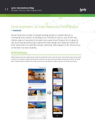
- 1. 1 Lyris Connections Blog Excerpts From Our Most Popular Posts Email Inspiration: Six Great Responsive Email Designs By Andrew King We all know the number of people reading emails on mobile devices is increasing every month. According to our friends at Litmus, 22% of the 109 million opens it recorded in October 2012 came from iPhones! So it’s great to see some brands embracing responsive email design and making it easier for their subscribers to read their emails, wherever they happen to be. Here are six of the best I’ve seen recently. British Airways British Airways has been optimizing its emails for mobile devices for some time now. The modular layout of this email is perfect for responsive design and allows the email to be easily restructured without hiding any content. The “Read More” buttons that are added to the mobile version also look great and make it easier to click with your thumb.
- 2. 2 Lyris Connections Blog Excerpts From Our Most Popular Posts REI I wouldn’t have guessed that this email had a responsive design from looking at the full size version. So I was pleasantly surprised when I viewed it on my mobile! By hiding the two large images on the right, REI is able to create a single column layout without losing any of the main calls-to-action.
- 3. 3 Lyris Connections Blog Excerpts From Our Most Popular Posts Virgin Trains Virgin Trains realizes that a lot of its subscribers will be regular travellers, so it makes sense to optimize for mobile. In this email, the company has removed the navigation, re-sized the main headline so it really stands out, removed any unessential text, and added some useful links for travellers to the footer.
- 4. 4 Lyris Connections Blog Excerpts From Our Most Popular Posts Gilt Gilt has a fairly simple but effective responsive email design. The left column containing navigation links is removed, the free shipping banner has been re-sized, and some non-vital links within the navigation disappear. I can see why Gilt didn’t go for a single column layout, as the email would become incredibly long.
- 5. 5 Lyris Connections Blog Excerpts From Our Most Popular Posts House of Fraser Here’s another great example of responsive email design from House of Fraser. By removing the navigation and changing the layout from four to two products, the email instantly becomes much easier to read on a mobile. Responsive email design doesn’t have to involve a complete re-design of your email; removing anything unnecessary and ensuring the layout is not more than two columns can dramatically improve the email’s readability on a small screen.
- 6. lyris.comCopyright © 2014 Lyris, Inc. All rights reserved. About Lyris Inc: Lyris (@Lyris ) is a leading global provider of digital marketing solutions that help companies engage with customers in more meaningful ways. Lyris products and services empower marketers to design, automate, and optimize data- driven interactive marketing campaigns that facilitate superior engagement, increase conversions, and deliver measurable business value. Lyris’ high-performance, secure, and flexible digital marketing platforms improve marketing efficiency by providing automated digital message delivery, robust segmentation, and real-time digital channel analytics. The Lyris solutions portfolio is comprised of both in-the-cloud and on-premises offerings – Lyris HQ and Lyris LM – combined with customer-focused services and support. More than 5,000 companies worldwide partner with Lyris to manage and execute sophisticated digital marketing campaigns across email, social, Web, and mobile channels. Learn more at www.lyris.com. Inside Lyris Newsletter At Lyris, we recognize that a lot of our own readers also use mobile devices to read our website and emails. So we’ve optimized both for mobile devices using responsive design. Here’s an example of our Inside Lyris newsletter. If you want to see for yourself how it transforms when viewed on a small screen, simply view it here and reduce the width of your Web browser. Cool, huh? Keep up with the latest industry trends, developments and best practices for continuously optimizing your digital marketing campaigns. Visit Lyris Connections Blog