
Empfohlen
Weitere ähnliche Inhalte
Was ist angesagt?
Was ist angesagt? (16)
Ähnlich wie Advert deconstruction
Ähnlich wie Advert deconstruction (20)
Mehr von LukaWheeler
Mehr von LukaWheeler (20)
Advert deconstruction
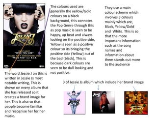
- 1. The colours used are They use a main generally the yellow/Gold colour scheme which colours on a black involves 3 colours background, this connotes mainly which are, the Pop Genre through this Black, Yellow/Gold as pop music is seen to be and White. This is so happy, up beat and always that the more looking on the positive side, important information Yellow is seen as a positive such as the song colour so its bringing the names and positive side (Yellow) out of information about the bad (black), This is them stands out more because dark colours are to the audience seen to be dull looking and The word Jessie J on this is not positive. written in Jessie Js most notable writing, This is 3 of Jessie Js album which include her brand image shown on every album that she has released so it creates a brand image for her, This is also so that people become familiar and recognise her for her music.
- 2. Olly Murs’s brand The colours used on this are image would mainly Red, White and Black, They use be the font in which these colour variations to moist things are create the most important word written in, this is so ‘Olly Murs’ to stand out, this is peoiple become done by putting it on the white familiar with his background. The usage of white albums etc.. on the red background again makes the release date stand The font used in this is out, so people recognise it the same font used in easily and finally the pictures of most of his album work him are in the darkest colour on or even all of it, This is so the white which again creates people recognise it and them to be more visualised to relate it to him. the viewers. The way Olly Murs is dressed in this would be seen as his ‘Star Image’ this would be seen as skinny jeans, Shirt and a Trilby, this is so that people recognise him and can associate to him easily.