SlideShare ist ein Scribd-Unternehmen logo
1 von 5
Colour Scheme: The grey and light
blue colour scheme is understated,
yet at the same time effective. By
using these dull colours, it
automatically draws the eye to the
red heart, which makes our
primary focus on the artist.
They also chose an artist that is
renowned for his extravagant
fashion sense, which links in with
the fashion section. With it being a
music magazine, the addition of a
fashion segment differentiates it
from the competition, and will
entice a wider range of readers.
Header: The word ‘contents’ has
been separated into three lines,
which means it avoids having to be
spread across the page, and cover
the letter ‘V’ which represents the
name of the magazine. It is also
large and bold so that it stands out
on the dull colour scheme of the
page
Layout: This contents page
does not have much
information on it, and it is
much more visual than
most. The simple layout of
the majority of the text to
the right of the page, and
the picture to the left
Central Image: The image of KanyeWest
is in black and white in order to fit in
with the colour scheme, with the only
aspect of bright colour being the love
heart held by a woman’s hand. This
adds an emotional depth to the picture
which correlates with his facial
expression. The heart is probably a
reference to his album ‘808’s &
Heartbreak’.
The posh, calligraphy style font used adds
a sense of class, giving it a more
professional look.
Kanye’s clothing doesn’t have
the stereotypical rapper look
about them, reinforcing the
idea of him being a fashion icon.
His clothingare of dull colours
like the scheme and portray him
as a ‘sophisticated rapper’,
fitting in with the overall
professional look of the page.
Central Image: A stereotypical rapper
‘Plies’, with tattoo’s, gold
teeth,expensive, flashy jewellery and a
hat. He presents himself as quite
arrogant due to him showing off both his
body and wearing an over the top
amount of chains. By doing this it
presents him as someone who likes to
show off his wealth. The diamond
studded balaclava (which would be
stereotypically used by robbers etc.)
chain with the word ‘Goon’ on it,
glamorises criminal activity, further
supporting the thug like image he is
portraying.
Header: Has the same three lined
structure in every issue,
differentiating the magazine, which
may connote that the magazine has
something different/special to
offer.
Layout: The contents information has
been placed of the left side, and split into
two sections for easy reading. By placing
it to the left, it allows the central image to
dominate the page, suggesting that this is
what they want to be the main focus.
Background: The
burgundy background
connotes class and
sophistication, which
could be the values the
magazine wants to
portray, suggesting its
superiority. The ‘V’ is
subtle, yet easily visible
and promotes the brands
identity.
The posh, calligraphy style font used adds
a sense of class, giving it a more
professional look.
Colour scheme: The white font on
the burgundy background gives the
page a more professional look. This
is due to the simplicity of the use of
only two colours making it look less
childish and more formal.
Header: The font style is quite
different, but isn’t very clear or
easy to read. It is also quite small,
and therefore does not stand out
as, or immediately attract the
attention of the eye. The white
font on the red background
however, makes it stand out more
than if it was on the dull red
background.
Layout: The rapper ‘GZA’ is
predominately to the right of the page,
whilst the contents information is to the
right. By keeping the two separate it
allows for easy reading. The layout is very
simple, and with only the basic features
used.
Central Image: Therapper GZA
doesn’t have the stereotypical
over the top thug look about
him that the majority of
rappers portray. This is due to
his lack of jewellery, his bright
orange jacket, and his ‘soft’
looking pose. His hand on his
chin and the way he is looking
directly into the camera,
conduct him to look very
thoughtful, and as if he has a
story to tell, adding a sense of
mystery and depth to him.
Colour scheme: The predominately red and white
colour scheme, with a bit of black is quite plain
and boring to look at. However, the magazine may
have been trying to portray the magazine as being
more formal, and as if it is full of beneficial
content. The tone of red is quite dull, which allows
the bright orange of his jacket to stand out more,
and therefore direct the attention onto the
central image.
Font: The style is very
basic, allowing for easy
reading. It looks neither
childish nor formal,
suggesting the
magazine’s content will
also be somewhere in
the middle.
By placing the page number of the main
article in a bigger font under the relevant
central image, it tells us that he is the
selling point. Meaning those who bought
it specifically for the rapper, have no
trouble finding the page.
Layout: This is not the usual contents
page layout. The majority of contents
information in is accompanied by an
image of an artist. This will entice
consumers as it is mostly visual, therefore
making it easier to follow and
understand. The image of the woman
pouting is significantly bigger than the
other images, instantly telling us she is
the artist that the magazine is focusing
on, which is further suggested by having
her slightly covering the header.
Header: The header goes across the entire
page, and is in a bold font of lower case
letters. By doing this is makes it stand out and
easy to read, however by not using capitals
like the majority of magazines do, it adds
some individuality to the title.
The magazines masthead is small
and neatly placed to the right of
the page. This is a small
representation of the magazine,
and without making it dramatically
big it adds a professional look.
The inclusion of the ‘less
important’ stories at the
bottom page, are there to
simply make the consumer
aware that they are there,
in hope of maintaining
interest, through the buzz
word ‘PLUS’.
The Issue date informs
any readers of when
the next issue will be
available, informing
consumers that they
are issued monthly.
Central Image: Unusually the
image is not of a music artist, but
model, actress, stylist, &
entrepreneurKeyshia Dior. By
choosing her as the main focus, it
shows the magazines versatility
of its content. Her body language
portrays her as extremely
confident, with her pout and up
right stance connoting she views
herself as superior, but at the
same time adding a sense of
humour. Her clothing is slightly
revealing but by her posing to
the side it presents her as being
confident and in control of how
she portrays herself. She is
dressed in all black, connoting
power, mystery and danger.
Colour scheme: The predominately
black and white scheme, with
small amounts of red, allows the
magazine to make the graphic
features to be the main focus. The
simplicity of the scheme adds a
professional look, and shows that
the target audience is likely to be
in their late teens/early 20’s.
Central Image: The image of rapper Rick Ross renowned
for consistently removing his shirt when rapping, poses
with only an open jacket on. This allows his tattoos to be
seen and present him as carefree, and not valuing others
opinions on it. His sunglasses enforce the stereotypical
rapper image, which can also be viewed as arrogance, as if
he is superior. He is wearing the prestigious colour black
which has connotations of power, strength and mystery.
Layout: The central image is
immediately what catches the
attention of the eye, due to it
being placed directly in the
middle of the page. This
instantly informs us that the
rapper Rick Ross will be the
main focus of the magazine.
The contents information is
placed to the right of the page,
with a basic layout, making it
easy to understand. The header
is subtly placed the right,
alongside the main article, a
cover story, which is on the
artist in the central image.
A mention of the
photographer, who held the
photo shoot for the front and
contents page. Doubling up as
an advertisement, in case any
consumers liked his work.
Colour scheme:
Predominately white, with
a slight inclusion of yellow.
This is due to the dark
background, and clothing
of the artist, this means
the page is less dull and
easier to read.
Header: This is placed sideways
along the right side of the
magazine, by doing this is
allows more room for content
information. It is written in
bold white, which doesn’t
significantly stand out amongst
the other text.

Weitere ähnliche Inhalte

Was ist angesagt? (16)

Front cover analysis
Front cover analysisFront cover analysis
Front cover analysis
 
Magazine Analysis
Magazine AnalysisMagazine Analysis
Magazine Analysis
 
Magazine analysis
Magazine analysisMagazine analysis
Magazine analysis
 
Magazine analysis
Magazine analysisMagazine analysis
Magazine analysis
 
Cover page analysis
Cover page analysis Cover page analysis
Cover page analysis
 
Textual analysis
Textual analysisTextual analysis
Textual analysis
 
Industry analysis
Industry analysisIndustry analysis
Industry analysis
 
Q
QQ
Q
 
Analysisi of magaixzne
Analysisi of magaixzneAnalysisi of magaixzne
Analysisi of magaixzne
 
ANALYSIS OF FRONT COVERS
ANALYSIS OF FRONT COVERSANALYSIS OF FRONT COVERS
ANALYSIS OF FRONT COVERS
 
Xxl magazine analysis
Xxl magazine analysisXxl magazine analysis
Xxl magazine analysis
 
Media studies xxl magazine analysis pdf
Media studies xxl magazine analysis pdfMedia studies xxl magazine analysis pdf
Media studies xxl magazine analysis pdf
 
Magazine analysis
Magazine analysis    Magazine analysis
Magazine analysis
 
Question 1
Question 1Question 1
Question 1
 
Semiotic analysis of a magazine cover
Semiotic analysis of a magazine coverSemiotic analysis of a magazine cover
Semiotic analysis of a magazine cover
 
Med
MedMed
Med
 

Andere mochten auch (9)

Silent night meeting01-26-12
Silent night meeting01-26-12Silent night meeting01-26-12
Silent night meeting01-26-12
 
Skydrive
SkydriveSkydrive
Skydrive
 
Genre conventions planning task 2
Genre conventions  planning task 2Genre conventions  planning task 2
Genre conventions planning task 2
 
Cn tu12 1_alt_landcon_presentation_coen_ritsema_final
Cn tu12 1_alt_landcon_presentation_coen_ritsema_finalCn tu12 1_alt_landcon_presentation_coen_ritsema_final
Cn tu12 1_alt_landcon_presentation_coen_ritsema_final
 
Bridging the Productivity Gap
Bridging the Productivity GapBridging the Productivity Gap
Bridging the Productivity Gap
 
Igualdad en san sebastian de los reyes
Igualdad en san sebastian de los reyesIgualdad en san sebastian de los reyes
Igualdad en san sebastian de los reyes
 
360i® Visioning Dynamics
360i® Visioning Dynamics360i® Visioning Dynamics
360i® Visioning Dynamics
 
Тренировка
ТренировкаТренировка
Тренировка
 
MINERGIE-A-ECO - Von der Vision zur Realisation des Zukunftshauses
MINERGIE-A-ECO - Von der Vision zur Realisation des ZukunftshausesMINERGIE-A-ECO - Von der Vision zur Realisation des Zukunftshauses
MINERGIE-A-ECO - Von der Vision zur Realisation des Zukunftshauses
 

Ähnlich wie Music magazine contents analysis (20)

Magazine Analysis
Magazine AnalysisMagazine Analysis
Magazine Analysis
 
Analysis of magazines
Analysis of magazinesAnalysis of magazines
Analysis of magazines
 
Analyising music magazines
Analyising music magazinesAnalyising music magazines
Analyising music magazines
 
Magazine Cover Analysis
Magazine Cover AnalysisMagazine Cover Analysis
Magazine Cover Analysis
 
Deconstruction practice
Deconstruction practiceDeconstruction practice
Deconstruction practice
 
Music magazine analysis
Music magazine analysisMusic magazine analysis
Music magazine analysis
 
Analyising music magazines
Analyising music magazinesAnalyising music magazines
Analyising music magazines
 
Analyising music magazines
Analyising music magazinesAnalyising music magazines
Analyising music magazines
 
Dizze rascal
Dizze rascalDizze rascal
Dizze rascal
 
Dizze rascal
Dizze rascalDizze rascal
Dizze rascal
 
Dizze rascal
Dizze rascalDizze rascal
Dizze rascal
 
Analyising music magazines
Analyising music magazinesAnalyising music magazines
Analyising music magazines
 
annotated front covers
annotated front coversannotated front covers
annotated front covers
 
Magazine Research
Magazine ResearchMagazine Research
Magazine Research
 
Evaluation Question 1
Evaluation Question 1Evaluation Question 1
Evaluation Question 1
 
Evaluation q1 22
Evaluation q1 22Evaluation q1 22
Evaluation q1 22
 
Nme analysis
Nme analysisNme analysis
Nme analysis
 
Pop music magazine
Pop music magazinePop music magazine
Pop music magazine
 
Textual analysis 1
Textual analysis 1Textual analysis 1
Textual analysis 1
 
Music Magazine Analysis
Music Magazine AnalysisMusic Magazine Analysis
Music Magazine Analysis
 

Mehr von Louisha26

Printscreen trailer
Printscreen trailerPrintscreen trailer
Printscreen trailer
Louisha26
 
Behind the scenes set, make-up and props
Behind the scenes set, make-up and propsBehind the scenes set, make-up and props
Behind the scenes set, make-up and props
Louisha26
 
The making of my film magazine printscreens
The making of my film magazine printscreensThe making of my film magazine printscreens
The making of my film magazine printscreens
Louisha26
 
The making of my film poster printscreens
The making of my film poster printscreensThe making of my film poster printscreens
The making of my film poster printscreens
Louisha26
 
Analyse 6 film posters task 7
Analyse 6 film posters  task 7Analyse 6 film posters  task 7
Analyse 6 film posters task 7
Louisha26
 
Film trailers task 1
Film trailers  task 1Film trailers  task 1
Film trailers task 1
Louisha26
 
College mag contents analysis
College mag contents analysisCollege mag contents analysis
College mag contents analysis
Louisha26
 
Flat plan template
Flat plan templateFlat plan template
Flat plan template
Louisha26
 
The 3 mock ups
The 3 mock upsThe 3 mock ups
The 3 mock ups
Louisha26
 
The making of my contents page
The making of my contents pageThe making of my contents page
The making of my contents page
Louisha26
 
Questionnaire analysis
Questionnaire analysisQuestionnaire analysis
Questionnaire analysis
Louisha26
 
Location recess
Location recessLocation recess
Location recess
Louisha26
 
Focus group 2
Focus group 2Focus group 2
Focus group 2
Louisha26
 
The process of making my double page spread
The process of making my double page spreadThe process of making my double page spread
The process of making my double page spread
Louisha26
 
The process of making my front cover
The process of making my front coverThe process of making my front cover
The process of making my front cover
Louisha26
 
The process of making my front cover
The process of making my front coverThe process of making my front cover
The process of making my front cover
Louisha26
 
Masthead choices
Masthead choicesMasthead choices
Masthead choices
Louisha26
 
Masthead choices
Masthead choicesMasthead choices
Masthead choices
Louisha26
 
Masthead summary
Masthead summaryMasthead summary
Masthead summary
Louisha26
 

Mehr von Louisha26 (20)

Printscreen trailer
Printscreen trailerPrintscreen trailer
Printscreen trailer
 
Behind the scenes set, make-up and props
Behind the scenes set, make-up and propsBehind the scenes set, make-up and props
Behind the scenes set, make-up and props
 
The making of my film magazine printscreens
The making of my film magazine printscreensThe making of my film magazine printscreens
The making of my film magazine printscreens
 
The making of my film poster printscreens
The making of my film poster printscreensThe making of my film poster printscreens
The making of my film poster printscreens
 
Analyse 6 film posters task 7
Analyse 6 film posters  task 7Analyse 6 film posters  task 7
Analyse 6 film posters task 7
 
Film trailers task 1
Film trailers  task 1Film trailers  task 1
Film trailers task 1
 
College mag contents analysis
College mag contents analysisCollege mag contents analysis
College mag contents analysis
 
Flat plan template
Flat plan templateFlat plan template
Flat plan template
 
Bubbl
BubblBubbl
Bubbl
 
The 3 mock ups
The 3 mock upsThe 3 mock ups
The 3 mock ups
 
The making of my contents page
The making of my contents pageThe making of my contents page
The making of my contents page
 
Questionnaire analysis
Questionnaire analysisQuestionnaire analysis
Questionnaire analysis
 
Location recess
Location recessLocation recess
Location recess
 
Focus group 2
Focus group 2Focus group 2
Focus group 2
 
The process of making my double page spread
The process of making my double page spreadThe process of making my double page spread
The process of making my double page spread
 
The process of making my front cover
The process of making my front coverThe process of making my front cover
The process of making my front cover
 
The process of making my front cover
The process of making my front coverThe process of making my front cover
The process of making my front cover
 
Masthead choices
Masthead choicesMasthead choices
Masthead choices
 
Masthead choices
Masthead choicesMasthead choices
Masthead choices
 
Masthead summary
Masthead summaryMasthead summary
Masthead summary
 

Kürzlich hochgeladen

Histor y of HAM Radio presentation slide
Histor y of HAM Radio presentation slideHistor y of HAM Radio presentation slide
Histor y of HAM Radio presentation slide
vu2urc
 
CNv6 Instructor Chapter 6 Quality of Service
CNv6 Instructor Chapter 6 Quality of ServiceCNv6 Instructor Chapter 6 Quality of Service
CNv6 Instructor Chapter 6 Quality of Service
giselly40
 

Kürzlich hochgeladen (20)

Boost PC performance: How more available memory can improve productivity
Boost PC performance: How more available memory can improve productivityBoost PC performance: How more available memory can improve productivity
Boost PC performance: How more available memory can improve productivity
 
How to Troubleshoot Apps for the Modern Connected Worker
How to Troubleshoot Apps for the Modern Connected WorkerHow to Troubleshoot Apps for the Modern Connected Worker
How to Troubleshoot Apps for the Modern Connected Worker
 
Advantages of Hiring UIUX Design Service Providers for Your Business
Advantages of Hiring UIUX Design Service Providers for Your BusinessAdvantages of Hiring UIUX Design Service Providers for Your Business
Advantages of Hiring UIUX Design Service Providers for Your Business
 
Bajaj Allianz Life Insurance Company - Insurer Innovation Award 2024
Bajaj Allianz Life Insurance Company - Insurer Innovation Award 2024Bajaj Allianz Life Insurance Company - Insurer Innovation Award 2024
Bajaj Allianz Life Insurance Company - Insurer Innovation Award 2024
 
Slack Application Development 101 Slides
Slack Application Development 101 SlidesSlack Application Development 101 Slides
Slack Application Development 101 Slides
 
Workshop - Best of Both Worlds_ Combine KG and Vector search for enhanced R...
Workshop - Best of Both Worlds_ Combine  KG and Vector search for  enhanced R...Workshop - Best of Both Worlds_ Combine  KG and Vector search for  enhanced R...
Workshop - Best of Both Worlds_ Combine KG and Vector search for enhanced R...
 
Finology Group – Insurtech Innovation Award 2024
Finology Group – Insurtech Innovation Award 2024Finology Group – Insurtech Innovation Award 2024
Finology Group – Insurtech Innovation Award 2024
 
Data Cloud, More than a CDP by Matt Robison
Data Cloud, More than a CDP by Matt RobisonData Cloud, More than a CDP by Matt Robison
Data Cloud, More than a CDP by Matt Robison
 
Histor y of HAM Radio presentation slide
Histor y of HAM Radio presentation slideHistor y of HAM Radio presentation slide
Histor y of HAM Radio presentation slide
 
Driving Behavioral Change for Information Management through Data-Driven Gree...
Driving Behavioral Change for Information Management through Data-Driven Gree...Driving Behavioral Change for Information Management through Data-Driven Gree...
Driving Behavioral Change for Information Management through Data-Driven Gree...
 
Automating Google Workspace (GWS) & more with Apps Script
Automating Google Workspace (GWS) & more with Apps ScriptAutomating Google Workspace (GWS) & more with Apps Script
Automating Google Workspace (GWS) & more with Apps Script
 
Axa Assurance Maroc - Insurer Innovation Award 2024
Axa Assurance Maroc - Insurer Innovation Award 2024Axa Assurance Maroc - Insurer Innovation Award 2024
Axa Assurance Maroc - Insurer Innovation Award 2024
 
Breaking the Kubernetes Kill Chain: Host Path Mount
Breaking the Kubernetes Kill Chain: Host Path MountBreaking the Kubernetes Kill Chain: Host Path Mount
Breaking the Kubernetes Kill Chain: Host Path Mount
 
08448380779 Call Girls In Greater Kailash - I Women Seeking Men
08448380779 Call Girls In Greater Kailash - I Women Seeking Men08448380779 Call Girls In Greater Kailash - I Women Seeking Men
08448380779 Call Girls In Greater Kailash - I Women Seeking Men
 
Tata AIG General Insurance Company - Insurer Innovation Award 2024
Tata AIG General Insurance Company - Insurer Innovation Award 2024Tata AIG General Insurance Company - Insurer Innovation Award 2024
Tata AIG General Insurance Company - Insurer Innovation Award 2024
 
CNv6 Instructor Chapter 6 Quality of Service
CNv6 Instructor Chapter 6 Quality of ServiceCNv6 Instructor Chapter 6 Quality of Service
CNv6 Instructor Chapter 6 Quality of Service
 
Exploring the Future Potential of AI-Enabled Smartphone Processors
Exploring the Future Potential of AI-Enabled Smartphone ProcessorsExploring the Future Potential of AI-Enabled Smartphone Processors
Exploring the Future Potential of AI-Enabled Smartphone Processors
 
Presentation on how to chat with PDF using ChatGPT code interpreter
Presentation on how to chat with PDF using ChatGPT code interpreterPresentation on how to chat with PDF using ChatGPT code interpreter
Presentation on how to chat with PDF using ChatGPT code interpreter
 
TrustArc Webinar - Stay Ahead of US State Data Privacy Law Developments
TrustArc Webinar - Stay Ahead of US State Data Privacy Law DevelopmentsTrustArc Webinar - Stay Ahead of US State Data Privacy Law Developments
TrustArc Webinar - Stay Ahead of US State Data Privacy Law Developments
 
04-2024-HHUG-Sales-and-Marketing-Alignment.pptx
04-2024-HHUG-Sales-and-Marketing-Alignment.pptx04-2024-HHUG-Sales-and-Marketing-Alignment.pptx
04-2024-HHUG-Sales-and-Marketing-Alignment.pptx
 

Music magazine contents analysis

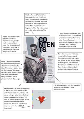
  • 1. Colour Scheme: The grey and light blue colour scheme is understated, yet at the same time effective. By using these dull colours, it automatically draws the eye to the red heart, which makes our primary focus on the artist. They also chose an artist that is renowned for his extravagant fashion sense, which links in with the fashion section. With it being a music magazine, the addition of a fashion segment differentiates it from the competition, and will entice a wider range of readers. Header: The word ‘contents’ has been separated into three lines, which means it avoids having to be spread across the page, and cover the letter ‘V’ which represents the name of the magazine. It is also large and bold so that it stands out on the dull colour scheme of the page Layout: This contents page does not have much information on it, and it is much more visual than most. The simple layout of the majority of the text to the right of the page, and the picture to the left Central Image: The image of KanyeWest is in black and white in order to fit in with the colour scheme, with the only aspect of bright colour being the love heart held by a woman’s hand. This adds an emotional depth to the picture which correlates with his facial expression. The heart is probably a reference to his album ‘808’s & Heartbreak’. The posh, calligraphy style font used adds a sense of class, giving it a more professional look. Kanye’s clothing doesn’t have the stereotypical rapper look about them, reinforcing the idea of him being a fashion icon. His clothingare of dull colours like the scheme and portray him as a ‘sophisticated rapper’, fitting in with the overall professional look of the page.
  • 2. Central Image: A stereotypical rapper ‘Plies’, with tattoo’s, gold teeth,expensive, flashy jewellery and a hat. He presents himself as quite arrogant due to him showing off both his body and wearing an over the top amount of chains. By doing this it presents him as someone who likes to show off his wealth. The diamond studded balaclava (which would be stereotypically used by robbers etc.) chain with the word ‘Goon’ on it, glamorises criminal activity, further supporting the thug like image he is portraying. Header: Has the same three lined structure in every issue, differentiating the magazine, which may connote that the magazine has something different/special to offer. Layout: The contents information has been placed of the left side, and split into two sections for easy reading. By placing it to the left, it allows the central image to dominate the page, suggesting that this is what they want to be the main focus. Background: The burgundy background connotes class and sophistication, which could be the values the magazine wants to portray, suggesting its superiority. The ‘V’ is subtle, yet easily visible and promotes the brands identity. The posh, calligraphy style font used adds a sense of class, giving it a more professional look. Colour scheme: The white font on the burgundy background gives the page a more professional look. This is due to the simplicity of the use of only two colours making it look less childish and more formal.
  • 3. Header: The font style is quite different, but isn’t very clear or easy to read. It is also quite small, and therefore does not stand out as, or immediately attract the attention of the eye. The white font on the red background however, makes it stand out more than if it was on the dull red background. Layout: The rapper ‘GZA’ is predominately to the right of the page, whilst the contents information is to the right. By keeping the two separate it allows for easy reading. The layout is very simple, and with only the basic features used. Central Image: Therapper GZA doesn’t have the stereotypical over the top thug look about him that the majority of rappers portray. This is due to his lack of jewellery, his bright orange jacket, and his ‘soft’ looking pose. His hand on his chin and the way he is looking directly into the camera, conduct him to look very thoughtful, and as if he has a story to tell, adding a sense of mystery and depth to him. Colour scheme: The predominately red and white colour scheme, with a bit of black is quite plain and boring to look at. However, the magazine may have been trying to portray the magazine as being more formal, and as if it is full of beneficial content. The tone of red is quite dull, which allows the bright orange of his jacket to stand out more, and therefore direct the attention onto the central image. Font: The style is very basic, allowing for easy reading. It looks neither childish nor formal, suggesting the magazine’s content will also be somewhere in the middle. By placing the page number of the main article in a bigger font under the relevant central image, it tells us that he is the selling point. Meaning those who bought it specifically for the rapper, have no trouble finding the page.
  • 4. Layout: This is not the usual contents page layout. The majority of contents information in is accompanied by an image of an artist. This will entice consumers as it is mostly visual, therefore making it easier to follow and understand. The image of the woman pouting is significantly bigger than the other images, instantly telling us she is the artist that the magazine is focusing on, which is further suggested by having her slightly covering the header. Header: The header goes across the entire page, and is in a bold font of lower case letters. By doing this is makes it stand out and easy to read, however by not using capitals like the majority of magazines do, it adds some individuality to the title. The magazines masthead is small and neatly placed to the right of the page. This is a small representation of the magazine, and without making it dramatically big it adds a professional look. The inclusion of the ‘less important’ stories at the bottom page, are there to simply make the consumer aware that they are there, in hope of maintaining interest, through the buzz word ‘PLUS’. The Issue date informs any readers of when the next issue will be available, informing consumers that they are issued monthly. Central Image: Unusually the image is not of a music artist, but model, actress, stylist, & entrepreneurKeyshia Dior. By choosing her as the main focus, it shows the magazines versatility of its content. Her body language portrays her as extremely confident, with her pout and up right stance connoting she views herself as superior, but at the same time adding a sense of humour. Her clothing is slightly revealing but by her posing to the side it presents her as being confident and in control of how she portrays herself. She is dressed in all black, connoting power, mystery and danger. Colour scheme: The predominately black and white scheme, with small amounts of red, allows the magazine to make the graphic features to be the main focus. The simplicity of the scheme adds a professional look, and shows that the target audience is likely to be in their late teens/early 20’s.
  • 5. Central Image: The image of rapper Rick Ross renowned for consistently removing his shirt when rapping, poses with only an open jacket on. This allows his tattoos to be seen and present him as carefree, and not valuing others opinions on it. His sunglasses enforce the stereotypical rapper image, which can also be viewed as arrogance, as if he is superior. He is wearing the prestigious colour black which has connotations of power, strength and mystery. Layout: The central image is immediately what catches the attention of the eye, due to it being placed directly in the middle of the page. This instantly informs us that the rapper Rick Ross will be the main focus of the magazine. The contents information is placed to the right of the page, with a basic layout, making it easy to understand. The header is subtly placed the right, alongside the main article, a cover story, which is on the artist in the central image. A mention of the photographer, who held the photo shoot for the front and contents page. Doubling up as an advertisement, in case any consumers liked his work. Colour scheme: Predominately white, with a slight inclusion of yellow. This is due to the dark background, and clothing of the artist, this means the page is less dull and easier to read. Header: This is placed sideways along the right side of the magazine, by doing this is allows more room for content information. It is written in bold white, which doesn’t significantly stand out amongst the other text.