1. A) B)
C) D)
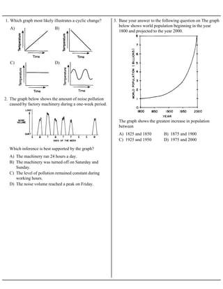
1. Which graph most likely illustrates a cyclic change?
2. The graph below shows the amount of noise pollution
caused by factory machinery during a one-week period.
A) The machinery ran 24 hours a day.
B) The machinery was turned off on Saturday and
Sunday.
C) The level of pollution remained constant during
working hours.
D) The noise volume reached a peak on Friday.
Which inference is best supported by the graph?
3. Base your answer to the following question on The graph
below shows world population beginning in the year
1800 and projected to the year 2000.
A) 1825 and 1850 B) 1875 and 1900
C) 1925 and 1950 D) 1975 and 2000
The graph shows the greatest increase in population
between
2. 4. Base your answer to the following question on the diagrams below which represents the same rock material
at five stages of development. The graph below shows the temperature and depth of burial at which stages A
through D develop Stage E has intentionally been omitted from the graph.
A) 10 km B) 7 km C) 3 km D) 0 km
According to the graph, gneiss is formed at a depth of approximately
3. 5. Base your answer to the following question on the graph below, which shows the water levels of ocean tides
measured in Boston, Massachusetts, for a 2-day period.
A) 3.5 hours B) 6.0 hours C) 12.5 hours D) 16.0 hours
The graph shows that high tides at Boston occur approximately every
4. 6. The graph below indicates the average number of
daylight hours and the average surface air temperature
over a 12-month period at a specific location on the
Earth.
A) on June 21
B) between June 21 and September 23
C) on December 21
D) between December 21 and March 21
Based on the graph, the highest average surface air
temperature occurs
A) B)
C) D)
7. Which graph best represents human population growth?
8. The graph below represents the relationship between the
intensity and wavelength of the Sun's electromagnetic
radiation.
A) The infrared radiation given off by the Sun occurs at
a wavelength of 2,000 angstroms.
B) The maximum intensity of radiation given off by the
Sun occurs in the visible region.
C) The infrared radiation given off by the Sun has a
shorter wavelength than ultraviolet radiation.
D) The electromagnetic energy given off by the Sun
consists of a single wavelength.
Which statement is best supported by the graph?
5. 9. Base your answer to the following question on the graph
below which shows the amount of heat energy (calories)
needed to raise the temperature of 1-gram samples of
four different materials.
A) The same amount of heat energy is required to raise
the temperature of each material by 10 Celsius
degrees.
B) The temperature of a material with a high specific
heat is raised faster than that of a material with a
low specific heat.
C) Three of the four materials have the same specific
heat.
D) The amount of heat energy needed to produce an
equal temperature change varies with the materials
heated.
Which statement is best supported by the graph?
10. Base your answer to the following question on the
graph below. The graph shows temperature data taken
at four different depths in the soil at one location on
Long Island, New York, for one year.
A) decreases B) increases
C) remains the same
The graph shows that as depth increases, the annual
temperature range
6. 11. Base your answer to the following question on the graph below, which shows changes in the Sun’s
magnetic activity and changes in the number of sunspots over a period of approximately 100 years.
Sunspots are dark, cooler areas within the Sun’s photosphere that can be seen from Earth.
A) randomly and unpredictably
B) precisely at the beginning of each decade
C) in a cyclic pattern, repeating approximately every 6 years
D) in a cyclic pattern, repeating approximately every 11 years
The graph indicates that years having the greatest number of sunspots occur
12. Base your answer to the following question on the graph below, which shows the amount of insolation
during one year at four different latitudes on Earth’s surface.
A) latitude and time of day B) latitude and time of year
C) longitude and time of day D) longitude and time of year
This graph shows that insolation varies with
7. 13. Base your answer to the following question on the weather map provided below, which shows surface
air-pressure readings, in millibars, at various locations in the United States and Canada. The 1020-millibar
isobars have been drawn and labeled.
Draw the 1024- and 1028-millibar isobars on the weather map provided above.
8. 14. Base your answer to the following question on the two maps and on your knowledge of Earth science. Both
maps show data from a December snowstorm. Map 1 shows the snowfall, measured in inches, at various
locations in New York State, Pennsylvania, and New Jersey. Map 2 shows weather conditions in New
York State and the surrounding region during the storm. Letter L represents the center of the low-pressure
system that produced the snowstorm. Isobars show air pressure, in millibars.
Toward which compass direction would this low-pressure center most likely have moved if this system
followed a normal storm track?
9. 15. Base your answer to the following question on the field map provided below. The field map shows air
temperature at specific locations in an area near a school in Maine. Part of this area is a blacktop parking
lot. Accurate temperature readings were taken by Earth science students at 10 a.m. on June 1. Two
reference points, A and B, are shown.
On the field map provided, draw only the 15°C and the 20°C isotherms. Isotherms must be extended to the
edge of the map.
10. 16. Base your answer to the following question on the temperature field map below. The map shows
temperature readings (°C) recorded by students in a science classroom. The readings were taken at the
same time at floor level. Temperature readings for points A and B are labeled on the map.
On the temperature field map, use solid lines to draw the 18°C, 20°C, and 22°C isotherms. Isotherms must
extend to the boundary of the map. Label each isotherm to indicate its temperature.
11. 17. Base your answer to the following question on
the weather map provided, which shows partial
weather-station data for several cities in eastern North
America.
On the weather map provided, draw isotherms every
10°F, starting with 40°F and ending with 70°F.
Isotherms must extend to the edges of the map.
12. 18. Base your answer to the following question on the field map below. The field map shows temperatures, in
degrees Fahrenheit, taken at several locations on a blacktop parking lot in New York State. The
temperatures were recorded at 11:00 a.m. in early June.
On the field map above, draw the 70°F and 80°F isotherms. The isotherms should be extended to the edges
of the map.
19. Base your answer to the following question on the weather map below, which shows temperature readings
at weather stations in the continental United States.
On the weather map provided on your answer paper, draw three isotherms: the 40°F isotherm, the 50°F
isotherm, and the 60°F isotherm.
13. 20. Base your answer to the following question on the temperature field map below. the map shows 25
measurements (in °C) that were made in a temperature field and recorded as shown. The dots represent the
exact location of the measurements. A and B are locations within the field.
On the temperature field map above, draw threee isotherms: the 23°C isotherm, the 24°C isotherm, and the
25°C isotherm.
14. 21. Base your answer to the following question on the
temperature field map below. The map shows air
temperatures, in degrees Fahrenheit, recorded at the
same time at weather stations across North America.
The air temperature at location A has been deliberately
left blank.
a On the map provided,use smooth, curved solid lines
to draw the 30°F, 40°F, and 50°F isotherms.
b What is the most probable air temperature at location
A?
15. 22. Base your answer to the following question on the map below, which shows one method of classifying
Earth's surface into latitudinal climate belts. In the tropical climate belt, the average monthly temperatures
never drop below 18°C. In the polar climate belts, the average monthly temperatures never rise above
10°C. The isotherms show the average monthly temperature of the coolest and warmest months. Effects of
elevation have been omitted.
According to the isotherms on the map, locations in the mid-latitude climate belts have average monthly
temperatures between what values?