SlideShare ist ein Scribd-Unternehmen logo
1 von 14
Existing Product Research
Magazine choices Billboard Magazine 2005 Issue I have chosen this magazine to analyse as it is a more modern version of a Billboard Magazine which means I can make comparisons to the earlier issues. This will help me to see how music magazines have developed from the 1980s , to see similarities and what is done differently. My reason for choosing an issue dated 2005 and not 2010 is because this particular issue features Madonna and about her comeback. This relates to the type of magazine that I will be creating as it will be about 80s music acts coming back into the modern music industry. This means that I can see how fairly modern magazines have presented this idea. Billboard Magazine 1986 Issue I will be making a modern magazine however it will be an 80s special therefore I have chosen to analyse this magazine so that I can see how 80s music was presented  in its time. Although Billboard is an American magazine I have still chosen to analyse it as a lot of artists listened to in the 80s in the UK were popular in America too, e.g. Madonna and Michael Jackson. Therefore similar artists that would feature in UK music magazines would also feature in American ones. I have also chosen this specific issue to analyse as it is a special issue focusing on the music of 1986. This will help me to see how a special edition magazine is presented. No 1 Magazine I have chosen to analyse this magazine issue as it is a UK pop magazine released in the 80s. This means I can see how pop music was presented in the UK in the 80s and compare it to the way in which pop music magazines are presented now. I will be able to see the development however can consider using some of the techniques in my own magazine. Smash Hits Magazine Although Smash Hits magazine stopped being published in 2006, I have chosen to analyse this magazine as it shows the conventions of a fairly modern and popular pop music magazine. Another reason for choosing this particular issue is because it was released in 2009 as a one off special edition dedicated to Michael Jackson. This relates to what I am producing as I will be creating a one off 80s music special edition. Analysing this magazine will give me an idea of how a modern special edition issue is presented in the UK.
Front Cover 1 There isn’t much text on this front cover therefore there is little room for writing style. Short simple sentences are used to give an idea of the some of the stories which will appear inside the magazine. The lack of text on the front cover could be due to the audience which suggests either a young audience of not well educated however it could be something to do with the date of release as it was more expensive to print in the 80s.  There are more photos on this front cover compared to text as the little text there is has been written in a big font to take up more room. This suggests the magazine is for a young audience however again more than likely has something to do with its date of release being the 1980s. The fonts used on this page are bold which reflects the fashion of 80s music artists. The bright coloured text also  relates to this idea as well as giving a happy feel which the 80s pop music was. The names ‘Boy George’ and ‘Mike Read’ are written in italics which emphasises them suggesting they are important features within the magazine issue. At the top of the page other artists which feature in the magazine are written, all in different colours which suggests the 80s was filled with a great variety of music acts. The overall look of this front cover is basic but the techniques used are effective. It would be too basic for a modern day audience however I will consider the colours, fonts and photography style when producing my magazine. The photography used on this front cover is posed which suggests the photographs has been taken specifically for this magazine.  This colour scheme for this front cover works well as it uses bright colours which represents the upbeat 80s pop music. The large posed photo central on the magazine front cover works well as Boy George was a popular 80s pop music artist therefore it was a good idea to put him on the front for sales. Although I think this would have been a good front cover for its time it would be too basic for a modern audience and wouldn’t see therefore more text and photos would need to be included.
Contents Page 1 The colour scheme of this contents page is black and white which reflects a newspaper style suggesting the magazine is for an older audience. However  the most likely scenario for the colour scheme being black and white is due to the magazine’s date of release.  The writing style used is simple which suggests a younger audience however the simple writing style is probably due to the date of release. It would have cost more to print in the 80s therefore they would have written less. There is a higher ratio to picture that text on this contents page because its purpose is to inform. However there are still three pictures to make the page more interesting to look at. The images featured are of artists which feature in the magazine therefore they are relevant.  All of the photography used on this contents page is posed. They have been taken using medium shots so there faces can be seen as well as a bit of their clothing, showing the 80s fashion. A variety of fonts are used on this contents page. The main text is written in a simple font so that its easy to read however the main title and sub-headings are written using an italic font to stand out. Artists names such as ‘Bananarama’ are written in a thin but large font, again so this writing stands out. The overall design of this contents page is good as it features a variety of fonts, images and it is simple to read. However for a modern audience colour should be added to make the page brighter.
Double Page Spread 1 This DPS uses a very varied colour scheme with lots of colours. The main colours used are blue, pink and yellow which reflect the brightness of 80s music and fashion.  The photography used on this DPS is live and natural. The photos aren’t posed, instead the audience can see a glimpse of the band’s busy lifestyle. The main article has been written using fairly simple sentences which suggests a young audience, however it would be suitable for an older audience who don’t want to read long, dull articles. Song lyrics don’t feature writing style as they are already pre-written, they are presented in different paragraphs to separate verses to chorus which make it easier to read. The overall look of this DPS is good as it features lots of colour and images as well as an article and songlyrics. It has a lot of variety to suit a wide audience. There is slightly more photography than text on the DPS which suggests a younger audience. Half of the text is song lyrics which isn’t information.  The font used for the main text is simple so that it’s easy to read. However for the main title ‘Bananarama’ a more exciting font is used. Instead of A’s, triangles are used. This reflects the boldness of 80s music. Featuring shapes in the font also suggests the magazine is for a younger audience. Other sub-headings are written using a bold font so that they stand out.
Front Cover 2 The style of photography used on this front cover is mostly posed, with the music acts smiling, again showing that the 80s was a very happy and upbeat decade for its pop music.  The images are made up of  medium close ups and medium shots mostly shot at a straight angle which shows, in detail, some of the popular music stars of 1986 which is what the magazine is about. A couple of long shots are used also, which shows shot variety. The brightness differs from photo to photo which suggests 1986 came with a variety of different music acts.   The colour scheme of this front cover uses a mixture of bright colours. Pop music in the 80s was very upbeat and happy therefore dark colours weren’t heavily used in magazine designs as this would give a morbid feel. This is why this front cover uses red and blue writing for the majority of the text instead of black. Black is used for small text to show date of release and price which is important information so needs to be seen clearly. It is also used for the main title, however some of the letters are filled in with colours; red, yellow and blue to brighten it up. On the front cover there is very little text and it consists of mostly pictures. This is because pictures attract the audience to buy the magazine. If the front cover consisted of lots of writing then the magazine would look very dull and people may not buy it.  This front cover mainly features simple fonts which may have something to do with its date of release. The title is written in a simple bold font however some of the letters are filled in with bright colours to add originality which makes the magazine recognisable. The simple fonts make the text easy to read which suggests the writing isn’t a feature the publisher wants the audience to concentrate on. However the main text, central on the front cover, which reads ‘1986 The year in music and video’ is written in a more fancy font which suggests this is the most important text on the cover.
There is little writing on this front cover however this is because  it is a special addition issue, other issues from his time consisted of a lot of writing. I have chosen this issue as I will be doing a modern magazine but a 80s music special edition. There are no paragraphs of writing, instead short sentences are used single words..  This front cover is very eye catching as it has many colourful pictures of popular music artists. Presenting ‘1986 The year in music and video’ central of the page in bright colours and a bold font makes this information stand out to its audience. Excluding the title, the page is set out in the style of a CD/Record(in its time) as it set out in the same shape and features pictures and the genres included. This adds relevance to what the magazine is about and helps target its audience. Therefore overall I think this is a front cover would have been appealing for its then audience and for a modern audience if slightly more information was given.
Contents Page 2 This contents page features different writing styles. On the left of the page is the contents ‘In the issue’ and is written in a fairly informal way so it is easy to understand. The sections in the magazine have headings and are numbered so that sections can be easily found. On the other side of the page are articles which are set out in a newspaper style which suggests a more educated audience. This shows that the magazine is for a wide audience as it suits different audiences in different sections. The articles are written using more formal language than used on the left side. There is lot more text in comparison to pictures on this page. This suggests the magazine is for an older and well educated audience because children would be appealed with more photos. However this could have something to do with the date of release and how times have changed or location of release which is America. There is only one photo on this contents page which is probably because the publisher wants the audience’s main focus on the contents section. The photography used, however, is a natural photo which matches the story written next to it. It is a black and white photo which matches the colour scheme of the page, this also means that the photo is not meant to stand out, otherwise it would be in colour so that it contrasted to the rest of the page.  This contents page is written using a colour scheme of black and white which is the usual colours of a newspaper. This suggests that this magazine is for an older audience as young people would find this dull to look at as it has no colour.  The fonts on this contents page vary which creates the page to be more interesting. A bold font is used for the main title so that t stands out and people know where to look for the contents. Bold fonts and italics are used for other headings and subheadings. A simple font is used for the main text so that it is easy to read. Overall I think this is a very dull contents page as it lacks colour and features too much writing for a contents page. It is crowded with information which may make it difficult for people to locate the information they want. I don’t think this would be suitable for the modern UK audience for a pop music magazine as it is more aimed at an older and well educated audience whereas a pop magazine is usually aimed at a younger audience.
Double Page Spread 2 There is a lot of writing in this DPS however there are also a lot of pictures to make relevance of the article. This suggests the magazine is for an audience from young adults and above.  The colour scheme of this DPS is black and white. It has a newspaper look to it more than a magazine. This could have something to do with its date of release. The colour scheme suggests that the magazine is for an older audience as children would find this dull to look at.  There is a wide variety of images in this DPS which are all in black and white. The photos are both posed and natural with a variety of different shots used. This idea relates to the article being about the top stories of the year as it is likely that there has been a variety of different things going on. There is a lot of writing on this DPS which is divided into paragraphs with pictures. It has been written using long sentences with fairly formal language however isn’t complicated. This suggests it is easy reading for an older audience but also may be read my young adults.  A range of different fonts have been used  in this DPS which again relates to the article being about the range of different stories of the year. The main text is in a simple font so that the article is easy to read whereas the subheadings are in a variety of fonts including bold and italics. This makes the article less dull to read. Overall this is a good DPS as it features an even ratio of pictures to text making it balanced and has been created using a variety of different texts adding interest to the article. However to make this DPS suitable for a modern audience colour would need to be added to brighten the page up.
Front Cover 3 The colour scheme of this front cover is black with blue, purple and pink colours to brighten it up. The combination of colours are quite girly which suggests the magazine is aimed at a female audience. This front cover only features one image, however it is a large image and takes up a lot of the page. The photo is posed with Madonna looking bright with shadows and a dark background so that she stands out. This image gives the impression the target audience is female as it portrays the idea of fashion and beauty. After about 20 years, Billboard magazine uses the same title style. A simple and bold font with coloured in letters. There is an even amount of pictures to words which gives a nice balance. This suggests the audience don’t want to spend too much time reading the front cover, however want to know a bit of information. The writing style used on this front cover is fairly informal and relevant to the image. The phrase ‘Dancing Queen’ ...... The phrase ‘Madonna Gets Her Groove Back’ suggests there will be an article in the magazine about Madonna’s comeback. Madonna being in a spotlight is a good way of presenting her comeback as most of the focus is on her. She has a new modern look which suggests new and modern music from her. The terms used are a good way of suggesting what the article is about ‘Madonna gets her groove back’ as it suggests she is going to be as great as she was in the 80s therefore overall this is a good front cover design.   The ratio of text to pictures is about half. There is only one image however it takes up around half of the front cover. There is an equal balance which suggests a balanced audience.
The colour scheme of this contents page is varied with the main background being white. Green and blue colours have been added to make the page more bright and appealing to a wider audience. A younger audience are likely to buy a magazine with colourful pages because it doesn’t look dull. Contents Page 3 The photography on this page is posed with a variety of medium shots. Some of the photos are bright and others are dark which again shows variety. The mise-en-scene shows some of the people dressed in suits which suggests they have posed specifically for the magazine. The variety of images again suggests a wide audience range.  There is very little writing found on this contents page as its purpose is to inform people where different articles and information can be found in the rest of the magazine. There are little sentences, instead just words next to page numbers. This makes it easy to read and simple for people to locate specific information. There is slightly more text to pictures, however it is quite even. This again suggests the magazine is for a wide audience as it is balanced.  This is well structured contents page with range of colour use and fonts however it could be made more appealing with more exciting photos and more bright colours. Therefore overall I think it is an okay contents page however could be improved for a UK audience.  Simple fonts are used for most of the writing on this page so that it’s easy to read. It is important for it to be clear as people need this information to locate specific sections in the magazine therefore a fancy font would be unsuitable as it would be difficult to read. Bold fonts are used for headings so that they stand out. The design of the font for these headings is white with black lines to give a modern feel to the magazine.
Double Page Spread 3 The colour scheme on this DPS is black, white and pink. These colours represent the usual article with a touch of girliness.  The colour pink it stereotypically a girly colour which suggests  the article is for a female reader, however it could have been used because it is about a female artist.  The photography used for this DPS is posed as Madonna is representing her comeback therefore wants to look glamorous and powerful. The photo takes up a whole page suggesting Madonna’s new look is important and it is important for the audience to notice it. There are dashed lines around the outside of the picture for people to cut around so that they have a poster. This suggests the magazine is for a younger audience as younger people tend to put posters on their wall. A large, fancy and italic  font is used for the main title ‘Dancing Queen’ which shows femininity which again suggests a female audience. A bold font is used for the sub heading to emphasise key information and a simple font is used for the main text so that it is easy to read. The ratio of text/picture is half as each page of the DPS is dedicated to each one. The left page is taken up by a large picture of Madonna whereas the right hand page is filled with paragraphs of writing presenting the article of Madonna. This has been done as people will see the picture of Madonna looking glamorous and will want to know what the article is about. The article on this DPS is written in the style of a newspaper. Long sentences are used which suggests an older audience. The layout of this DPS is good as people will know whether to read the article if they are fans of Madonna. Overall this DPS is good and balanced as it features an even amount of photography and text.
Smash Hits Magazine – Michael Jackson special (2009) There hasn’t been a specific colour scheme used for this front cover. Red, yellow, white and black have all been used which shows variety. Red has been used for the main colour which represents blood and death however because its a pop music  magazine representing his life the publisher wouldn’t have wanted it to be morbid therefore added yellow to brighten the page up and make it happier. The main photography used on this front cover is live. It has been taken at one of Michael Jackson’s concerts when he’s been performing, we can tell this from the mise-en-scene as he is wearing the clothes you would expect him to wear in concert and is singing. This has been used as a representative of Michael Jackson’s career in music and how good of a performer he was. It is a bright photo which represents that his life was always in the spotlight. The photo has been used to appeal to its audience which is Michael Jackson fans. Bold fonts are used to put emphasis on some words and the title is written in a fancy font which represents that the magazine is a one off special. The key features of the magazine have been written using a simple font so that they are easy to read.  The phrase ‘AAOOOW’ has been used to appeal to the audience as Michael Jackson featured this phrase it his songs. ‘The music lives forever’ creates a happy tone because even though he has died his music will live on. The main picture takes up the majority of the page which suggests this is the main concentration. There is little writing as the audience only need those few quotes to make them want to read the magazine because if they are Michael Jackson fans they are likely to want it anyway.  The live photograph of Michael Jackson and the phrase ‘AAOOOW’ are very good representations of his life which will appeal to his fans which is the audience of this magazine. Therefore overall this a good magazine front cover for its audience.
Publishers Smash hits magazine was published by EMAP from 1978-2006. In its history EMAP published many magazines mainly in computing and video games however also published a magazine called ‘The Face’ which was about music, fashion and trends as well as ‘Mojo’ which is another music magazine . ‘Smash hits’ and ‘The Face’ will have had the same target audiences unlike most of the other magazines that were published by EMAP in its history. In the present day, EMAP no longer publishes music magazines but has over 20 magazines in its business-to-business portfolio including; Nursing times and Retail week which will have a completely different target audience to Smash Hits. Billboard is an American  music magazine which was published by Billboard Publications until 2009 when  it was sold to Prometheus Global Media who have been publishing it since. Prometheus Global Media also publish magazines; Mediaweek and The Hollywood Reporter which are both linked with the entertainment industry therefore may have similar audiences. Number One was a pop music magazine in the 80s that was published to be a main competition to Smash hits magazine. The magazine was published by IPC Media who currently publish celebrity and fashion magazines;  Look and Now.IPC media also publish popular music magazine NME which would have a different audience as they present different music genres.

Weitere ähnliche Inhalte

Was ist angesagt?

Sophie Angus Unit 13 LO3
Sophie Angus Unit 13 LO3Sophie Angus Unit 13 LO3
Sophie Angus Unit 13 LO3sangus7
 
2nd magazine idea pitch
2nd magazine idea pitch 2nd magazine idea pitch
2nd magazine idea pitch Harrison Cole
 
My magazine research
My magazine researchMy magazine research
My magazine researchadinewenner
 
My magazine research
My magazine research My magazine research
My magazine research adinewenner
 
Lo2- Be able to generate ideas for an original print- based media product
Lo2- Be able to generate ideas for an original print- based media productLo2- Be able to generate ideas for an original print- based media product
Lo2- Be able to generate ideas for an original print- based media productHarrison Cole
 
Magazine analysis
Magazine analysisMagazine analysis
Magazine analysisLoftusg1
 
Lo3- Be able to develop ideas by creating proposals and sample materials for ...
Lo3- Be able to develop ideas by creating proposals and sample materials for ...Lo3- Be able to develop ideas by creating proposals and sample materials for ...
Lo3- Be able to develop ideas by creating proposals and sample materials for ...Harrison Cole
 
Sophie Angus Unit 13 LO1
Sophie Angus Unit 13 LO1Sophie Angus Unit 13 LO1
Sophie Angus Unit 13 LO1sangus7
 
Music magazine research
Music magazine researchMusic magazine research
Music magazine research960940
 
AS Media Magazine Analysis
AS Media Magazine AnalysisAS Media Magazine Analysis
AS Media Magazine AnalysisLilyAugu
 
Task 5 done and on blog
Task 5   done and on blogTask 5   done and on blog
Task 5 done and on blogEmilySampson14
 
Content analysis media[1]
Content analysis media[1]Content analysis media[1]
Content analysis media[1]sabah93
 
Q Magazine Analysis
Q Magazine AnalysisQ Magazine Analysis
Q Magazine Analysispriasandhu
 
My magazine research
My magazine research My magazine research
My magazine research adinewenner
 
3 Magazine front cover analysing
3 Magazine front cover analysing3 Magazine front cover analysing
3 Magazine front cover analysinglaylakeegan
 
Lo2- Be able to generate ideas for an original print- based media product
Lo2- Be able to generate ideas for an original print- based media productLo2- Be able to generate ideas for an original print- based media product
Lo2- Be able to generate ideas for an original print- based media productHarrison Cole
 
Lo 3 proposal 1 template
Lo 3 proposal 1   template Lo 3 proposal 1   template
Lo 3 proposal 1 template Harrison Cole
 

Was ist angesagt? (20)

Sophie Angus Unit 13 LO3
Sophie Angus Unit 13 LO3Sophie Angus Unit 13 LO3
Sophie Angus Unit 13 LO3
 
2nd magazine idea pitch
2nd magazine idea pitch 2nd magazine idea pitch
2nd magazine idea pitch
 
My magazine research
My magazine researchMy magazine research
My magazine research
 
My magazine research
My magazine research My magazine research
My magazine research
 
Music magazine analysis
Music magazine analysisMusic magazine analysis
Music magazine analysis
 
Lo2- Be able to generate ideas for an original print- based media product
Lo2- Be able to generate ideas for an original print- based media productLo2- Be able to generate ideas for an original print- based media product
Lo2- Be able to generate ideas for an original print- based media product
 
Magazine analysis
Magazine analysisMagazine analysis
Magazine analysis
 
Unit14 lo1
Unit14 lo1Unit14 lo1
Unit14 lo1
 
Lo3- Be able to develop ideas by creating proposals and sample materials for ...
Lo3- Be able to develop ideas by creating proposals and sample materials for ...Lo3- Be able to develop ideas by creating proposals and sample materials for ...
Lo3- Be able to develop ideas by creating proposals and sample materials for ...
 
Sophie Angus Unit 13 LO1
Sophie Angus Unit 13 LO1Sophie Angus Unit 13 LO1
Sophie Angus Unit 13 LO1
 
Evaluation
EvaluationEvaluation
Evaluation
 
Music magazine research
Music magazine researchMusic magazine research
Music magazine research
 
AS Media Magazine Analysis
AS Media Magazine AnalysisAS Media Magazine Analysis
AS Media Magazine Analysis
 
Task 5 done and on blog
Task 5   done and on blogTask 5   done and on blog
Task 5 done and on blog
 
Content analysis media[1]
Content analysis media[1]Content analysis media[1]
Content analysis media[1]
 
Q Magazine Analysis
Q Magazine AnalysisQ Magazine Analysis
Q Magazine Analysis
 
My magazine research
My magazine research My magazine research
My magazine research
 
3 Magazine front cover analysing
3 Magazine front cover analysing3 Magazine front cover analysing
3 Magazine front cover analysing
 
Lo2- Be able to generate ideas for an original print- based media product
Lo2- Be able to generate ideas for an original print- based media productLo2- Be able to generate ideas for an original print- based media product
Lo2- Be able to generate ideas for an original print- based media product
 
Lo 3 proposal 1 template
Lo 3 proposal 1   template Lo 3 proposal 1   template
Lo 3 proposal 1 template
 

Andere mochten auch

New voice, new tone, new IA: Writing for the modern developer
New voice, new tone, new IA: Writing for the modern developerNew voice, new tone, new IA: Writing for the modern developer
New voice, new tone, new IA: Writing for the modern developerKeith Boyd
 
Are computers an essential feature of modern education
Are computers an essential feature of modern educationAre computers an essential feature of modern education
Are computers an essential feature of modern educationMohammad Zia Ehsani
 
Writing the Modern Press Rlease gotwald
Writing the Modern Press Rlease gotwaldWriting the Modern Press Rlease gotwald
Writing the Modern Press Rlease gotwaldJudith Gotwald
 
Technology in 2013 ppt
Technology in 2013 pptTechnology in 2013 ppt
Technology in 2013 pptDuncan Elder
 
Feature Writing 101
Feature Writing 101Feature Writing 101
Feature Writing 101Ken_Writer
 
Feature Writing Slides
Feature Writing SlidesFeature Writing Slides
Feature Writing SlidesMdm Azean
 
Feature Writing Basics
Feature Writing BasicsFeature Writing Basics
Feature Writing BasicsJanet Tibaldo
 
Writing a Feature Article
Writing a Feature ArticleWriting a Feature Article
Writing a Feature ArticleZakaria Rmidi
 

Andere mochten auch (8)

New voice, new tone, new IA: Writing for the modern developer
New voice, new tone, new IA: Writing for the modern developerNew voice, new tone, new IA: Writing for the modern developer
New voice, new tone, new IA: Writing for the modern developer
 
Are computers an essential feature of modern education
Are computers an essential feature of modern educationAre computers an essential feature of modern education
Are computers an essential feature of modern education
 
Writing the Modern Press Rlease gotwald
Writing the Modern Press Rlease gotwaldWriting the Modern Press Rlease gotwald
Writing the Modern Press Rlease gotwald
 
Technology in 2013 ppt
Technology in 2013 pptTechnology in 2013 ppt
Technology in 2013 ppt
 
Feature Writing 101
Feature Writing 101Feature Writing 101
Feature Writing 101
 
Feature Writing Slides
Feature Writing SlidesFeature Writing Slides
Feature Writing Slides
 
Feature Writing Basics
Feature Writing BasicsFeature Writing Basics
Feature Writing Basics
 
Writing a Feature Article
Writing a Feature ArticleWriting a Feature Article
Writing a Feature Article
 

Ähnlich wie Existing Product Research

music magazine analysis 2
music magazine analysis 2 music magazine analysis 2
music magazine analysis 2 media355
 
Magazine analysis research
Magazine analysis researchMagazine analysis research
Magazine analysis researchhsmedia16
 
Textual Analysis
Textual AnalysisTextual Analysis
Textual Analysispinogo
 
Magazine analysis research
Magazine analysis researchMagazine analysis research
Magazine analysis researchhsmedia16
 
Class analysis of music magazine 1 nme
Class analysis of music magazine 1  nmeClass analysis of music magazine 1  nme
Class analysis of music magazine 1 nmeEllisHackett
 
Magazine Research Analysis
Magazine Research AnalysisMagazine Research Analysis
Magazine Research AnalysisTRUDY
 
Media front cover analysis
Media front cover analysisMedia front cover analysis
Media front cover analysisurvisha38
 
Magazine anaylisis
Magazine anaylisisMagazine anaylisis
Magazine anaylisissineadjen
 
Magazine anaylisis
Magazine anaylisisMagazine anaylisis
Magazine anaylisissineadjen
 
Q analysis
Q analysisQ analysis
Q analysisbeckyt95
 
Q analysis
Q analysisQ analysis
Q analysisbeckyt95
 
Music magazine analysis
Music magazine analysisMusic magazine analysis
Music magazine analysisSashawallen
 
N:\Gsce Media\Analysis Of Magazines
N:\Gsce Media\Analysis Of MagazinesN:\Gsce Media\Analysis Of Magazines
N:\Gsce Media\Analysis Of Magazinesbenjichandra
 
Analysis of music magazines
Analysis of music magazines Analysis of music magazines
Analysis of music magazines George Eldridge
 
Textual analysis covers
Textual analysis  coversTextual analysis  covers
Textual analysis covers051MARY
 
Music magazine analysis
Music magazine analysisMusic magazine analysis
Music magazine analysisSashawallen
 

Ähnlich wie Existing Product Research (20)

Question 4
Question 4Question 4
Question 4
 
music magazine analysis 2
music magazine analysis 2 music magazine analysis 2
music magazine analysis 2
 
Analysis
AnalysisAnalysis
Analysis
 
Magazine analysis research
Magazine analysis researchMagazine analysis research
Magazine analysis research
 
Textual Analysis
Textual AnalysisTextual Analysis
Textual Analysis
 
Magazine analysis research
Magazine analysis researchMagazine analysis research
Magazine analysis research
 
Class analysis of music magazine 1 nme
Class analysis of music magazine 1  nmeClass analysis of music magazine 1  nme
Class analysis of music magazine 1 nme
 
Magazine Research Analysis
Magazine Research AnalysisMagazine Research Analysis
Magazine Research Analysis
 
Style Sheet Powerpoint
Style Sheet PowerpointStyle Sheet Powerpoint
Style Sheet Powerpoint
 
Media front cover analysis
Media front cover analysisMedia front cover analysis
Media front cover analysis
 
Magazine anaylisis
Magazine anaylisisMagazine anaylisis
Magazine anaylisis
 
Magazine anaylisis
Magazine anaylisisMagazine anaylisis
Magazine anaylisis
 
Q analysis
Q analysisQ analysis
Q analysis
 
Q analysis
Q analysisQ analysis
Q analysis
 
Music magazine analysis
Music magazine analysisMusic magazine analysis
Music magazine analysis
 
N:\Gsce Media\Analysis Of Magazines
N:\Gsce Media\Analysis Of MagazinesN:\Gsce Media\Analysis Of Magazines
N:\Gsce Media\Analysis Of Magazines
 
Analysis of music magazines
Analysis of music magazines Analysis of music magazines
Analysis of music magazines
 
Unit 13 lo2
Unit 13 lo2Unit 13 lo2
Unit 13 lo2
 
Textual analysis covers
Textual analysis  coversTextual analysis  covers
Textual analysis covers
 
Music magazine analysis
Music magazine analysisMusic magazine analysis
Music magazine analysis
 

Mehr von LaurenJadeArmstrong (13)

7
77
7
 
6
66
6
 
6
66
6
 
5
55
5
 
4
4  4
4
 
3
3 3
3
 
2
22
2
 
1
1  1
1
 
Photography Powerpoint
Photography PowerpointPhotography Powerpoint
Photography Powerpoint
 
Audience Research
Audience ResearchAudience Research
Audience Research
 
Ideas for magazine layout
Ideas for magazine layoutIdeas for magazine layout
Ideas for magazine layout
 
Photography
Photography Photography
Photography
 
Style Sheet Powerpoint
Style Sheet PowerpointStyle Sheet Powerpoint
Style Sheet Powerpoint
 

Existing Product Research

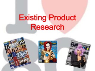
  • 2. Magazine choices Billboard Magazine 2005 Issue I have chosen this magazine to analyse as it is a more modern version of a Billboard Magazine which means I can make comparisons to the earlier issues. This will help me to see how music magazines have developed from the 1980s , to see similarities and what is done differently. My reason for choosing an issue dated 2005 and not 2010 is because this particular issue features Madonna and about her comeback. This relates to the type of magazine that I will be creating as it will be about 80s music acts coming back into the modern music industry. This means that I can see how fairly modern magazines have presented this idea. Billboard Magazine 1986 Issue I will be making a modern magazine however it will be an 80s special therefore I have chosen to analyse this magazine so that I can see how 80s music was presented in its time. Although Billboard is an American magazine I have still chosen to analyse it as a lot of artists listened to in the 80s in the UK were popular in America too, e.g. Madonna and Michael Jackson. Therefore similar artists that would feature in UK music magazines would also feature in American ones. I have also chosen this specific issue to analyse as it is a special issue focusing on the music of 1986. This will help me to see how a special edition magazine is presented. No 1 Magazine I have chosen to analyse this magazine issue as it is a UK pop magazine released in the 80s. This means I can see how pop music was presented in the UK in the 80s and compare it to the way in which pop music magazines are presented now. I will be able to see the development however can consider using some of the techniques in my own magazine. Smash Hits Magazine Although Smash Hits magazine stopped being published in 2006, I have chosen to analyse this magazine as it shows the conventions of a fairly modern and popular pop music magazine. Another reason for choosing this particular issue is because it was released in 2009 as a one off special edition dedicated to Michael Jackson. This relates to what I am producing as I will be creating a one off 80s music special edition. Analysing this magazine will give me an idea of how a modern special edition issue is presented in the UK.
  • 3. Front Cover 1 There isn’t much text on this front cover therefore there is little room for writing style. Short simple sentences are used to give an idea of the some of the stories which will appear inside the magazine. The lack of text on the front cover could be due to the audience which suggests either a young audience of not well educated however it could be something to do with the date of release as it was more expensive to print in the 80s. There are more photos on this front cover compared to text as the little text there is has been written in a big font to take up more room. This suggests the magazine is for a young audience however again more than likely has something to do with its date of release being the 1980s. The fonts used on this page are bold which reflects the fashion of 80s music artists. The bright coloured text also relates to this idea as well as giving a happy feel which the 80s pop music was. The names ‘Boy George’ and ‘Mike Read’ are written in italics which emphasises them suggesting they are important features within the magazine issue. At the top of the page other artists which feature in the magazine are written, all in different colours which suggests the 80s was filled with a great variety of music acts. The overall look of this front cover is basic but the techniques used are effective. It would be too basic for a modern day audience however I will consider the colours, fonts and photography style when producing my magazine. The photography used on this front cover is posed which suggests the photographs has been taken specifically for this magazine. This colour scheme for this front cover works well as it uses bright colours which represents the upbeat 80s pop music. The large posed photo central on the magazine front cover works well as Boy George was a popular 80s pop music artist therefore it was a good idea to put him on the front for sales. Although I think this would have been a good front cover for its time it would be too basic for a modern audience and wouldn’t see therefore more text and photos would need to be included.
  • 4. Contents Page 1 The colour scheme of this contents page is black and white which reflects a newspaper style suggesting the magazine is for an older audience. However the most likely scenario for the colour scheme being black and white is due to the magazine’s date of release. The writing style used is simple which suggests a younger audience however the simple writing style is probably due to the date of release. It would have cost more to print in the 80s therefore they would have written less. There is a higher ratio to picture that text on this contents page because its purpose is to inform. However there are still three pictures to make the page more interesting to look at. The images featured are of artists which feature in the magazine therefore they are relevant. All of the photography used on this contents page is posed. They have been taken using medium shots so there faces can be seen as well as a bit of their clothing, showing the 80s fashion. A variety of fonts are used on this contents page. The main text is written in a simple font so that its easy to read however the main title and sub-headings are written using an italic font to stand out. Artists names such as ‘Bananarama’ are written in a thin but large font, again so this writing stands out. The overall design of this contents page is good as it features a variety of fonts, images and it is simple to read. However for a modern audience colour should be added to make the page brighter.
  • 5. Double Page Spread 1 This DPS uses a very varied colour scheme with lots of colours. The main colours used are blue, pink and yellow which reflect the brightness of 80s music and fashion. The photography used on this DPS is live and natural. The photos aren’t posed, instead the audience can see a glimpse of the band’s busy lifestyle. The main article has been written using fairly simple sentences which suggests a young audience, however it would be suitable for an older audience who don’t want to read long, dull articles. Song lyrics don’t feature writing style as they are already pre-written, they are presented in different paragraphs to separate verses to chorus which make it easier to read. The overall look of this DPS is good as it features lots of colour and images as well as an article and songlyrics. It has a lot of variety to suit a wide audience. There is slightly more photography than text on the DPS which suggests a younger audience. Half of the text is song lyrics which isn’t information. The font used for the main text is simple so that it’s easy to read. However for the main title ‘Bananarama’ a more exciting font is used. Instead of A’s, triangles are used. This reflects the boldness of 80s music. Featuring shapes in the font also suggests the magazine is for a younger audience. Other sub-headings are written using a bold font so that they stand out.
  • 6. Front Cover 2 The style of photography used on this front cover is mostly posed, with the music acts smiling, again showing that the 80s was a very happy and upbeat decade for its pop music. The images are made up of medium close ups and medium shots mostly shot at a straight angle which shows, in detail, some of the popular music stars of 1986 which is what the magazine is about. A couple of long shots are used also, which shows shot variety. The brightness differs from photo to photo which suggests 1986 came with a variety of different music acts. The colour scheme of this front cover uses a mixture of bright colours. Pop music in the 80s was very upbeat and happy therefore dark colours weren’t heavily used in magazine designs as this would give a morbid feel. This is why this front cover uses red and blue writing for the majority of the text instead of black. Black is used for small text to show date of release and price which is important information so needs to be seen clearly. It is also used for the main title, however some of the letters are filled in with colours; red, yellow and blue to brighten it up. On the front cover there is very little text and it consists of mostly pictures. This is because pictures attract the audience to buy the magazine. If the front cover consisted of lots of writing then the magazine would look very dull and people may not buy it. This front cover mainly features simple fonts which may have something to do with its date of release. The title is written in a simple bold font however some of the letters are filled in with bright colours to add originality which makes the magazine recognisable. The simple fonts make the text easy to read which suggests the writing isn’t a feature the publisher wants the audience to concentrate on. However the main text, central on the front cover, which reads ‘1986 The year in music and video’ is written in a more fancy font which suggests this is the most important text on the cover.
  • 7. There is little writing on this front cover however this is because it is a special addition issue, other issues from his time consisted of a lot of writing. I have chosen this issue as I will be doing a modern magazine but a 80s music special edition. There are no paragraphs of writing, instead short sentences are used single words.. This front cover is very eye catching as it has many colourful pictures of popular music artists. Presenting ‘1986 The year in music and video’ central of the page in bright colours and a bold font makes this information stand out to its audience. Excluding the title, the page is set out in the style of a CD/Record(in its time) as it set out in the same shape and features pictures and the genres included. This adds relevance to what the magazine is about and helps target its audience. Therefore overall I think this is a front cover would have been appealing for its then audience and for a modern audience if slightly more information was given.
  • 8. Contents Page 2 This contents page features different writing styles. On the left of the page is the contents ‘In the issue’ and is written in a fairly informal way so it is easy to understand. The sections in the magazine have headings and are numbered so that sections can be easily found. On the other side of the page are articles which are set out in a newspaper style which suggests a more educated audience. This shows that the magazine is for a wide audience as it suits different audiences in different sections. The articles are written using more formal language than used on the left side. There is lot more text in comparison to pictures on this page. This suggests the magazine is for an older and well educated audience because children would be appealed with more photos. However this could have something to do with the date of release and how times have changed or location of release which is America. There is only one photo on this contents page which is probably because the publisher wants the audience’s main focus on the contents section. The photography used, however, is a natural photo which matches the story written next to it. It is a black and white photo which matches the colour scheme of the page, this also means that the photo is not meant to stand out, otherwise it would be in colour so that it contrasted to the rest of the page. This contents page is written using a colour scheme of black and white which is the usual colours of a newspaper. This suggests that this magazine is for an older audience as young people would find this dull to look at as it has no colour. The fonts on this contents page vary which creates the page to be more interesting. A bold font is used for the main title so that t stands out and people know where to look for the contents. Bold fonts and italics are used for other headings and subheadings. A simple font is used for the main text so that it is easy to read. Overall I think this is a very dull contents page as it lacks colour and features too much writing for a contents page. It is crowded with information which may make it difficult for people to locate the information they want. I don’t think this would be suitable for the modern UK audience for a pop music magazine as it is more aimed at an older and well educated audience whereas a pop magazine is usually aimed at a younger audience.
  • 9. Double Page Spread 2 There is a lot of writing in this DPS however there are also a lot of pictures to make relevance of the article. This suggests the magazine is for an audience from young adults and above. The colour scheme of this DPS is black and white. It has a newspaper look to it more than a magazine. This could have something to do with its date of release. The colour scheme suggests that the magazine is for an older audience as children would find this dull to look at. There is a wide variety of images in this DPS which are all in black and white. The photos are both posed and natural with a variety of different shots used. This idea relates to the article being about the top stories of the year as it is likely that there has been a variety of different things going on. There is a lot of writing on this DPS which is divided into paragraphs with pictures. It has been written using long sentences with fairly formal language however isn’t complicated. This suggests it is easy reading for an older audience but also may be read my young adults. A range of different fonts have been used in this DPS which again relates to the article being about the range of different stories of the year. The main text is in a simple font so that the article is easy to read whereas the subheadings are in a variety of fonts including bold and italics. This makes the article less dull to read. Overall this is a good DPS as it features an even ratio of pictures to text making it balanced and has been created using a variety of different texts adding interest to the article. However to make this DPS suitable for a modern audience colour would need to be added to brighten the page up.
  • 10. Front Cover 3 The colour scheme of this front cover is black with blue, purple and pink colours to brighten it up. The combination of colours are quite girly which suggests the magazine is aimed at a female audience. This front cover only features one image, however it is a large image and takes up a lot of the page. The photo is posed with Madonna looking bright with shadows and a dark background so that she stands out. This image gives the impression the target audience is female as it portrays the idea of fashion and beauty. After about 20 years, Billboard magazine uses the same title style. A simple and bold font with coloured in letters. There is an even amount of pictures to words which gives a nice balance. This suggests the audience don’t want to spend too much time reading the front cover, however want to know a bit of information. The writing style used on this front cover is fairly informal and relevant to the image. The phrase ‘Dancing Queen’ ...... The phrase ‘Madonna Gets Her Groove Back’ suggests there will be an article in the magazine about Madonna’s comeback. Madonna being in a spotlight is a good way of presenting her comeback as most of the focus is on her. She has a new modern look which suggests new and modern music from her. The terms used are a good way of suggesting what the article is about ‘Madonna gets her groove back’ as it suggests she is going to be as great as she was in the 80s therefore overall this is a good front cover design. The ratio of text to pictures is about half. There is only one image however it takes up around half of the front cover. There is an equal balance which suggests a balanced audience.
  • 11. The colour scheme of this contents page is varied with the main background being white. Green and blue colours have been added to make the page more bright and appealing to a wider audience. A younger audience are likely to buy a magazine with colourful pages because it doesn’t look dull. Contents Page 3 The photography on this page is posed with a variety of medium shots. Some of the photos are bright and others are dark which again shows variety. The mise-en-scene shows some of the people dressed in suits which suggests they have posed specifically for the magazine. The variety of images again suggests a wide audience range. There is very little writing found on this contents page as its purpose is to inform people where different articles and information can be found in the rest of the magazine. There are little sentences, instead just words next to page numbers. This makes it easy to read and simple for people to locate specific information. There is slightly more text to pictures, however it is quite even. This again suggests the magazine is for a wide audience as it is balanced. This is well structured contents page with range of colour use and fonts however it could be made more appealing with more exciting photos and more bright colours. Therefore overall I think it is an okay contents page however could be improved for a UK audience. Simple fonts are used for most of the writing on this page so that it’s easy to read. It is important for it to be clear as people need this information to locate specific sections in the magazine therefore a fancy font would be unsuitable as it would be difficult to read. Bold fonts are used for headings so that they stand out. The design of the font for these headings is white with black lines to give a modern feel to the magazine.
  • 12. Double Page Spread 3 The colour scheme on this DPS is black, white and pink. These colours represent the usual article with a touch of girliness. The colour pink it stereotypically a girly colour which suggests the article is for a female reader, however it could have been used because it is about a female artist. The photography used for this DPS is posed as Madonna is representing her comeback therefore wants to look glamorous and powerful. The photo takes up a whole page suggesting Madonna’s new look is important and it is important for the audience to notice it. There are dashed lines around the outside of the picture for people to cut around so that they have a poster. This suggests the magazine is for a younger audience as younger people tend to put posters on their wall. A large, fancy and italic font is used for the main title ‘Dancing Queen’ which shows femininity which again suggests a female audience. A bold font is used for the sub heading to emphasise key information and a simple font is used for the main text so that it is easy to read. The ratio of text/picture is half as each page of the DPS is dedicated to each one. The left page is taken up by a large picture of Madonna whereas the right hand page is filled with paragraphs of writing presenting the article of Madonna. This has been done as people will see the picture of Madonna looking glamorous and will want to know what the article is about. The article on this DPS is written in the style of a newspaper. Long sentences are used which suggests an older audience. The layout of this DPS is good as people will know whether to read the article if they are fans of Madonna. Overall this DPS is good and balanced as it features an even amount of photography and text.
  • 13. Smash Hits Magazine – Michael Jackson special (2009) There hasn’t been a specific colour scheme used for this front cover. Red, yellow, white and black have all been used which shows variety. Red has been used for the main colour which represents blood and death however because its a pop music magazine representing his life the publisher wouldn’t have wanted it to be morbid therefore added yellow to brighten the page up and make it happier. The main photography used on this front cover is live. It has been taken at one of Michael Jackson’s concerts when he’s been performing, we can tell this from the mise-en-scene as he is wearing the clothes you would expect him to wear in concert and is singing. This has been used as a representative of Michael Jackson’s career in music and how good of a performer he was. It is a bright photo which represents that his life was always in the spotlight. The photo has been used to appeal to its audience which is Michael Jackson fans. Bold fonts are used to put emphasis on some words and the title is written in a fancy font which represents that the magazine is a one off special. The key features of the magazine have been written using a simple font so that they are easy to read. The phrase ‘AAOOOW’ has been used to appeal to the audience as Michael Jackson featured this phrase it his songs. ‘The music lives forever’ creates a happy tone because even though he has died his music will live on. The main picture takes up the majority of the page which suggests this is the main concentration. There is little writing as the audience only need those few quotes to make them want to read the magazine because if they are Michael Jackson fans they are likely to want it anyway. The live photograph of Michael Jackson and the phrase ‘AAOOOW’ are very good representations of his life which will appeal to his fans which is the audience of this magazine. Therefore overall this a good magazine front cover for its audience.
  • 14. Publishers Smash hits magazine was published by EMAP from 1978-2006. In its history EMAP published many magazines mainly in computing and video games however also published a magazine called ‘The Face’ which was about music, fashion and trends as well as ‘Mojo’ which is another music magazine . ‘Smash hits’ and ‘The Face’ will have had the same target audiences unlike most of the other magazines that were published by EMAP in its history. In the present day, EMAP no longer publishes music magazines but has over 20 magazines in its business-to-business portfolio including; Nursing times and Retail week which will have a completely different target audience to Smash Hits. Billboard is an American music magazine which was published by Billboard Publications until 2009 when it was sold to Prometheus Global Media who have been publishing it since. Prometheus Global Media also publish magazines; Mediaweek and The Hollywood Reporter which are both linked with the entertainment industry therefore may have similar audiences. Number One was a pop music magazine in the 80s that was published to be a main competition to Smash hits magazine. The magazine was published by IPC Media who currently publish celebrity and fashion magazines; Look and Now.IPC media also publish popular music magazine NME which would have a different audience as they present different music genres.