
Empfohlen
Weitere ähnliche Inhalte
Was ist angesagt?
Was ist angesagt? (19)
Andere mochten auch
Andere mochten auch (20)
Ähnlich wie Double page spread 1
Ähnlich wie Double page spread 1 (20)
Mehr von LaraDobsonx
Mehr von LaraDobsonx (20)
Kürzlich hochgeladen
Kürzlich hochgeladen (20)
Double page spread 1
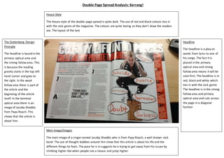
- 1. The Guttenberg Design Principle The headline is based in the primary optical area and the strong fallow area. This is because the reading gravity starts in the top left hand corner and goes to the right. In the weak fallow area there is part of the article and the beginning of the article itself. In the terminal optical area there is an image of Jacoby Shaddix from Papa Roach. This shows that the article is about him. Main Image/Images The main image of a singer named Jacoby Shaddix who is from Papa Roach, a well-known rock band. The use of thought bubbles around him show that this article is about his life and the different things he feels. The pose he is in suggests he is trying to get away from his issues by climbing higher like when people see a mouse and jump higher. Headline The headline is a play on words from lyrics to one of his songs. The fact it is placed in the primary optical area and strong fallow area means it will be seen first. The headline is in red, black and white which ties in with the rock genre. The headline is in the strong fallow area and primary optical area and cuts across the page in a diagonal fashion House Style The House style of the double page spread is quite dark. The use of red and black colours ties in with the rock genre of the magazine. The colours are quite boring as they don’t draw the readers ate. The layout of the text Double Page Spread Analysis: Kerrang!