1. The background behind the
two protagonists is very
bright white, almost heaven
like, which again is fore
shadowing the plot of the
film as the male in the image
dies from a brain tumor,
leaving his wife with only 10
letters.
Also the bright light shining
on the characters shows that
even though this is a sad
drama, there is hope in a the
bright light could reflect a
happy ending.
The names of the A-Listers is
written towards the side
quite subtly, so it isn't
drawing attention from the
characters and the chemistry
we can see between them.
Also the title of the film and
the cinema is placed in red to
represent love, so the
audience can see a main
theme in this film.
The grey writing on the poster is the production details of the film. This includes important
information on the people who have created the film; such as the director, the main actors, etc. The
font used is Grey Steel Tongs, this font is used to not distract attention from the main features of the
poster (title, image and star actors).
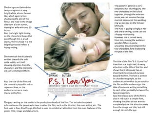
The poster in general is very
simple but full of ambiguity. The
two characters are laid close
together, through the mise-enscene, we can assume they are
married because of the wedding
ring we can see on the females
left hand.
The male is gazing lovingly at her
and she is smiling, so we can see
a happy relationship.
However she is turned away
from him, making the audience
wonder if there is some
unwanted distance between the
two characters, fore shadowing
the plot of the film.
The title of the film “P.S. I Love You”
is written in a bright red, drawing
attention to the title of the film and
shows that it obviously has an
important meaning and purpose
toward the film. The font is written
in a handwriting style, so the
audience can see that its personal to
the film and the audience get the
idea of someone writing something
to each other, probably between the
two protagonists.
Also the release date of the film is
also in red but in a simpler font,
showing that they do not want to
completely draw the attention away
from the image and title, but still
enough to catch the eye.
2. Here there is tag line to hook the audience in and
give them some insight as to what the film is about
but without giving too much away.
The background of a poster is what
looks like a countryside, that might
symbolizes something to the couple
or storyline. We can also see on
Rachel McAdams characters finger
is a wedding ring that is clearly
displayed, probably to give a
message to the audience but there
is a reason it is clearly displayed.
The whole poster is edited with a
contrast and a light filter around the
characters to make them stand out,
showing that there is something
important about these two and it
isn't just there relationship.
The grey writing on the poster is
the production details of the film.
This includes important
information on the people who
have created the film; such as the
director, the main actors, etc. The
font used is Grey Steel Tongs, this
font is used to not distract
attention from the main features
of the poster (title, image and star
actors).
On this poster of “The Notebook”
there is a main image of a couple in a
passionate embrace. There is use of
pathetic fallacy with the rain,
revealing to the observer of the
poster that this story isn't going to be
a smooth ride.
The actors as listed here as in the
near center of the page, so this is
used to draw the observers attention
to them to see that these actors are in
it, help making there decision if they
will enjoy the film or not.
The title of the of film is enlarged but
in still in a black font, like the actors
names. Above the title, “From the
Best Selling Novel” is written, telling
the observer that this story sold well
as a book, another persuasive device
to draw in the audience.