
Empfohlen
Weitere ähnliche Inhalte
Was ist angesagt?
Ähnlich wie Music Mag Presentation
Ähnlich wie Music Mag Presentation (20)
Mehr von City College
Kürzlich hochgeladen
Kürzlich hochgeladen (20)
Music Mag Presentation
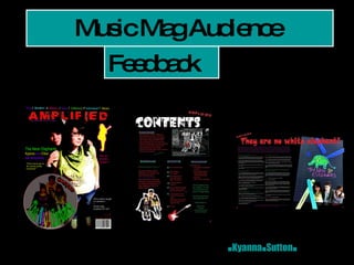
- 1. Music Mag Audience . Kyanna . Sutton . Feedback
- 2. What Gender are you? Female 44.4% Male 55.6% Which age group do you fall in? 14-16 11.1% 17-19 77.8% 20-25 11.1% Which age group would you recommend to read this magazine? Teens 77.8% Young Adults 22.2% Middle-aged 0% The older generation 0% What gender would you think would be most likely to read this magazine? Female 44.4% Male 0% Both 55.6% Would you personally buy this magazine? Would you say it is reasonably priced for what it is? What genre of music do you think has been used in this magazine? Yes, I would buy it and it is priced well 33.3% Yes, I would buy it but at a slightly lowered price 11.1% No, it doesn’t grab my attention enough to! 44.4% No, I cannot afford to spend that much on something I’d end up throwing away! 0.0% Not decided 11.1% How would you say ‘The Neon Elephants’ are presented in the magazine? Would you listen to their music? They are presented really well, they seem to be a decent band and I would try something new by listening to their music 22.2% They are presented well but I don’t think I would listen to their music 55.6% They are not given much credit in this magazine, it makes the band look poor, but I would listen to their music, they seem OK 0.0% There isn’t enough information about the band for me to give an opinion 22.2% Rock 0% Indie 44.4% Pop 11.1% Alternative 11.1% Dub step 11.1% R’n’B 0% A mix 22.2%
- 5. Which ONE thing would you improve on the front cover if you were able to change it for improvements? “ I would improve the layout...” “ Different photo…one that includes all the band” “ I would make the colours bolder” “ more detail on what’s in the magazine” “ The font used for 'the neon elephants' on the front cover, it's a little hard to read.” “ nothing”
- 7. Which ONE thing would you improve on the contents page if you were able to change it for improvements? “ Nothing it’s very well designed and professional” “ The writing” “ nothing” “ Spelling mistakes, more focus on music rather than ‘celebs caught on camera’”
- 9. Which ONE thing would you improve on the double-page spread if you were able to change it for improvements? “ the background” “ Better spelling & grammar. General linguistic skills could be improved a bit.” “ I'm not a fan of the changes in the text colour but its very eye-catching and effective” “ Doesn’t say anything about the genre of the Neon Elephants, too much banter and no focus on the music” “ a better main image, maybe have the coloured in elephant to one side, with a bigger picture of the band ...” “ nothing”
- 10. What media institution would I use to distribute my magazine?
- 11. Who would my target audience be aimed at for the magazine? How have I attracted/addressed the audience? How does it represent particular social groups?