
Empfohlen
Weitere ähnliche Inhalte
Was ist angesagt?
Was ist angesagt? (19)
Andere mochten auch
Andere mochten auch (17)
Ähnlich wie Progression
Ähnlich wie Progression (20)
Mehr von Kero00
Mehr von Kero00 (19)
Progression
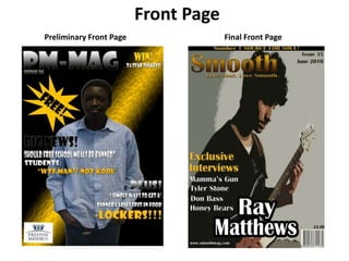
- 1. Front Page Preliminary Front Page Final Front Page
- 2. Contents Page Preliminary Contents Page Final Contents Page
- 3. Main Article Final Main Article
- 7. Main image of student (audience can relate)
- 10. Poor choice of costume for main image (doesn’t go well with colour scheme)
- 12. Subvert the conventions of a stereotypical magazine by not using direct address
- 13. Edited the photo to make it suit the sort of look I wanted to express the genre of soul.
- 14. Kept my font consistent throughout the magazine. Choosing the right font was key as I wanted it to be sophisticated enough to look at for my mature audience
- 15. Learnt how to manipulate colours as I have done with the masthead before it was just black and white now I can use any colour.
- 19. Shows no effort
- 20. Looks too similar to Front Page, it should vary from it.
- 21. Spelling mistakes and some grammar errors
- 24. Every section is neatly arranged
- 25. Simple and sophisticated layout, not too cluttered
- 26. The Editors Note is filled with more information relevant to my audience and my magazine.
- 27. Developed many influences and ideas from my analysis of contents pages
- 28. Images are well cropped and proportioned within the page
- 29. Colour scheme and font is consistent with the front page
- 31. Question and Answer style interview to fully get to grips with my artist.
- 32. Mainly open questions used to develop the interview more
- 33. Use of floating quotes to feel more attached to the artist
- 34. Alliteration used to stick within the readers mind
- 35. One base picture for the background. It’s simple and sophisticated
- 36. Doesn’t look anything like the contents or front page. It is as if this page is dedicated to the artist alone and Smooth shouldn’t interfere.
- 37. Image looks very natural. The sun gleaming behind the trees; it made the artist seem like he’s looking at the trees and title and it looks almost romantic. Final Main Article
- 39. Developed many influences and ideas from my analysis of different genres of magazine and learnt about codes and conventions magazines used to communicate with their audience
- 40. Discovered the most successful techniques to communicate with my audience; superlatives, hyperboles, floating quotes, register etc.
- 41. Can now manipulate images and text with a whole lot more skill.