
Recommended
Recommended
More Related Content
Similar to Bullet Graph Improvements for IBCS Standards
Similar to Bullet Graph Improvements for IBCS Standards (20)
Recently uploaded
Recently uploaded (20)
Bullet Graph Improvements for IBCS Standards
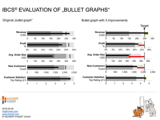
- 1. IBCS® EVALUATION OF „BULLET GRAPHS“ 2016-02-04 rh@hichert.com www.hichert.com © HICHERT+FAISST GmbH Bullet graph with 3 improvementsOriginal „bullet graph“
- 2. Profit % Revenue tUSD Avg. Order Size USD New Customers Count Customer Satisfact. Top Rating of 5 0 50 100 150 200 250 300 15%10%5%0% 30%25%20% 3002001000 600500400 3210 54 © HICHERT+FAISST GmbHSource: Wikipedia https://en.wikipedia.org/wiki/Bullet_graph of 2016-01-31 (redrawn picture) This is a typical „bullet graph“ as suggested by Stephen Few – here as presented in Wikipedia 0 1,5001,000500 2,5002,000
- 3. 0 50 100 150 200 250 300 15%10%5%0% 30%25%20% 3002001000 600500400 3210 54 © HICHERT+FAISST GmbHSource: Wikipedia https://en.wikipedia.org/wiki/Bullet_graph of 2016-01-31 (redrawn picture) This is a typical „bullet graph“ as suggested by Stephen Few – here as presented in Wikipedia Profit % Revenue tUSD Avg. Order Size USD New Customers Count Customer Satisfact. Top Rating of 5 0 1,5001,000500 2,5002,000 The dark line represents the actual value
- 4. 0 50 100 150 200 250 300 15%10%5%0% 30%25%20% 3002001000 600500400 3210 54 The gray bands represent ranges of performance © HICHERT+FAISST GmbHSource: Wikipedia https://en.wikipedia.org/wiki/Bullet_graph of 2016-01-31 (redrawn picture) This is a typical „bullet graph“ as suggested by Stephen Few – here as presented in Wikipedia Profit % Revenue tUSD Avg. Order Size USD New Customers Count Customer Satisfact. Top Rating of 5 0 1,5001,000500 2,5002,000 The dark line represents the actual value
- 5. 0 50 100 150 200 250 300 15%10%5%0% 30%25%20% 3002001000 600500400 3210 54 © HICHERT+FAISST GmbHSource: Wikipedia https://en.wikipedia.org/wiki/Bullet_graph of 2016-01-31 (redrawn picture) This is a typical „bullet graph“ as suggested by Stephen Few – here as presented in Wikipedia Profit % Revenue tUSD Avg. Order Size USD New Customers Count Customer Satisfact. Top Rating of 5 0 1,5001,000500 2,5002,000 The dark line represents the actual value The gray bands represent ranges of performance The vertical line represents a target or plan value
- 6. 0 50 100 150 200 250 300 15%10%5%0% 30%25%20% 3002001000 600500400 3210 54 © HICHERT+FAISST GmbHSource: Wikipedia https://en.wikipedia.org/wiki/Bullet_graph of 2016-01-31 (redrawn picture) Profit % Revenue tUSD Avg. Order Size USD New Customers Count Customer Satisfact. Top Rating of 5 This is a typical „bullet graph“ as suggested by Stephen Few – there are three potential improvements with respect to the IBCS Standards 0 1,5001,000500 2,5002,000
- 7. This is a typical „bullet graph“ as suggested by Stephen Few – there are three potential improvements with respect to the IBCS Standards 0 50 100 150 200 250 300 15%10%5%0% 30%25%20% 3002001000 600500400 3210 54 © HICHERT+FAISST GmbHSource: Wikipedia https://en.wikipedia.org/wiki/Bullet_graph of 2016-01-31 (redrawn picture) Profit % Revenue tUSD Avg. Order Size USD New Customers Count Customer Satisfact. Top Rating of 5 The light gray should not have an arbitrary length as shown here. Furthermore, it is not representing a third range of performance (!) 1 0 1,5001,000500 2,5002,000
- 8. This is a typical „bullet graph“ as suggested by Stephen Few – there are three potential improvements with respect to the IBCS Standards 0 50 100 150 200 250 300 15%10%5%0% 30%25%20% 3002001000 600500400 3210 54 © HICHERT+FAISST GmbHSource: Wikipedia https://en.wikipedia.org/wiki/Bullet_graph of 2016-01-31 (redrawn picture) Profit % Revenue tUSD Avg. Order Size USD New Customers Count Customer Satisfact. Top Rating of 5 1 Therefore, we do not need the light gray color 0 1,5001,000500 2,5002,000
- 9. 0 0 50 100 150 200 250 300 15%10%5%0% 30%25%20% 3002001000 600500400 1,5001,000500 2,5002,000 3210 54 © HICHERT+FAISST GmbHSource: Wikipedia https://en.wikipedia.org/wiki/Bullet_graph of 2016-01-31 (redrawn picture) Profit % Revenue tUSD Avg. Order Size USD New Customers Count Customer Satisfact. Top Rating of 5 This is a typical „bullet graph“ as suggested by Stephen Few – there are three potential improvements with respect to the IBCS Standards 1 Therefore, we do not need the light gray color
- 10. 0 0 50 100 150 200 250 300 15%10%5%0% 30%25%20% 3002001000 600500400 1,5001,000500 2,5002,000 3210 54 © HICHERT+FAISST GmbHSource: Wikipedia https://en.wikipedia.org/wiki/Bullet_graph of 2016-01-31 (redrawn picture) Profit % Revenue tUSD Avg. Order Size USD New Customers Count Customer Satisfact. Top Rating of 5 This is a typical „bullet graph“ as suggested by Stephen Few – there are three potential improvements with respect to the IBCS Standards 1 …in this case we can use lighter gray colors
- 11. 0 50 100 150 200 250 300 15%10%5%0% 30%25%20% 3002001000 600500400 3210 54 © HICHERT+FAISST GmbHSource: Wikipedia https://en.wikipedia.org/wiki/Bullet_graph of 2016-01-31 (redrawn picture) Profit % Revenue tUSD Avg. Order Size USD New Customers Count Customer Satisfact. Top Rating of 5 This is a typical „bullet graph“ as suggested by Stephen Few – there are three potential improvements with respect to the IBCS Standards 1 0 1,5001,000500 2,5002,000 …in this case we can use lighter gray colors
- 12. 0 50 100 150 200 250 300 15%10%5%0% 30%25%20% 3002001000 600500400 3210 54 © HICHERT+FAISST GmbHSource: Wikipedia https://en.wikipedia.org/wiki/Bullet_graph of 2016-01-31 (redrawn picture) Profit % Revenue tUSD Avg. Order Size USD New Customers Count Customer Satisfact. Top Rating of 5 IBCS suggest normalized target values – otherwise the KPIs cannot be compared properly (!) This is a typical „bullet graph“ as suggested by Stephen Few – there are three potential improvements with respect to the IBCS Standards 1 2 0 1,5001,000500 2,5002,000
- 13. 3210 54 0 50 100 150 200 250 300 15%10%5%0% 30%25%20% 3002001000 600500400 © HICHERT+FAISST GmbHSource: Wikipedia https://en.wikipedia.org/wiki/Bullet_graph of 2016-01-31 (redrawn picture) Profit % Revenue tUSD Avg. Order Size USD New Customers Count Customer Satisfact. Top Rating of 5 Target This is a typical „bullet graph“ as suggested by Stephen Few – there are three potential improvements with respect to the IBCS Standards 1 2 0 1,5001,000500 2,5002,000 IBCS suggest normalized target values – otherwise the KPIs cannot be compared properly (!)
- 14. 3210 54 0 50 100 150 200 250 300 15%10%5%0% 30%25%20% 3002001000 600500400 © HICHERT+FAISST GmbHSource: Wikipedia https://en.wikipedia.org/wiki/Bullet_graph of 2016-01-31 (redrawn picture) Profit % Revenue tUSD Avg. Order Size USD New Customers Count Customer Satisfact. Top Rating of 5 Target IBCS suggest to highlight the variances in order to quickly understand the chart by seeing and not by reading bar by bar This is a typical „bullet graph“ as suggested by Stephen Few – there are three potential improvements with respect to the IBCS Standards 1 2 3 0 1,5001,000500 2,5002,000
- 15. 3210 54 0 50 100 150 200 250 300 15%10%5%0% 30%25%20% 3002001000 600500400 © HICHERT+FAISST GmbHSource: Wikipedia https://en.wikipedia.org/wiki/Bullet_graph of 2016-01-31 (redrawn picture) Profit % Revenue tUSD Avg. Order Size USD New Customers Count Customer Satisfact. Top Rating of 5 Target …good variances with green (resp. light) lines This is a typical „bullet graph“ as suggested by Stephen Few – there are three potential improvements with respect to the IBCS Standards 1 2 3 0 1,5001,000500 2,5002,000 IBCS suggest to highlight the variances in order to quickly understand the chart by seeing and not by reading bar by bar
- 16. 3210 54 0 50 100 150 200 250 300 15%10%5%0% 30%25%20% 3002001000 600500400 © HICHERT+FAISST GmbHSource: Wikipedia https://en.wikipedia.org/wiki/Bullet_graph of 2016-01-31 (redrawn picture) Profit % Revenue tUSD Avg. Order Size USD New Customers Count Customer Satisfact. Top Rating of 5 Target This is a typical „bullet graph“ as suggested by Stephen Few – there are three potential improvements with respect to the IBCS Standards 1 2 3 0 1,5001,000500 2,5002,000 …good variances with green (resp. light) lines IBCS suggest to highlight the variances in order to quickly understand the chart by seeing and not by reading bar by bar …bad variances with red (resp. dark) lines
- 17. 3210 54 0 50 100 150 200 250 300 15%10%5%0% 30%25%20% 3002001000 600500400 © HICHERT+FAISST GmbHSource: Wikipedia https://en.wikipedia.org/wiki/Bullet_graph of 2016-01-31 (redrawn picture) Profit % Revenue tUSD Avg. Order Size USD New Customers Count Customer Satisfact. Top Rating of 5 Target This is a typical „bullet graph“ as suggested by Stephen Few – there are three potential improvements with respect to the IBCS Standards We compare with the original 0 1,5001,000500 2,5002,000
- 18. Profit % Revenue tUSD Avg. Order Size USD New Customers Count Customer Satisfact. Top Rating of 5 0 0 50 100 150 200 250 300 15%10%5%0% 30%25%20% 3002001000 600500400 1,5001,000500 2,5002,000 3210 54 © HICHERT+FAISST GmbHSource: Wikipedia https://en.wikipedia.org/wiki/Bullet_graph of 2016-01-31 (redrawn picture) This is a typical „bullet graph“ as suggested by Stephen Few – here presented in Wikipedia We compare with the original
- 19. Bullet graph with 3 improvementsOriginal „bullet graph“ © HICHERT+FAISST GmbHSource: Wikipedia https://en.wikipedia.org/wiki/Bullet_graph of 2016-01-31 (redrawn picture) We compare with the original
- 20. If you want to know more about our work and the rules behind this concept visit us at www.hichert.com and www.ibcs-a.org. As always, we like to hear your critical comments and suggestions! Rolf Hichert and Jürgen Faisst 2016-02-04 rh@hichert.com www.hichert.com © HICHERT+FAISST GmbH