
Empfohlen
Weitere ähnliche Inhalte
Kürzlich hochgeladen
Kürzlich hochgeladen (20)
Empfohlen
Empfohlen (20)
Poster analysis
- 2. Target Audience and Genre The target audience for our film was mostly males between the ages of 15 and 30 who enjoy horror/thriller films. The genre for our film is a hybrid of Horror/Thriller/Police Drama
- 3. Posters from similar films One thing these posters have in common with our poster is that they use quite dark, sinister colours, blacks, reds and oranges, giving you an idea about the genre of the film. Another thing that they all have in common is that they don’t give much about the films plot away, showing just a brief look at a couple of characters in the films, leaving you wondering what is happening in the images.
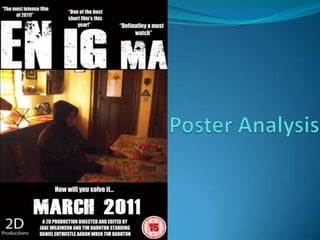
- 4. Title – Enigma The definition of Enigma is – “a puzzling or inexplicable occurrence or situation” (http://dictionary.reference.com/browse/enigma) We felt that this title would be a great choice for our film as the plot revolves around a mystery, which is what an enigma is. On the poster, the title is the largest text and is white, to contrast with the black background, making it stand out more. I positioned it above the image, and the word is spaced out into 3 separate parts EN, IG, MA. This adds to the idea of mystery and keeps the audience guessing why it is like that.
- 5. Tagline – How will you solve it… The tagline adds to the mysterious façade of the film asking the audience directly how they will solve this puzzle. It is positioned below the image and title, so the people would read the title, ENIGMA, then look at the image and then the tagline, and would hopefully get them thinking about what is happening on the poster.
- 6. Blurb and Details of Products Above each section of the title I put a short quote from a review of the film, such as “One of the best short films this year”, this quote shows the film has been received well by a critic giving it good press, but it also lets people know that it is a short film. Another quote that I used was “The most intense film of 2011” which could give away a clue as to the genre of the film as thriller films tend to be quite intense. I also added the BBFC’s 15 rating symbol to the poster so that people could identify whether the film would be suitable for them. I also gave a date to the release of the film MARCH 2011. This is not a precise date so it could make people look up the film online to see when it comes out. The names of the people involved in the making of the film are also at the bottom of the poster letting you know who was involved.
- 7. Image The image I used is quite dark and disturbing, adding to the sinister feeling of the poster. It shows a person sitting at a table in a dark room with his eyes closed and hood up. This image could make the audience wonder what is happening here, is he asleep, dead or something else. I felt this image could get people thinking about the film without giving to much of the plot away.
- 8. Colour Scheme The colour scheme to the poster is mainly a black background with white text, I used this as it reflects the tone of the film and using brighter colours would give people the wrong idea about the film.