The document describes the conventions used in a magazine design for a rock music genre magazine. It discusses using a recognizable masthead, barcode, sans-serif fonts, and "route of the eye" layout. The cover story is made to stand out by being larger. Pull quotes, cover lines, and conventional band images are also used. Headers, contents, subscription boxes, page numbers, and editorials are included to be consistent with magazine conventions. Throughout the magazine, bold fonts, large images, pull quotes, and kickers are employed to highlight key elements in articles.
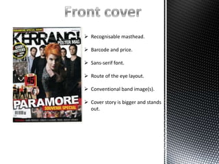
1. Recognisable masthead.
Barcode and price.
Sans-serif font.
Route of the eye layout.
Conventional band image(s).
Cover story is bigger and stands
out.
2. Masthead
Pull quotes
Cover line
Large cover story
Barcode
My magazine uses conventions of a real
magazine and media products that relate
to the rock genre. I have used dark fonts
as well as bold sans-serif in order to
make the text stand out, this is also used
as it will appeal to the audience. Another
thing that is conventional about my
magazine is the use of pull quote, cover
lines, and a cover story. Not only is this
conventional with my genre but its also
conventional with most if not all
magazines. My magazine also
implements the route of the eye, which
is the route the eye takes when
reading/looking at the front cover, this is
also finished off with a barcode at the
end so it’s the last thing that is looked at.
3. Masthead
Bold headings
Magazine content clearly shown
Subscription box at the bottom
Sans serif fonts
Route of the eye layout
Page number
Editorial
4. Masthead
Contents headings
My magazine contents page is conventional to
other rock contents pages. The page has
headings above the contents to clearly show
what part of the contents that is being
Contents
shown, as well as a clear masthead at the top
of the page. The page is also conventional as
it also includes an editorial in which the editor
of the magazine expresses what they think.
An editorial is used as makes the audience
feel more interactive with the editor. Also
included in the contents page to make it
conventional is at the bottom right there is a
box with details, stating how you would
subscribe and what deal you get when you
subscribe. The fronts used are both dark
Subscription box
colours as well as sans-serif as this relates to
the audience as well as being bold and stands.
The image used is also conventional as the
expressions are either aggressive or wild, and
the clothes are also conventional of the genre
of rock.
Page number
Editorial
6. Bold headline
Kicker
Pull quote
Large image
Article
My magazine double page spread in
conventional with the rock genre. This is
because I use a range of conventional
methods. One is a bold headline that stands
out against the background and is eye
catching. It also implements a kicker into
the conventional article which is a larger
letter or word at the start of the article. The
article is also conventional as it has a pull
quote the goes through part of it, to catch
the audiences eye and give them a taste of
the article. The colour scheme used is also
conventional as it consists of dark colours
such as blacks, greys and reds. The image
that is used on the first page is also
conventional as the expressions of the band
members are aggressive, and their clothing
is also conventional as it suits the genre of
rock.