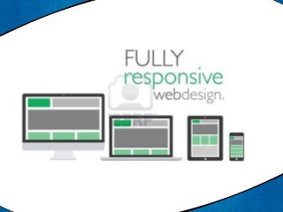
Responsive web design for multiple devices

The days of your website being viewed solely on a desktop computer are over. Mobile devices are the new reality and your site needs to cater to all types of devices and screen sizes to maintain your brand positioning. Responsive design is a method of developing your website so that it automatically adjusts to the screen size and device used to view the site. This ensures a consistent user experience and allows you to replicate your site’s content without reducing it for smaller screens, as you need to do with a mobile site. Benefits of Responsive Design Your site scales to desktops, notebooks, tablets and smartphones now and in the future. One URL for all devices consolidates traffic for better SEO results. Cater to the 112.5 million US consumers who will own a tablet by 2016, which is one-third of the US adult population. (Source: Forrester). Learn more about why you should consider responsive design for your website. For more information about Responsive Website Design Technology for Mobile Websites, contact us now at j@jackylopez.com | 805-467-6777