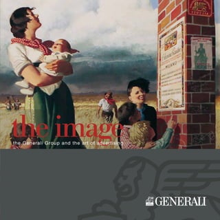
The Image - The Generali Group and the Art of Advertising - I
•
1 gefällt mir•2,996 views

Introduction and Authors / Critical essays

Empfohlen
Empfohlen
Weitere ähnliche Inhalte
Ähnlich wie The Image - The Generali Group and the Art of Advertising - I
Ähnlich wie The Image - The Generali Group and the Art of Advertising - I (20)
Mehr von Generali
Mehr von Generali (20)
Kürzlich hochgeladen
Kürzlich hochgeladen (20)
The Image - The Generali Group and the Art of Advertising - I
- 1. theimagetheGeneraliGroupandtheartofadvertising theimagethe Generali Group and the art of advertising
- 2. T his book was created with two objectives: on the one hand, preserving and handing down the memory of an era when advertising was synonymous with art and the insurance sector was extremely active in communicating its message of social security, with the help of some of the greatest illustrators of the time; on the other hand, collecting in one book images from the historical archives of all the companies that were active in the 1800s and in the first half of the XX Century, though under different names, and that today strengthen Generali’s leadership with their experience and pro- fessionalism: besides the parent company, other companies such as Toro, FaTa and Ina assitalia have contributed to the creation of this book. In the first section, the critical essays and interviews cover the following topics: the image tradition of Generali; a brief history of posters in Italy; the origins of the Salce Collection, the largest Italian collection of advertising posters; the “elegant touch” of Marcello Dudovich, one of the greats who designed for the Group. This section is followed by reproductions of the posters, half-sheet posters and calendars created for Generali and for the other companies of the Group: an overview – introduced chapter by chapter by brief essays by Pietro Egidi, co-editor of the book – we have tried to make as complete as possible, by presenting not only works from the archives of the Group, but also those found in the Sal- ce Collection or in other public collections, or lent by private collectors eager to contribute to the project. Our most sincere thanks go to them, as well as due credit in the final pages of the book. In the appen- dix, for the benefit of scholars and enthusiasts of the genre, we have also provided inventory numbers for all the works from the Salce Collection. The works created by masters such as Leopoldo Metlicovitz, achille Beltrame and Gino Boccasile, besides the above-mentioned Dudovich lead us to the second half of the XX Century, when the golden age of posters and of quality advertising graphics comes to an end, dethroned by the advent of new techniques and strategies of business communication. The book does not end there, however: after two chapters dedicated respectively to the so-called “small” publi- city materials and to the works designed for some of the Group’s foreign com- panies, mostly in Spain and France, there was room for an “extra” focusing on cartoons, comics and logos designed after 1985 by some sublime authors such as Milo Manara, Marco Biassoni and Giorgio Forattini to promote insurance products. In closing, the tradition renews itself with two pre- viously-unpublished cartoons drawn especially for this book by Silver, from an idea by alfredo Castelli, and by Carlo Squillante.
- 3. tableofcontents OsvaldoBalleriochapterV MarcelloDudovichchapterIV Plinio Codognato chapter II ¢ CriTiCal essays From the Eagle/Lion to the Art Poster by Pietro Egidi ................................................................. 6 > From the Group Archives by Roberto Rosasco.............................................................. 14 That Wall Art That Works over Time by Roberto Curci ................................................................ 16 > The “Legend” of Mele’s Department Store from Corriere del Mezzogiorno................ 24 Nando Salce: a Life for Posters interview with Eugenio Manzato by Elisabetta Delfabro ......... 26 > Collecting: Passion, Pathology, or What? by Pietro Egidi ............................................ 36 Dudovich’s Elegant Touch interview with Roberto Curci by Elisabetta Delfabro......................... 38 > The Dudovich Household: Art, Culture and Patriotism by Roberto Curci.................. 46 ¢ THe iMaGe (Texts by Pietro Egidi) Chapter I – The Lion in Color... ...................................................................................................... 50 Chapter II – The Great Italian Companies of the Group............................................................ 58 Chapter III – Farmers, the Country and the Great War .............................................................. 66 Chapter IV – Dudovich’s “Sign”..................................................................................................... 82 Chapter V – The Italian Companies between the Two Wars ..................................................... 94 Chapter VI – Boccasile and Others............................................................................................... 110 Chapter VII – The War and Its Aftermath ..................................................................................... 120 Chapter VIII – Small... but Effective............................................................................................... 134 Chapter IX – Abroad ........................................................................................................................ 152 Extra – Great Comic Strips and Cartoons.................................................................................... 164 > Drawn Especially for Us ................................................................................................... 176 MarcoBiassoniextra Gino Boccasile chapter VI ¢ THe arTisTs (Texts by Pietro Egidi) Plinio Codognato – The “Bard” of Machines and Speed .......................................................... 56 Leopoldo Metlicovitz – A Great Master of the Art of the Poster............................................... 64 Osvaldo Ballerio – From Frescoes to Advertising Graphics..................................................... 79 Achille Beltrame -- ...Or, La Domenica del Corriere, “Italy’s First Video” ............................... 80 Pollione Sigon – Raised in a World of Art.................................................................................... 91 Marcello Dudovich – The Great Master........................................................................................ 92 Tito Corbella – Advertising, Film and Postcards......................................................................... 107 Severo Pozzati (Sepo) – Italy, France and Innovation ............................................................... 108 Aldo Raimondi – Master Watercolorist......................................................................................... 117 Gino Boccasile -- “Miss Great Authors, with Your Novecento Ways...”.................................. 118 Mario Puppo – The Artist of Tourism ............................................................................................ 131 Anselmo Ballester – Cinema’s “Painter”...................................................................................... 132 Alberto Bianchi – Graphic Designer, Illustrator, Portrait Artist ................................................. 149 Adolfo Busi – A Pleasant, Effective Graphic Sign ...................................................................... 150 In Brief – Other Poster Artists ........................................................................................................ 162 Marco Biassoni – The Light Art of Humor.................................................................................... 172 Milo Manara – Master of Comic Books ........................................................................................ 174 leopoldo Metlicovitz pg. 64 achille Beltrame pg. 80 severoPozzati(sepo)pg.108 MiloManarapg.174 Biographies ¢ iNDeXes Group Companies........................................................................................... 180 Artists ............................................................................................................. 182 Works ............................................................................................................. 183 Selected Bibliography.................................................................................... 205 Acknowledgments .......................................................................................... 207 ¢ sNaPsHOTs OF HisTOry (by Annamaria Miot and Roberto Rosasco) Culture and Leisure at the End of the XIX Century.................................... 55 The Age of Giolitti ........................................................................................... 61 “But in My Heart No Cross Is Absent”......................................................... 72 The Last “Doge” of Venice............................................................................. 85 Italo Balbo’s Transatlantic Flights ................................................................ 106 New Land to Farm........................................................................................... 114 Legendary Champions................................................................................... 124 Publicity Postcards......................................................................................... 137 Arts and Culture in the Age of Mass Media................................................ 157 Italian Comic Book Masters.......................................................................... 166
- 4. With the scientific articles written by three experts, with texts written directly by them or through the interviews conducted by Elisabetta Delfabro, we focus in this sec- tion on the “image tradition” of the Gen- erali Group within the larger context of the history of the poster and of the col- lectors who devoted their efforts to that “wall art” which, as Dudovich wrote, “works through time.” criticalessays euGeNiOMaNzaTO PieTrOeGiDi Born in Pitigliano, he lives and works in Trieste; he is an archaeologist, author of many studies in the field, and teaches literature. He also studies industrial archeology in the history of business and in period advertising; he has published the books Collezionare Trieste. Pubblicità e prodotti industriali d’epoca (Collecting Trieste. Vintage advertising and Industrial Products, 1996) and Trieste in fumo (Trieste in Smoke, 2005), a history of the Trieste companiesproductingcigarette-papers,with essays by Claudio Grisancich. For Generali, he has collaborated on the books Tradizione d’immagine(ImageTradition,1993)andPalazzo Carciotti (1995) Born in Quinto di Treviso, he has taughtart History at the University of Udine. asdirector of the Musei Civici di Treviso,between 1980 and 2001 he curated manyexhibitions and edited many catalogues.He has published books and guides of thecity. as far as the Salce Collection postersare concerned, besides curating exhibitions,he has researched the history of the Collec-tionbystudyingand cataloguingthearchivesextensively. after leaving the Musei Civici, hehas continued to research and write about thearts of Veneto, as well as the history of theposter. criticalessays rOBerTOCurCi Born in Trieste, Curci received his degree in art History with a dissertation onDudovich,laterpublishedinbookform as Marcello Dudovich, Poster Artist (Mar- cello Dudovich cartellonista, 1976). For over thirty years, he worked as editor of the newspaper Il Piccolo and, for thirteen years until 1995, as editor of its culture section. Together with musicologist Gianni Gori he published the book Dolcissima effige: manifesti italiani dell’opera lirica (Sweet Effigy: Italian Opera Posters, 1983). He contributed essays for the catalogues of several exhibitions and in 2002 curated the exhibition Marcello Dudovich. Oltre il mani- festo (Marcello Dudovich. Beyond Posters) at Museo Revoltella in Trieste.
- 5. FrOMTHeeaGle/liON 6 eGiDi From the eagle/lion to the art Poster PieTrO eGiDi “iMaGe” aND ViNTaGe aDVerTisiNG iN GeNerali’s HisTOry T erms and concepts such as business communication, company image, marketing and sales information strategies, which are today common in business, are part of a relatively recent lexicon, the result of the profound transformation of technology, of the market and of media in the business world dur- ing the last fifty years. In 1831, when Generali Insurance was born, initially under the name of austrian- Italian General Insurance, the above-mentioned terms and concepts, including that of “advertising” as we mean it today, were unthinkable, though the newspapers and bulletins of the time were not devoid of small graphic and textual ads. It would take several decades for advertising proper to establish itself on a large scale as a pro- motional means for companies – together with the full range of tools which would shape modern “business communication.” In the early 1800s, when business information was still limited and not particularly aggressive, in order to “sell” a credible and competitive image, companies offering specific products such as insurance policies or financial services had to rely on factors linked to their internal structure: the quality of their 7 FrOMTHeeaGle/liONeGiDi Facing page: Palazzo Carciotti, first headquarters of Assicurazioni Generali, in a lithography of the mid-1800s Above: metal plate of the 1920s/30s Below: the Procuratie Vecchie (Old Porticoes) of Saint Mark Square in Venice, head office of the Venetian management (from a period print) business, the solidity of their capital, the authoritativeness and reliability of their managers. Generali too, for its founding assembly on December 26, 1831, chose as founding members some of the most prestigious names in Trieste’s world of business and fi- nance, some with solid experience in the insurance field: this was the case, for ex- ample, of Giuseppe Lazzaro Morpurgo, the creator of the new organism. The very sum established as share capital, 2 million “Fiorini,” was remarkable for an insurance company of the time and guaranteed ample financial coverage. The choice of headquarters also contributed to the creation of a solid “company image”: Palazzo Carciotti, one of the most prestigious buildings in Trieste, built on the waterfront of the “Maria Teresian” neighborhood between 1798 and 1803, sym- bol of the rise of the new business middle class, would be the home of Generali through 1866. The same criteria of reliability and financial solidity displayed by the founders of the Trieste headquarters were the guiding force behind the choice of men, capitals and building in the Veneto Headquarters (Direzione veneta), established in Venice for all business in the Lombardo-Veneto Kingdom and situated in the heart of the city, in the most beautiful and prestigious wing of the ancient porticoes in Saint Mark Square. The two headquarters, despite their different histories and political-administrative
- 6. FrOMTHeeaGle/liON 8 eGiDi milieus, offered parallel contributions to the rapid growth of the company, using as leverage – in terms of product value and credibility – symbols and images that guaran- teed a strong impact on the public. The emblem of the Hapsburg imperial eagle, which had previously been used on the policies of the azienda assicuratrice di Trieste formerly created by Morpurgo, featured prominently on the documents of the new company from 1833 on; from 1848 on, the Venetian management adopted, as logo for its Italian business, the image of the winged lion of Saint Mark, pictorial synthesis of the great- ness of the Serenissima republic and of its longtime economic and entrepreneurial activities; this image went through several changes, but ultimately established itself as the symbol of Generali. Through the skill of its early leaders and the impact of that first “com- pany image,” the company increased its business volume significantly, particularly in the late decades of the XIX Century, and reached impor- tant objectives: the supremacy in the Italian market, the creation of affiliate companies, the establishment of a large network of agencies in various Right: brass plate (1833/1848) Below: Frontispieces for policies of the mid-1800s 9 FrOMTHeeaGle/liONeGiDi continents, and the acquisition of prestigious real estate. In 1886, a new Generali building was inaugu- rated on the waterfront of Trieste, as permanent headquarters of its management. In those late 1800s, because of the massive evolution of industrial and commercial activities, and because of growing competition, companies had a great- er need for visibility: a need to be better known and to give out more detailed infor- mation about their activities and products. This “entrepreneurial fever”, this will to be seen, was attested by the proliferation, in the second half of the XIX Century, of all kinds of universal expositions, exhibitions and fairs, and by the increasing use of the advertising message: initially through simple written ads, flyers and cards laid into the products; subsequently, beginning in the mid-1880s, through the medium that was to become the prevailing instrument of business information: the chromolithographic poster. Some nations, Italy among them, came rather late to the use of the illustrated color poster, compared to countries like France, where “affiches,” first in black-and-white and then with parts in color, appeared in the 1850s, and where, thanks to the technical and artistic intuitions of great masters (Chéret, Toulouse-Lautrec, Bonnard and others), the genre came into its own relatively early and became the “modern” chromolithographic poster we know today. Above left: Istrian stone winged lion of the XVI Century; the frieze was placed on the facade of the Generali building in Piazza Venezia in Rome at the beginning of the XX Century Above: central management building in Trieste, headquarters of the company since 1886 Below: 1860 poster for the Turin agency
- 7. FrOMTHeeaGle/liON 10 eGiDi From the last decade of the XIX Century, at any rate, this advertis- ing tool met with considerable success, and many companies, especially the more affluent ones, began exploiting it in a massive way to advertise their products: in the streets, in the squares and wherever posting was allowed. The insurance field has never been an easy subject for advertising, due to the particular nature of its products and services; nonethe- less, major companies such as Generali did not hesitate to promote themselves through posters, often designed by great artists, and to exploit the potential of the new medium for years to come. The material available today dates from the early years of the XX Century, starting with a 1906/09 poster depicting the Venetian winged lion in the small square of Saint Mark: unfortunately, only a black-and-white reproduction survives. The porthole poster signed by Sormani dates from a few years later, and features the neo-classical figure of Mercury, protector of merchants and new symbol of progress, against the backdrop of Venice, a city whose historical allegories and views will figure promi- nently in Generali’s advertising. Then, in the 1910s, there are post- ers designed by Chiurlotto, Codo- gnato and some uncredited art- ists. For many companies, poster ad- vertising went hand in hand with other forms of publicity, such as cal- This page, from the top: Assicurazioni Generali posters, 1901, 1906/09 and circa 1910 (detail of a poster by Sormani) 11 FrOMTHeeaGle/liONeGiDi endars, postcards, and pamphlets, sometimes illustrated by great artists. Such is the case, for example, of the calendars for anonima Grandine (Hail Joint-Stock Company), a company created by Generali in 1890: all their calendars were cre- ated by the great painter achille Beltrame between the Great War and the early 1930s. The poster, however, was the most effective instrument to advertise products and services, because of its visibility and, in many cases, artistic value. From the mid-1920s, after the troubles of the war, Gen- erali was able to strengthen its economic status, laying the foundation for its development in the following de- cades. With new markets and a new historical situation, new criteria had to be used in promoting the company’s visibility, as well as big names in the art world. Thus, a new collaboration was born between Gen- Left: rural scene, from an oil sketch by Beltrame for Anonima Grandine (1931) Below: detail of a company wall calendar illustrated by Dudovich (1935)
- 8. FrOMTHeeaGle/liON 12 eGiDi Above, from left: detail of a Dudovich poster for Generali (circa 1937) and of two wall calendars, the first by Boccasile for Anonima Grandine (1937), the second by Mosca for the Fiume company (1935) Below: detail of a poster for Assicurazioni d’Italia (Assitalia) by Ballester (1940) erali and Marcello Dudovich, an artist from Trieste who was one of the biggest names in poster design. In roughly ten years of work for the com- pany, Dudovich produced a large number of posters, many of them featuring Venice and its lagoon; other works of his display a more “historical” slant, such as those depicting the Fascist colonial campaigns in africa. During the 1930s, other great graphic artists collaborated with Generali or its affiliates, beginning with Gino Boccasile, one of It- aly’s best-known and prolific artists, who painted sketches for posters, half-sheet posters and calendars for anonima Grandine. In those same years, Osvaldo Ballerio, aldo Raimondi and Franco Mosca also worked for anonima Grandine or for Generali itself. In that decade, a collaboration also began with Modiano, the Trieste paper manufacturer. Pollione Sigon, Modiano’s main illustrator, 13 FrOMTHeeaGle/liONeGiDi Above: the rooster created by Busi for a FATA (Fondo Assicurativo Tra Agricoltori) poster (1959) Left: photographic poster (1953) created billboards, calendars and other promotional materials for Generali. These same graphic designers and illustrators worked – along with great artists such as Metlicovitz, Mazza, Severo Pozzati (Sepo), Puppo, Ballester and Busi – for several Italian insurance companies, some of them later acquired by the Generali Group: alleanza, Toro, Ina and its controlled companies assitalia, Fiume and FaTa. For these companies as well as for Generali, the above-mentioned art- ists produced posters and other publicity material through the 1950s, a time when the illustrated poster was going out of fashion, along with all vintage advertising born out of the magical, sometimes “na- ive” merging of craftsmanship, intuition and creativity. This twilight of the genre inexorably shows in the poster production of those later years, displaying symptoms of a noticeable looseness of graphic sign and promo- tional message. an entirely new era was to begin for advertising: the era of photography and of film and television, which brought about a profound change in taste and habits, and a new style for promoting products, even insurance policies.
- 9. 14 FrOMTHeGruOParCHiVes 14 rOsasCO From the Group Archives Within the historical heritage of an insurance company, policies are of prime importance for at least three reasons: the contents of the con- tracts show the evolution of the company’s activity; the images that decorate the frontispieces represent the embryo of that visual communication that will later become mass phenomenon with the advent of posters; the names of some famous clients are a sign of the success of the company. 15 FrOMTHeeaGle/liONeGiDi Counterclockwise from the top of the facing page, the policies of: Alessandro Manzoni (Generali, 1856), Agostino Depretis (Toro, 1865), Pope Pio X (Generali, 1897), Francesco Saverio Nitti (INA, 1913), Carlo I (Generali, 1918) Benito Mussolini (INA, 1929), Gabriele D’Annunzio (Anonima Infortuni, 1934) That is why we have decided to reproduce on this double page a few significant policies from the archives of the Group, together with the portraits of its clients: we believe they are a perfect illustration of the fact that, even that far back, those logos were symbols of secu- rity for clients big and small. Roberto Rosasco
- 10. wallart 16 CUrCI a n advertising poster after all is no great thing. So how do you explain, then, that an image will linger in your mind’s eye for years, and become charged with a seemingly important meaning? Even the drawing of an every- day object can gradually acquire its own special personality: the simplest of figures can speak, sing, smile, shout at you. A poster is like a delayed-action bomb. That is why it is art: it works over time.” In simple words (he hardly ever used dif- ficult ones), Marcello Dudovich – consid- ered, together with Leonetto Cappiello, the top player of Italian graphic advertising in the 1900s – stated the simple truth of a fundamental concept of poster artistry, of the “street art” which, from the last years of the XIX Century, had begun to color the walls and fences of Italian towns big and small – though somewhat late compared to other European countries and to the United States. An unusual galaxy of shapes and colors, within the communication genre of posting materials which had existed since that wall art that works over time roberto CUrCI “ 17 wallartCUrCI the 1500s, supplanted once and for all the non-illustrated notice: the one where per- haps a few ornamental squiggles framed a sheet of paper encumbered with words, words, and more words, forcing the viewer to read and interpret the message with some effort. The “delayed-action bomb” was the disruptive force of the Image, which, defeating the Word and reducing it to a slogan, imposed itself with ever-increasing strength on the poster at the turn of the century and made instantly recogniz- able a brand, a name, and therefore a product, even at a distance, even for the hurried and inattentive man of the street. Though non-occult persuasion and consumerism had yet to be defined as concepts, even Cappiello saw the need for the advertising poster to be “an act of authority over the passer-by.” In his view, the task of the poster was “to loudly shout a name, and, through clarity and pleasure of form, through surprise and novelty of arabesque, through intensity of color, to become unforgettable.” For the longest time, it must be said, this was not so in Italy. At the end of the XIX Century, the cultural (but also social-economic and industrial) backwardness with which the coun- try viewed poster art matched the indecisiveness of artists-illustrators, who were still anchored to a pictorial (or pictorialist) tradition firmly rooted in Academia and who, at the same time, were impressed by what the French, Anglo-American, or German poster artists were producing: strong, “modern” figurative images; à plat colors; linear captiousness deriving from that movement known in Italy as Liberty and elsewhere called Art Nouveau, Modern Style or Jugendstil, a movement in turn influenced by Symbolism, by the Pre-Raphaelites, and by the Japanism then in fashion. When in Italy a well-respected art magazine such as Emporium and a thoughtful critic such as Vittorio Pica finally began to praise the qualities of the so-called “wall art,” the These two pages, from left: Corriere del Mattino (Pusterla, 1887), Palais de Glace (Chéret, 1896), Lance Parfum “Rodo” (Mucha, 1896), Aristide Bruant (Toulouse- Lautrec, 1892) and The Sun (Rhead, 1900)
- 11. wallart 18 CUrCI From left: Tosca (Hohenstein, 1899), Calzaturificio di Varese (1914, detail) and Sogno di un Valzer (1910) both by Metlicovitz; Dover-Ostend Line (Hohenstein, 1900) year 1895 had already come and gone; France had regaled the world with the works of great masters such as Chéret, Toulouse-Lautrec, Bonnard, Steinlen, and Mucha; the United Kingdom could boast names such as Beardsley and the Beggarstaff brothers; America had produced Bradley, Rhead, and Penfield. And in Central Europe, anti-ac- ademic Secessions proliferated: in Vienna, Munich, and Berlin. Not coincidentally, perhaps, the first true Italian poster artists, those who undestood the requirements of a new artistic language, not to be contaminated or mixed with “pure” painting, were all “foreigners”: Adolf Hohenstein, born in Saint Petersburg but clearly of German origin and educated in Vienna, and the two artists born in Trieste but of Dalmatian descent (and, lest we forget, Trieste was not in Italy at that time), Leopoldo Metlicovitz and Marcello Dudovich. They paved the way, in the exciting con- text of the chromolithographic workshop where they worked: Casa Ricordi in Milan, which ended up becoming the most important “school” for Italian poster art, with its diverse interests: music, commerce and advertising. Hohenstein worked at Ricordi until 1905 as artistic director, producing exquisitely de- signed posters with a savvy balance between middle-class realism and “modernist” graphics; he thus became the real leader of a pool of smart, innovative poster artists. 19 wallartCUrCI Above, from left: Chocolat Klaus (Cappiello, 1903) and Costina’s Coffee (Laskoff, 1914) Left: detail of a poster designed by Dudovich in 1908 for Magazzini Mele From this group of artists who were still wavering between two figurative worlds (or between two Centuries) – Giovanni Maria Mataloni, Aleardo Villa, Vespasiano Bignami, Emilio Malerba – soon new, bold, original names emerged: the already-mentioned Metlicovitz and Dudovich, and the Polish immigrant (a “foreigner,” again...) Franz Laskoff, with his penchant for stark silhouettes and flat color fields in- spired by the British school. It must be said that, in those times, the advertising message was born – sometimes extemporaneously – of the free inventiveness of the artist on hand, not conditioned or inhibited by market surveys or “sci- entific” studies about its possible target audiences. We were still a long way from the era of targeted advertising and advertising agencies: thus, the choice of subjects and their graphic representation was exclusive domain of the artists, the only “creative directors” of the time, barring any dissenting opinions on the part of the customers or of the managers of the printing shops: not only the already-famous Ricordi, but also Doyen
- 12. wallart 20 CUrCI Above and right: two more examples of figures of women, designed respectively by Metlicovitz and by Dudovich, circa 1912, for Magazzini Mele Below: Bitter Campari (Sacchetti, 1921) in Turin, Chappuis in Bologna, Arti Grafiche in Bergamo, Armanino in Genoa, Modiano in Trieste, and even Passero in Udine and Monfalcone. This climate of buoyant creative freedom was perfectly represented by the long – unparalleled – series of posters designed up to 1915 by various Ricordi artists for the Neapolitan department store owned by the Mele brothers. In the midst of the prevail- ing contradictions and inconsistencies of the design world, in the sea of mediocrity of the period, these fascinating works by Metlicovitz and Dudovich stood out con- spicuously – and do to this day (Hohenstein, homesick for his Germany, had already left). Of the two artists, Metlicovitz, the teacher, was definitely more “painterly,” while the pupil, Dudovich, was more synthetic and purely “graphic”; these two artists, up- rooted from Trieste to work in Milan, fought from the start a sort of personal “duel of titans”: a duel eventually won by the younger Dudovich, with posters displaying perfect command of composition and color, dominated by large figures of elegantly-dressed women. From that time on, the coupling Dudovich-Woman became a personal signature running throughout his production (even after the style of the XX Cen- tury started changing profoundly) right up to the artist’s death. Dudovich’s personal lesson – trenchant and vibrantly “phys- ical” posters rendered with a uniquely lightness of touch – was soon eagerly inherited by other excellent poster artists such as Aleardo Terzi, Enrico Sacchetti, and the sarcastic Aldo Mazza (who produced wonderfully idiosyncratic cypher- posters – or idea-posters) who proved durable over time. An example: if one were to focus on the Max Meyer logo (the red- paint-spattered dog with a paintbrush in its teeth) one would scarcely believe that it is a replica of a Terzi poster dated 1921. Another ingenious Italian artist, Leonardo Cappiello from Livorno, could have been the runner-up for Dudovich’s title 21 wallartCUrCI as best poster artist of the pre-war years, with his rascally, dynamic inventions: usually, a single character flying or prancing, rendered in bright colors against a black background (another first). Cappiello, however, worked most- ly in France, where he became very successful, so there was never a real contest. The years of the Great War marked, for obvious reasons, a dramatic caesura, and brought to an end a period that could still be called Belle Epoque or Gay Nineties. Only another foreigner, the French Achille Lucien Mauzan (who worked in Milan and was the author of the famous poster with the intense soldier pointing Above: posters by Terzi for Dentol (1914, detail) and Colorificio Italiano (1921) Left: Magazzini Mele (Mazza, 1910) and Cinzano Vermouth Torino (Cappiello, 1910)
- 13. wallart 22 CUrCI his finger at the viewer over the imperative sen- tence “You must all do your duty!”) benefited from this change of climate, producing posters mostly aimed at the nascent film industry: vaguely ex- pressionistic posters, often bordering on showy or coarse. Everything changed after the war and in the 1920s. Advertising was well on its way to be- coming an exact science, so to speak; market considerations began to prevail over free inspiration, and the first agencies and internal advertising departments were born. Dudovich himself – working in those years for La Rinascente department store in Milan – had a fling with a conflict of interests when he produced posters for Igap (General Company for Posting and Advertising, founded in 1892) and became its artistic director, i.e. the contractor of himself. But it is from the point of view of taste that things changed most dramatically. A stronger influence was exercised on poster design by painterly avant-gardes: Cubism and Futurism (hence the unmistakable posters by Fortunato Depero, the only futurist drawn to advertising); Art Deco or Style 1925, which retained a link to the calligraphies of Art Nouveau; Modernism (Novecentismo) which displayed massive, orthogonal shapes and showed a clear kinship to Fascist aesthetics. Later on, Bauhaus rationalism leaked into the art of the poster with its geometric rigor, inspiring – for example through the use of photo montages in the Russian or German style – some promising young graphic designers such as Marcello Nizzoli and Erberto Carboni. Thus, between the 1920s and the 1930s, there was a proliferation of diverse thematic and stylistic choices: this favored the emergence of powerful, original personalities, regardless of their individual sympathies towards one particular movement or another (for example Severo Pozzati, a.k.a. Sepo, with his affinity to the French post-cubist masters Cassandre, Above: half-sheet poster for Bitter Campari (Depero, circa 1925) and poster for Noveltex (Sepo, 1933) Above, right: “Fate tutti il vostro dovere!” (“You must all do your duty!” Mauzan, 1917) 23 wallartCUrCI Carlu or Loupot) or of marginal eccentrics (for example Federico Seneca, with his religiously sober posters, or the bizarre, moody Primo Sinopico). Within this range of diverse styles, there was only one certainty: the constant presence of Dudovich, by then revered as master, notwithstanding his own indecisions and changes of mind due to the rise of new styles and new fashions. Another war, more devastating than the first, inexorably shortened the lifespan of the vis- ual ad, even though Dudovich continued to produce his last works, and Gino Boccasile, emerging unscathed from his propaganda for the Italian Social Republic, devoted himself to reassuring ads for Mio cheese and Pavesi cookies. There was still room for the brilliant Armando Testa, the “last poster artist,” and his colorful, ironic expedients. More and more, however, wall advertising preferred the camera lens to paint brushes and pencils, and eventually gave in to the power of the television commercial. The “wall art” did get a new lease on life at the start of this new millennium, though under new forms and using new contents: no longer the child of a handful of creative artists, it became rather the product of punctilious, sophisticated market studies and of newfangled, hyper-specialized technology. An- other “act of authority over the passer-by,” if you will, but one less fascinating and persuasive – shall we say less beautiful? – than the one imagined by the great Cappiello one hundred years ago. Above: posters by Boccasile, during WWII Alle armi! (To Arms!) Xa MAS and after (Biscotti Pavesi) Below: Punt e Mes (Testa, 1960)
- 14. The “Legend” of Mele’s Department Store the store was founded in 1889 by two Neapolitan brothers, Emiddio and Alfonso Mele: enlightened businessmen who stocked the shelves of a huge palazzo (an area of about half an acre between the streets of San Carlo and Municipio, with 500 employees) with all manner of goods. Firstly, clothing, both for elegant ladies and for well-groomed gentlemen: coats, furs, hats, veils, neckties, shirts, boots, vests and bodices, stockings and culottes. And then, soaps, laundry starches, champagnes, wristwatches and clocks, furniture, upholstery, perfumes. Absolutely everything. “Top con- venience,” screamed the ads, printed in bold capital letters all over the city walls. The Mele brothers catered to a new clientèle: the well-to-do bourgeoisie that wants to spend money and have fun, that wants, and gets, the latest fashionable garment to show it off at the racetrack or on the boardwalk. In Naples, of course, but not only. What is the difference between the lively customers of the Caflish and those of Milan’s Gran Caffè in the Galleria, between the citizens of Padua sitting at the Caffè Pedrocchi and the Romans sitting at the Aragno or Caffè Greco, or the inhabitants of Turin pa- tronizing the Cambio? The Mele Emporium decided it was time for Italy to unite as far as shopping was concerned. And so it offered a truly amazing range of products – wholesale, retail, or mail order – in the Neapolitan area, in Puglia, in Sicily, in Sardinia and in Malta. It then laid siege on the North, the most appetizing phalanx of customers to be conquered. But in order to sell, one needs to expand, to be known, to spread a winning brand and image. One needs advertising. Thus, the brilliant intuition: Mele Department Store signed an iron-clad 25-year agree- ment with Ricordi Graphic Workshop in Milan, a firm that started its activity in the tHe“leGeND”oFMele 24 CorrIere 25 la“leGGeNDa”MeleCorrIere These two pages, clockwise from top left: posters by Villa (1899 and 1902), Dudovich (1907), Metlicovitz (1909, detail), and Laskoff (1901) music field by publishing scores and books and then branched out and forged some of the most extraordinary advertising posters in the international panorama. Thirteen master artists designed posters for the department store: Beltrame, Caldanzano, Cappiello, De Ste- fano, Laskoff, Malerba, Mauzan, Mazza, Metlicovitz, Sac- chetti, Terzi and Villa. And the divine Marcello Dudovich, an artist from Trieste with a soft, persuasive style. The works of these artists are true masterpieces, a riotous tour of the taste and fashion of some roaring years which shattered upon the tren- ches of the Great War. It was 1915: it was no longer the time for fashion shows and heedless- ness: business declined and one could hear the roar of the cannons. The Mele brothers sold their business to their nephew David, and the legend of the country’s most fabulous emporium faded. To remember it, we still have the posters. From the newspaper Corriere del Mezzogiorno
- 15. alIFeForPoSterS 26 DelFabro Nando Salce: a life for Posters P rofessor Manzato, your extensive research and your work as curator of the Salce Collection, during your twenty years as director of the Civici Musei di Treviso, make you the best- qualified person to talk about the importance of this wonderful col- lection of posters. The donation took place in 1962, but it took us quite a few years to actually take charge of it, because we did not know how many items we were dealing with. As a matter of fact, Salce himself thought he had accumulated 12,000 posters, 14,000 maximum: he did not know the exact number. For this reason, after his death, we began an inventory of the collection – this process took about a decade. That long? Yes! Just think of the space 25,000 posters took up... not counting all the logistical difficulties: we had to find a suitable space for them, lay the posters flat on the floor in packs, employ a person who, one poster at a time, transcribed the data under the supervision of Luigi Menegazzi, who must be given credit for publishing the first catalogue. In what year? In 1974, under the sponsorship of Cassa di Risparmio bank and with wonderful Interview with EUGENIO MANZATO elISabetta DelFabro Above: the 1977 book about the great collector, from a graphic project by Toni Basso, edited by Basso and Andrea Cason 27 alIFeForPoSterSDelFabro Below: the 1895 poster by Giovanni Maria Mataloni for the Auer patent, the first poster bought by Nando Salce pagination created by Diego Birelli, a great paginator/graphic designer at Electa publishers. In this first book we were able to reproduce about 500 posters, many in black and white – at the time it was not easy to render color. A hard-to-find book now; I own a copy because my father was a client of the bank. A historical copy then? I would say so. In subsequent years, the anthology was reprinted, though in partial form: Electa published a not-for-sale volume where only 250 posters appeared. Im- mediately after that, however, another book came out that finally made the collection famous, featuring exactly 24,580 posters! Had professor Menegazzi, who was the first curator, met Nando Salce personally? In the early ‘50s some mutual friends had taken the professor to see the famous attic where the posters were displayed and stored; this allowed him to see first-hand the collector’s activ- ity, but he was too late to actually collaborate with him. Other important information emerged thanks to Giuseppe Mazzotti who in 1959 curated an exhibition of mountain-themed posters and wrote a beautiful, well-researched introduction for the catalogue. On that occasion, the legend was born of a 17-year- old Salce corrupting the town’s billboard posting man in order to buy his first poster.... At any rate, regardless of the truthful- ness of that anecdote, we know that in 1895 young Nando was so taken with the beauty of a woman depicted on a poster, whose sensual features could be divined under her dress, that he invested 1 Lira to acquire that first piece. That poster was by Giovanni Maria Mataloni.... Yes, the one with the Auer-patented gas lamps. A beautiful poster, rather daring for those times: the glowing smile of a
- 16. alIFeForPoSterS 28 DelFabro topless woman dressed only in veils; so innovative that Vittorio Pica in one of his articles rated it at par with the best European posters. Could Salce’s purchase have been prompted by his reading that article? I think his passion for posters came from his curiosity for the new. We shouldn’t forget that in the late 1800s there weren’t many other kinds of color image reproduction: rich families could afford paintings, but, before the populariza- tion of the photo camera, posters were a novelty and an attraction, people actually left their homes especially to go see them. Anyway, his first buy might have been a coinci- dence, but Salce certainly read Pica’s article because it was published in an Emporium anthology that we found in his library. So, curiosity starts him off, but then he chooses to continue.... He immediately began to do research and read materials useful to a poster collector, in order to become acquainted with the authors, judge which were the best posters, etc. If his had been simple curiosity, even propelled by a passionate aesthetic sense, he probably would have contented himself with a hundred or so posters; he would not have ended up buying 25,000 of them! Then he found a beautiful relationship with his kindred spirit Regina Gregorj... His niece tells the story of how they had known each other since they were children, they were practically the same age: he was Gina’s senior by one year. It has always struck me that this man was always very sure of what he wanted: he took one road and went on in that direction, undaunted, with great determination. Both his passion for posters and his love for his wife – a really charming person – lasted his entire lifetime. Above: a portrait of Regina Gregorj as a young girl: Gina, from a well-to-do industrialist family from Veneto, met Nando when the two were very young; they married in 1899, just over the age of 20 29 alIFeForPoSterSDelFabro Was Gina also from a well-to-do family from Veneto? Yes, she was rich, and cultivated. When they married, the newlyweds merged their elective affinities as well as their fortunes. There is a picture of the two of them skating together in the prime of their youth: they are gorgeous. He with a proud, happy expression, she elegant and beautiful, though a little intimidated – but that might just be because she didn’t feel safe on skates. And the incred- ible thing is, they remained that fascinating right through their old age. Were both of them willful, and did they both cultivate a passion for posters? That passion was Nando’s, she simply humored him. They loved and re- spected one another, leaving one another maximum freedom of choice: they were a very modern couple. Nando, for example, was agnostic, while Gina was religious; so he would take her to the church in his carriage, then have a ride by himself before going back to pick her up. They were a lucky couple and were able Above: Gina and Nando boating during a trip to Sorrento in 1910 Left: the natural skating rinks in Treviso and environs
- 17. alIFeForPoSterS 30 DelFabro to enjoy a nice life: Guido Mestriner, their trusty driver, every year took them on a holiday trip, to Switzerland or Austria, then to the seaside or to a spa. They had a fantastic live-in cook, who spoiled them rotten and served, for example, tortellini in a tureen made of baked bread dough. When at home, did Nando devote a lot of his time to the collection? Yes. In the morning he answered letters and in the afternoon he put order in his collection in the attic. He had his own way of doing things, he was meticulous and practical... A true professional. As if that were his job, he pursued his objectives with scientific precision. One can truly say he was the first director of that collection. Is this corroborated by his correspondence and by the documents? Yes. It’s very interesting to study those documents. The correspondence began in 1898, when he turned 18 and decided to marry; before then, he had bought posters occasionally, but it was in that year that he began to work at his passion. This is documented by the letters he sent to the poster artists themselves, but, even before that, to the specialized galleries. He contacted the artists directly after he had accumulated a substantial group of posters, so as to tap the source for the missing pieces. Periodically, he would send the artists a letter with the list of the posters he owned... It was a strategy, that allowed him not only to find pieces he was missing, but also to under- stand what the latest styles or works were: for example, there are letters between him and Mataloni, and between him and Hohenstein, who Above: decoration created by Giovanni Maria Mataloni for Salce as stationery letterhead Below: water-color commissioned by Salce to caricaturist Bepi Fabiano for a thank-you card 31 alIFeForPoSterSDelFabro would then redirect him to Sipizzi the lamp manufacturer... who in turn would send Nando the posters. He also corresponded with the publishers of the posters, and he was so stubborn that, even when initially they denied him the items, they eventually gave in. By working this way, didn’t he end up with a lot of duplicates? He always wanted to have duplicates, to use as exchange currency, especially with non-Italian gallerists. Using this method, he was able to get works by Leonetto Cap- piello, no less, from his French publishers. Aside from being practical, was he also skillful and knowledgeable? He had a multi-faceted, rather brilliant personality. Among other things, he published a book of mathe- matical studies related to the family business: his father owned a thriving textile and wholesale clothing com- pany. Did he sell in Treviso? No, he sold all over Italy. And he met the Mele broth- ers in Naples thanks to the business. From a letter, we learned, for example, that one of the Mele brothers wrote to Nando to ask him about a shipment of berets ordered from his father. Young Nando immediately took advantage of this, answering politely that he had forwarded the query to a clerk and asking the Meles for news of their latest poster! We can safely say that his father’s staff was so efficient that they managed perfectly well without Nando’s collabora- tion; Nando was initially his father’s partner and then Below: poster by Leonetto Cappiello for the Livorno summer tourist season of 1901
- 18. alIFeForPoSterS 32 DelFabro inherited the business from him, but there was no real need for his presence, so he was free to devote himself to his posters. He worked very creatively to find a practical solution to the problem of display- ing the posters, did he not? He had invented a contraption that allowed viewing without effort; not all the posters were exhibited, only the most beautiful ones. Posters were fitted between two thin rods with a string that kept the two works horizontal, back to back, and was in turn connected to a vertical beam so as to allow flipping, like the pages of a big book that, when turned, created a distinctive, pleasant rustle. This way he could share his hobby with others? He invited his most trusted friends to the vast attic of his Borgo Mazzini house in Treviso; some articles were also written advertising this special poster gallery, but I would say that Salce invented it all especially for his own pleasure. Above: the drawing of the system Salce adopted in his attic in Treviso to allow people to view his posters (the actual image is from an unproduced 1950s short film about his collection) 33 alIFeForPoSterSDelFabro So this collection was already famous during its creator’s lifetime? Oh, sure. Were there any particularly valuable pieces in the collection? I think the real value of this collection is its aspiration towards complete- ness. Salce did not only go after the showy posters, which might get chosen following personal taste, he also collected the less striking pieces for the sake of research. The range of items is enormous, with a nice selection of foreign posters, especially French, but also English and German posters... the collection even includes Japanese posters! Has anybody calculated how much he must have spent? It’s difficult, because one would have to include in the calculation the frequent swaps; but, even without chancing a sum, we can be sure that the amount of money spent was very large. Prior to his death, was he worried about the fate of his collection? Certainly; he realized that it presented difficult problems, and he did not trust his home town, attached to it as he was. After the war, the lo- cal museums had just been restored and the situation, still in a flux, did not seem to offer an adequate site. He tried to involve Brera and the university circuit, but got no-where because the sheer size of the collection deterred the potential recipients of the donation. Plus, the time was not ripe for posters to be seen as actual works of art. So can one call Salce a precursor? Absolutely, because he understood the phenomenal power advertis- ing had acquired through the poster and how influential this medium was on progress. Only in recent times have we reached the same conclusion. This vision was made official by the Milan exhibition called “Italy’s Changes through the Posters Above: 1898 poster by Adolf Hohenstein for A. Calderoni Gioiellerie
- 19. of the Salce Collection”; but in the years when Nando was pursuing his passion, posters were viewed as ephemeral, unimportant objects. No scholars were studying this phenomenon; it would take many more years for specialized magazines to be born and for the role of the advertiser to be studied and formalized. Upon his death, where did the collection end up? Salce was forced to make up a will without being sure where the posters would go. He decided to leave them to the Ministry of Education – there was no Ministry of Cultural Affairs then – with the stipulation that the collection be preserved and kept in a city in Veneto. This way he wasn’t explicitly ruling out his home town, but was leaving other possibilities open. He was probably thinking of Venice, which was home to the Biennale art exposition, or Padua, important university town. Treviso, sensing the danger of losing the collection, responded with a public petition; Mazzotti himself, at the time director of the town’s tourist council, got involved, stating that the collec- tion ought to stay in its town; he found a home for it in Palazzo Scotti and had the building renovated to that end. This was the first home of the Salce collection after his death... Yes. It was set up with the collaboration of prof. Menegazzi; an ingenious system was devised, similar to the mechanism used by Salce in his attic, to pull out and view the posters. How long did the collection stay at this location? For thirty years. In 1996 I decided to transfer the posters to an- other location, which guaranteed better safety. Since then, rather than being arranged in bunches, the posters have been stored in large iron cabinets with drawers; this might be less quaint and less “faithful” to Salce, but it is certainly safer. Nando Salce was a generous man: aside from this donation, he also did a lot of charity work. Below: 1902 poster by Aleardo Villa 35 alIFeForPoSterSDelFabro It’s true, he was a mem- ber of many philanthrop- ic associations; further- more, since he and Gina did not have di- rect heirs, he left his entire estate to rest homes. To this day, in Treviso there is a Salce Hotel-Home, which is his own house adapt- ed to that use in accordance with his last will. Those who knew him describe him as willful, as a man of character, but also as kind, easy-going and friendly. If Mr. Salce were a collector today, what would he collect? His sensibility would be attracted by TV commercials: video advertising today has the same impact that posters had in his times. In 1962, at the time of Salce’s death, the TV-commercial anthology “Carosello” was already very popular, and advertising moved from the city walls into the television sets, inaugurating a new era. But there is a kinship between the two worlds, even though the two media are very different. The atmosphere one finds in the TV commercials for Barilla, for example, is pretty much the same one finds in the old posters depicting a mother with her children: the look of wonder in their eyes creates the same emotion we feel today in front of the TV commercial. And, today as yesterday, the boldest and most beautiful commercials are the ones gravitating around speed and motors.... Yes, I definitely think that, were Salce alive, he would direct his passion towards commercials, the natural descendants of posters. Though I’m not exactly sure how he would collect them! Left: 1922 poster by Josef Maria Auchentaller (1865-1949); thanks to research by prof. Manzato, the poster was only recently attributed to the Viennese artist, who relocated to Grado in the early years of the XX Century Below: Nando Salce photographed in front of a Pirelli poster advertising colored balls
- 20. It has been said that “being a collector is an illness, but it is the most beautiful illness in the world.” Nando Salce probably agreed with this definition as he stashed thousands and thousands of posters in his attic; but there are many who, behind this act of collecting, see something beyond the undeniable pleasure of owning things that one likes: something morbid, almost pathological. In recent years, psychologists and scholars of human behavior, when referring to people who gather objects in a maniacal way, have even diagnosed them as suffer- ing from the effects of childhood traumas such as abandonment, parents’ separations, or malformations. Others simply view the collector as a “monster” with many souls: at turns nostalgic sentimentalist, robber, trader. There is probably a kernel of truth in all these views. What is certain for now is that the passion, desire or illness (how- ever one might wish to call it) of collecting, which has al- ways existed, has grown be- yond measure, spilling over all boundaries of social sta- tion, economy and taste. ColleCtING 36 eGIDI Above: vintage Italian comic books Below: detail of an ad for a collectors’ fair Below, right: period radio models Collecting: Passion, Pathology, or What? 37 ColleCtINGeGIDI People collect everything and anything, so much so that it would be pointless to try to list all the types of collections in existence. Take for example the number of books or specialized magazines pub- lished in the last few decades, or the number of collectors’ shops, auctions, reviews and markets, replete of all sorts of items and crowd- ed by people in search of something for their collections. And, once they find that something, off they go, home, to look at it, admire it at leisure, enjoy it in their beloved collection... but not for long, for their mind is already racing to the item they are missing, to the item that can be added, and to the place where it can be found.... Maybe it really is an illness. But a gorgeous one. Pietro Egidi Above, from left: lobby-card shop; some pocket “barber’s calendars” Below: hurray for trading cards!
- 21. ’s elegant touch M arcello Dudovich proved himself an extremely skilled illustrator from the start; he displayed great talent from a very young age. Yes, his talent was absolutely innate: since childhood, he had had a knack for drawing, and around him, at home, he found the right environment to cut his teeth, or, better, ... his eye. He frequented the studio of his cousin, the painter Guido Grima- ni, and the artists’social club Circolo Artistico Triestino. But his big leap forward took place in Milan, where his father sent him almost as punishment. The year was 1897, and Marcello was not 20 yet. Did his father want to yank him from an environment he considered morally unhealthy? More or less. In an attempt to make him “grow up,” his father sent him to his friend Leopoldo Metlicovitz, who had already settled at the Ricordi Graphic Workshop, becoming technical director there, and working side by side with an artistic director of the caliber of Adolf Hohenstein. The latter had been working at Ricordi since 1889 and, having been educated in Vienna, had a leaning towards certain “modernist” models not yet popular in Italy. Hohen- stein was a master at brilliantly reconciling painting and graphics: i.e., he knew how to insert painterly figures, rendered with chiaroscuro and a skillful use of color nuances, in an Art Nouveau graphic con- text, requiring more essential lines. Metlicovitz was Interview with ROBERTO CURCI Above: one of the first known posters by Dudovich: printed in 1899 by Chappuis of Bologna, it summarizes in the brilliant slogan (“I set the idea,” but the pun could also be interpreted as “I stare at the idea”) the very “philosophy” of the advertising poster Right: young Dudovich with his father Antonio in the early 1900s elISabetta DelFabro 39 DUDoVICH’StoUCHDelFabro less “bold,” but in his posters too painting and graph- ics were able to coexist, often very harmoniously. And young Dudovich? Upon his arrival at Ricordi, Dudovich was hired as “chromist,” that is, as the person in charge of repro- ducing other people’s work using the chromolitho- graphic technique: a subordinate role, to be sure, and not a particularly creative one. Young Marcello however was soon noticed, and earned his first assignments as poster designer. In this first Milan phase, at any rate, Dudovich was still searching for his “voice”: his mind was not made up yet, he wanted to be a painter and opened a studio together with a painter friend; he also accepted assignments from firms other than Ricordi. He had a foot in both camps, in other words, and was not sure of his talent; this also because at the firm he was “obscured” by two strong, established artists. The turning point was not far, anyway, and his personality helped him to pursue success... He was certainly determined, and his ego was fairly large. At times he was also an eccentric, and liked to wear flashy clothes. His was an attempt to be unique, and a successful one, so much so that a young publisher from Bologna, Edmondo Chappuis, of French ancestry, noticed him. The year was 1899 and Dudovich accepted his invitation to relocate to Bologna, upon promise of some very big things. He was disappointed at first, when he discovered that the Chappuis firm was housed in a basement and its staff was far from distinguished compared to Ricordi’s.... In any case, something clicked for him: Marcello almost immediately entered a contest for the promotional materials of Bologna’s annual spring festival, and for three years in a row he beat the competition with his posters. His popularity soared, but so did the jealousy and competitiveness of his rivals, with the result that he is treated as an intruder, notwithstanding his good Left: a photographic portrait of Dudovich as a young man Below: the first of the posters – still in allegorical and mythological style – with which Dudovich leaped into the limelight – for three years in a row, from 1900 to 1902 – by winning the contests to publicize Bologna’s spring festivals
- 22. relations with many artists in town. In the same period, he collaborated with an avant-garde magazine, Italia Ride (Italy Laughs), which favored a simplification of form and a flat, contrasted design devoid of chiaroscuro. The magazine was short-lived, but it was important for Dudovich to be able to distinguish him- self in this context also. In his letters of the period he writes of his precocious success but also of the hardships... In his letters to his father and mother, he talks about the prizes and the success, but also of conflicts with Chappuis and with the city’s artistic environment; in fact, at one point he writes of his decision to leave Bologna to accept an invitation from another graphic establishment in Genoa, Armanino. His stay in Genoa was short, and all that remains of that period is one poster for “Rapid” ink: a milestone of a poster; the subject is a woman writing some letters, portrayed in profile at the desk, and the rendering is a bold synthesis which does away with all re- dundancies: against a very dark background, Dudovich stresses the essential: the face, the hands, the pen, the woman’s bright red hair. Everything else is implied. Is this a novelty, a disruptive idea compared to the prevailing style? Yes. Dudovich was bold enough to dare, to stick his neck out; he did this perhaps more and better during those first years, from 1905 on. In 1906 he returned to Ricordi, and began his series of posters for the Neapolitan department store Mele. Not just Dudovich, but also the other great poster artists of the period – Hohenstein and Metlicovitz, Aleardo Villa, Leonardo Cappiello, Franz Laskoff, Aleardo Terzi – collaborated with the Meles to produce a large number of posters over many years, to advertise both the regular Right: the background that plunges the figure in darkness was, creatively speaking, an absolute novelty for the years in which this poster was designed for Rapid ink (1906, Industrie Grafiche Armanino in Genoa) Below: the light-blue-clad lady in the poster for Magazzini Mele dated 1908 was also reproduced on an Italian commemorative stamp celebrating the art of the poster (2003) 41 DUDoVICH’StoUCHDelFabro seasons and special sales and promotions. Important material to study the evolution of poster art in Italy. Did Dudovich always take inspiration from real life? As far as I know, he did not use photographs at the time, since all the images we found date from the 1920s and 1930s; but he already had an excellent eye for the social life around him, and was gifted with a grace and lightness of touch that no-one else had. And his stylistic choice, to privilege fields of flatly-applied color, stark lines, and bright, strong hues, allowed him to reach a level of expression without precedent. Even when he used pastel colors, he was able to achieve the same result: a splendid poster for Mele represents a woman in a light-blue gown as she is getting in her car. The dress is not bright red like in some of his other posters, but is just as striking, for Dudovich was able to excel using a range of registers. Up to that point, also, there had been a forced co-existence of image and captions explaining – sometimes in prolix detail – the subject of the ad. With the Mele posters, thanks also to their size – they are just under 7 feet tall – the visual impact is truly remarkable: the women seem to be stepping out of the posters and the captions are pared down to a minimum. Was this the beginning of a new advertising tech- nique? Yes. We are of course talking about Dudovich’s best production, which can be dated from 1905/06 to about 1910, the year of the Bor- salino contest, when he came up with the poster of the bowler hat sitting on an arm- chair in an elegant living room; Dudovich’s decision not to present the human figure but only to suggest a situation, an atmosphere, is an absolute novelty: there is only one precedent by Hohlwein, in Germany. Then, in 1911, Dudovich arrived in Munich, invited by the publisher Langen: from that point on, he designed a few more posters for Ricordi, but devoted most of his time inventing illustrations for Above: this work, innovative for the conspicuous absence of the human figure, was not to the liking of the owner of Ricordi, but nonetheless won the national competition sponsored by Borsalino in 1910 Left: detail
- 23. DUDoVICH’StoUCH 42 DelFabro the satirical magazine Simplicissimus, illustrations that were later reproduced in the anthology Corso. Most of them represented scenes from high society: ladies and gentlemen, ballrooms, casinos, horse races.... So he became a sort of reporter for the social register? He was a special correspondent, in a way, and with his drawings Dudovich rendered snapshots of easy living and of a sophisticated, elegant world. The “Gay Nineties” were coming to an end, and Dudovich’s wife, Elisa Bucchi, followed him on his assignments because she was a fashion reporter. Their only daughter, Adriana, was born in 1911 in Germany, where the family stayed until just before the Great War. Was he already a well-known poster artist at this point? Oh, certainly. Already after his period in Bolo- gna Dudovich was a famous artist, an up-and- coming young talent: he was admired, imitated, and envied. Upon his return to Italy from Munich, he settled in Milan, where, with the exception of some brief periods, he lived for the rest of his life. He received friendship and sup- port from some high-class families, e.g. the Borlettis or the Brustios, founders of La Rinascente depart- ment store, who would be his most important clients during the 1920s and 1930s. During the Great War, of course, poster production dwindled: Dudo- vich produced a few war posters and many maga- zine covers. He also began Above: Marcello Dudovich, in a gondola in Venice in the Twenties, together with a model Right: a poster for La Rinascente (circa 1934) Below: Dudovich’s wife, Elisa Bucchi, who inspired many of the artist’s posters 43 DUDoVICH’StoUCHDelFabro designing film posters. In Turin, capital of the early film industry, he met a French artist, Luciano Achille Mauzan, who also resembled him physically: both were tall, gangling blonds. Both worked for the cinema, but the Frenchman’s style was a little crass, vulgar. Dudovich’s style remained light and airy. His artistic style matched his lifestyle... True. In Milan his ego could have become bloated, but it never did. Hum- bly, he considered himself a capable artisan and never exploited his fame, remaining true to his artistic style and to his lifestyle. Though he was paid well, he was regularly broke, rumor has it because of all the women swoon- ing around him.... He was a fascinating artist, but also a fascinating man, a very sweet, meek man without a trace of arrogance. His relationship with his wife remained very amicable even after they separated formally; in 1945, when she became seriously ill, Dudovich stood by her with great devotion to the very end. Elisa Bucchi had been his model on several occasions; then, in the Twenties, her figure was replaced by that of their daughter, who was still a girl: there are some Rinascente posters where Adriana’s boyish haircut is unmistakable. In the years in which in Italy fashion and style changed and most poster designers chose the Novecento or rationalist style, what did Dudovich do? He became detached, true to his ways, feeling a certain nostalgia for painting, even though he continued to produce posters – in direct com- petition with a whole new generation of artists: Severo Pozzati (Sepo), Marcello Nizzoli and above all Erberto Carboni whose success grew after WWII. Dudovich’s only “pupil” was Walter Resentera, who married Adria- na in 1935. In the 1930s, as he felt his inspiration waning, Dudovich left more and more room to his son-in-law, who spurred him and encouraged him to catch up with the times, and actually collaborated with him. Dudovich’s best work from the 1930s was probably the Balilla poster, produced in 1934. After that, his shapes became more massive, cubi- cal, more akin to the style in vogue during the Fascist regime. As someone once wrote, Well-known poster, of elegant line, which Dudovich created in 1934 (many of his works deal with cars, to publicize the products of FIAT, Michelin, Pirelli and Bugatti)
- 24. his style became “Resenterish,” losing that lightness of touch that had been his trademark. In some of Dudovich’s posters, one can actually see Resen- tera’s hand. Did his first trip to Libya around 1936 help him in this unproductive period? It certainly shook him up and stimulated him, and stirred up his dormant passion for painting, especially tempera; he produced fewer posters, though his activity lasted through the Fifties. He still came up with some nice ideas, such as the bathing beauty lying in a pool on top of a large starfish, in a 1955 poster for Rinascente; but he obviously was no longer the Dudovich of yesteryear: he took refuge in painting, nostalgically, reprising the old themes developed in the Corso album, the high society of lost times, the elegant outfits, and so forth. Was he hard on himself in preparing his works? Dudovich had a great knack for drawing. Like a writer who wri- tes without rewrites, who does not macerate himself over the blank page, so he too did not suffer over the sketch. He was sometimes lazy and did not meet deadlines, but this was part of his personality, slightly slothful and a little dissolute. At any rate, the Twenties were a period of intense work for him, he had also become artistic director at Igap, the General Company for Posting and Advertising, and was deluged with a lot of assignments. In his cor- respondence of the period, he writes that his clients sometimes had to send him reminders, Above: this 1955 work contains a very creative idea to promote La Rinascente vacanze Right: 1933 letter from Dudovich to general manager Marco Ara, about the delivery of some works commissioned by Generali 45 DUDoVICH’StoUCHDelFabro and he had to assure them that he would deliver the works on time. But actually, once he got to work, he worked very quickly. He claimed that he “waited to fall into a trance”; at first he avoided the work, he procrastinated, then – once inspiration struck – he finished the sketch in no time. Did he take a lot of photographs? Yes, it was common practice. From the late 1800s onward, many poster artists, but also famous painters, used the photographic medium as a reference point. And Du- dovich always carried his sketch book with him anyway. Of all the drawings we found (thousands!), some are, yes, finished renderings, more or less perfect; but often they are just notes, unfinished sketches or scribblings. It fascinated him to capture on paper – with pencil or charcoal – a hand, a foot, a knee, a shoe, or a hat: anything that drew his attention. Was he very creative, did he have a vision different from the majority of people? He was brilliant, surely, but I do not think he imagined things “other” than reality, he was simply able to capture the quintessence of certain situations, usually revolving around the feminine universe. That was his main interest: women, who were in his time the protagonists of poster ads, just as today they are the protagonists of TV commercials; he had a great passion for women, a sincere admiration, which allowed him to recreate the feminine mystery in his posters. Many of his female figures have their faces hidden: either by a hat, or because they are drawn from the back. So, we can say that his inner life was very present in his works? Definitely, this mysterious world that fascinated him animated his works and determined his stylistic choices. His way of “capturing” that mysterious something of femininity and his capacity or translating such feelings into drawings allowed him to reach some extraordinary results. But Marcello Dudovich was fundamentally a simple, straightforward man, there were no dark zones about him. I would say that the thousands of drawings from the various collections speak for him. He was a rare, transparent person and, I daresay, a happily naive one. Above: preparatory photograph for the poster Dudovich designed in 1928 for Generali (below, a detail)
- 25. The Dudovich Household: Art, Culture and Patriotism Marcello Dudovich was born in Trieste on March 21, 1878. His father Antonio, originally from Traù (today Trigor), in Dalmatia, was an employee of Assicu- razioni Generali. A fervent irredentist, he wore the Garibaldi red shirt, and fought in his army in Bezzecca (1866) and Dijon (1871). Dudovich’s mother, Elisabetta (Elisa) Cadorini from Trieste, was an excellent pianist, and a loving and beloved mother. At home, art, culture and patriotism were always in the air. Marcello was the third of four children: Maria (1873), Itala (1874) and Manlio (1882). Manlio became a well-known violinist and played for thirty years in the Quartetto Triestino together with Jankovich, Viezzoli and Baraldi, touring all over the world. Marcello’s maternal cousin was Guido Grimani (1871-1933). From a very early age, Dudovich frequented the studios of Trie- ste painters and attended the jolly “Sa- batine,” or Saturday soirées, of the Arti- stic Club (Circolo Artistico), occasionally performing in drag in some sketches. In his years attending art school (1893-95), Arturo Rietti was a big influence on him: his pastel self-portrait painted circa 1895 confirms this. In Bologna, where he worked from 1899 to 1905, he met Elisa Bucchi from Faen- za, fashion reporter, who became his Above: Antonio Dudovich in his Garibaldi army uniform Below: the Trieste Quartet (Quartetto Triestino): from left, Jankovich, Viezzoli, Baraldi and Manlio Dudovich DUDoVICHHoUSeHolD 46 CUrCI wife. Their only daughter, Adriana, was born in Munich in 1911, when Dudovich was working for the magazine Simplicissimus. In 1935 Adriana married a young painter from Seren del Grappa in Veneto, Walter Resentera, who years before had traveled to Milan with the intention of studying with his idol Dudovich: the two artists later collaborated on the production of both posters and mural decorations. Dudovich’s Portrait of Sister Itala dates from the Thirties, and is one of his most intense paintings. Itala’s daughter, Nives Comas Casati, became her uncle Marcello’s pupil and posed for him as a model. She is a good painter in her own right. Roberto Curci Left and above: Marcello Dudovich in his self-portrait, circa 1895, and on the day of Adriana’s wedding, 1935, with wife Elisa and the young newlyweds Right: Portrait of Sister Itala, circa 1930 47 DUDoVICHHoUSeHolDCUrCI