Usability Testing Principles for Historic Newspapers
•Als PPT, PDF herunterladen•
1 gefällt mir•3,536 views

This document discusses principles and best practices for conducting usability testing of historic newspapers. It defines usability as ensuring a website works well and can be used as intended without frustration. Key lessons include minimizing complexity, prioritizing important content, providing consistent navigation, clear error messages, and help functions. The document outlines types of usability testing, recruiting participants, planning test tasks, and analyzing results to identify usability problems. Recommendations emphasize balancing content and white space, following standards, and enabling feedback.

Empfohlen
Empfohlen
Weitere ähnliche Inhalte
Was ist angesagt?
Was ist angesagt? (20)
Andere mochten auch
Andere mochten auch (10)
Ähnlich wie Usability Testing Principles for Historic Newspapers
Ähnlich wie Usability Testing Principles for Historic Newspapers (20)
Mehr von Europeana Newspapers
Mehr von Europeana Newspapers (20)
Kürzlich hochgeladen
Kürzlich hochgeladen (20)
Usability Testing Principles for Historic Newspapers
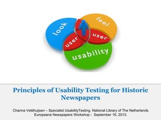
- 1. Channa Veldhuijsen – Specialist UsabilityTesting, National Library of The Netherlands Europeana Newspapers Workshop - September 16, 2013. Principles of Usability Testing for Historic Newspapers
- 2. What is usability? Usability means… …making sure something works well, and that a person of average ability or experience can use it for its intended purpose without getting hopelessly frustrated. - Steve Krug
- 3. Usability lessons to keep in mind • Don’t Make Me Think As a rule, people don’t like to puzzle over how to do things. Web applications should explain themselves. Don’t make your website unnecessarily complicated; if users have to think too much, you’ll lose them. • Don’t waste my time Much of people’s web use is motivated by the desire to save time. So make important features / content stand out or users will get frustrated. • No Time for Small Talk Most users don’t have time for small talk; they want to get right to the beef. So get rid of irrelevant information on your website.
- 4. • We’re creatures of habit If people find something that works, they usually stick to it. They’ll use a better way if they stumble across one, but they seldom look for one. So first impression is important! • Take me back! Users often choose system functions by mistake and will need a clearly marked "emergency exit" to leave the unwanted state or they’ll use the back button. The back button is the most-used feature of web browsers (!), so make sure it works on your website. • Make it easy to go home Having a home button in sight at all times offers reassurance to users that no matter how lost they may get, they can always start over. Usability lessons to keep in mind
- 5. • Don’t lose search Some people (search-dominant users and there are a lot of them among library ), will almost always look for a search box as they enter a site, so make sure they can find it. • Be consistent Users should not have to wonder whether different words, situations, or actions mean the same thing. Follow platform conventions. • What’s wrong?! Error messages should be expressed in plain language (no codes), precisely indicating the problem and constructively suggesting a solution. • Help me! Even though your website should be easy to use, some people may still get lost. Help them along with a FAQ and/or tutorials. Usability lessons to keep in mind
- 6. What is usability testing? Watching people try to use what you’re creating/designing/building (or something you’ve already created/designed/built), with the intention of (a) making it easier for people to use or (b) proving that it is easy to use. - Steve Krug The aim is to observe people using the product to discover errors and areas of improvement. - Wikipedia
- 7. Why should you do it? • All websites have problems and most problems are easy to find… if you try. You probably won’t notice (some of the) usability problems on your website, because you know how the site works. Most of your users, on the other hand, don’t know the website and that makes all the difference. • If you don’t try, your users will tell you about these problems once you have launched the website. It is much easier to fix problems in the early stages of a project and it’s certainly better for your reputation.
- 8. • Watching users makes you a better designer; it makes you smarter about how people use things and how things can be designed for use. Despite all the talk about “user-centered design” and “user experience”, relatively few designers/developers/stakeholders/etc have actually spent any time watching how people use websites. As a result, people end up designing for their abstract idea of users, based for the most part on themselves. Why should you do it?
- 9. If it’s so valuable, why isn’t it a standard part of every web project? Lack of time; most web projects have tight schedules. Most people don’t have any experience with usability testing, so they just don’t know how valuable it is. Reluctance to show work before it is finished. The idea that web analytics give more than enough insight on what people are doing on the website.
- 10. How does it work? – Different types of testing • Hallway testing: Bring in a few random people to test the website. The name of the technique refers to the fact that the testers should be random people who pass by in the hallway and not an in-house, trained group of testers. • Remote Usability Testing: Instead of bringing the users to you, you go to them – electronically, via web tools and by talking on the phone. Easier recruiting (anybody with an internet connection), no travel required, easier scheduling, good results. So why not do all tests remotely? Good results, but being right next to the participant gives even better results. You do lose something not being in the same room as the participant. Compare it to talking face to face vs. talking on the phone. It works, but you do spend more time clarifying things.
- 11. • A/B testing: Two versions of (part of) the website (A and B) are compared. Version A might be the currently used version, while version B is modified in some respect. Which one do users prefer? • Expert review: This method relies on bringing in experts with experience in the field (possibly from companies that specialize in usability testing) to evaluate the usability of a product. How does it work? – Different types of testing
- 12. How does it work? – Rounding up test participants Find users via newsletters, social media, feedback forms, the reading rooms, customer panels, etc. Try to find users who reflect your target audience, but don’t get hung up about it. The more users you watch, the fewer new problems you’ll see. Three to eight users per test is enough (depending on the scale of the test). Ask people who are not (yet) familiar with the project/website.
- 13. How does it work? – What you should test Decide what to test, based on: •The things that people must be able to do in order to make your website a success. (for instance; being able to open digital image of historic newspaper) •The things that you suspect people are going to have trouble with; that may confuse people. (features that have caused debate within the design team) •The things that your other research suggest may not be easy to use. (based on the questions costumer support gets, web analytics, etc)
- 14. How does it work? – Attitude • Stay neutral Hide your personal agenda. You don’t want to influence the participants or your testing will lose its credibility. And never criticise the participant. Keep in mind that whatever problems the participant encounters, it is your website that is causing these problems, not the participant. • Keep your promises Don’t ask people to test your website if you are not going to be using their feedback. Make sure the test results are integrated into future developments of the website.
- 15. How does it work? – Roles Moderator: Right next to the participant. Tells participants what to do, makes them feel comfortable, gets them to verbalize their thoughts, keeps them talking. Does not give his/her own opnion about the website and does not answer questions; the participants have to figure it out on their own. Observer: In another room, but able to follow everything the participant does. Takes notes. Particulary interested in moments when the participant gets confused or frustrated.
- 16. Conclusions and debriefing Make a list of the most serious usability problems that the participants encountered. To determine to most important problems, ask yourself: •Will a lot of people experience this problem? •Will it cause a serious problem or just an inconvenience? Discuss the list with (your fellow) developers and decide which problems you are going to fix first.
- 17. Keep the before mentioned usability lessons in mind! And… •Balance is everything Make sure the interface keeps a good balance between text, image and empty space: Try to avoid long texts; most people do not take the time to read properly and a lot of text will scare them away. If you have to use a lot of text: please use alinea’s, and subheadings. Images and icons make your website visually attractive. Please don’t forget to use alt texts for images and icons. Empty space creates overview; most people don’t have the patience to scan the whole website to find what they are looking for. •Follow web standards; they exist for a reason. For instance; people expect to go to the top right corner to log out. Don’t confuse or frustrate users by putting the log out button somewhere else. Usability: historic newspapers
- 18. • Don’t hide it If the historic newspaper site is part of another website, make sure users immediately know where to look for the newspaper section. • Let them browse! Users want to know what kind of content they can expect on your website (titles, years, more information about each title, etc) and they want to be able to browse through it. • First things first Ask yourself; what is the main feature on this page? Make sure the user’s attention is immediately drawn to it (in this case; search engine, digital image of newspaper). • Open access is preferred If you do ask users to pay, I am sure you’ll have your reasons for it. So please explain them to your users. • Always enable users to give feedback on the website. It satisfies users to be able to ask questions or leave suggestions/complaints and it will give you a lot of useful information about the usability issues on your website. Usability: historic newspapers
- 19. Recommendations Books •“Don’t Make Me Think” - Steve Krug •“Rocket Surgery Made Easy” - Steve Krug •“Handbook of Usability Testing” - Jeffrey Rubin & Dana Chisnell •“A Practical Guide to Usability Testing”- Joseph Dumas & Janice Redish •“Usability Testing Essentials: Ready, Set...Test!” - Carol Barnum
- 20. Recommendations Websites •http://www.sensible.com/ Steve Krug’s website; full of useful information on usabilty testing, including chapters from his books, video’s, etc •http://www.nngroup.com/people/jakob-nielsen/ Jakob Nielsen’s website; lots of useful articles on web usability, user testing, writing for the web, etc. •http://www.usefulusability.com/24-usability-testing-tools/ List of 24 usability testing tools
Hinweis der Redaktion
- Steve Krug is a renowned usability expert. He wrote two influential books about it (see recommendations later on). I found this image online. It gives a good impression of the things people will say when a website or product is usabilityfriendly.
- Combination of lessons by Steve Krug, Jakob Nielsen (usability experts) and my own experience from usability testing.
- Creatures of habit; first impression is very important, because people rarely look for other ways to use your website.
- Web analytics are certainly very valuable, but they show you what people do and not why they do it. Usability testing does both.
- Hallway testing: you can find these people anywhere; literally in the hallway / reading rooms or through social media, newsletters and the like. The idea is that you contact them and they’ll come to you to do the testing.
- A/B tetsing: could be the current website (version A) and a new design (version B) or two different options of a new feature. Expert review: valuable when you are working on a big project.
- Not familiar with the project/website: participants need a to be as unbiased as humanly possibly. You do not necessarily need users from your target group. Many of the most serious usability problems have nothing to do with domain knowledge, they’re related to things like navigation, page lay-out and so on; problems that almost anybody will encounter. Number of users: depends on the scale of the test (small test is less testers) and it also depends on who you are talking to. Krug says three testers per test is enough, Nielsen says five… Most people agree that no matter how big your usability test is, eight participants is enough to discover the vast majority of usability problems on the webiste. If you’ll bring in more than eight people, it is very unlikely that the ninth or tenth tester will tell you things you do not already know by then. Steve Krug: three users is enough Jakob Nielsen: five users is enough.
- Image “No! That’s not how you’re supposed to use it!”: You may think it, but you should never say say it out loud!
- Some people use the term “facillitator” instead of “moderator”. The participant is the person in the middle; he/she is in the room with the moderator/facillitator.
- Determine the most important problems: if one participant finds a serious usability issue, you should include it, even if he/she is the only person who found it.
- Usability lessons: slide 3-5 Avoid long texts: especially on the homepage.
- Don’t hide it: as I’ve said before; most users are impatient. If they have to think too much, you’ll lose them.
- These are just a few examples. There are other good books out there. If you’re new to usability testing, the books by Krug are probably the best ones to start with. They’re easy to read and very hands-on.
- Like Steve Krug, Jakob Nielsen is a renowned usability expert. I have not included any of his books (last slide), because the ones on usability testing are a little outdated, in my opnion, but his website is very useful.