
Empfohlen
Weitere ähnliche Inhalte
Was ist angesagt?
Was ist angesagt? (20)
Ähnlich wie Analysis of Comic
Ähnlich wie Analysis of Comic (20)
Mehr von Erika Louise Tolputt
Mehr von Erika Louise Tolputt (20)
Kürzlich hochgeladen
Kürzlich hochgeladen (20)
Analysis of Comic
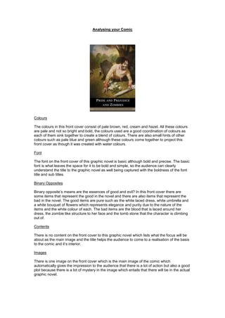
- 1. Analysing your Comic Colours The colours in this front cover consist of pale brown, red, cream and hazel. All these colours are pale and not so bright and bold, the colours used are a good coordination of colours as each of them sink together to create a blend of colours. There are also small hints of other colours such as pale blue and green although these colours come together to project this front cover as though it was created with water colours. Font The font on the front cover of this graphic novel is basic although bold and precise. The basic font is what leaves the space for it to be bold and simple, so the audience can clearly understand the title to the graphic novel as well being captured with the boldness of the font title and sub titles. Binary Opposites Binary opposite’s means are the essences of good and evil? In this front cover there are some items that represent the good in the novel and there are also items that represent the bad in the novel. The good items are pure such as the white laced dress, white umbrella and a white bouquet of flowers which represents elegance and purity due to the nature of the items and the white colour of each. The bad items are the blood that is laced around her dress, the zombie like structure to her face and the tomb stone that the character is climbing out of. Contents There is no content on the front cover to this graphic novel which lists what the focus will be about as the main image and the title helps the audience to come to a realisation of the basis to the comic and it’s interior. Images There is one image on the front cover which is the main image of the comic which automatically gives the impression to the audience that there is a lot of action but also a good plot because there is a lot of mystery in the image which entails that there will be in the actual graphic novel.
- 2. Genre The common genre is more of a horror based graphic novel; this means that there are elements of thrills and horror scenes in this graphic novel which leads it to be considered a horror. There are some elements that follow codes and conventions of a comic, the normal items you might find are panels to separate frames, break panels to separate the frames, speech bubbles of the characters and onomatopoeia. This comic is different in the sense of the art form which is different from a typical comic as it is more realistic and detailed sketches, there aren’t colours involved in this comic where a normal comic would usually include lots of colours to represent emotions and atmospheres which this comic doesn’t use. There are also the difference of the narrative which means this comic uses a more old fashioned form of communication where as a normal comic usually wouldn’t do this, the other aspect that is dissimilar is the characters are not out of the ordinary such as the normal comic samples such as the superhero and the villain. The normal front cover to a comic contains multiple elements such as the masthead which is the section on the front cover that presents the title, author and other people that helped to produce the comic; this shares the purpose of giving credit and recognition to the creators and supporters of the comic. The other elements include the tagline which serves its purpose through promoting and endorsed through other companies that applauds its efforts and achievements. The strapline shares the purpose of producing a form of slogan for the comic to convince the audience to purchase the comic if the audience weren’t persuaded so far. The freebie that comes with a comic can tempt the audience to purchase the comic due to the free gift that is provided on purchase with the comic, this can tempt the audience that are interested in comic collector items. The main character on the front of the comic presents the purpose that it shows who is the main focus and icon of the comic. The price is situated around the barcode on the cover which means that the price is a piece of information that the comic doesn’t want paraded on the front for the audience to notice and consider over the interest of the comic. The date is not presented in an obvious form but serves its purpose with the age so the audience understand the age of the comic to understand how all its other elements could be presented. The barcode on the cover shares its purpose of the purchase so that it can be paid for and then belong to the customer. The internet address will serve its purpose of promoting the comic and or its author to be able to market itself more than just the purchase of the comic. A clue to its contents will help the audience to grasp an idea of what the comics contents contains so that it could spur them to purchase the comic more than just the image and title of the comic. This specific comic contains just a simple handful of these comics such as the masthead, tagline, the main character, price, date, barcode and a clue to the contents of the comic which are all basic elements to most comics. The front cover of this comic follows the codes and conventions of comics to a certain extent but does waver from it as the entire baseline of the comic is rather different to a normal comic and therefore doesn’t contain the same sort of information. Fonts and Sizes The font fits with the genre of the comic because the font gives the idea that the comic could be simpler than first expected whereas the image on the comic front cover prevails a different impression. The simple font on the front cover helps to simplify the comic so that it does not become too complex or complicated for the audience as this could promote a disinterest in the comic. The font also appears to have straighter edges and a more professional appearance which leaves the impression that is for targeted at adults and more of the older generation that will understand the ethics of this graphic novel. The font also is of a medium standard and not too outrageous to present the impression that it is a particularly classic and aristocratic graphic novel.
- 3. Image The main image on the front cover gives a small summative review on the outline of the graphic novel; it is a realistic image which is common in western graphic novels. The image focuses around one of the main characters in the novel which supports the target audience for understanding the style of the graphic novel and its interior. The mise-en-scene which means the items in the whole picture includes multiple items; the first item is the colouring which is a mixture of pale colours which blend together to create a soft colour scheme which is coordinated in a professional light. The other items in the mise-en-scene is the main character which is featured in the graphic novel, the basic facial expression of that main character is plain although her outfit is peculiar which leads the focus there. The most important items in this front cover are the posture of the main character which is more of a primal posture which appears unsuitable for the character but suitable for the title of the graphic novel. The message it delivers to its audience is that together it would seem as though some items do not fit together but sometimes those pieces can produce a great piece of art, as the image shows a range of items that are not a common mixture although in this comic it seems to fit together. When the reader reacts in an astounded form to the comic their instincts when purchasing should be how the comic will open their minds to possibilities untaught of. The comic promises the reader that there is a surprise during the comic that was unexpected and will change the tone of the comic and the audience. Main Character/ Icon The image expected on the front cover of a graphic novel should be of the main character which is also the same situation for this front cover on this comic. The main image of the main character is shown in a light where the background colours are dull and faded, where the expressions of the main character is simple yet effective due to the deformations which are similar to a zombie on her face. The main character featured in this image is predominantly in the same outfit in each series of this graphic novel, there are no extra characters with the main character although the changes made in each front cover is the position and extra element or prop that is featured in the background of the image. The prop in each image does remain as some sort of bad item as mentioned before although the positions are not just primal, the positions can also be of a higher class to mix up the situation and to bring fresh ideas to the audience’s eyes. Representation The forms of characters used in this comic are of a high class although their situation appears dangerous and suicidal. In this comic the fashion statement for each character can give the audience an idea of who each character is and who the main characters are. The audience would react in different forms depending on the audiences taste and preferred form of graphic novel. I believe that this particular comic is not criticized for stereotyping as the characters involved, including the main characters, do not portray a particular stereotype, so I would
- 4. argue that this graphic novel does challenge the typical stereotyping in graphic novels. This particular novel does this through using uncommon characters that are not common in a comic but are common in general books which tend not to include stereotyping as much as comics. The clothing of the characters represents an era more than forms of sexism, racism and occupations, the era signifies the women’s role and the men’s role of that time although that will just represent historical facts. Audience The age range for this comic will be of the age of a mature adult, male or female gender as this comic is not specific for either as it is aimed at the unisex group and it is more for the working class and higher due to the price and ranking of the comic. The audience would read the comic to gain a thorough understanding and cure the interest of the initial draw into the comic when first sited. It will provide the use of widening the creative mind for the audience and the gratifications of the understanding of the comic. The significance of the price is that it presents the direction of the target audience as that is the group that this comic is reaching out to. One of the main reasons for targeting to a mature adult audience is so that after the completion of reading the comic then that person would be eligible to recommending it to a friend or collage that would ordinarily fall into the same target audience description of the customer that had just read it.