Esri News for State & Local Government newsletter
•
2 gefällt mir•1,278 views

Esri News for State & Local Government Summer 2013 newsletter

Empfohlen
Weitere ähnliche Inhalte
Was ist angesagt?
Was ist angesagt? (20)
Andere mochten auch
Andere mochten auch (10)
Ähnlich wie Esri News for State & Local Government newsletter
Ähnlich wie Esri News for State & Local Government newsletter (20)
Mehr von Esri
Mehr von Esri (20)
Kürzlich hochgeladen
Kürzlich hochgeladen (20)
Esri News for State & Local Government newsletter
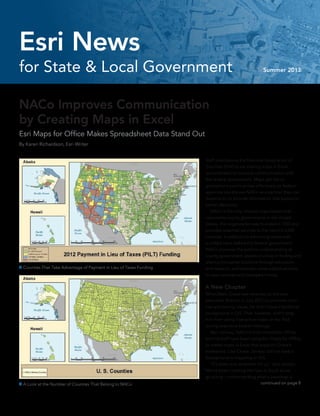
- 1. NACo Improves Communication by Creating Maps in Excel Esri Maps for Office Makes Spreadsheet Data Stand Out By Karen Richardson, Esri Writer Staff members at the National Association of Counties (NACo) are making maps in Excel spreadsheets to improve communication with the federal government. Maps get the or- ganization’s points across effectively so federal agencies quickly see NACo as a partner they can depend on to provide information that supports better decisions. NACo is the only national organization that represents county governments in the United States. The organization was founded in 1935 and provides essential services to the nation’s 3,069 counties. In addition to advancing issues with a unified voice before the federal government, NACo improves the public’s understanding of county government, assists counties in finding and sharing innovative solutions through education and research, and provides value-added services to save counties and taxpayers money. A New Chapter When Matt Chase was selected as the new executive director in July 2012 to promote coun- ties and county issues, he didn’t have a technical background in GIS. That, however, didn’t stop him from using interactive maps on his iPad during executive board meetings. Bert Jarreau, NACo’s chief innovation officer, and his staff have been using Esri Maps for Office to create maps in Excel that support Chase’s endeavors. Like Chase, Jarreau did not have a background in mapping or GIS. “It’s been trial and error for us,” said Jarreau. “We’ve been creating the how-to book as we go along—understanding what a basemap is A Look at the Number of Counties That Belong to NACo continued on page 8 Counties That Take Advantage of Payment in Lieu of Taxes Funding for State & Local Government Summer 2013 Esri News
- 2. Summer 2013 Esri News for State & Local Government is a publication of the State and Local Government Solutions Group of Esri. To contact the Esri Desktop Order Center, call 1-800-447-9778 within the United States or 909-793-2853, extension 1-1235, outside the United States. Visit the Esri website at esri.com. View Esri News for State & Local Government online at esri.com/statelocalnews or scan the code below with your smartphone. Advertise with Us E-mail ads@esri.com. Submit Content To submit articles for publication in Esri News for State & Local Government, contact Christopher Thomas at cthomas@esri.com or Matt DeMeritt at mdemeritt@esri.com. Manage Your Subscription To update your mailing address or subscribe or unsubscribe to Esri publications, visit esri.com/publications. International customers should contact an Esri distributor to manage their subscriptions. For a directory of distributors, visit esri.com/distributors. Circulation Services For back issues, missed issues, and other circulation services, e-mail requests@esri.com; call 909-793-2853, extension 2778; or fax 909-798-0560. Submission Guide Lines For submission guide lines, visit esri.com/industries/localgov/ community/guidelines. 2 Esri News for State & Local Government Summer 2013 Contents Cover 1 NACo Improves Communication by Creating Maps in Excel Case Study 4 “If You Build It, They Will Become Aware” 6 Better than Scratch 9 Making a Game of Bicycle Commuting Esri News 10 Esri Online 10 2013 Esri Partner Conference Award Winners The information contained in this work is the exclusive property of Esri or its licensors. This work is protected under United States copyright law and other international copyright treaties and conventions. No part of this work may be reproduced or transmitted in any form or by any means, electronic or mechanical, including photocopying and recording, or by any information storage or retrieval system, except as expressly permitted in writing by Esri. All requests should be sent to Attention: Contracts and Legal Services Manager, Esri, 380 New York Street, Redlands, CA 92373-8100 USA. The information contained in this work is subject to change without notice. The Geographic Advantage, Esri, the Esri globe logo, 3D Analyst, ArcAtlas, ArcCatalog, ArcData, ArcDoc, ArcEditor, ArcExplorer, ArcGIS, the ArcGIS logo, ArcGlobe, ArcIMS, ARC/INFO, ArcInfo, ArcLogistics, ArcMap, ArcNetwork, ArcNews, ArcObjects, ArcPad, ArcPress, ArcReader, ArcSDE, ArcSurvey, ArcToolbox, ArcTools, ArcUser, ArcView, ArcVoyager, ArcWatch, ArcWeb, ArcWorld, ArcXML, Business Analyst Online, BusinessMAP, CommunityInfo, EDN, Geography Network, GIS Day, MapData, MapObjects, Maplex, MapStudio, ModelBuilder, MOLE, NetEngine, RouteMAP, SDE, Sourcebook•America, StreetMap, Tapestry, @esri.com, esri. com, arcgis.com, geographynetwork.com, gis.com, and gisday.com are trademarks, service marks, or registered marks of Esri in the United States, the European Community, or certain other jurisdictions. Other companies and products or services mentioned herein may be trademarks, service marks, or registered marks of their respective mark owners. Copyright © 2013 Esri. All rights reserved. Printed in the United States of America.
- 4. “If You Build It, They Will Become Aware” Integrated Web Map Aids Hurricane Sandy Relief Efforts By Jessica Wyland, Esri private surveyors, and local assessors. Bundra quickly updated the map—known officially as the TRMUA GIS map. He added poststorm satellite imagery from the National Oceanic and Atmospheric Administration (NOAA) along with current floodplain delineations and Sandy high-water mark data from the Federal Emergency Management Agency (FEMA). Anyone who needed to quickly get an accurate picture of the Sandy situation could click to the TRMUA GIS map. Bundra built it, and people did come. Police and fire fighters came to determine where to deploy resources. Electric, gas, and water companies came to decide where to start restoring services. Homeowners, evacuated and eager to survey the damage to their property, came to look at before-and-after aerial photos. And, as Bundra predicted, people most definitely did become aware. “The map served as a valuable resource for the police department after Sandy,” said Mike Burke, IT and 911 coordinator for Toms River Police Department. “We relied on that visual representation—the before-and-after layers— to set up security perimeters and determine where to place cement barriers.” Since the TRMUA GIS map was built on the Esri ArcGIS platform and hosted by Amazon Web Services, it provides virtually unlimited power for analysis, collaboration, and spatial data processing. For example, following the storm, many outside contractors arrived on the shores of New Jersey to restore the region’s infrastructure. One group in particular consisted of engineers who needed to figure out the best plan for repaving roads. The TRMUA GIS map helped them find their way around unfamiliar areas. They were able to use the map to locate important elements such as parcels, street addresses, hydrants, and underground utilities. In the weeks and months following Sandy, the map continued to help. Utilities used it to review parcel polygons on the barrier islands to identify houses and neighborhoods that were destroyed so the impacted ratepayers would not be charged for the year 2013. The map’s links to FEMA flood advisory maps It started as a free, public sewer infrastructure map for Toms River, New Jersey. Len Bundra, IT and GIS director for Toms River Municipal Utilities Authority (TRMUA), built it in 2004. Then, he kept adding layers. He added aerial imagery, parcel data, and information from agencies such as the New Jersey Department of Transportation, the US Department of NOAA Imagery for the Barrier Island Areas of Toms River—Top Image Shows before Sandy; Bottom Image Shows after Sandy Agriculture, and the US Census Bureau. Bundra had one belief in mind: “If you build it, they will become aware.” He was right. When Hurricane Sandy hit the East Coast of the United States in October 2012, the map was suddenly the go-to information source for emergency responders, utilities, public works, 4 Esri News for State & Local Government Summer 2013
- 5. are helping affected townships adopt a new flood insurance risk map. Bundra also recently added a layer to show houses that are slated for demolition and/or labeled uninhabitable to advise citizens and utility companies on where to focus rebuilding infrastructure. For Bundra’s own company, the TRMUA GIS map has continued to serve as a hub. “Simply stated, the Toms River MUA GIS map is a comprehensive, one-stop shopping database of all useful pieces of information for everyone within the MUA, as well as contrac- tors, plumbers, consultants, and more,” said Nicholas Otten, authority engineer for Toms River Municipal Utilities Authority. “All various pieces of data are centralized and accessible by every MUA department within the office or in the field.” Before Bundra created the map, Otten said TRMUA engineers had to sift through a room of drawers with thousands of engineering drawings for information or request data from other departments or agencies. Often, they would have to send out crews for field visits. Now, everything they need is on the computer screen with an aerial basemap. Otten says he can now view maps of all 430 miles of pipe, 9,600 manholes, and 18 pump stations, along with all attributes. At a glance, he can see whether a pipe or manhole has been inspected or rehabilitated and then simply click to view an inspection report or video. He can access various aerial maps, including posthurricane Sandy and aerial basemaps from as far back as 1930. He can tell when a service lateral has been cut and capped and see the triangulated location sketch of the curb cleanout. The map shows all billing information, in- cluding the recorded number of fixtures within a building. It also shows pump station data; the number of connections flowing to the station; and hundreds of pages of data on emergency generators, wiring diagrams, pertinent engi- neering drawings, and pump curves. “With a few clicks, I am also able to generate specific reports,” Otten said. “With GIS, I can determine the approximate average flow within any given pipe segment. I can list pipes and manholes by name. I can find the names and mailing addresses of property owners within 200 feet of one of our construction projects.” History of GIS at Toms River MUA Toms River MUA began its GIS work in 2005 in an effort to assemble 40 years of paper plans and files into a centralized mapping interface. The system was built by in-house staff without the use of any outside consultants, and it was completed within two years. All 9,600 of the MUA’s sewer manholes had exact coordinates verified in the field using submeter GPS units. More than 600,000 line and manhole attributes were entered into an Esri geodatabase from more than 3,000 engineering plans. In addition, an entire GIS parcel basemap was created from scratch to include additional There are 2,558 points hyperlinked to post-Sandy aerial oblique photographs from Civil Air Patrol added to the TRMUA GIS map. elements not typically found on the tax maps. For example, 3,000 individual condo units and all major apartment buildings were added to the basemap, which was then aligned to New Jersey State and US Geological Survey (USGS) orthophotography. The system is now available for all MUA office staff across an internal network and to all field staff via ruggedized laptop units. “The GIS has increased operational ef- ficiencies across all departments by allowing instantaneous access to data that previously had to be searched for among reams of paper files and plans,” Bundra said. “The GIS also allows our field crews access to all the information they need to quickly assess and properly address emergency situations.” Case Study 5Summer 2013 esri.com/localgov
- 6. Better than Scratch Use Configurable ArcGIS Applications to Get Results Quickly By Matthew DeMeritt, Esri Writer A Quick Solution Since 1999, the GIS division of the City of Fort Lauderdale has delivered geospatial services internally to city staff. With a population of more than 168,000, Fort Lauderdale is the largest city in Broward County. Recently, to meet growing demand by public and internal customers for increased transparency and additional services, the division began investigating the templates and applications available from the ArcGIS for Local Government resource center. GIS manager Ian Wint and his staff discovered that simply by con- figuring the templates, the city could rapidly expand its collection of mapping applications in a fraction of the time that it would take if the city developed web maps from scratch. The city’s aging Parks and Recreation application, based on ArcIMS technology, was selected as the initial project. Residents value the park system, and proximity to a neighborhood park positively affects property values. Within a week, Fort Lauderdale’s GIS division had migrated its old Parks and Recreation database schema over to the new information model and stood up the Park and Recreation Finder, which lets residents find nearby parks, either by address or current location or by activity (such as basketball). Inspired by that fast turnaround, staff members began replacing other dated and slow-running web maps. Rather than moving every- thing over at once, the templates from the resource center allowed Fort Lauderdale to take a one-at-a-time approach. “The gradual method of improving our services with increased qual- ity and speed was a huge appeal,” said Wint. “The templates allowed us to add new services to our application gallery at a comfortable pace without the risk of biting off more than we could chew.” What do Fort Lauderdale, Florida; Lake County, Florida; and Cabarrus County, North Carolina, have in common? All three local govern- ments saved time and money by implementing Esri’s ArcGIS for Local Government maps and applications instead of developing those applications from scratch. Esri’s ArcGIS for Local Government maps and applications offer quick and configurable solutions for common web mapping needs. An attractive alternative to creating new services from the ground up, they can refine internal workflows and provide new services to the public. All of the nearly 100 applications can be downloaded at no charge from the ArcGIS for Local Government resource center and are built on the Local Government Information Model. With the Park and Recreation Finder application, residents can find a park that is nearby or that has activities of interest to them. Using Lake County’s My Public Services application, residents can find information on everything from trash pickup to nearby health facilities. “The gradual method of improving our services with increased quality and speed was a huge appeal.” Ian Wint, GIS Manager GIS Division of the City of Fort Lauderdale 6 Esri News for State & Local Government Summer 2013
- 7. Since publishing its Park and Recreation Finder application, Fort Lauderdale GIS has added several new applications based on ArcGIS for Local Government to its existing web mapping application gallery, and more applications are planned. Minimizing Development Time Lake County, Florida, needed a better way to inform both new and part-time residents about county services. It is the home of more than 1,400 named lakes and more than 300,000 residents. Although some information had been available on the county’s interactive map, the GIS division wanted to provide applications that addressed specific needs. Lake County’s GIS programmer/systems coordinator Keyetta Jackson heard about Esri’s local government preconfigured ap- plications at a local user group meeting. She downloaded the My Government Services template from ArcGIS Online and, after up- dating the county database to conform to Esri’s Local Government Information Model, had a new Public Services application published on Lake County’s website in less than a week. “The Public Services page works better than we imagined,” said Jackson. “It provides our customers with a nice-looking interactive dis- play, intuitive controls, and a scrolling window showing all the available services.” Depending on the type of service, each tab includes contact infor- mation, driving distance, and links to websites of the particular service provider. “The beauty of the template is that it minimizes development time,” said Jackson. “I would have spent hours just making design decisions and developing my own code.” Developers can still modify the modules for a custom appearance as they see fit. For instance, Lake County’s page also displays nongovernmental services, such as hospitals and health facilities. Lake County next added the Parks Finder application and plans to eventually create other specialized maps based on the applications in the Esri Local Government Maps and Apps Gallery. The gallery contains a variety of focused web maps. “The Public Services and Parks and Rec pages are just the beginning,” said Jackson. “Being able to individually improve our services with existing assets is a huge benefit.” Eliminating Calls Voters need to know where to vote. With an estimated population of more than 180,000, that meant a lot of calls to the Cabarrus County Board of Elections office. To reduce the number of calls, members of the GIS staff at Cabarrus County, North Carolina, implemented Esri’s Polling Place Locator template. While visiting the county, Esri developers had demonstrated ArcGIS for Local Government templates, that can be used to rapidly create focused applications. With major elections approaching, the polling place locator—which helps voters by identifying their polling place— seemed an obvious choice as the first application to implement. “Within a week of discussing how we could improve our service, we were demonstrating the completed application to our Board of Elections,” said Zachary Woolard, GIS administrator for the county. “Starting from the ground up with no framework or guidance would have taken much more time and considerable effort to get the data to display on the map.” The HTML-responsive design of the Polling Place Locator template also allowed Cabarrus County to deploy the application in the iTunes and Google Play stores. Since publishing the application in 2012, the county has experienced a significant drop in the number of phone calls received by the Board of Elections. The application, which was both successful and relatively easy to stand up, encouraged the county to publish the Parks Finder application and a maps and applications gallery page. Woolard advises developers who are considering implementing these templates to learn the Local Government Information Model schema. “Studying the requirements of the local government model pays off in getting quick project turnarounds,” he said. “That’s fairly easy to do compared to starting a project from scratch. From there, it’s just plug and play.” Getting Results All three local governments created polished, responsive applications that meet specific needs in a short time frame. See what resources are available and get started by visiting facilities.arcgis.com/communities/ local-government. To learn how the ArcGIS Data Interoperability extension can streamline migration to the Local Government Information Model, see “Making Data Fit the Community Maps Program: Migrating to the Local Government Information Model” in the Winter 2013 issue of ArcUser. Cabarrus County’s Election Polling Place Finder gives the location, hours, accessibility, contact, and other information for each polling place, eliminating countless phone calls to the offices of the Board of Elections. Case Study 7Summer 2013 esri.com/localgov
- 8. and which ones should be made available for our staff once they are unleashed to create their own maps. It’s been such an eye-opening ex- perience to discover what we really have available in our data. We can’t wait to train the rest of the staff so they can use this powerful tool.” From Healthcare to Membership Data America’s county governments deliver healthcare directly through public hospitals, clinics, nursing homes, and other settings, as well as protect the public through local health departments. Counties also contribute to the nonfederal share for certain Medicaid services and provide health benefits to the nearly three million county workers and their retirees nationwide. Jarreau’s team created an interactive map that displayed where hospitals and nursing homes were located in each county. With this interactive map, Chase was able to explore data with executives from the United States Department of Health and Human Services, which facilitated better discussions about health care initiatives. Another map was created to show which counties were represented at NACo annual conferences. This data had been collected over a number of years, but there had never been a way to understand the trends in the data before. By mapping the information, the staff was able to see how the makeup of attendees had changed over time. The annual conference map also showed how many counties took part in various NACo programs, such as dental discount cards, and federal funding, such as payment in lieu of taxes (PILT). PILT is a federal program that compensates county governments for the tax revenue that is lost from land that’s owned by the federal government. An example is a national park. While county governments still maintain the expense of infrastructure and services for these areas, they don’t receive a benefit from taxes for their programs. “This was really educational for our members,” said Jarreau. “While many had thought participation in PILT was more of a western phe- nomenon, there were actually a lot of eastern and southern counties that also were part of the program. This is just one of the things we discovered when we were able to look at the data on a map. We can’t wait to see what else we uncover.” For more information, contact Bert Jarreau, chief innovation officer, NACo, at bjarreau@naco.org. Make Maps Directly in Excel Esri Maps for Office is a downloadable add-in for Microsoft Office 2010 that helps organizations make better decisions through location analytics. Interactive maps can be added to Microsoft PowerPoint presentations or shared through Esri’s cloud mapping platform, ArcGIS Online. Maps shared through ArcGIS Online are accessible throughout an organization and available for embedding into mobile or web applications. Through tight integration of Esri Maps for Office with ArcGIS Online, users can access a variety of background maps, includ- ing street, satellite, and topographic maps. These maps can also reuse and incorporate any other map their organization provides access to, as well as tens of thousands of maps published by Esri’s worldwide user community. Creating interactive maps of Excel data is simple. Maps can display locations (e.g., addresses, sites by map coordinates, facili- ties, businesses, opportunities, distribution points) and geographic data, such as color-coded maps of enrollment by state. All that’s needed to get started using Esri Maps for Office is an ArcGIS Online paid or trial subscription, along with Microsoft Office 2010 or later. Esri Maps for Office is available as a free download to organizations with ArcGIS Online subscriptions. For more information on Esri Maps for Office, visit esri.com/maps4office. Addresses can be easily mapped in Excel. NACo Improves Communication by Creating Maps in Excel continued from cover 8 Esri News for State & Local Government Summer 2013
- 9. Making a Map Game of Bicycle Commuting Greater Redmond Transportation Management Association Generates Enthusiasm RideAmigos provided a map specifically for participants so they could visualize their trip and mileage statistics. GRTMA also learned how far the participants normally drive to work. The organization used that information to show participants the amount of pollution they reduced and gas savings to encourage participants to extend their bike commutes beyond the competition. For more information, contact Jeffrey Chernick at jeff@rideamigos.com. Redmond, Washington, 16 miles east of Seattle, is well-known as the home of Microsoft. It is also home to an active bicycling community. Known as the Bicycle Capital of the Northwest, the city hosts Redmond Derby Days each year, the nation’s longest-running bicycle race. Seven years ago, the Greater Redmond Transportation Management Association (GRTMA) began Tour de Redmond, a commuter bicycle challenge that encourages participating companies’ employees to bike to work. The competition has had an estimated 900 participants, which requires extensive preparation and excellent execution. Until last year, it struggled to organize participant information. At several points in the event’s history, participants had to report their mileage in spreadsheets, a process that was labor intensive for participants and GRTMA staff and prone to error. The electronic systems GRTMA tried weren’t much better. “The programmers could never quite get it right, and that created all kinds of havoc for us,” said Linda Ballew, executive director, GRTMA. Luckily, Ballew saw Jeffrey Chernick, chief executive officer of Esri partner RideAmigos, making a presentation at a conference a few months before the 2012 Tour de Redmond began. RideAmigos technology provides online resources and maps that make it easy for commuters to find car pools and vanpools or determine times and routes for biking or public transportation. The solutions also create friendly competition among commuters with prizes for those who take the most trips with alternative transportation. “Lightbulbs started going off in my head,” said Ballew. “I told him he had just made everything I’d ever seen for tracking and monitoring people obsolete. Then I asked him if it would be possible to use just the team portion of his program for a bicycle challenge.” GRTMA used the gaming, rewards, and tracking module from RideAmigos to create a website where participants could log their trips and miles. Participants in the eight-week-long event could see their individual trip and mileage statistics as well as a leaderboard with rank- ings for teams and individual riders. “When you start correlating trip logs with ranking, you start making it user versus user, team versus team, company versus company, and all of a sudden it becomes a game, and that’s what drives the sticki- ness factor,” said Chernick. “People get into it, and instead of doing it because their boss tells them to, they do it because they want to get points and take the lead.” In addition to the thrill of attaining a number-one ranking, partici- pants were competing for prizes including trophies, cash awards, and REI gift certificates. For the GRTMA, RideAmigos combined bike commuter data with existing bike infrastructure data, such as bike lane locations, on a map to help the association understand which resources riders were using and drive smarter decisions about managing and creating this kind of infrastructure. For example, seeing where there are heavy concen- trations of bike commuters indicates good areas for adding bicycle lanes. The interactive map showed the GRTMA where participants were concentrated across the area as well as employer participation. A map showed GRTMA the areas where bike commuters were concentrated. Each bicyclist could easily log trips and see ranking, total miles and trips, and a leaderboard online. Case Study 9Summer 2013 esri.com/localgov
- 10. Find ArcGIS for Local Government Resources on GitHub To make it easier for developers to access the code base for the growing collection of ArcGIS for Local Government applications and add-ins, Esri launched a series of GitHub repositories to share source code for web, desktop, and mobile content. Esri will continue to ship supported versions of the ArcGIS for Local Government maps and apps via ArcGIS.com along with this new channel for its developer community. https://github.com/Esri Get the Latest Esri UC News The 2013 Esri International User Conference (Esri UC) is almost here. Geospatial enthusiasts from around the world will gather in San Diego, California, July 8–12 to learn about the latest trends, technology, and implementations. Follow these sources to stay connected with Esri UC news: •• Esri.com/ucnews •• Twitter.com/esriuc •• Facebook.com/esriuc •• Plus.google.com/+esri Esri Online 2013 Esri Partner Conference Award Winners At the 2013 Esri Partner Conference, Esri acknowledged several organizations for innovative uses of the ArcGIS platform’s latest features. The following award winners are taking geographic visualization to a higher level: Best New Partner MindMixer Mindmixer.com Public-Facing Web Application Data Transfer Solutions—WildfireMaps.com www.dtsgis.com Internal Workflow Web Application Accela—Accela Automation www.accela.com Innovation Application RideAmigos www.rideamigoscorp.com Mobile Application NISC—iVUE App Suite www.nisc.coop/ivue Stand-alone Desktop Application (Runtime) Blue Dot Solutions—Cyan Patrol Inspections www.bluedotsolutions.com ArcGIS for Desktop Application Dig-Smart—Dig-Smart Enterprise www.dig-smart.com Location Analytics Galigeo—GeoDashboard www.galigeo.com Organizational Use of ArcGIS Online GEO-Jobe GIS Consulting www.geo-jobe.com Learn more about Esri partners at esri.com/partners. MindMixer Co-Founder Nick Bowden (right) accepts Best New Award from Esri president, Jack Dangermond (left). Become an Insider Check out the Esri Insider blog to be among the first to know about Esri’s visions, strategic initiatives, and trending topics. Bloggers include Esri president Jack Dangermond, Esri technical evangelist and product manager Bern Szukalski, and Esri chief scientist Dawn Wright. Esri.com/insider 10 Esri News for State & Local Government Summer 2013
- 11. Enterprise Information Solutions www.enterinfo.com 9002 Red Branch Road, Columbia, MD 21045 (410) 884-7888 Complete Pavement Management Decision Support 3D Pavement Analyzer Automated Crack Detection Transverse Profiling (Rutting) Longitudinal Profiling (IRI) Hi-Res Pavement Imaging Hi-Res 360º ROW imaging Grade and Curvature Rating, Budgeting, Repair Prioritizing, and Condition Forecasting Solid Waste Sweeper Transit Bus Grader Loader Real-Time Service Tracking AVL www.eRoadTrack.com www.eRoadInfo.com
- 12. Presorted Standard US Postage Paid Esri 380 New York Street Redlands, California 92373-8100 usa 30-day free trial: esri.com/agol Creating your own map from maps published by other users is just one of many ways to take advantage of the rich collection of data and resources ArcGIS SM Online makes available to you. Welcome to the new frontier in geographic information systems. ArcGIS Online Copyright © 2012 Esri. All rights reserved. 30-day free trial: esri.com/agol Creating your own map from maps published by other users is just one of many ways to take advantage of the rich collection of data and resources ArcGIS SM Online makes available to you. Welcome to the new frontier in geographic information systems. ArcGIS Online Maps made better. (Some assembly required.) Copyright © 2012 Esri. All rights reserved. 135637 QUAD146.4M5/13tk