
Empfohlen
Weitere ähnliche Inhalte
Andere mochten auch
Andere mochten auch (13)
Ähnlich wie Question 3 Evaluation
Ähnlich wie Question 3 Evaluation (20)
Question 3 Evaluation
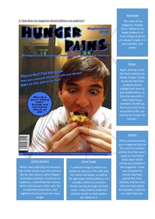
- 1. 3. How does my magazine attract/address my audience? Masthead The name of my magazine, Hunger Pains, relates to my target audience as most college students are always hungry. It is also comedic, and catchy. Slogan Again, playing on the fact that students are always hungry, it puts across the fact that students attend college/sixth form to gain qualifications, to become successful. I have heard many members of staff say that if you want to be successful in life, you need to be ‘hungry for success’. Colour Scheme When I was collecting my research, one of the results I was the common like for two colours, which happen to be black and blue. To attract my audience, I used these two colours, which contrast each other well. The complement each other, and together stand out from the cover image. Cover Image I used this image to attract my audience, because it fits well with the name and slogan, as well as the age range of the audience. It is comedic, which is a common theme running through my front cover. I have tried to make the scenario simple so that readers can relate to it. Articles Often someone would put a magazine back on the rack if it contains articles that they won’t read, so I have been picky about which articles are included in the magazine. I have only included the articles that have gained the most interest, and the ones that are most useful, for example, a jobs list, or a staff interview.