
Empfohlen
Weitere ähnliche Inhalte
Was ist angesagt?
Was ist angesagt? (20)
Andere mochten auch
Andere mochten auch (20)
Ähnlich wie Film review analysis
Ähnlich wie Film review analysis (20)
Mehr von Dionj
Kürzlich hochgeladen
Kürzlich hochgeladen (20)
Film review analysis
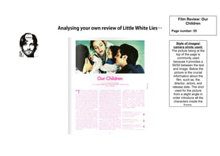
- 1. Analysing your own review of Little White Lies… Film Review: Our Children Page number: 55 Style of images/ camera shots used: The picture being at the top of the page is commonly used because it provides a 50/50 between the text and image. Below the picture is the crucial information about the film, such as, the director, actors, and release date. The shot used for the picture from a slight angle in order introduce all the characters inside the frame.
- 2. Rating system: What does this suggest? Little White Lies uses a unique way of rating each film. They will have a side column dedicated to the rating system in the order of Anticipation, Enjoyment and Retrospect. Layout and design of page: Adjectives used to describe film: • Intense • Harrowing • Chilling bleakness • Impressive • Fully committed • Beautifully active • Ensuring tragedy Use of colour/ fonts: The use of colours is the same throughout the film review. The consistent colour of pink is because it relates to the main concept of the magazine… ‘Man of Steel’ Format/ layout: The layout of the film review is very simple and straightforward. This is because there is one image that is at the top of the page and the review is followed underneath. The layout of the writing is divided into three columns. This helps to break up the amount of writing and is followed throughout the magazine.