Improve UX with Audience Insights
•Als PPT, PDF herunterladen•
1 gefällt mir•757 views

This document discusses the importance of website user experience (UX). It explains that UX encompasses all aspects of a customer's interaction with a company through its services and products. The document advises understanding who your website visitors are, why they are visiting, and if their needs are being met through intuitive organization, clear calls-to-action, and analytics. It emphasizes the importance of having a clear value proposition that customers can understand in 5 seconds or less. The overall message is that a website is an extension of a company and should be designed with the customer in mind.

Empfohlen
Weitere ähnliche Inhalte
Ähnlich wie Improve UX with Audience Insights
Ähnlich wie Improve UX with Audience Insights (20)
Mehr von Deluxe Corporation
Mehr von Deluxe Corporation (20)
Kürzlich hochgeladen
Kürzlich hochgeladen (20)
Improve UX with Audience Insights
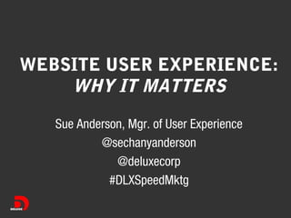
- 1. WEBSITE USER EXPERIENCE: WHY IT MATTERS Sue Anderson, Mgr. of User Experience @sechanyanderson @deluxecorp #DLXSpeedMktg
- 2. WHAT IS UX? • "User experience" encompasses all aspects of the enduser's interaction with the company, its services, and its products.
- 3. YOU ARE ALREADY DOING IT! Your customer service: • Customer needs • Customer touchpoints • Customer impressions
- 4. YOUR WEBSITE IS AN EXTENTION OF YOU
- 5. KNOW YOUR AUDIENCE • • • • Who are they? Why are they visiting? Can they do that? Do they get you?
- 6. WHO? • Who is your target customer? • Online?
- 7. WHO? What do you know about them? • Comfort levels with technology • Online habits • Motivators/triggers
- 8. MEET MIKE BLACK • Lawyer and Mediator • Family law practice since 1978 • Mediating divorces for 30+ years
- 9. WHO VISITS MIKE'S SITE?
- 10. WHY? • Why are folks visiting your site? • What do they want to know/do?
- 11. WHY?
- 12. WHY? How do I know? • Observe • Ask • Document
- 13. ARE YOU MEETING THEIR NEEDS? • Can they find what they are looking for? • Does the organization of content make sense? • Are your Calls-To-Action (CTAs) clear?
- 14. ARE YOU MEETING THEIR NEEDS? Organizing content intuitively THEN NOW
- 15. ARE YOU MEETING THEIR NEEDS? Clear paths / calls-to-action We really want you to do this Where should a user start?
- 16. ANALYTICS CAN HELP • • • • • Bounce rates Keyword search terms Next page flow Time on page Visit time of day
- 17. VALUE PROPOSITION CLEAR? • What makes you different? • Why should your customers choose you? Try the 5 second test
- 19. VALUE PROPOSITION • What does Shamblott do? • What is different about them? • What assumptions did you make about Shamblott?
- 21. VALUE PROPOSITION • What does Zuckerberg do? • What is different about him? • What assumptions did you make about Zuckerberg?
- 23. IN SUMMARY • • • • Know your audience Know why they are visiting your site Be aware if you are meeting their needs Make sure your site does you justice
Hinweis der Redaktion
- Understanding your customer will bring you more cusotmers
- There is a need or problem that you are solving
- Hve you ever asked “Don’t these folks want my business?” If they are frustrated, they will translate that into making assumptions about you and your company
- People who are online today? Are they the ones you want online? Are they different than your “target customer?”
- People who are online today? Are they the ones you want online? Are they different than your “target customer?”
- Deliberate observation Take time to ask questions Make sure you are documenting / future tracking of improvement
- Deliberate observation Take time to ask questions Make sure you are documenting / future tracking of improvement
- Ice cream shop: What might you have as the CTAs What wouldl be important to put into the navigation? If you do this quickly and easily, they are more open to listening to you. Or looking at the producst you want to sell to them. Donating
- Etsy has evolve their “navigation” based upon how user’s expect to look for things on their site. Other things to consider: Search
- Clear calls-to-action means: it’s immediately clear what path we want the user’s to take. Use visual cues. Make buttons look “clickable”. Links should: use “trigger” or keywords and should inform the user of what will happen next.
- If you do this quickly and easily, they are more open to listening to you. Or looking at the producst you want to sell to them. Donating
- Understanding your customer will bring you more cusotmers