
Empfohlen
Weitere ähnliche Inhalte
Was ist angesagt?
Was ist angesagt? (19)
Andere mochten auch
Andere mochten auch (16)
Ähnlich wie Poster analysis
Ähnlich wie Poster analysis (20)
Mehr von Connorevansmedia
Mehr von Connorevansmedia (17)
Kürzlich hochgeladen
Kürzlich hochgeladen (20)
Poster analysis
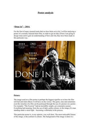
- 1. Poster analysis “Done in” – 2014. For the first of many research tasks that we have been set to do, I will be analysing a poster of a recently released short film, in order to get an idea of how I am going to design mine and to gain an understanding of how and why they have been made in this particular way. Picture: The image used on a film poster is perhaps the biggest signifier as to how the film will feel and what effects it will have on the viewer. The genre, tone and sometimes even the storyline of a film can be portrayed through the use of a picture on a poster. For example, “The Exorcist” had an incredibly simple, yet connotative poster. Everything had meaning, from the use of dark, gothic colours, to the image of a man standing under a street light – becoming a silhouette in the process. This particular poster is, in my opinion, very well done. The most noticeable feature of the image, is the contrast in colours. The background of the image is done in a
- 2. warm golden colour, whilst the image of the protagonist is simply black and white. This may seem blatantly obvious and may have no relevance to anything at first, but if we look deeper we can start to see why the colours have been used. The film is titled “Done in”, perhaps implying that an extensive period of hard work or effort is now over. It could also signify how the main character has been hard done by and hurt, which is shown by his facial expression. The rich, warm golden glow of the background could represent the past, in which this character was successful and happy. The black and white image of the man could literally represent how he has been left feeling afterwards. I have not seen this film or researched into the storyline at all, because I need to treat this poster as if it is the first time I have seen it. Making the character black and white may also represent the tone of the film. Without even analysing the character’s face, we can guess that he is a lonely and almost depressed character. Another typical convention of film posters that has been used is a full bleed image. Full bleed images help to endorse the audience into the film more than a smaller image, because they offer more (in a visual sense) to the audience. However, the visual impact aside, full bleed images do come with their constraints. The use of a detailed, enticing picture is effective until text is put over it. Because there are no spaces in borders at the side of the poster, it means that text has to take up more space and block out more of the picture than the designer may have originally wanted it to. In terms of mise-en-scene, the costume and props that the character is wearing/holding are used to signify the type of character that he is. He is dressed in a smart suit and is holding a cup of tea, both of which have connotations of class and sometimes prestige (When thinking about the stereotypical representation of British people). This possible representation of the character once again links back to the contrast of the colours. Another feature of this poster is the use of reviews from people who have watched the film. Reviews have become something of a necessity within film posters, despite the lack of influence that they have on whether or not somebody goes to watch a film. Conglomerate film companies use reviews to enhance their reputation more than anything. Five star ratings are something that large film companies thrive off of. However, smaller, independent films NEED reviews in order to be successful. The opinion of others, particularly film critics or big companies are vitally important to small films, because it shows that they can be successful. Star ratings and a brief synopsis of the opinion are usually shown on film posters. The synopsis of the opinion will probably be the most favourable or positive thing that the person giving the review said. For example, if a film critic said: “This is by far the best film of 2014, the use of camera really makes you feel involved”, then the synopsis will probably just say “By far the best film of 2014”. One final feature that I wish to talk about on the poster is the use of text font and colour, particularly on the title itself. It is easy to analyse the use of font colour, because a lot of people tend to only look at whether or not it stands out from the background. But font colour and particularly type can give a sense of identity to the film, rather like bands and their logos.
- 3. For example, the Star Wars logo/title is instantly recognisable when looked at. It is so famous, that you only really need to see one or two letters to realise what it is and where it’s from. This gives a real sense of identity to films. The image above was taken from a Star Wars film poster. This font style has proved to be world famous and incredibly successful when marketing the film.