04 user interfaces
•
0 gefällt mir•2,093 views

In Android, the user interface is built using a hierarchy of View and ViewGroup objects. Views are basic UI elements like buttons and text fields, while ViewGroups serve as containers to hold other views and arrange their layout. The UI hierarchy is defined using XML layout files, which map XML elements to their corresponding View classes. These layout files are loaded and inflated into views at runtime. Views can also be created and added programmatically in code. Views handle drawing, interaction events, and other behaviors to display the UI to the user.

Empfohlen
Weitere ähnliche Inhalte
Was ist angesagt?
Was ist angesagt? (20)
Andere mochten auch
Ähnlich wie 04 user interfaces
Ähnlich wie 04 user interfaces (20)
Kürzlich hochgeladen
Kürzlich hochgeladen (20)
04 user interfaces
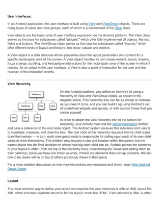
- 1. User Interfaces. In an Android application, the user interface is built using View and ViewGroup objects. There are many types of views and view groups, each of which is a descendant of the View class. View objects are the basic units of user interface expression on the Android platform. The View class serves as the base for subclasses called "widgets," which offer fully implemented UI objects, like text fields and buttons. The ViewGroup class serves as the base for subclasses called "layouts," which offer different kinds of layout architecture, like linear, tabular and relative. A View object is a data structure whose properties store the layout parameters and content for a specific rectangular area of the screen. A View object handles its own measurement, layout, drawing, focus change, scrolling, and key/gesture interactions for the rectangular area of the screen in which it resides. As an object in the user interface, a View is also a point of interaction for the user and the receiver of the interaction events. View Hierarchy On the Android platform, you define an Activity's UI using a hierarchy of View and ViewGroup nodes, as shown in the diagram below. This hierarchy tree can be as simple or complex as you need it to be, and you can build it up using Android's set of predefined widgets and layouts, or with custom Views that you create yourself. In order to attach the view hierarchy tree to the screen for rendering, your Activity must call the setContentView() method and pass a reference to the root node object. The Android system receives this reference and uses it to invalidate, measure, and draw the tree. The root node of the hierarchy requests that its child nodes draw themselves — in turn, each view group node is responsible for calling upon each of its own child views to draw themselves. The children may request a size and location within the parent, but the parent object has the final decision on where how big each child can be. Android parses the elements of your layout in-order (from the top of the hierarchy tree), instantiating the Views and adding them to their parent(s). Because these are drawn in-order, if there are elements that overlap positions, the last one to be drawn will lie on top of others previously drawn to that space. For a more detailed discussion on how view hierarchies are measured and drawn, read How Android Draws Views. Layout The most common way to define your layout and express the view hierarchy is with an XML layout file. XML offers a human-readable structure for the layout, much like HTML. Each element in XML is either
- 2. a View or ViewGroup object (or descendant thereof). View objects are leaves in the tree, ViewGroup objects are branches in the tree (see the View Hierarchy figure above). The name of an XML element is respective to the Java class that it represents. So a <TextView> element creates a TextView in your UI, and a <LinearLayout> element creates a LinearLayout view group. When you load a layout resource, the Android system initializes these run-time objects, corresponding to the elements in your layout. For example, a simple vertical layout with a text view and a button looks like this: <?xml version="1.0" encoding="utf-8"?> <LinearLayout xmlns:android="http://schemas.android.com/apk/res/android" android:layout_width="fill_parent" android:layout_height="fill_parent" android:orientation="vertical" > <TextView android:id="@+id/text" android:layout_width="wrap_content" android:layout_height="wrap_content" android:text="Hello, I am a TextView" /> <Button android:id="@+id/button" android:layout_width="wrap_content" android:layout_height="wrap_content" android:text="Hello, I am a Button" /> </LinearLayout> Notice that the LinearLayout element contains both the TextView and the Button. You can nest another LinearLayout (or other type of view group) inside here, to lengthen the view hierarchy and create a more complex layout. For more on building a UI layout, read Declaring Layout. Tip: You can also draw View and ViewGroups objects in Java code, using the addView(View) methods to dynamically insert new View and ViewGroup objects. There are a variety of ways in which you can layout your views. Using more and different kinds of view groups, you can structure child views and view groups in an infinite number of ways. Some pre-defined view groups offered by Android (called layouts) include LinearLayout, RelativeLayout, TableLayout, GridLayout and others. Each offers a unique set of layout parameters that are used to define the positions of child views and layout structure. To learn about some of the different kinds of view groups used for a layout, read Common Layout Objects. Widgets A widget is a View object that serves as an interface for interaction with the user. Android provides a set of fully implemented widgets, like buttons, checkboxes, and text-entry fields, so you can quickly
- 3. build your UI. Some widgets provided by Android are more complex, like a date picker, a clock, and zoom controls. But you're not limited to the kinds of widgets provided by the Android platform. If you'd like to do something more customized and create your own actionable elements, you can, by defining your own View object or by extending and combining existing widgets. Read more in Building Custom Components. For a list of the widgets provided by Android, see the android.widget package. UI Events Once you've added some Views/widgets to the UI, you probably want to know about the user's interaction with them, so you can perform actions. To be informed of UI events, you need to do one of two things: Define an event listener and register it with the View. More often than not, this is how you'll listen for events. The View class contains a collection of nested interfaces named On<something>Listener, each with a callback method called On<something>(). For example, View.OnClickListener (for handling "clicks" on a View), View.OnTouchListener (for handling touch screen events in a View), and View.OnKeyListener (for handling device key presses within a View). So if you want your View to be notified when it is "clicked" (such as when a button is selected), implement OnClickListener and define its onClick() callback method (where you perform the action upon click), and register it to the View with setOnClickListener(). Override an existing callback method for the View. This is what you should do when you've implemented your own View class and want to listen for specific events that occur within it. Example events you can handle include when the screen is touched (onTouchEvent()), when the trackball is moved (onTrackballEvent()), or when a key on the device is pressed (onKeyDown()). This allows you to define the default behavior for each event inside your custom View and determine whether the event should be passed on to some other child View. Again, these are callbacks to the View class, so your only chance to define them is when you build a custom component. Continue reading about handling user interaction with Views in the Handling UI Events document. Menus Application menus are another important part of an application's UI. Menus offers a reliable interface that reveals application functions and settings. The most common application menu is revealed by pressing the MENU key on the device. However, you can also add Context Menus, which may be revealed when the user presses and holds down on an item. Menus are also structured using a View hierarchy, but you don't define this structure yourself. Instead, you define the onCreateOptionsMenu() or onCreateContextMenu() callback methods for your Activity and declare the items that you want to include in your menu. At the appropriate time, Android will automatically create the necessary View hierarchy for the menu and draw each of your menu items in it.
- 4. Menus also handle their own events, so there's no need to register event listeners on the items in your menu. When an item in your menu is selected, the onOptionsItemSelected() or onContextItemSelected() method will be called by the framework. And just like your application layout, you have the option to declare the items for you menu in an XML file. Read Creating Menus to learn more. Advanced Topics Once you've grappled the fundamentals of creating a user interface, you can explore some advanced features for creating a more complex application interface. Adapters Sometimes you'll want to populate a view group with some information that can't be hard-coded, instead, you want to bind your view to an external source of data. To do this, you use an AdapterView as your view group and each child View is initialized and populated with data from the Adapter. The AdapterView object is an implementation of ViewGroup that determines its child views based on a given Adapter object. The Adapter acts like a courier between your data source (perhaps an array of external strings) and the AdapterView, which displays it. There are several implementations of the Adapter class, for specific tasks, such as the CursorAdapter for reading database data from a Cursor, or an ArrayAdapter for reading from an arbitrary array. To learn more about using an Adapter to populate your views, read Binding to Data with AdapterView. Styles and Themes Perhaps you're not satisfied with the look of the standard widgets. To revise them, you can create some of your own styles and themes. A style is a set of one or more formatting attributes that you can apply as a unit to individual elements in your layout. For example, you could define a style that specifies a certain text size and color, then apply it to only specific View elements. A theme is a set of one or more formatting attributes that you can apply as a unit to all activities in an application, or just a single activity. For example, you could define a theme that sets specific colors for the window frame and the panel background, and sets text sizes and colors for menus. This theme can then be applied to specific activities or the entire application. Styles and themes are resources. Android provides some default style and theme resources that you can use, or you can declare your own custom style and theme resources. Learn more about using styles and themes in the Applying Styles and Themes document.
- 5. Declaring Layout. Your layout is the architecture for the user interface in an Activity. It defines the layout structure and holds all the elements that appear to the user. You can declare your layout in two ways: Declare UI elements in XML. Android provides a straightforward XML vocabulary that corresponds to the View classes and subclasses, such as those for widgets and layouts. Instantiate layout elements at runtime. Your application can create View and ViewGroup objects (and manipulate their properties) programmatically. The Android framework gives you the flexibility to use either or both of these methods for declaring and managing your application's UI. For example, you could declare your application's default layouts in XML, including the screen elements that will appear in them and their properties. You could then add code in your application that would modify the state of the screen objects, including those declared in XML, at run time. The ADT Plugin for Eclipse offers a layout preview of your XML — with the XML file opened, select the Layout tab. You should also try the Hierarchy Viewer tool, for debugging layouts — it reveals layout property values, draws wireframes with padding/margin indicators, and full rendered views while you debug on the emulator or device. The layoutopt tool lets you quickly analyze your layouts and hierarchies for inefficiencies or other problems. The advantage to declaring your UI in XML is that it enables you to better separate the presentation of your application from the code that controls its behavior. Your UI descriptions are external to your application code, which means that you can modify or adapt it without having to modify your source code and recompile. For example, you can create XML layouts for different screen orientations, different device screen sizes, and different languages. Additionally, declaring the layout in XML makes it easier to visualize the structure of your UI, so it's easier to debug problems. As such, this document focuses on teaching you how to declare your layout in XML. If you're interested in instantiating View objects at runtime, refer to the ViewGroup and View class references. In general, the XML vocabulary for declaring UI elements closely follows the structure and naming of the classes and methods, where element names correspond to class names and attribute names correspond to methods. In fact, the correspondence is often so direct that you can guess what XML attribute corresponds to a class method, or guess what class corresponds to a given xml element. However, note that not all vocabulary is identical. In some cases, there are slight naming differences. For example, the EditText element has a text attribute that corresponds to EditText.setText(). Tip: Learn more about different layout types in Common Layout Objects. There are also a collection of tutorials on building various layouts in the Hello Views tutorial guide. Write the XML
- 6. For your convenience, the API reference documentation for UI related classes lists the available XML attributes that correspond to the class methods, including inherited attributes. To learn more about the available XML elements and attributes, as well as the format of the XML file, see Layout Resources. Using Android's XML vocabulary, you can quickly design UI layouts and the screen elements they contain, in the same way you create web pages in HTML — with a series of nested elements. Each layout file must contain exactly one root element, which must be a View or ViewGroup object. Once you've defined the root element, you can add additional layout objects or widgets as child elements to gradually build a View hierarchy that defines your layout. For example, here's an XML layout that uses a vertical LinearLayout to hold a TextView and a Button: <?xml version="1.0" encoding="utf-8"?> <LinearLayout xmlns:android="http://schemas.android.com/apk/res/android" android:layout_width="fill_parent" android:layout_height="fill_parent" android:orientation="vertical" > <TextView android:id="@+id/text" android:layout_width="wrap_content" android:layout_height="wrap_content" android:text="Hello, I am a TextView" /> <Button android:id="@+id/button" android:layout_width="wrap_content" android:layout_height="wrap_content" android:text="Hello, I am a Button" /> </LinearLayout> After you've declared your layout in XML, save the file with the .xml extension, in your Android project's res/layout/ directory, so it will properly compile. We'll discuss each of the attributes shown here a little later. Load the XML Resource When you compile your application, each XML layout file is compiled into a View resource. You should load the layout resource from your application code, in your Activity.onCreate() callback implementation. Do so by calling setContentView(), passing it the reference to your layout resource in the form of: R.layout.layout_file_name For example, if your XML layout is saved as main_layout.xml, you would load it for your Activity like so: public void onCreate(Bundle savedInstanceState) { super.onCreate(savedInstanceState); setContentView(R.layout.main_layout); }
- 7. The onCreate() callback method in your Activity is called by the Android framework when your Activity is launched (see the discussion about lifecycles, in the Activities document). Attributes Every View and ViewGroup object supports their own variety of XML attributes. Some attributes are specific to a View object (for example, TextView supports the textSize attribute), but these attributes are also inherited by any View objects that may extend this class. Some are common to all View objects, because they are inherited from the root View class (like the id attribute). And, other attributes are considered "layout parameters," which are attributes that describe certain layout orientations of the View object, as defined by that object's parent ViewGroup object. ID Any View object may have an integer ID associated with it, to uniquely identify the View within the tree. When the application is compiled, this ID is referenced as an integer, but the ID is typically assigned in the layout XML file as a string, in the id attribute. This is an XML attribute common to all View objects (defined by the View class) and you will use it very often. The syntax for an ID, inside an XML tag is: android:id="@+id/my_button" The at-symbol (@) at the beginning of the string indicates that the XML parser should parse and expand the rest of the ID string and identify it as an ID resource. The plus-symbol (+) means that this is a new resource name that must be created and added to our resources (in the R.java file). There are a number of other ID resources that are offered by the Android framework. When referencing an Android resource ID, you do not need the plus-symbol, but must add the android package namespace, like so: android:id="@android:id/empty" With the android package namespace in place, we're now referencing an ID from the android.R resources class, rather than the local resources class. In order to create views and reference them from the application, a common pattern is to: 1. Define a view/widget in the layout file and assign it a unique ID: <Button android:id="@+id/my_button" android:layout_width="wrap_content" android:layout_height="wrap_content" android:text="@string/my_button_text"/> 2. Then create an instance of the view object and capture it from the layout (typically in the onCreate() method):
- 8. Button myButton = (Button) findViewById(R.id.my_button); Defining IDs for view objects is important when creating a RelativeLayout. In a relative layout, sibling views can define their layout relative to another sibling view, which is referenced by the unique ID. An ID need not be unique throughout the entire tree, but it should be unique within the part of the tree you are searching (which may often be the entire tree, so it's best to be completely unique when possible). Layout Parameters XML layout attributes named layout_something define layout parameters for the View that are appropriate for the ViewGroup in which it resides. Every ViewGroup class implements a nested class that extends ViewGroup.LayoutParams. This subclass contains property types that define the size and position for each child view, as appropriate for the view group. As you can see in figure 1, the parent view group defines layout parameters for each child view (including the child view group). Figure 1. Visualization of a view hierarchy with layout parameters associated with each view. Note that every LayoutParams subclass has its own syntax for setting values. Each child element must define LayoutParams that are appropriate for its parent, though it may also define different LayoutParams for its own children. All view groups include a width and height (layout_width and layout_height), and each view is required to define them. Many LayoutParams also include optional margins and borders. You can specify width and height with exact measurements, though you probably won't want to do this often. More often, you will use one of these constants to set the width or height: wrap_content tells your view to size itself to the dimensions required by its content
- 9. fill_parent (renamed match_parent in API Level 8) tells your view to become as big as its parent view group will allow. In general, specifying a layout width and height using absolute units such as pixels is not recommended. Instead, using relative measurements such as density-independent pixel units (dp), wrap_content, or fill_parent, is a better approach, because it helps ensure that your application will display properly across a variety of device screen sizes. The accepted measurement types are defined in the Available Resources document. Layout Position The geometry of a view is that of a rectangle. A view has a location, expressed as a pair of left and top coordinates, and two dimensions, expressed as a width and a height. The unit for location and dimensions is the pixel. It is possible to retrieve the location of a view by invoking the methods getLeft() and getTop(). The former returns the left, or X, coordinate of the rectangle representing the view. The latter returns the top, or Y, coordinate of the rectangle representing the view. These methods both return the location of the view relative to its parent. For instance, when getLeft() returns 20, that means the view is located 20 pixels to the right of the left edge of its direct parent. In addition, several convenience methods are offered to avoid unnecessary computations, namely getRight() and getBottom(). These methods return the coordinates of the right and bottom edges of the rectangle representing the view. For instance, calling getRight() is similar to the following computation: getLeft() + getWidth(). Size, Padding and Margins The size of a view is expressed with a width and a height. A view actually possess two pairs of width and height values. The first pair is known as measured width and measured height. These dimensions define how big a view wants to be within its parent. The measured dimensions can be obtained by calling getMeasuredWidth() and getMeasuredHeight(). The second pair is simply known as width and height, or sometimes drawing width and drawing height. These dimensions define the actual size of the view on screen, at drawing time and after layout. These values may, but do not have to, be different from the measured width and height. The width and height can be obtained by calling getWidth() and getHeight(). To measure its dimensions, a view takes into account its padding. The padding is expressed in pixels for the left, top, right and bottom parts of the view. Padding can be used to offset the content of the view by a specific amount of pixels. For instance, a left padding of 2 will push the view's content by 2 pixels to the right of the left edge. Padding can be set using the setPadding(int, int, int, int) method and queried by calling getPaddingLeft(), getPaddingTop(), getPaddingRight() and getPaddingBottom().
- 10. Even though a view can define a padding, it does not provide any support for margins. However, view groups provide such a support. Refer to ViewGroup and ViewGroup.MarginLayoutParams for further information. For more information about dimensions, see Dimension Values. Creating Menus. Menus are an important part of an activity's user interface, which provide users a familiar way to perform actions. Android offers a simple framework for you to add standard menus to your application. There are three types of application menus: Options Menu The primary collection of menu items for an activity, which appears when the user touches the MENU button. When your application is running on Android 3.0 or later, you can provide quick access to select menu items by placing them directly in the Action Bar, as "action items." Context Menu A floating list of menu items that appears when the user touches and holds a view that's registered to provide a context menu. Submenu A floating list of menu items that appears when the user touches a menu item that contains a nested menu. This document shows you how to create each type of menu, using XML to define the content of the menu and callback methods in your activity to respond when the user selects an item. Creating a Menu Resource Instead of instantiating a Menu in your application code, you should define a menu and all its items in an XML menu resource, then inflate the menu resource (load it as a programmable object) in your application code. Using a menu resource to define your menu is a good practice because it separates the content for the menu from your application code. It's also easier to visualize the structure and content of a menu in XML. To create a menu resource, create an XML file inside your project's res/menu/ directory and build the menu with the following elements: <menu> Defines a Menu, which is a container for menu items. A <menu> element must be the root node for the file and can hold one or more <item> and <group> elements. <item>
- 11. Creates a MenuItem, which represents a single item in a menu. This element may contain a nested <menu> element in order to create a submenu. <group> An optional, invisible container for <item> elements. It allows you to categorize menu items so they share properties such as active state and visibility. See the section about Menu groups. Here's an example menu named game_menu.xml: <?xml version="1.0" encoding="utf-8"?> <menu xmlns:android="http://schemas.android.com/apk/res/android"> <item android:id="@+id/new_game" android:icon="@drawable/ic_new_game" android:title="@string/new_game" /> <item android:id="@+id/help" android:icon="@drawable/ic_help" android:title="@string/help" /> </menu> This example defines a menu with two items. Each item includes the attributes: android:id A resource ID that's unique to the item, which allows the application can recognize the item when the user selects it. android:icon A reference to a drawable to use as the item's icon. android:title A reference to a string to use as the item's title. There are many more attributes you can include in an <item>, including some that specify how the item may appear in the Action Bar. For more information about the XML syntax and attributes for a menu resource, see the Menu Resource reference. Inflating a Menu Resource From your application code, you can inflate a menu resource (convert the XML resource into a programmable object) using MenuInflater.inflate(). For example, the following code inflates the game_menu.xml file defined above, during the onCreateOptionsMenu() callback method, to use the menu as the activity's Options Menu: @Override public boolean onCreateOptionsMenu(Menu menu) { MenuInflater inflater = getMenuInflater();
- 12. inflater.inflate(R.menu.game_menu, menu); return true; } The getMenuInflater() method returns a MenuInflater for the activity. With this object, you can call inflate(), which inflates a menu resource into a Menu object. In this example, the menu resource defined by game_menu.xml is inflated into the Menu that was passed into onCreateOptionsMenu(). (This callback method for the Options Menu is discussed more in the next section.) Creating an Options Menu Figure 1. Screenshot of the Options Menu in the Browser. The Options Menu is where you should include basic activity actions and necessary navigation items (for example, a button to open the application settings). Items in the Options Menu are accessible in two distinct ways: the MENU button or in the Action Bar (on devices running Android 3.0 or higher). When running on a device with Android 2.3 and lower, the Options Menu appears at the bottom of the screen, as shown in figure 1. When opened, the first visible portion of the Options Menu is the icon menu. It holds the first six menu items. If you add more than six items to the Options Menu, Android places the sixth item and those after it into the overflow menu, which the user can open by touching the "More" menu item. On Android 3.0 and higher, items from the Options Menu is placed in the Action Bar, which appears at the top of the activity in place of the traditional title bar. By default all items from the Options Menu are placed in the overflow menu, which the user can open by touching the menu icon on the right side of the Action Bar. However, you can place select menu items directly in the Action Bar as "action items," for instant access, as shown in figure 2. When the Android system creates the Options Menu for the first time, it calls your activity's onCreateOptionsMenu() method. Override this method in your activity and populate the Menu that is passed into the method, Menu by inflating a menu resource as described above in Inflating a Menu Resource. For example: @Override public boolean onCreateOptionsMenu(Menu menu) { MenuInflater inflater = getMenuInflater(); inflater.inflate(R.menu.game_menu, menu); return true; }
- 13. Figure 2. Screenshot of the Action Bar in the Email application, with two action items from the Options Menu, plus the overflow menu. You can also populate the menu in code, using add() to add items to the Menu. Note: On Android 2.3 and lower, the system calls onCreateOptionsMenu() to create the Options Menu when the user opens it for the first time, but on Android 3.0 and greater, the system creates it as soon as the activity is created, in order to populate the Action Bar. Responding to user action When the user selects a menu item from the Options Menu (including action items in the Action Bar), the system calls your activity's onOptionsItemSelected() method. This method passes the MenuItem that the user selected. You can identify the menu item by calling getItemId(), which returns the unique ID for the menu item (defined by the android:id attribute in the menu resource or with an integer given to the add() method). You can match this ID against known menu items and perform the appropriate action. For example: @Override public boolean onOptionsItemSelected(MenuItem item) { // Handle item selection switch (item.getItemId()) { case R.id.new_game: newGame(); return true; case R.id.help: showHelp(); return true; default: return super.onOptionsItemSelected(item); } } In this example, getItemId() queries the ID for the selected menu item and the switch statement compares the ID against the resource IDs that were assigned to menu items in the XML resource. When a switch case successfully handles the menu item, it returns true to indicate that the item selection was handled. Otherwise, the default statement passes the menu item to the super class, in case it can handle the item selected. (If you've directly extended the Activity class, then the super class returns false, but it's a good practice to pass unhandled menu items to the super class instead of directly returning false.) Additionally, Android 3.0 adds the ability for you to define the on-click behavior for a menu item in the menu resource XML, using the android:onClick attribute. So you don't need to implement onOptionsItemSelected(). Using the android:onClick attribute, you can specify a method to call when the user selects the menu item. Your activity must then implement the method specified in the
- 14. android:onClick attribute so that it accepts a single MenuItem parameter—when the system calls this method, it passes the menu item selected. Tip: If your application contains multiple activities and some of them provide the same Options Menu, consider creating an activity that implements nothing except the onCreateOptionsMenu() and onOptionsItemSelected() methods. Then extend this class for each activity that should share the same Options Menu. This way, you have to manage only one set of code for handling menu actions and each descendant class inherits the menu behaviors. If you want to add menu items to one of your descendant activities, override onCreateOptionsMenu() in that activity. Call super.onCreateOptionsMenu(menu) so the original menu items are created, then add new menu items with menu.add(). You can also override the super class's behavior for individual menu items. Changing menu items at runtime Once the activity is created, the onCreateOptionsMenu() method is called only once, as described above. The system keeps and re-uses the Menu you define in this method until your activity is destroyed. If you want to change the Options Menu any time after it's first created, you must override the onPrepareOptionsMenu() method. This passes you the Menu object as it currently exists. This is useful if you'd like to remove, add, disable, or enable menu items depending on the current state of your application. On Android 2.3 and lower, the system calls onPrepareOptionsMenu() each time the user opens the Options Menu. On Android 3.0 and higher, you must call invalidateOptionsMenu() when you want to update the menu, because the menu is always open. The system will then call onPrepareOptionsMenu() so you can update the menu items. Note: You should never change items in the Options Menu based on the View currently in focus. When in touch mode (when the user is not using a trackball or d-pad), views cannot take focus, so you should never use focus as the basis for modifying items in the Options Menu. If you want to provide menu items that are context-sensitive to a View, use a Context Menu. If you're developing for Android 3.0 or higher, be sure to also read Using the Action Bar. Creating a Context Menu A context menu is conceptually similar to the menu displayed when the user performs a "right-click" on a PC. You should use a context menu to provide the user access to actions that pertain to a specific item in the user interface. On Android, a context menu is displayed when the user performs a "long press" (press and hold) on an item. You can create a context menu for any View, though context menus are most often used for items in a ListView. When the user performs a long-press on an item in a ListView and the list is registered to
- 15. provide a context menu, the list item signals to the user that a context menu is available by animating its background color—it transitions from orange to white before opening the context menu. (The Contacts application demonstrates this feature.) Register a ListView If your activity uses a ListView and you want all list items to provide a context menu, register all items for a context menu by passing the ListView to registerForContextMenu(). For example, if you're using a ListActivity, register all list items like this: registerForContextMenu(getListView()); In order for a View to provide a context menu, you must "register" the view for a context menu. Call registerForContextMenu() and pass it the View you want to give a context menu. When this View then receives a long-press, it displays a context menu. To define the context menu's appearance and behavior, override your activity's context menu callback methods, onCreateContextMenu() and onContextItemSelected(). For example, here's an onCreateContextMenu() that uses the context_menu.xml menu resource: @Override public void onCreateContextMenu(ContextMenu menu, View v, ContextMenuInfo menuInfo) { super.onCreateContextMenu(menu, v, menuInfo); MenuInflater inflater = getMenuInflater(); inflater.inflate(R.menu.context_menu, menu); } MenuInflater is used to inflate the context menu from a menu resource. (You can also use add() to add menu items.) The callback method parameters include the View that the user selected and a ContextMenu.ContextMenuInfo object that provides additional information about the item selected. You might use these parameters to determine which context menu should be created, but in this example, all context menus for the activity are the same. Then when the user selects an item from the context menu, the system calls onContextItemSelected(). Here is an example of how you can handle selected items: @Override public boolean onContextItemSelected(MenuItem item) { AdapterContextMenuInfo info = (AdapterContextMenuInfo) item.getMenuInfo(); switch (item.getItemId()) { case R.id.edit: editNote(info.id); return true; case R.id.delete: deleteNote(info.id); return true;
- 16. default: return super.onContextItemSelected(item); } } The structure of this code is similar to the example for Creating an Options Menu, in which getItemId() queries the ID for the selected menu item and a switch statement matches the item to the IDs that are defined in the menu resource. And like the options menu example, the default statement calls the super class in case it can handle menu items not handled here, if necessary. In this example, the selected item is an item from a ListView. To perform an action on the selected item, the application needs to know the list ID for the selected item (it's position in the ListView). To get the ID, the application calls getMenuInfo(), which returns a AdapterView.AdapterContextMenuInfo object that includes the list ID for the selected item in the id field. The local methods editNote() and deleteNote() methods accept this list ID to perform an action on the data specified by the list ID. Note: Items in a context menu do not support icons or shortcut keys. Creating Submenus A submenu is a menu that the user can open by selecting an item in another menu. You can add a submenu to any menu (except a submenu). Submenus are useful when your application has a lot of functions that can be organized into topics, like items in a PC application's menu bar (File, Edit, View, etc.). When creating your menu resource, you can create a submenu by adding a <menu> element as the child of an <item>. For example: <?xml version="1.0" encoding="utf-8"?> <menu xmlns:android="http://schemas.android.com/apk/res/android"> <item android:id="@+id/file" android:icon="@drawable/file" android:title="@string/file" > <!-- "file" submenu --> <menu> <item android:id="@+id/create_new" android:title="@string/create_new" /> <item android:id="@+id/open" android:title="@string/open" /> </menu> </item> </menu> When the user selects an item from a submenu, the parent menu's respective on-item-selected callback method receives the event. For instance, if the above menu is applied as an Options Menu, then the onOptionsItemSelected() method is called when a submenu item is selected.
- 17. You can also use addSubMenu() to dynamically add a SubMenu to an existing Menu. This returns the new SubMenu object, to which you can add submenu items, using add() Other Menu Features Here are some other features that you can apply to most menu items. Menu groups A menu group is a collection of menu items that share certain traits. With a group, you can: Show or hide all items with setGroupVisible() Enable or disable all items with setGroupEnabled() Specify whether all items are checkable with setGroupCheckable() You can create a group by nesting <item> elements inside a <group> element in your menu resource or by specifying a group ID with the the add() method. Here's an example menu resource that includes a group: <?xml version="1.0" encoding="utf-8"?> <menu xmlns:android="http://schemas.android.com/apk/res/android"> <item android:id="@+id/item1" android:icon="@drawable/item1" android:title="@string/item1" /> <!-- menu group --> <group android:id="@+id/group1"> <item android:id="@+id/groupItem1" android:title="@string/groupItem1" /> <item android:id="@+id/groupItem2" android:title="@string/groupItem2" /> </group> </menu> The items that are in the group appear the same as the first item that is not in a group—all three items in the menu are siblings. However, you can modify the traits of the two items in the group by referencing the group ID and using the methods listed above. Checkable menu items Figure 3. Screenshot of a submenu with checkable items. A menu can be useful as an interface for turning options on and off, using a checkbox for stand-alone options, or radio buttons for groups of mutually exclusive
- 18. options. Figure 2 shows a submenu with items that are checkable with radio buttons. Note: Menu items in the Icon Menu (from the Options Menu) cannot display a checkbox or radio button. If you choose to make items in the Icon Menu checkable, you must manually indicate the checked state by swapping the icon and/or text each time the state changes. You can define the checkable behavior for individual menu items using the android:checkable attribute in the <item> element, or for an entire group with the android:checkableBehavior attribute in the <group> element. For example, all items in this menu group are checkable with a radio button: <?xml version="1.0" encoding="utf-8"?> <menu xmlns:android="http://schemas.android.com/apk/res/android"> <group android:checkableBehavior="single"> <item android:id="@+id/red" android:title="@string/red" /> <item android:id="@+id/blue" android:title="@string/blue" /> </group> </menu> The android:checkableBehavior attribute accepts either: single Only one item from the group can be checked (radio buttons) all All items can be checked (checkboxes) none No items are checkable You can apply a default checked state to an item using the android:checked attribute in the <item> element and change it in code with the setChecked() method. When a checkable item is selected, the system calls your respective item-selected callback method (such as onOptionsItemSelected()). It is here that you must set the state of the checkbox, because a checkbox or radio button does not change its state automatically. You can query the current state of the item (as it was before the user selected it) with isChecked() and then set the checked state with setChecked(). For example: @Override public boolean onOptionsItemSelected(MenuItem item) { switch (item.getItemId()) { case R.id.vibrate: case R.id.dont_vibrate: if (item.isChecked()) item.setChecked(false); else item.setChecked(true);
- 19. return true; default: return super.onOptionsItemSelected(item); } } If you don't set the checked state this way, then the visible state of the item (the checkbox or radio button) will not change when the user selects it. When you do set the state, the activity preserves the checked state of the item so that when the user opens the menu later, the checked state that you set is visible. Note: Checkable menu items are intended to be used only on a per-session basis and not saved after the application is destroyed. If you have application settings that you would like to save for the user, you should store the data using Shared Preferences. Shortcut keys To facilitate quick access to items in the Options Menu when the user's device has a hardware keyboard, you can add quick-access shortcut keys using letters and/or numbers, with the android:alphabeticShortcut and android:numericShortcut attributes in the <item> element. You can also use the methods setAlphabeticShortcut(char) and setNumericShortcut(char). Shortcut keys are not case sensitive. For example, if you apply the "s" character as an alphabetic shortcut to a "save" menu item, then when the menu is open (or while the user holds the MENU button) and the user presses the "s" key, the "save" menu item is selected. This shortcut key is displayed as a tip in the menu item, below the menu item name (except for items in the Icon Menu, which are displayed only if the user holds the MENU button). Note: Shortcut keys for menu items only work on devices with a hardware keyboard. Shortcuts cannot be added to items in a Context Menu. Dynamically adding menu intents Sometimes you'll want a menu item to launch an activity using an Intent (whether it's an activity in your application or another application). When you know the intent you want to use and have a specific menu item that should initiate the intent, you can execute the intent with startActivity() during the appropriate on-item-selected callback method (such as the onOptionsItemSelected() callback). However, if you are not certain that the user's device contains an application that handles the intent, then adding a menu item that invokes it can result in a non-functioning menu item, because the intent might not resolve to an activity. To solve this, Android lets you dynamically add menu items to your menu when Android finds activities on the device that handle your intent. To add menu items based on available activities that accept an intent:
- 20. 1. Define an intent with the category CATEGORY_ALTERNATIVE and/or CATEGORY_SELECTED_ALTERNATIVE, plus any other requirements. 2. Call Menu.addIntentOptions(). Android then searches for any applications that can perform the intent and adds them to your menu. If there are no applications installed that satisfy the intent, then no menu items are added. Note: CATEGORY_SELECTED_ALTERNATIVE is used to handle the currently selected element on the screen. So, it should only be used when creating a Menu in onCreateContextMenu(). For example: @Override public boolean onCreateOptionsMenu(Menu menu){ super.onCreateOptionsMenu(menu); // Create an Intent that describes the requirements to fulfill, to be included // in our menu. The offering app must include a category value of Intent.CATEGORY_ALTERNATIVE. Intent intent = new Intent(null, dataUri); intent.addCategory(Intent.CATEGORY_ALTERNATIVE); // Search and populate the menu with acceptable offering applications. menu.addIntentOptions( R.id.intent_group, // Menu group to which new items will be added 0, // Unique item ID (none) 0, // Order for the items (none) this.getComponentName(), // The current activity name null, // Specific items to place first (none) intent, // Intent created above that describes our requirements 0, // Additional flags to control items (none) null); // Array of MenuItems that correlate to specific items (none) return true; } For each activity found that provides an intent filter matching the intent defined, a menu item is added, using the value in the intent filter's android:label as the menu item title and the application icon as the menu item icon. The addIntentOptions() method returns the number of menu items added. Note: When you call addIntentOptions(), it overrides any and all menu items by the menu group specified in the first argument. Allowing your activity to be added to other menus You can also offer the services of your activity to other applications, so your application can be included in the menu of others (reverse the roles described above).
- 21. To be included in other application menus, you need to define an intent filter as usual, but be sure to include the CATEGORY_ALTERNATIVE and/or CATEGORY_SELECTED_ALTERNATIVE values for the intent filter category. For example: <intent-filter label="Resize Image"> ... <category android:name="android.intent.category.ALTERNATIVE" /> <category android:name="android.intent.category.SELECTED_ALTERNATIVE" /> ... </intent-filter> Read more about writing intent filters in the Intents and Intent Filters document. For a sample application using this technique, see the Note Pad sample code. Using the action bar. The Action Bar is a widget for activities that replaces the traditional title bar at the top of the screen. By default, the Action Bar includes the application logo on the left side, followed by the activity title, and any available items from the Options Menu on the right side. The Action Bar offers several useful features, including the ability to: Display items from the Options Menu directly in the Action Bar, as "action items"—providing instant access to key user actions. Menu items that do not appear as action items are placed in the overflow menu, revealed by a drop- down list in the Action Bar. Provide tabs for navigating between fragments. Provide a drop-down list for navigation. Provide interactive "action views" in place of action items (such as a search box). Figure 1. A screenshot of the Action Bar in the Email application, containing action items to compose new email and refresh the inbox. Adding the Action Bar The Action Bar is included by default in all activities that target Android 3.0 or greater. More specifically, all activities that use the new "holographic" theme include the Action Bar, and any application that targets Android 3.0 automatically receives this theme. An application is considered to "target" Android 3.0 when it has set either the android:minSdkVersion or android:targetSdkVersion attribute in the <uses-sdk> element to "11" or greater. For example:
- 22. <manifest xmlns:android="http://schemas.android.com/apk/res/android" package="com.example.helloworld" android:versionCode="1" android:versionName="1.0"> <uses-sdk android:minSdkVersion="4" android:targetSdkVersion="11" /> <application ... > ... </application> </manifest> In this example, the application requires a minimum version of API Level 4 (Android 1.6), but it also targets API Level 11 (Android 3.0). This way, when the application is installed on a device running Android 3.0 or greater, the system applies the holographic theme to each activity, and thus, each activity includes the Action Bar. However, if you want to use Action Bar APIs, such as to add tabs or modify Action Bar styles, you need to set the android:minSdkVersion to "11", so you can access the ActionBar class. Removing the Action Bar If you want to remove the Action Bar for a particular activity, set the activity theme to Theme.Holo.NoActionBar. For example: <activity android:theme="@android:style/Theme.Holo.NoActionBar"> Tip: If you have a custom activity theme in which you'd like to remove the Action Bar, set the android:windowActionBar style property false. See Styling the Action Bar for more about Action Bar styles. You can also hide the Action Bar at runtime by calling hide(), then show it again by calling show(). For example: ActionBar actionBar = getActionBar(); actionBar.hide(); When the Action Bar hides, the system adjusts your activity content to fill all the available screen space. Note: If you remove the Action Bar using a theme, then the window will not allow the Action Bar at all, so you cannot add it at runtime—calling getActionBar() will return null. Adding Action Items
- 23. An action item is simply a menu item from the Options Menu which you declare should appear directly in the Action Bar. An action item can include an icon and/or text. If a menu item does not appear as an action item, then the system places it in the overflow menu, which the user can open with the menu icon on the right side of the Action Bar. Figure 2. A screenshot from an Action Bar with two action items and the overflow menu. When the activity first starts, the system populates the Action Bar and overflow menu by calling onCreateOptionsMenu() for your activity. As discussed in the guide to Creating Menus, it's in this callback method that you define the Options Menu for the activity. You can specify a menu item to appear as an action item—if there is room for it—from your menu resource by declaring android:showAsAction="ifRoom" for the <item> element. This way, the menu item appears in the Action Bar for quick access only if there is room available for it. If there's not enough room, the item is placed the overflow menu (revealed by the menu icon on the right side of the Action Bar). You can also declare a menu item to appear as an action item from your application code, by calling setShowAsAction() on the MenuItem and passing SHOW_AS_ACTION_IF_ROOM. If your menu item supplies both a title and an icon, then the action item shows only the icon by defult. If you want to include the text with the action item, add the "with text" flag: in XML, add withText to the android:showAsAction attribute or, in your application code, use the SHOW_AS_ACTION_WITH_TEXT flag when calling setShowAsAction(). Figure 2 shows an Action Bar that has two action items with text and the icon for the overflow menu. Here's an example of how you can declare a menu item as an action item in a menu resource file: <?xml version="1.0" encoding="utf-8"?> <menu xmlns:android="http://schemas.android.com/apk/res/android"> <item android:id="@+id/menu_save" android:icon="@drawable/ic_menu_save" android:title="@string/menu_save" android:showAsAction="ifRoom|withText" /> </menu> In this case, both the ifRoom and withText flags are set, so that when this item appears as an action item, it includes the title text along with the icon. A menu item placed in the Action Bar triggers the same callback methods as other items in the Options Menu. When the user selects an action item, your activity receives a call to onOptionsItemSelected(), passing the item ID.
- 24. Note: If you added the menu item from a fragment, then the respective onOptionsItemSelected() method is called for that fragment. However the activity gets a chance to handle it first, so the system calls onOptionsItemSelected() on the activity before calling the fragment. You can also declare an item to always appear as an action item, but you should avoid doing so, because it can create a cluttered UI if there are too many action items and they might collide with other elements in the Action Bar. For more information about menus, see the Creating Menus developer guide. Using the app icon as an action item By default, your application icon appears in the Action Bar on the left side. It also responds to user interaction (when the user taps it, it visually responds the same way action items do) and it's your responsibility to do something when the user taps it. Figure 3. Email's Action Bar, with the application icon on the left. The normal behavior should be for your application to return to the "home" activity or the initial state (such as when the activity hasn't changed, but fragments have changed) when the user taps the icon. If the user is already at home or the initial state, then you don't need to do anything. When the user taps the icon, the system calls your activity's onOptionsItemSelected() method with the android.R.id.home ID. So, you need to add a condition to your onOptionsItemSelected() method to listen for android.R.id.home and perform the appropriate action, such as start the home activity or pop recent fragment transactions off the stack. If you respond to the application icon by returning to the home activity, you should include the FLAG_ACTIVITY_CLEAR_TOP flag in the Intent. With this flag, if the activity you're starting already exists in the current task, then all activities on top of it are destroyed and it is brought to the front. You should favor this approach, because going "home" is an action that's equivalent to "going back" and you should usually not create a new instance of the home activity. Otherwise, you might end up with a long stack of activities in the current task. For example, here's an implementation of onOptionsItemSelected() that returns to the application's "home" activity: @Override public boolean onOptionsItemSelected(MenuItem item) { switch (item.getItemId()) { case android.R.id.home: // app icon in Action Bar clicked; go home Intent intent = new Intent(this, HomeActivity.class); intent.addFlags(Intent.FLAG_ACTIVITY_CLEAR_TOP); startActivity(intent);
- 25. return true; default: return super.onOptionsItemSelected(item); } } Using the app icon to navigate "up" Figure 4. The standard icon for the Email application (top) and the "up" icon (bottom). You can also use the application icon to provide "up" navigation for the user. This is especially useful when your application is composed of activities that generally appear in a certain order and you want to facilitate the ability for the user to navigate up the activity hierarchy (regardless of how they entered the current activity). The way you respond to this event is the same as when navigating home (as discussed above, except you start a different activity, based on the current activity). All you need to do to indicate to the user that the behavior is different is set the Action Bar to "show home as up." You can do so by calling setDisplayHomeAsUpEnabled(true) on your activity's ActionBar. When you do, the system draws your application icon with an arrow indicating the up behavior, as shown in figure 4. For example, here's how you can show the application icon as an "up" action: @Override protected void onStart() { super.onStart(); ActionBar actionBar = this.getActionBar(); actionBar.setDisplayHomeAsUpEnabled(true); } Then, your activity should respond to the user tapping the icon, from the onOptionsItemSelected(), by listening for the android.R.id.home ID (as shown above). In this case, when navigating up, it's even more important that you use the FLAG_ACTIVITY_CLEAR_TOP flag in the Intent, so that you don't create a new instance of the parent activity if one already exists. Adding an Action View Figure 5. An action view with a SearchView widget.
- 26. An action view is a widget that appears in the Action Bar as a substitute for an action item. For example, if you have an item in the Options Menu for "Search", you can add an action view for the item that provides a SearchView widget in the Action Bar whenever the item is enabled as an action item. When adding an action view for a menu item, it's important that you still allow the item to behave as a normal menu item when it does not appear in the Action Bar. For example, a menu item to perform a search should, by default, bring up the Android search dialog, but if the item is placed in the Action Bar, the action view appears with a SearchView widget. Figure 4 shows an example of the SearchView widget in an action view. The best way to declare an action view for an item is in your menu resource, using the android:actionLayout or android:actionViewClass attribute: The value for android:actionLayout must be a resource pointer to a layout file. For example: <?xml version="1.0" encoding="utf-8"?> <menu xmlns:android="http://schemas.android.com/apk/res/android"> <item android:id="@+id/menu_search" android:title="Search" android:icon="@drawable/ic_menu_search" android:showAsAction="ifRoom" android:actionLayout="@layout/searchview" /> </menu> The value for android:actionViewClass must be a fully-qualified class name for the View you want to use. For example: <?xml version="1.0" encoding="utf-8"?> <menu xmlns:android="http://schemas.android.com/apk/res/android"> <item android:id="@+id/menu_search" android:title="Search" android:icon="@drawable/ic_menu_search" android:showAsAction="ifRoom" android:actionViewClass="android.widget.SearchView" /> </menu> You must include android:showAsAction="ifRoom" in order for the item to appear as an action view when room is available. If necessary, however, you can force the item to always appear as an action view by setting android:showAsAction to "always". Now, when the menu item is displayed as an action item, it's action view appears instead of the icon and/or title text. However, if there's not enough room in the Action Bar, the item appears in the overflow menu as a normal menu item and you must respond to it from the onOptionsItemSelected() callback method.
- 27. When the activity first starts, the system populates the Action Bar and overflow menu by calling onCreateOptionsMenu(). After you've inflated your menu in this method, you can acquire elements in an action view (perhaps in order to attach listeners) by calling findItem() with the ID of the menu item, then getActionView() on the returned MenuItem. For example, the search widget from the above samples is acquired like this: @Override public boolean onCreateOptionsMenu(Menu menu) { getMenuInflater().inflate(R.menu.options, menu); SearchView searchView = (SearchView) menu.findItem(R.id.menu_search).getActionView(); // Set appropriate listeners for searchView ... return super.onCreateOptionsMenu(menu); } For more information about using the search widget, see Creating a Search Interface. Adding Tabs Figure 6. Screenshot of tabs in the Action Bar, from the Honeycomb Gallery sample application. The Action Bar can display tabs that allow the user navigate between different fragments in the activity. Each tab can include a title and/or an icon. To begin, your layout must include a View in which each Fragment associated with a tab is displayed. Be sure the view has an ID that you can use to reference it from your code. To add tabs to the Action Bar: 1. Create an implementation of ActionBar.TabListener to handle the interaction events on the Action Bar tabs. You must implement all methods: onTabSelected(), onTabUnselected(), and onTabReselected(). Each callback method passes the ActionBar.Tab that received the event and a FragmentTransaction for you to perform the fragment transactions (add or remove fragments). For example: private class MyTabListener implements ActionBar.TabListener { private TabContentFragment mFragment; // Called to create an instance of the listener when adding a new tab public MyTabListener(TabContentFragment fragment) { mFragment = fragment;
- 28. } public void onTabSelected(Tab tab, FragmentTransaction ft) { ft.add(R.id.fragment_content, mFragment, null); } public void onTabUnselected(Tab tab, FragmentTransaction ft) { ft.remove(mFragment); } public void onTabReselected(Tab tab, FragmentTransaction ft) { // do nothing } } This implementation of ActionBar.TabListener adds a constructor that saves the Fragment associated with a tab so that each callback can add or remove that fragment. 2. Get the ActionBar for your activity by calling getActionBar() from your Activity, during onCreate() (but be sure you do so after you've called setContentView()). 3. Call setNavigationMode(NAVIGATION_MODE_TABS) to enable tab mode for the ActionBar. 4. Create each tab for the Action Bar: 1. Create a new ActionBar.Tab by calling newTab() on the ActionBar. 2. Add title text and/or an icon for the tab by calling setText() and/or setIcon(). Tip: These methods return the same ActionBar.Tab instance, so you can chain the calls together. 3. Declare the ActionBar.TabListener to use for the tab by passing an instance of your implementation to setTabListener(). 5. Add each ActionBar.Tab to the Action Bar by calling addTab() on the ActionBar and passing the ActionBar.Tab. For example, the following code combines steps 2 - 5 to create two tabs and add them to the Action Bar: @Override protected void onCreate(Bundle savedInstanceState) { super.onCreate(savedInstanceState); setContentView(R.layout.main); // setup Action Bar for tabs final ActionBar actionBar = getActionBar(); actionBar.setNavigationMode(ActionBar.NAVIGATION_MODE_TABS); // remove the activity title to make space for tabs actionBar.setDisplayShowTitleEnabled(false); // instantiate fragment for the tab Fragment artistsFragment = new ArtistsFragment();
- 29. // add a new tab and set its title text and tab listener actionBar.addTab(actionBar.newTab().setText(R.string.tab_artists) .setTabListener(new TabListener(artistsFragment))); Fragment albumsFragment = new AlbumsFragment(); actionBar.addTab(actionBar.newTab().setText(R.string.tab_albums) .setTabListener(new TabListener(albumsFragment))); } All the behaviors that occur when a tab is selected must be defined by your ActionBar.TabListener callback methods. When a tab is selected, it receives a call to onTabSelected() and that's where you should add the appropriate fragment to the designated view in your layout, using add() with the provided FragmentTransaction. Likewise, when a tab is deselected (because another tab becomes selected), you should remove that fragment from the layout, using remove(). Caution: You must not call commit() for these transactions—the system calls it for you and it may throw an exception if you call it yourself. You also cannot add these fragment transactions to the back stack. If your activity is stopped, you should retain the currently selected tab with the saved state so that when the user returns to your application, you can open the tab. When it's time to save the state, you can query the currently selected tab with getSelectedNavigationIndex(). This returns the index position of the selected tab. Caution: It's important that you save the state of each fragment as necessary, so when the user switches fragments with the tabs, then returns to a previous fragment, it appears the way they left. For information about saving the state of your fragment, see the Fragments developer guide. Adding Drop-down Navigation As another mode of navigation within your activity, you can provide a drop-down list in the Action Bar. For example, the drop-down list can provide alternative modes for sorting the content in the activity or switching the user's account. Here's a quick list of steps to enable drop-down navigation: 1. Create a SpinnerAdapter that provides the list of selectable items for the drop-down and the layout to use when drawing each item in the list. 2. Implement ActionBar.OnNavigationListener to define the behavior when the user selects an item from the list. 3. Enable navigation mode for the Action Bar with setNavigationMode(). For example: ActionBar actionBar = getActionBar(); actionBar.setNavigationMode(ActionBar.NAVIGATION_MODE_LIST); Note: You should perform this during your activity's onCreate() method.
- 30. 4. Then, set the callback for the drop-down list with setListNavigationCallbacks(). For example: actionBar.setListNavigationCallbacks(mSpinnerAdapter, mNavigationCallback); This method takes your SpinnerAdapter and ActionBar.OnNavigationListener. More about these next. That's the basic setup. However, implementing the SpinnerAdapter and ActionBar.OnNavigationListener is where most of the work is done. There are many ways you can implement these to define the functionality for your drop-down navigation and implementing various types of SpinnerAdapter is beyond the scope of this document (you should refer to the SpinnerAdapter class reference for more information). However, below is a simple example for a SpinnerAdapter and ActionBar.OnNavigationListener to get you started (click the title to reveal the sample). Example SpinnerAdapter and OnNavigationListener SpinnerAdapter is an adapter that provides data for a spinner widget, such as the drop-down list in the Action Bar. SpinnerAdapter is an interface that you can implement, but Android includes some useful implementations that you can extend, such as ArrayAdapter and SimpleCursorAdapter. For example, here's an easy way to create a SpinnerAdapter by using ArrayAdapter implementation, which uses a string array as the data source: SpinnerAdapter mSpinnerAdapter = ArrayAdapter.createFromResource(this, R.array.action_list, android.R.layout.simple_spinner_dropdown_item); The createFromResource() method takes three parameters: the application Context, the resource ID for the string array, and the layout to use for each list item. A string array defined in a resource looks like this: <?xml version="1.0" encoding="utf-8"?> <resources> <string-array name="action_list"> <item>Mercury</item> <item>Venus</item> <item>Earth</item> </string-array> </pre> The ArrayAdapter returned by createFromResource() is complete and ready for you to pass it to setListNavigationCallbacks() (in step 4 from above). Before you do, though, you need to create the OnNavigationListener. Your implementation of ActionBar.OnNavigationListener is where you handle fragment changes or other modifications to your activity when the user selects an item from the drop-down list. There's only one callback method to implement in the listener: onNavigationItemSelected().
- 31. The onNavigationItemSelected() method receives the position of the item in the list and a unique item ID provided by the SpinnerAdapter. Here's an example that instantiates an anonymous implementation of OnNavigationListener, which inserts a Fragment into the layout container identified by R.id.fragment_container: mOnNavigationListener = new OnNavigationListener() { // Get the same strings provided for the drop-down's ArrayAdapter String[] strings = getResources().getStringArray(R.array.action_list); @Override public boolean onNavigationItemSelected(int position, long itemId) { // Create new fragment from our own Fragment class ListContentFragment newFragment = new ListContentFragment(); FragmentTransaction ft = openFragmentTransaction(); // Replace whatever is in the fragment container with this fragment // and give the fragment a tag name equal to the string at the position selected ft.replace(R.id.fragment_container, newFragment, strings[position]); // Apply changes ft.commit(); return true; } }; This instance of OnNavigationListener is complete and you can now call setListNavigationCallbacks() (in step 4), passing the ArrayAdapter and this OnNavigationListener. In this example, when the user selects an item from the drop-down list, a fragment is added to the layout (replacing the current fragment in the R.id.fragment_container view). The fragment added is given a tag that uniquely identifies it, which is the same string used to identify the fragment in the drop- down list. Here's a look at the ListContentFragment class that defines each fragment in this example: public class ListContentFragment extends Fragment { private String mText; @Override public void onAttach(Activity activity) { // This is the first callback received; here we can set the text for // the fragment as defined by the tag specified during the fragment transaction super.onAttach(activity); mText = getTag(); } @Override public View onCreateView(LayoutInflater inflater, ViewGroup container, Bundle savedInstanceState) {
- 32. // This is called to define the layout for the fragment; // we just create a TextView and set its text to be the fragment tag TextView text = new TextView(getActivity()); text.setText(mText); return text; } } Styling the Action Bar The Action Bar is the heading for your application and a primary interaction point for users, so you might want to modify some of its design in order to make it feel more integrated with your application design. There are several ways you can do this if you wish. For simple modifications to the ActionBar, you can use the following methods: setBackgroundDrawable() Sets a drawable to use as the Action Bar's background. The drawable should be a Nine-patch image, a shape, or a solid color, so the system can resize the drawable based on the size of the Action Bar (you should not use a fixed-size bitmap image). setDisplayUseLogoEnabled() Enables the use of an alternative image (a "logo") in the Action Bar, instead of the default application icon. A logo is often a wider, more detailed image that represents the application. When this is enabled, the system uses the logo image defined for the application (or the individual activity) in the manifest file, with the android:logo attribute. The logo will be resized as necessary to fit the height of the Action Bar. (Best practice is to design the logo at the same size as your application icon.) For more complex customizations, you can use Android's style and theme framework to restyle your Action Bar in several ways. The Action Bar has two standard themes, "dark" and "light". The dark theme is applied with the default holographic theme, as specified by the Theme.Holo theme. If you want a white background with dark text, instead, you can apply the Theme.Holo.Light theme to the activity in the manifest file. For example: <activity android:name=".ExampleActivity" android:theme="@android:style/Theme.Holo.Light" /> For more control, you can override either the Theme.Holo or Theme.Holo.Light theme and apply custom styles to certain aspects of the Action Bar. Some of the Action Bar properties you can customize include the following: android:actionBarTabStyle
- 33. Style for tabs in the Action Bar. android:actionBarTabBarStyle Style for the bar that appears below tabs in the Action Bar. android:actionBarTabTextStyle Style for the text in the tabs. android:actionDropDownStyle Style for the drop-down list used for the overflow menu and drop-down navigation. android:actionButtonStyle Style for the background image used for buttons in the Action Bar. For example, here's a resource file that defines a custom theme for the Action Bar, based on the standard Theme.Holo theme: <?xml version="1.0" encoding="utf-8"?> <resources> <!-- the theme applied to the application or activity --> <style name="CustomActionBar" parent="android:style/Theme.Holo.Light"> <item name="android:actionBarTabTextStyle">@style/customActionBarTabTextStyle</item> <item name="android:actionBarTabStyle">@style/customActionBarTabStyle</item> <item name="android:actionBarTabBarStyle">@style/customActionBarTabBarStyle</item> </style> <!-- style for the tab text --> <style name="customActionBarTabTextStyle"> <item name="android:textColor">#2966c2</item> <item name="android:textSize">20sp</item> <item name="android:typeface">sans</item> </style> <!-- style for the tabs --> <style name="customActionBarTabStyle"> <item name="android:background">@drawable/actionbar_tab_bg</item> <item name="android:paddingLeft">20dp</item> <item name="android:paddingRight">20dp</item> </style> <!-- style for the tab bar --> <style name="customActionBarTabBarStyle"> <item name="android:background">@drawable/actionbar_tab_bar</item> </style> </resources> Note: In order for the tab background image to change, depending on the current tab state (selected, pressed, unselected), the drawable resource used must be a state list drawable. Also
- 34. be certain that your theme declares a parent theme, from which it inherits all styles not explicitly declared in your theme. You can apply your custom theme to the entire application or to individual activities in your manifest file, like this: <application android:theme="@style/CustomActionBar" ... /> Additionally, if you want to create a custom theme for your activity that removes the Action Bar completely, use the following style attributes: android:windowActionBar Set this style property false to remove the Action Bar. android:windowNoTitle Set this style property true to also remove the traditional title bar. For more information about using themes in your application, read Applying Styles and Themes. Creating Dialogs. A dialog is usually a small window that appears in front of the current Activity. The underlying Activity loses focus and the dialog accepts all user interaction. Dialogs are normally used for notifications that should interupt the user and to perform short tasks that directly relate to the application in progress (such as a progress bar or a login prompt). The Dialog class is the base class for creating dialogs. However, you typically should not instantiate a Dialog directly. Instead, you should use one of the following subclasses: AlertDialog A dialog that can manage zero, one, two, or three buttons, and/or a list of selectable items that can include checkboxes or radio buttons. The AlertDialog is capable of constructing most dialog user interfaces and is the suggested dialog type. See Creating an AlertDialog below. ProgressDialog A dialog that displays a progress wheel or progress bar. Because it's an extension of the AlertDialog, it also supports buttons. See Creating a ProgressDialog below. DatePickerDialog A dialog that allows the user to select a date. See the Hello DatePicker tutorial. TimePickerDialog A dialog that allows the user to select a time. See the Hello TimePicker tutorial.
- 35. If you would like to customize your own dialog, you can extend the base Dialog object or any of the subclasses listed above and define a new layout. See the section on Creating a Custom Dialog below. Showing a Dialog A dialog is always created and displayed as a part of an Activity. You should normally create dialogs from within your Activity's onCreateDialog(int) callback method. When you use this callback, the Android system automatically manages the state of each dialog and hooks them to the Activity, effectively making it the "owner" of each dialog. As such, each dialog inherits certain properties from the Activity. For example, when a dialog is open, the Menu key reveals the options menu defined for the Activity and the volume keys modify the audio stream used by the Activity. Note: If you decide to create a dialog outside of the onCreateDialog() method, it will not be attached to an Activity. You can, however, attach it to an Activity with setOwnerActivity(Activity). When you want to show a dialog, call showDialog(int) and pass it an integer that uniquely identifies the dialog that you want to display. When a dialog is requested for the first time, Android calls onCreateDialog(int) from your Activity, which is where you should instantiate the Dialog. This callback method is passed the same ID that you passed to showDialog(int). After you create the Dialog, return the object at the end of the method. Before the dialog is displayed, Android also calls the optional callback method onPrepareDialog(int, Dialog). Define this method if you want to change any properties of the dialog each time it is opened. This method is called every time a dialog is opened, whereas onCreateDialog(int) is only called the very first time a dialog is opened. If you don't define onPrepareDialog(), then the dialog will remain the same as it was the previous time it was opened. This method is also passed the dialog's ID, along with the Dialog object you created in onCreateDialog(). The best way to define the onCreateDialog(int) and onPrepareDialog(int, Dialog) callback methods is with a switch statement that checks the id parameter that's passed into the method. Each case should check for a unique dialog ID and then create and define the respective Dialog. For example, imagine a game that uses two different dialogs: one to indicate that the game has paused and another to indicate that the game is over. First, define an integer ID for each dialog: static final int DIALOG_PAUSED_ID = 0; static final int DIALOG_GAMEOVER_ID = 1; Then, define the onCreateDialog(int) callback with a switch case for each ID: protected Dialog onCreateDialog(int id) { Dialog dialog; switch(id) { case DIALOG_PAUSED_ID: // do the work to define the pause Dialog
- 36. break; case DIALOG_GAMEOVER_ID: // do the work to define the game over Dialog break; default: dialog = null; } return dialog; } Note: In this example, there's no code inside the case statements because the procedure for defining your Dialog is outside the scope of this section. See the section below about Creating an AlertDialog, offers code suitable for this example. When it's time to show one of the dialogs, call showDialog(int) with the ID of a dialog: showDialog(DIALOG_PAUSED_ID); Dismissing a Dialog When you're ready to close your dialog, you can dismiss it by calling dismiss() on the Dialog object. If necessary, you can also call dismissDialog(int) from the Activity, which effectively calls dismiss() on the Dialog for you. If you are using onCreateDialog(int) to manage the state of your dialogs (as discussed in the previous section), then every time your dialog is dismissed, the state of the Dialog object is retained by the Activity. If you decide that you will no longer need this object or it's important that the state is cleared, then you should call removeDialog(int). This will remove any internal references to the object and if the dialog is showing, it will dismiss it. Using dismiss listeners If you'd like your application to perform some procedures the moment that a dialog is dismissed, then you should attach an on-dismiss listener to your Dialog. First define the DialogInterface.OnDismissListener interface. This interface has just one method, onDismiss(DialogInterface), which will be called when the dialog is dismissed. Then simply pass your OnDismissListener implementation to setOnDismissListener(). However, note that dialogs can also be "cancelled." This is a special case that indicates the dialog was explicitly cancelled by the user. This will occur if the user presses the "back" button to close the dialog, or if the dialog explicitly calls cancel() (perhaps from a "Cancel" button in the dialog). When a dialog is cancelled, the OnDismissListener will still be notified, but if you'd like to be informed that the dialog was explicitly cancelled (and not dismissed normally), then you should register an DialogInterface.OnCancelListener with setOnCancelListener().
- 37. Creating an AlertDialog An AlertDialog is an extension of the Dialog class. It is capable of constructing most dialog user interfaces and is the suggested dialog type. You should use it for dialogs that use any of the following features: A title A text message One, two, or three buttons A list of selectable items (with optional checkboxes or radio buttons) To create an AlertDialog, use the AlertDialog.Builder subclass. Get a Builder with AlertDialog.Builder(Context) and then use the class's public methods to define all of the AlertDialog properties. After you're done with the Builder, retrieve the AlertDialog object with create(). The following topics show how to define various properties of the AlertDialog using the AlertDialog.Builder class. If you use any of the following sample code inside your onCreateDialog() callback method, you can return the resulting Dialog object to display the dialog. Adding buttons To create an AlertDialog with side-by-side buttons like the one shown in the screenshot to the right, use the set...Button() methods: AlertDialog.Builder builder = new AlertDialog.Builder(this); builder.setMessage("Are you sure you want to exit?") .setCancelable(false) .setPositiveButton("Yes", new DialogInterface.OnClickListener() { public void onClick(DialogInterface dialog, int id) { MyActivity.this.finish(); } }) .setNegativeButton("No", new DialogInterface.OnClickListener() { public void onClick(DialogInterface dialog, int id) { dialog.cancel(); } }); AlertDialog alert = builder.create(); First, add a message for the dialog with setMessage(CharSequence). Then, begin method-chaining and set the dialog to be not cancelable (so the user cannot close the dialog with the back button) with setCancelable(boolean). For each button, use one of the set...Button() methods, such as setPositiveButton(), that accepts the name for the button and a DialogInterface.OnClickListener that defines the action to take when the user selects the button.
- 38. Note: You can only add one of each button type to the AlertDialog. That is, you cannot have more than one "positive" button. This limits the number of possible buttons to three: positive, neutral, and negative. These names are technically irrelevant to the actual functionality of your buttons, but should help you keep track of which one does what. Adding a list To create an AlertDialog with a list of selectable items like the one shown to the right, use the setItems() method: final CharSequence[] items = {"Red", "Green", "Blue"}; AlertDialog.Builder builder = new AlertDialog.Builder(this); builder.setTitle("Pick a color"); builder.setItems(items, new DialogInterface.OnClickListener() { public void onClick(DialogInterface dialog, int item) { Toast.makeText(getApplicationContext(), items[item], Toast.LENGTH_SHORT).show(); } }); AlertDialog alert = builder.create(); First, add a title to the dialog with setTitle(CharSequence). Then, add a list of selectable items with setItems(), which accepts the array of items to display and a DialogInterface.OnClickListener that defines the action to take when the user selects an item. Adding checkboxes and radio buttons To create a list of multiple-choice items (checkboxes) or single-choice items (radio buttons) inside the dialog, use the setMultiChoiceItems() and setSingleChoiceItems() methods, respectively. If you create one of these selectable lists in the onCreateDialog() callback method, Android manages the state of the list for you. As long as the Activity is active, the dialog remembers the items that were previously selected, but when the user exits the Activity, the selection is lost. Note: To save the selection when the user leaves or pauses the Activity, you must properly save and restore the setting throughout the activity lifecycle. To permanently save the selections, even when the Activity process is completely shutdown, you need to save the settings with one of the Data Storage techniques. To create an AlertDialog with a list of single-choice items like the one shown to the right, use the same code from the previous example, but replace the setItems() method with setSingleChoiceItems():
- 39. final CharSequence[] items = {"Red", "Green", "Blue"}; AlertDialog.Builder builder = new AlertDialog.Builder(this); builder.setTitle("Pick a color"); builder.setSingleChoiceItems(items, -1, new DialogInterface.OnClickListener() { public void onClick(DialogInterface dialog, int item) { Toast.makeText(getApplicationContext(), items[item], Toast.LENGTH_SHORT).show(); } }); AlertDialog alert = builder.create(); The second parameter in the setSingleChoiceItems() method is an integer value for the checkedItem, which indicates the zero-based list position of the default selected item. Use "-1" to indicate that no item should be selected by default. Creating a ProgressDialog A ProgressDialog is an extension of the AlertDialog class that can display a progress animation in the form of a spinning wheel, for a task with progress that's undefined, or a progress bar, for a task that has a defined progression. The dialog can also provide buttons, such as one to cancel a download. Opening a progress dialog can be as simple as calling ProgressDialog.show(). For example, the progress dialog shown to the right can be easily achieved without managing the dialog through the onCreateDialog(int) callback, as shown here: ProgressDialog dialog = ProgressDialog.show(MyActivity.this, "", "Loading. Please wait...", true); The first parameter is the application Context, the second is a title for the dialog (left empty), the third is the message, and the last parameter is whether the progress is indeterminate (this is only relevant when creating a progress bar, which is discussed in the next section). The default style of a progress dialog is the spinning wheel. If you want to create a progress bar that shows the loading progress with granularity, some more code is required, as discussed in the next section. Showing a progress bar To show the progression with an animated progress bar: 1. Initialize the ProgressDialog with the class constructor, ProgressDialog(Context).
- 40. 2. Set the progress style to "STYLE_HORIZONTAL" with setProgressStyle(int) and set any other properties, such as the message. 3. When you're ready to show the dialog, call show() or return the ProgressDialog from the onCreateDialog(int) callback. 4. You can increment the amount of progress displayed in the bar by calling either setProgress(int) with a value for the total percentage completed so far or incrementProgressBy(int) with an incremental value to add to the total percentage completed so far. For example, your setup might look like this: ProgressDialog progressDialog; progressDialog = new ProgressDialog(mContext); progressDialog.setProgressStyle(ProgressDialog.STYLE_HORIZONTAL); progressDialog.setMessage("Loading..."); progressDialog.setCancelable(false); The setup is simple. Most of the code needed to create a progress dialog is actually involved in the process that updates it. You might find that it's necessary to create a second thread in your application for this work and then report the progress back to the Activity's UI thread with a Handler object. If you're not familiar with using additional threads with a Handler, see the example Activity below that uses a second thread to increment a progress dialog managed by the Activity. Example ProgressDialog with a second thread This example uses a second thread to track the progress of a process (which actually just counts up to 100). The thread sends a Message back to the main Activity through a Handler each time progress is made. The main Activity then updates the ProgressDialog. package com.example.progressdialog; import android.app.Activity; import android.app.Dialog; import android.app.ProgressDialog; import android.os.Bundle; import android.os.Handler; import android.os.Message; import android.view.View; import android.view.View.OnClickListener; import android.widget.Button; public class NotificationTest extends Activity { static final int PROGRESS_DIALOG = 0; Button button; ProgressThread progressThread; ProgressDialog progressDialog; /** Called when the activity is first created. */
- 41. public void onCreate(Bundle savedInstanceState) { super.onCreate(savedInstanceState); setContentView(R.layout.main); // Setup the button that starts the progress dialog button = (Button) findViewById(R.id.progressDialog); button.setOnClickListener(new OnClickListener(){ public void onClick(View v) { showDialog(PROGRESS_DIALOG); } }); } protected Dialog onCreateDialog(int id) { switch(id) { case PROGRESS_DIALOG: progressDialog = new ProgressDialog(NotificationTest.this); progressDialog.setProgressStyle(ProgressDialog.STYLE_HORIZONTAL); progressDialog.setMessage("Loading..."); return progressDialog; default: return null; } } @Override protected void onPrepareDialog(int id, Dialog dialog) { switch(id) { case PROGRESS_DIALOG: progressDialog.setProgress(0); progressThread = new ProgressThread(handler); progressThread.start(); } // Define the Handler that receives messages from the thread and update the progress final Handler handler = new Handler() { public void handleMessage(Message msg) { int total = msg.arg1; progressDialog.setProgress(total); if (total >= 100){ dismissDialog(PROGRESS_DIALOG); progressThread.setState(ProgressThread.STATE_DONE); } } }; /** Nested class that performs progress calculations (counting) */ private class ProgressThread extends Thread { Handler mHandler; final static int STATE_DONE = 0; final static int STATE_RUNNING = 1;
- 42. int mState; int total; ProgressThread(Handler h) { mHandler = h; } public void run() { mState = STATE_RUNNING; total = 0; while (mState == STATE_RUNNING) { try { Thread.sleep(100); } catch (InterruptedException e) { Log.e("ERROR", "Thread Interrupted"); } Message msg = mHandler.obtainMessage(); msg.arg1 = total; mHandler.sendMessage(msg); total++; } } /* sets the current state for the thread, * used to stop the thread */ public void setState(int state) { mState = state; } } } Creating a Custom Dialog If you want a customized design for a dialog, you can create your own layout for the dialog window with layout and widget elements. After you've defined your layout, pass the root View object or layout resource ID to setContentView(View). For example, to create the dialog shown to the right: 1. Create an XML layout saved as custom_dialog.xml: <LinearLayout xmlns:android="http://schemas.android.com/apk/res/android" android:id="@+id/layout_root" android:orientation="horizontal" android:layout_width="fill_parent" android:layout_height="fill_parent"