
Empfohlen
Weitere ähnliche Inhalte
Was ist angesagt?
Was ist angesagt? (20)
Ähnlich wie Analysis of album covers and magazine adverts
Ähnlich wie Analysis of album covers and magazine adverts (20)
Kürzlich hochgeladen
Kürzlich hochgeladen (20)
Analysis of album covers and magazine adverts
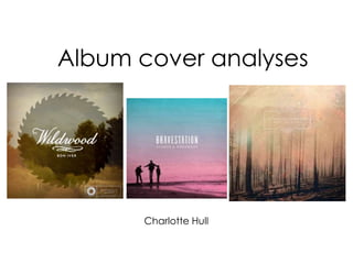
- 1. Charlotte Hull Album cover analyses
- 2. Tow’rs-Whiskey & Wine The colours used on this album cover are very dark and cool; the album artwork is not striking or dramatic which means the focus is on the letters. The letters are white which stand out amongst the plain background making them the centre of visual interest. The blue-toned image suggests it was taken later at night which therefore implies the end of something rather than the start. The only colours used on the album cover are blue, black and green with varying shades within each. The text on the album is quite basic with large, bold letters. The lettering is white which means it stands out amongst the background whilst remaining plain and subdued as to match the rest of the album cover. It is easy to read and will stand out amongst other albums. The text colour corresponds with the brighter parts of the image at the top which tie the two together and allow them to compliment each other rather than contrast and stand out. I like how the letters appear to be wrapped around the trees. The layout of the text has been manipulated so that it is not all in front or behind the image but varied to make it appear as though it is all one. This shows the text is equally as important as the image for this album cover. The image is of a dark forest and appears to have been taken during the winter seasons as there are no leaves on the trees. The surrounding area of the forest is empty with no people or animals to distract from the main feature. The CD that fits with this album has an artistic effect that makes for an additional artistic feature rather than it just being plain. The CD features the name of the band and a visual representation of what is shown on the cover. The colours of the disk fit well with the theme created by the overall package and does not distract from the main image. However, the main attraction of the disk is the mountains that are created through the lines that are printed onto the black background. Up until the centre the lines create rings which surround the name of the band created by the final line in the centre. This also creates three triangles which portray mountains and then create the word ‘Tow’rs’, the name of the band. The font of the word is similar to the one on the front cover and the same colour but in proportion to the CD. I like how the CD has a printed design as it makes it more attractive within the album cover rather than just having a visual point on the front. The only name on this album cover is of the band. There is no evidence of the name of the album or any additional information showing that they wanted the cover to be minimal. The main focus of the cover is the simplicity of the image and the bold text. This provides a minimalistic but effective presentation of the album.
- 3. The main thing that attracted me to this album cover was the colours. The use of the sunset colours has been used very imaginatively to create a backdrop for the name of the album. The colours have provided a multi- toned, almost ombré effect where the colours appear to dissolve into each other. The colours do not look harsh or fake but compliment each other and the rest of the cover effectively . This album cover gives the impression of an indie genre through the use of colour and the image. The traditional sunset colours and the use of treetops is a symbol for this genre which is represented through these aspects on the cover of the album. The band is an ‘IndieTronica’ band and so are rightfully represented through their album cover. This makes it clear to the audience what kind of music they will find from this band and what style the kind of songs included on the album will be. The image used on the front of the cover is of the sky during a sunset above a set of trees. This, although simple, is effective for the style it creates for the music video. The thing that makes this image most creative is the fact that it is positioned up-side down. The text is actually positioned in reverse to the image. This makes for a more alternative presentation, again referencing the genre of the band. Also the text fits better as it is positioned above the darkest section of the main area so the two contrast and stand out. The text used on the front cover of this album is very simple and minimalistic. The writing is small and thin which means the reliance is on the colour to allow the text to stand out amongst the image. The text is white which perfectly contrasts against the blue-purple piece of sky that it is positioned over. This allows for the text to be clear but without distracting too much from the image as it fits with the lighter colours. On the album cover they have included the name of the band as well as the name of the album but the significant difference is highlighted with size. The wires coming out of the telegraph pole in the image act as dividers between the main features within the image and the plain colouring of the sky. This breaks up the album cover and along with the telegraph pole, help to position the other features of the cover. This could also represent where the real image ends and where the colouring has been manipulated to make it more attractive and cover- worthy. There appears to be two initials on the bottom of the album cover which could relate to the band or an artist within the band. They are cleverly disguised through the use of colour ensuring it corresponds with the shade that is present during the place it is positioned. The are placed at the bottom of the album cover to show their insignificance in relation to the name of the band which is central on the cover and so the main focal point of the album cover. This is the most important thing on the cover and so thus, the first thing the audience will see.
- 4. The colours used in this album cover are quite warm and so directly link to the artists skin colour. The album artwork is a close up of the artist where she is wearing natural make-up and the colours reflect the shade of her cheek and lips. The colours get darker on the back off the CD case but still imitate of the colours that are used in the photo for example, the artist's hair. Unlike other CD covers there is really only one colour used here but many different shades which means it is easy to continue the theme created here. The colours also give the overall cover a soft and calm tone. The image used on both the front and the back of the album is of the artist. Both are close-ups, one directly in-front of her and one from above. The front cover from in-front is unusual as she is not looking directly into the camera and therefore there is no interaction with the audience. Instead, the artist appears to be in thought and mysterious which draws the audience in as they don’t know much about the music yet. The back image also represents this as the artist is looking down and again, away from the camera. The cover is fairly simple as the only thing in frame is the artist. The top that she is wearing fits with the theme as it is elegant and gentle through the use of lace and ribbon. The genre of this music is soul pop which is shown through the use of warm colours that compliment each other and discretely transition. This allows the effect to be subtle and gentle, which fits with the overall tone of her music and the album cover. The text used on this album cover is white which stands out well on the back of the album cover against the dark colours however, not so abruptly on the front. The lettering on the front of the album blend in with the colours of the image and therefore size has been used to emphasise the important features. Ella is larger than the other words and in a fancier font to show that this is important, as it is the artist’s name. The other words are on the front which suggests that are significant but the light font allows them to fit better with the overall appearance and not distract from the image. The images are not positioned central on this album cover which is unusual. The artist on the front appears to tilt her head slightly to the left and so the focal point, closest to the centre, is her lips and eyes. This allows the audience to focus on her beauty and the features of the artist before taking in the bigger picture. The image on the back is kept to the side which makes it seem like it is not as significant as the front image but is instead used to fit around the text of song names. The barcode and legal information is also displayed on the back around the image of the artist so that it remains aesthetically pleasing whilst still meeting the required standards.
- 5. The Ella Henderson album also includes a booklet with all of her song lyrics in and images of the artist. This follows the same colour scheme as the front and back cover of the album as well as having similar style images to reinforce the style. I like the idea of having a booklet with the lyrics of the song inside to make the album a bit more exciting and worthwhile for the audience to persuade them to buy the hard copy rather than just downloading the music. The CD for this album is relatively simple and stripped back which fits with the genre of the music and the overall set theme from the album. The disk is white with the name of the artist printed the same as it was on the front cover but in black letters instead of white. The surname of the artist is then printed beneath and the name of the album is below that. This is highlighted through the use of patterned circles that surround the name of the album separating it from the rest of the information about the album e.g. the company who produced it etc. I like how the disk is plain as it stands out against the rest of the packaging of the album.
- 6. Potential album cover ideas From looking at different album covers already on the market and analysing three specifically I have narrowed my ideas down to three that I am interested to develop. I either want to use a sunset with an array of colours that I can fade to dark, a photo using autumnal colours and my artist where I can use the colours as a base throughout. Or a photo of a forest with the individual trees and the name of the band split between them as in the first analysis. I will need to further look into these ideas and the ability to link them with my poster to see which would be most successful.
- 8. The image on this magazine advert is almost identical to the album cover with some of the colours swapped round. The colours have been changed on the poster so they match the bottom half of the advert which was not included on the album. The black at the bottom of the poster ties in with the name of the album which has been changed to black text from the album. The advert includes some extra information about the album and what will be on it/where to find out more. The picture has been slightly enlarged to fit the different sizing better and to fill the page to make it more eye-catching. The colours used on the poster follow the same colour scheme as the album and work together to make it attractive. The colours are different shades of one so that they blend fluently yet contrast enough to allow the words to stand out. The name of the band and the album are black and white and so stand out amongst the purple colour scheme. The yellow and orange used at the bottom of the poster are used to make it more striking and un-usual in comparison to the rest of the advert. The white text features throughout the poster allowing the audience’s eyes to move chronologically down the poster. The image used on the advert is a mosaic of a sunset scene. The image can be understood through the use of simple objects like the trees and moon but is made unusual by the effect. The mosaic makes the advert stand out and gives a more cryptic atmosphere for the music and album. The image appears central in both the album and the poster although in the advert the image has been cut slightly to allow it to adjust to the sizing and orientation difference. On the advert the main focal point is the name of the band ‘the killers’ with ‘the’ fitting within the word ‘killers’. This cleverly attracts the audience so this if the first thing they see and due to the different in colour of this text it stands out from a distance. The same colour is used within the moon which allows the moon to also be prominent amongst the magazine advert. The information about the album is positioned at the bottom of the advert which shows it is not as significant as the name of the band or even the name of the album included beneath that but is still important. It is placed on a black background so it is clear and therefore it is obvious to the audience where they can find this. The information includes the name of the band’s famous single to appeal to people who may not know of the band but have heard of this song. The text on the magazine advert is mostly central which allows it to fit directly in the middle of the poser and look professional as well as symmetrical. The soft mix of colours mean it is attractive to both genders as well as indicating the genre of the music indie/alternative rock. The relaxed purple colour scheme give the impression of calm, mellow music whilst the interruption of yellow/orange flames suggests something much more alternative.
- 9. The magazine advert for this album takes on a completely different approach to the original album artwork. The album cover is bright and plain, featuring the band in a window of a run-down shop whereas the advert is dark and busy with images of each different member of the band acting as the central square. Similarities remain as the text font is the same as the one on the album cover however a different design has been used to separate the two announcements. The layout of the images on the poster has been done so that this is the main focal point of the advert. Each band member has been framed by the same environment and placed symmetrically in a square. Nonetheless, these images are not placed exactly straight with each other which allows the poster to look a bit more relaxed and home-made. Each one has dark corners which make the images appear as though they have been stuck together on the poster individually. The name of the band is positioned directly at the top of the poster with the name of the album underneath slightly smaller than the initial text for the header. The information about the band and album has again, been positioned at the bottom of the poster. The text is white which stands out against the dark background. A quote has been used from magazine NME to make the band seem more attractive and to entice the readers to buy the album. The names of their popular songs have also been included and framed to show their significance on the front page. The colours used in this magazine advert are minimal. Mostly black and white are used with the exception of the red and blue coming from the image of the sunset in the background of the band members who are wearing black and white. The main colours contrast sufficiently to allow the information to stand out without taking away from the main focus on the pictures. The font for the text on the magazine advert differs for the different information. The font for the main header and album name has been taken directly from the album and is iconic to the band. Although the colours and overall design is different they still have this one thing that connects the two. The information at the bottom of the image is in a simple font so that it is easy to read and highlighted as different to the information at the top. The main thing that I like about this magazine advert is how the images of the band are placed together. Although each one is different and separate they all appear to fit together. Each uses the same environment and the position of the member is mostly the same. The colours and amount of light are identical and each has their instrument that makes them unique in the band in the image.
- 10. The colours used in this magazine advert come as a result of the image. The sunset provides the base for the colours used on this poster. The text colours are used to directly contrast to this with grey for the name of the band and the song and white for the extra information that is included at the bottom. The colours at the top of the sky are seen again in the shadows of the mountains further down in the image which allow the reader to connect these two parts of the image and so look around the poster without realising. The image is fairly simple with the mountains, ground level, remaining at the centre of the page. Above this the sunset provides an attraction to put the graphic and names on top of and the bottom filtering to black to position the extra information. The graphic on this poster is simple yet effective as one square has been rotated and placed on top of another allowing different shapes to be made within this. This works well amongst the colours of the sky as each layer is a different shade and it helps to be less harsh. The graphic provides an extra step rather than just placing the text straight onto the background. I like this magazine advert as I like the image that has been used and the graphic that has been positioned on top. The image provides an array of colours that stop the poster from looking boring or dull with the simplistic colours that remain. Also, I like how the image appears to fade to black at the bottom. It does not look fake or greatly edited which I think is something I will need to greatly consider when making mine. The font used throughout this poster is mainly simple and bold. The header and the extra information is in a plain, thick font that allows it to stand out as significant. The name of the single has been included in a fancier font that shows this information is different but important as well. The text on this magazine advert has been placed central which makes it look professional and neat. The name of the band is larger and in the centre of the graphic which not only allows it to be symmetrical but draws the reader’s eye directly to it. The start and end of the text are perfectly in line with the graphic and the size of it. Similarly, the text at the bottom of the advert is positioned directly underneath the point of the graphic . This is where the circle has been placed to create the centre of the lines separating the text. The lines allow the reader to move around the poster and take in all of the information without overcrowding it.
- 11. From further research of magazine adverts that currently exist and after analysing some in detail I have decided to draft my first idea based on using an image of a forest. I believe this will give me a good base for my poster as well as my album cover and will give me a good choice of colours to fade to black at the bottom of the poster as many of the ones I have looked at have. Potential magazine advert ideas