TrustArc Webinar - How to Build Consumer Trust Through Data Privacy
Construction2
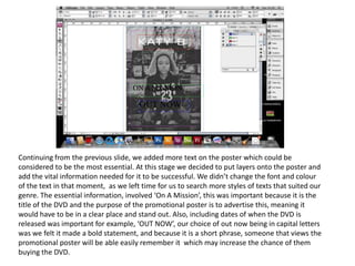
1. Continuing from the previous slide, we added more text on the poster which could be
considered to be the most essential. At this stage we decided to put layers onto the poster and
add the vital information needed for it to be successful. We didn’t change the font and colour
of the text in that moment, as we left time for us to search more styles of texts that suited our
genre. The essential information, involved ‘On A Mission’, this was important because it is the
title of the DVD and the purpose of the promotional poster is to advertise this, meaning it
would have to be in a clear place and stand out. Also, including dates of when the DVD is
released was important for example, ‘OUT NOW’, our choice of out now being in capital letters
was we felt it made a bold statement, and because it is a short phrase, someone that views the
promotional poster will be able easily remember it which may increase the chance of them
buying the DVD.
2. Subsequently after trialling different fonts for both the title ‘ON A MISSION’ and ‘OUT NOW’ we
decided on our final fonts. The font and positioning of DVD name we felt would be best placed at the
opposite end of the artist name. The reasoning for this is that from researching promotion posters this
was the usual layout, however we did feel that this would cause the viewer to look for what is being
advertised by the artist therefore attracting our target audience that are fans of Katy B. Yet again, we
chose to present the text in capital letters we wanted to incorporate this technique in the title of the
DVD to emphasis the importance to the audience. On the other hand ‘OUT NOW’, instead of keeping
the theme of simple text we used a more distinctive, the font differing from the artist name and album
title causes it to stand out and therefore jumps out to the audience when the album is available.
3. At this point in the creation process the promotional poster is formulating and is structured clearly.
Before this stage the font of the artist name Katy B was different, here once more we changed the
font after finding a font that we thought emulated that of a professional promotional poster.
Although it doesn't seem now, however the font at this stage is the same as our originally chosen
font. After manipulating the text we were able to create a font that seamlessly flowed with the
photograph, this was achieved through changing the font from regular to ultra light and increasing
the space between each letters using the tool above enlarged above. Also, we added a splash of
colour onto the poster by using the colour blue, adding colour a monotone background will help in
catching the attention of an audience. Furthermore, having the blue, relates to the colours of black,
grey and white which are all associated with our urban genre.
4. After looking at the promotional poster we felt as though something was missing, by recalling
back to our researching and planning stages including our various flat plans, we remembered
our previous ideas which involved putting quotes into the promotional poster. Additionally,
we thought by having quotes on the poster it would make sense for the quotes to come from
magazines or radio stations that are associated with our chosen genres. We thought using
words such as ‘excellent’ and ‘best’ would again add to the attraction, as well as carrying on
the style of using capital letters. The font we used for the quotes was furtura, this made them
clear and stand out. By having layers and writing quotes in them we were able to arrange
them in a way that frames the central image of the artist, therefore becoming the central
focus.
5. When completing almost every aspect to the promotional poster, after looking at it
again we found a minor problem. The problem was that the font did not clearly stand
out from the grey background and was slightly blending into the background, solve this
problem we added a black outline to all the text featured on the poster, this was
accomplished by highlighting the text and clicking on the swatches.
6. Finally, after completing the promotional poster there was
one more thing that needed to be added this was, the DVD
cover. To do this we added a new layer so we would be able
to place the front cover of DVD on the promotional poster.
We had to export the DVD cover from Indesign in order for it
to become a jpeg, so it could be place on top of the
promotional poster.
After this we had to resize
However at the ending we decided to have it the image so it would fit on
straight, so it can be clearly viewed. Also we the poster and resemble a
positioned it next to ‘out now’ we done this CD. We then tested out
because we felt it would allow our audience to different positions of the
know what the poster is promoting. DVD by rotating.