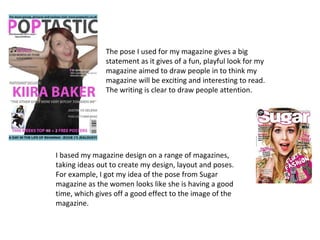
1. The pose I used for my magazine gives a big
statement as it gives of a fun, playful look for my
magazine aimed to draw people in to think my
magazine will be exciting and interesting to read.
The writing is clear to draw people attention.
I based my magazine design on a range of magazines,
taking ideas out to create my design, layout and poses.
For example, I got my idea of the pose from Sugar
magazine as the women looks like she is having a good
time, which gives off a good effect to the image of the
magazine.
2. I attempted to base the layout of my contents page on Q
magazines double page contents page. I used their idea
of the block of colour to file of everything. It helped me
to keep my contents page looking
clear and easy to recognise where
to look for the story they want to
read.
I chose to include an editor’s letter on my contents page as I’ve
seen a range of magazines doing this. I decided to copy the idea to
write a little bit about how exciting my magazine was to write and
include two pictures of me. This is good for the magazine as the
audience knows more about the editor feeling engaged.
3. The idea of my double page spread was to make it look good, whilst selling a
good story. I decided to make the headline interesting as good magazines do this
to. For example, ‘Take a Breaks’ headlines look exciting and interesting to read.
On my front cover, I placed my main story in the middle at the biggest font in
order to catch reader’s attention. This is what ‘Take a Break’ did too, as people
would get attracted to the headline, pick the magazine up and want to read the
rest of the magazine.