SlideShare ist ein Scribd-Unternehmen logo
1 von 1
Double page spread analysis
Colour scheme: The
colour scheme
throughout the
spread is the same
colours. This makes
the page have a
fresh and clean feel.
The woman on the
first page of the
spread dress
matches the font
colour this keeps
the layout clean.

Colour: The colour
contrast from the
red against the black
and white makes
the reader
automatically
interested in what
the page has to say
and captures their
attention.

Overall effect: The overall
effect of the pages give the
magazine a cosmopolitan
feel. Keeping it in trend
and clean. The layout is
neat and blends in well
with the image keeping it
in trend

Text: The fonts in
the title are
different; this sparks
the reader’s interest
as is it is unique and
different. This also
fits in with the style
of music. However
the interview text is
too small therefore
will lose the readers
interest more
quickly. However
the sub heading text
makes it easier to
break up.
Colour Scheme: The colour
scheme is very dark as it
reflects the type of music
they are promoting. The Red,
black and white contrasts
each other and stands out.

Text: The text style
is kept clean apart
from the title and
sub title, which is
in a separate font
all together. This
makes the page far
more interesting
and appealing to
the reader.

Images: The photo is eye catching and
takes up the whole of the left side of the
page therefore gaining the readers
interest. The image stays mainly black
however the sharp blast of colour
encourages the reader to read the article
as the image is eye catching.
Overall Effect: The magazine has a rough,
edgy feel about it. This makes it stand out
from the rest. By the use of colour and font
it makes the article look more appealing.

Images: The main image is of the woman
the article is about; this is good for the
reader as we can identify who the writer is
talking about. The image is also large
enough to attract attention. The image
keeps in colour contrast with the rest of
the article therefore blends in and keeps
the article neat.

Colours: The colours are
in keeping with the style
of the music. By using
dark colours against the
women’s lighter hair it
creates a good contrast.
Also with the type of
music this is focused on
the colours suit. Having
the sub
headings/questions a
different colour makes it
easier for the reader to
get through as it makes it
less of a chunk of text,
breaks the continuous
amount of black text and
sparks the readers intrest

Weitere ähnliche Inhalte

Was ist angesagt?

Representations my magzine
Representations my magzineRepresentations my magzine
Representations my magzinejoe_clarkie
 
Noel gallagher double page analysis
Noel gallagher double page analysisNoel gallagher double page analysis
Noel gallagher double page analysisasmediad14
 
Frontcover1media
Frontcover1mediaFrontcover1media
Frontcover1mediazanisharrrr
 
Noel gallagher double page analysis
Noel gallagher double page analysisNoel gallagher double page analysis
Noel gallagher double page analysisasmediad14
 
College magazine analysis
College magazine analysisCollege magazine analysis
College magazine analysisLeafyJ
 
Double page spread analysis (main task)
Double page spread analysis (main task)Double page spread analysis (main task)
Double page spread analysis (main task)EDPRICE93
 
Analysis of magazine
Analysis of magazineAnalysis of magazine
Analysis of magazinerioniwilliams
 
Researching genre
Researching genre Researching genre
Researching genre 046150
 
Up vibe front cover annot
Up vibe front cover annotUp vibe front cover annot
Up vibe front cover annotJumanaYasmeen
 
Double page analysiss
Double page analysissDouble page analysiss
Double page analysissMFJ
 
Magazine analysis
Magazine analysisMagazine analysis
Magazine analysisAlice Bates
 
Magazine analysis
Magazine analysisMagazine analysis
Magazine analysisAlice Bates
 

Was ist angesagt? (18)

The Pitch
The PitchThe Pitch
The Pitch
 
Representations my magzine
Representations my magzineRepresentations my magzine
Representations my magzine
 
Noel gallagher double page analysis
Noel gallagher double page analysisNoel gallagher double page analysis
Noel gallagher double page analysis
 
Frontcover1media
Frontcover1mediaFrontcover1media
Frontcover1media
 
Noel gallagher double page analysis
Noel gallagher double page analysisNoel gallagher double page analysis
Noel gallagher double page analysis
 
Magazine cover
Magazine coverMagazine cover
Magazine cover
 
College magazine analysis
College magazine analysisCollege magazine analysis
College magazine analysis
 
Double page spread analysis (main task)
Double page spread analysis (main task)Double page spread analysis (main task)
Double page spread analysis (main task)
 
Analysis of magazine
Analysis of magazineAnalysis of magazine
Analysis of magazine
 
Researching genre
Researching genre Researching genre
Researching genre
 
Up vibe front cover annot
Up vibe front cover annotUp vibe front cover annot
Up vibe front cover annot
 
Conents
ConentsConents
Conents
 
Double page analysiss
Double page analysissDouble page analysiss
Double page analysiss
 
Magazine analysis
Magazine analysisMagazine analysis
Magazine analysis
 
Analysis covers 2
Analysis covers 2Analysis covers 2
Analysis covers 2
 
Magazine analysis
Magazine analysisMagazine analysis
Magazine analysis
 
Nme magazine
Nme magazineNme magazine
Nme magazine
 
question 5
question 5question 5
question 5
 

Andere mochten auch

The Yellow Palm & Poppies
The Yellow Palm & PoppiesThe Yellow Palm & Poppies
The Yellow Palm & Poppiesthemerch78
 
Futility analysis
Futility analysisFutility analysis
Futility analysisrgarofano
 
Bayonet charge revision information
Bayonet charge   revision informationBayonet charge   revision information
Bayonet charge revision informationJon Bradshaw
 
Belfast confetti[1]
Belfast confetti[1]Belfast confetti[1]
Belfast confetti[1]mrhoward12
 
The Charge of the Light Brigade by Alfred Tennyson
The Charge of the Light Brigade by Alfred TennysonThe Charge of the Light Brigade by Alfred Tennyson
The Charge of the Light Brigade by Alfred Tennysonwww.MrSedani.co.uk
 

Andere mochten auch (9)

The Yellow Palm & Poppies
The Yellow Palm & PoppiesThe Yellow Palm & Poppies
The Yellow Palm & Poppies
 
Futility
FutilityFutility
Futility
 
Futility analysis
Futility analysisFutility analysis
Futility analysis
 
Poppies
PoppiesPoppies
Poppies
 
Bayonet charge revision information
Bayonet charge   revision informationBayonet charge   revision information
Bayonet charge revision information
 
Belfast confetti[1]
Belfast confetti[1]Belfast confetti[1]
Belfast confetti[1]
 
Futility by Wilfred Owen
Futility by Wilfred OwenFutility by Wilfred Owen
Futility by Wilfred Owen
 
Bayonet Charge by Ted Hughes
Bayonet Charge by Ted HughesBayonet Charge by Ted Hughes
Bayonet Charge by Ted Hughes
 
The Charge of the Light Brigade by Alfred Tennyson
The Charge of the Light Brigade by Alfred TennysonThe Charge of the Light Brigade by Alfred Tennyson
The Charge of the Light Brigade by Alfred Tennyson
 

Ähnlich wie Poppy dps analysis 1

Ähnlich wie Poppy dps analysis 1 (20)

Tasks 1 4 and hwk 2
Tasks 1 4 and hwk 2Tasks 1 4 and hwk 2
Tasks 1 4 and hwk 2
 
Market Research
Market ResearchMarket Research
Market Research
 
Market research
Market researchMarket research
Market research
 
Market research on the pop and rock music genre
Market research on the pop and rock music genreMarket research on the pop and rock music genre
Market research on the pop and rock music genre
 
Tasks 1 4 and hwk 1
Tasks 1 4 and hwk 1Tasks 1 4 and hwk 1
Tasks 1 4 and hwk 1
 
Evaluation
EvaluationEvaluation
Evaluation
 
Task 5
Task 5Task 5
Task 5
 
House style
House styleHouse style
House style
 
Mojo
MojoMojo
Mojo
 
Music Magazine Front Cover Analysis
Music Magazine Front Cover AnalysisMusic Magazine Front Cover Analysis
Music Magazine Front Cover Analysis
 
Research into codes and conventions
Research into codes and conventionsResearch into codes and conventions
Research into codes and conventions
 
Magazine analysis q, kerrang, nme
Magazine analysis   q, kerrang, nmeMagazine analysis   q, kerrang, nme
Magazine analysis q, kerrang, nme
 
Media evalution q5
Media evalution q5Media evalution q5
Media evalution q5
 
Magazine Analysis
Magazine Analysis Magazine Analysis
Magazine Analysis
 
Task 2(d)
Task 2(d)Task 2(d)
Task 2(d)
 
Magazine Analysis
Magazine AnalysisMagazine Analysis
Magazine Analysis
 
Style sheet.
Style sheet.Style sheet.
Style sheet.
 
Textual analysis
Textual analysisTextual analysis
Textual analysis
 
Poppy dps analysis 2
Poppy dps analysis 2Poppy dps analysis 2
Poppy dps analysis 2
 
Media front cover research
Media front cover researchMedia front cover research
Media front cover research
 

Mehr von Charis Creber (20)

Webiste analysis
Webiste analysisWebiste analysis
Webiste analysis
 
Moodboard
MoodboardMoodboard
Moodboard
 
Evalution (1)
Evalution (1)Evalution (1)
Evalution (1)
 
Q3
Q3Q3
Q3
 
Contents take
Contents take Contents take
Contents take
 
Contents take 2
Contents take 2Contents take 2
Contents take 2
 
Double page spread....
Double page spread....Double page spread....
Double page spread....
 
Media question 5
Media question 5Media question 5
Media question 5
 
Zombie makeup
Zombie makeupZombie makeup
Zombie makeup
 
Storyboard
StoryboardStoryboard
Storyboard
 
Soundtrack
SoundtrackSoundtrack
Soundtrack
 
Script
ScriptScript
Script
 
Magazine film cover analysis
Magazine film cover analysisMagazine film cover analysis
Magazine film cover analysis
 
Story board + script
Story board + scriptStory board + script
Story board + script
 
Cover page
Cover pageCover page
Cover page
 
Contents take 2
Contents take 2Contents take 2
Contents take 2
 
%Magzine cover
%Magzine cover%Magzine cover
%Magzine cover
 
Double page spread....
Double page spread....Double page spread....
Double page spread....
 
Wills double page spread
Wills double page spreadWills double page spread
Wills double page spread
 
Evaluation 7
Evaluation 7Evaluation 7
Evaluation 7
 

Poppy dps analysis 1

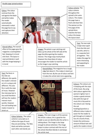
  • 1. Double page spread analysis Colour scheme: The colour scheme throughout the spread is the same colours. This makes the page have a fresh and clean feel. The woman on the first page of the spread dress matches the font colour this keeps the layout clean. Colour: The colour contrast from the red against the black and white makes the reader automatically interested in what the page has to say and captures their attention. Overall effect: The overall effect of the pages give the magazine a cosmopolitan feel. Keeping it in trend and clean. The layout is neat and blends in well with the image keeping it in trend Text: The fonts in the title are different; this sparks the reader’s interest as is it is unique and different. This also fits in with the style of music. However the interview text is too small therefore will lose the readers interest more quickly. However the sub heading text makes it easier to break up. Colour Scheme: The colour scheme is very dark as it reflects the type of music they are promoting. The Red, black and white contrasts each other and stands out. Text: The text style is kept clean apart from the title and sub title, which is in a separate font all together. This makes the page far more interesting and appealing to the reader. Images: The photo is eye catching and takes up the whole of the left side of the page therefore gaining the readers interest. The image stays mainly black however the sharp blast of colour encourages the reader to read the article as the image is eye catching. Overall Effect: The magazine has a rough, edgy feel about it. This makes it stand out from the rest. By the use of colour and font it makes the article look more appealing. Images: The main image is of the woman the article is about; this is good for the reader as we can identify who the writer is talking about. The image is also large enough to attract attention. The image keeps in colour contrast with the rest of the article therefore blends in and keeps the article neat. Colours: The colours are in keeping with the style of the music. By using dark colours against the women’s lighter hair it creates a good contrast. Also with the type of music this is focused on the colours suit. Having the sub headings/questions a different colour makes it easier for the reader to get through as it makes it less of a chunk of text, breaks the continuous amount of black text and sparks the readers intrest