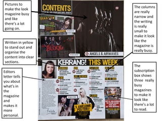
1. Pictures to
make the look
magazine busy
and like
there’s a lot
going on.
Written in yellow
to stand out and
organise the
content into clear
sections.
Editors
letter tells
you about
what’s in
the
magazine
and
makes it
more
personal.
The columns
are really
narrow and
the writing
is really
small to
make it look
like the
magazine is
really busy.
The
subscription
box shows
three really
busy
magazines
to make it
look like
there’s a lot
to read.
2. Magazine name
acting as mast
head to make it
more
recognisable and
so people
remember them.
One column
makes it look like
there isn’t a lot in
the magazine, but
the lots of writing
contradicts that.
He looks
mysterious and
the way he is
standing looks
masculine. Also
he looks like he
doesn’t follow
the rules, and
the background
and the contents
supports that
because
normally
contents pages
have at least 3
columns.
They picked out
a quote for the
article to make it
look more
interesting.