SlideShare ist ein Scribd-Unternehmen logo
1 von 3
Content page Analysis : From last year.

This contents page I don’t really like very much however, I think the layout of it is good. Its
got very clear writing and its easy to read the text and masthead. Although the masthead is
very boring and so are all of the photo’s, In the photos the people posing aren't looking
directly at the camera. This is bad as it doesn’t give the viewers a chance to really be
intrigued and be interested by the page as the photos are very boring. The fonts on the page
change this is bad as you need to really keep the same colours and text style throughout.
This Contents page is form last years work. This I think is one of the best
examples I've seen. I like the colours she has used although I don’t think the red,
yellow, and orange work and don’t really go with the grey scale design. Her outfit
doesn’t really fit with colour schemes either. However I do like the layout of the
text on my contents page and the collage of photos in the back. The pose she is
pulling is good as it is a full body shot and she is facing the camera, the way she
has cut around the body of the girl not to make her distorted is good too. As
usually with Photoshop its hard to outline the body well.

This contents page is one of the best amateur ones I've seen it keeps to a set guideline
and has clear bold masthead and text overall. The reason I like tis contents page more
because it has more pictures of different types which show the key stages in the
magazine and shows the best features by giving this it shows more aspects of the
magazine. On the left hand side of the contents page it has a more detailed planned
of the ‘number 1’ pages that are the ‘need to read’ in this magazine by doing this it
gives people a chance to skim read and find the parts they want to read in the
magazine easier.
These are some good contents pages that I'm going to
focus my contents page around.

Weitere ähnliche Inhalte

Andere mochten auch

Sector Analysis - Health Care
Sector Analysis - Health CareSector Analysis - Health Care
Sector Analysis - Health CareMaisy Lam
 
Tobi photoshoot plan
Tobi photoshoot planTobi photoshoot plan
Tobi photoshoot planCharis Creber
 
Teoría General de las Sociedades
Teoría General de las SociedadesTeoría General de las Sociedades
Teoría General de las SociedadesJhonathan Albino
 
Getting Organized & Time Management
Getting Organized & Time ManagementGetting Organized & Time Management
Getting Organized & Time ManagementSumera Muhammad
 
RobLatimerDesignPortfolio_16
RobLatimerDesignPortfolio_16RobLatimerDesignPortfolio_16
RobLatimerDesignPortfolio_16Rob Latimer
 
Olijfberg splijt 2
Olijfberg splijt 2Olijfberg splijt 2
Olijfberg splijt 2goedbericht
 
Tas - dynamic simulations of lightweight construction and phase change materi...
Tas - dynamic simulations of lightweight construction and phase change materi...Tas - dynamic simulations of lightweight construction and phase change materi...
Tas - dynamic simulations of lightweight construction and phase change materi...Su Butcher
 
de wegrukking van de mannelijke zoon
de wegrukking van de mannelijke zoonde wegrukking van de mannelijke zoon
de wegrukking van de mannelijke zoongoedbericht
 
de wegrukking, deel 2
de wegrukking, deel 2de wegrukking, deel 2
de wegrukking, deel 2goedbericht
 
Nordstrom Audit - Group 9
Nordstrom Audit - Group 9Nordstrom Audit - Group 9
Nordstrom Audit - Group 9Maisy Lam
 
ROBABEL V TEJOSO - UPDATED RESUME
ROBABEL V TEJOSO - UPDATED RESUMEROBABEL V TEJOSO - UPDATED RESUME
ROBABEL V TEJOSO - UPDATED RESUMEBobby Tejoso
 
ROPedro_resume_2016_r01
ROPedro_resume_2016_r01ROPedro_resume_2016_r01
ROPedro_resume_2016_r01Romualdo Pedro
 
Object oriented concepts
Object oriented conceptsObject oriented concepts
Object oriented conceptschristradus
 

Andere mochten auch (16)

Sector Analysis - Health Care
Sector Analysis - Health CareSector Analysis - Health Care
Sector Analysis - Health Care
 
Actuators
ActuatorsActuators
Actuators
 
Tobi photoshoot plan
Tobi photoshoot planTobi photoshoot plan
Tobi photoshoot plan
 
Teoría General de las Sociedades
Teoría General de las SociedadesTeoría General de las Sociedades
Teoría General de las Sociedades
 
KASHF ALI
KASHF ALIKASHF ALI
KASHF ALI
 
Getting Organized & Time Management
Getting Organized & Time ManagementGetting Organized & Time Management
Getting Organized & Time Management
 
Relación tributaria
Relación tributariaRelación tributaria
Relación tributaria
 
RobLatimerDesignPortfolio_16
RobLatimerDesignPortfolio_16RobLatimerDesignPortfolio_16
RobLatimerDesignPortfolio_16
 
Olijfberg splijt 2
Olijfberg splijt 2Olijfberg splijt 2
Olijfberg splijt 2
 
Tas - dynamic simulations of lightweight construction and phase change materi...
Tas - dynamic simulations of lightweight construction and phase change materi...Tas - dynamic simulations of lightweight construction and phase change materi...
Tas - dynamic simulations of lightweight construction and phase change materi...
 
de wegrukking van de mannelijke zoon
de wegrukking van de mannelijke zoonde wegrukking van de mannelijke zoon
de wegrukking van de mannelijke zoon
 
de wegrukking, deel 2
de wegrukking, deel 2de wegrukking, deel 2
de wegrukking, deel 2
 
Nordstrom Audit - Group 9
Nordstrom Audit - Group 9Nordstrom Audit - Group 9
Nordstrom Audit - Group 9
 
ROBABEL V TEJOSO - UPDATED RESUME
ROBABEL V TEJOSO - UPDATED RESUMEROBABEL V TEJOSO - UPDATED RESUME
ROBABEL V TEJOSO - UPDATED RESUME
 
ROPedro_resume_2016_r01
ROPedro_resume_2016_r01ROPedro_resume_2016_r01
ROPedro_resume_2016_r01
 
Object oriented concepts
Object oriented conceptsObject oriented concepts
Object oriented concepts
 

Mehr von Charis Creber (20)

Webiste analysis
Webiste analysisWebiste analysis
Webiste analysis
 
Moodboard
MoodboardMoodboard
Moodboard
 
Evalution (1)
Evalution (1)Evalution (1)
Evalution (1)
 
Q3
Q3Q3
Q3
 
Contents take
Contents take Contents take
Contents take
 
Contents take 2
Contents take 2Contents take 2
Contents take 2
 
Double page spread....
Double page spread....Double page spread....
Double page spread....
 
Media question 5
Media question 5Media question 5
Media question 5
 
Zombie makeup
Zombie makeupZombie makeup
Zombie makeup
 
Storyboard
StoryboardStoryboard
Storyboard
 
Soundtrack
SoundtrackSoundtrack
Soundtrack
 
Script
ScriptScript
Script
 
Magazine film cover analysis
Magazine film cover analysisMagazine film cover analysis
Magazine film cover analysis
 
Story board + script
Story board + scriptStory board + script
Story board + script
 
Cover page
Cover pageCover page
Cover page
 
Contents take 2
Contents take 2Contents take 2
Contents take 2
 
%Magzine cover
%Magzine cover%Magzine cover
%Magzine cover
 
Double page spread....
Double page spread....Double page spread....
Double page spread....
 
Wills double page spread
Wills double page spreadWills double page spread
Wills double page spread
 
Evaluation 7
Evaluation 7Evaluation 7
Evaluation 7
 

Jane contents page analysis

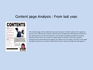
  • 1. Content page Analysis : From last year. This contents page I don’t really like very much however, I think the layout of it is good. Its got very clear writing and its easy to read the text and masthead. Although the masthead is very boring and so are all of the photo’s, In the photos the people posing aren't looking directly at the camera. This is bad as it doesn’t give the viewers a chance to really be intrigued and be interested by the page as the photos are very boring. The fonts on the page change this is bad as you need to really keep the same colours and text style throughout.
  • 2. This Contents page is form last years work. This I think is one of the best examples I've seen. I like the colours she has used although I don’t think the red, yellow, and orange work and don’t really go with the grey scale design. Her outfit doesn’t really fit with colour schemes either. However I do like the layout of the text on my contents page and the collage of photos in the back. The pose she is pulling is good as it is a full body shot and she is facing the camera, the way she has cut around the body of the girl not to make her distorted is good too. As usually with Photoshop its hard to outline the body well. This contents page is one of the best amateur ones I've seen it keeps to a set guideline and has clear bold masthead and text overall. The reason I like tis contents page more because it has more pictures of different types which show the key stages in the magazine and shows the best features by giving this it shows more aspects of the magazine. On the left hand side of the contents page it has a more detailed planned of the ‘number 1’ pages that are the ‘need to read’ in this magazine by doing this it gives people a chance to skim read and find the parts they want to read in the magazine easier.
  • 3. These are some good contents pages that I'm going to focus my contents page around.